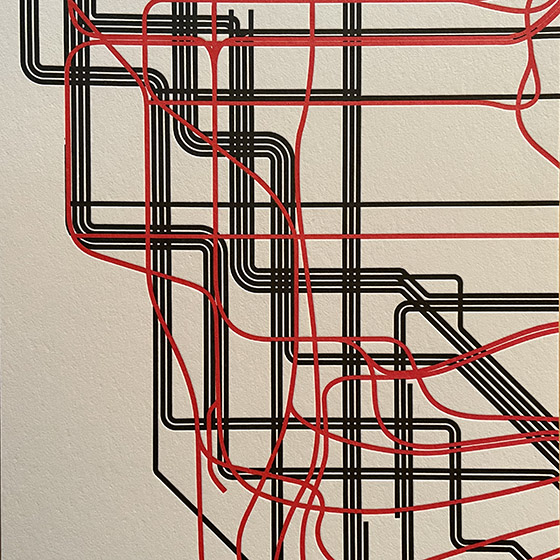
In 1978, in the Great Hall of Cooper Union in New York, a heated debate took place over a proposed redesign of the NYC subway map. In 2021, Gary Hustwit and Standards Manual published the transcript of that debate, accompanied by photos taken that same evening, in a smart-looking little book called The New York Subway Map Debate. It’s a document of design in the very real world.
The debate was a battle of two antagonistic concepts of what a transit map was supposed to do. In 1972, Massimo Vignelli and his studio had designed an elegantly abstract new subway map, doing away almost entirely with geography and presenting a schematic, almost a wiring diagram, of how to get from one point to another within a closed system. In 1978, a new map, championed by railroad enthusiast and cartographer John Tauranac, was proposed as a replacement. The new map would restore a semblance of geography, connect the subway to the city streets above, and show how the complex tangle of New York’s subways really worked. It was, as designer and debate panelist Peter Laundy later described it, “really a tunnel map rather than a route map.”
I started riding the New York subways in 1966, when I was sixteen. Shortly before that, Vignelli and Bob Noorda had designed a new signage system for the subways, assigning color-coded numbers or letters to each route. I found this system easy to follow; what I didn’t find easy to follow was the old signs in all the stations, pointing to the “BMT trains” or the “East Side Local.” The new system had not fully replaced the old, and to a novice these mixed signals were confusing. The Vignelli map had not yet been created, but the then-current subway map did identify all the lines by number or letter. There was no clue on it to the old nomenclature, or to the fact that the NYC subway system had been cobbled together from three separate companies, the IRT, the BMT, and the IND.
That map, and the Vignelli schematic in 1972, was an attempt at imposing order on a fundamentally chaotic and contradictory system. This, it seems to me, is exactly what design is supposed to do.
[Originally published on January 1, 2022, in PPN Post and Updates, the newsletter of the Publishing Professionals Network.]

