function jdb_page_navigation()
sPageSlug = blog
sPageTitle = easily amused
header:139:aPageArgs:page_title = easily amused
header:140:aPageArgs:section_title =
functions-johndberry:262:aPageArgs:page_title = easily amused
functions-johndberry:298:sPageTitle = easily amused
functions-johndberry:359:sPageTitle = easilyamused

easilyamused |

Archive for 2008

Entropic typography

Published

In the spirit of the expiring year, here’s a bit of decayed lettering on the awning of a car-repair shop in my neighborhood in Seattle. Digital distressing has nothing on the ravages of weather and sunlight. I’m not sure which is more poignant, the choice of typeface (Avant Garde?) or the phrase that it spells out (“Computerized Automotive Repair”).

‘Computerized Automotive Repair’

Not so fine

Published

Everybody has forwarded this link to me, though Deb Gibson was the first. I’m familiar with the book, Geoffrey Dowding’s Finer Points in the Spacing and Arrangement of Type (1954, reissued in 1966), though all I have is the Hartley & Marks reprint from 1995 and a xerox of the original that Steve Renick gave me many years ago. I have not actually seen this remarkably poor binding typography face to face, but if it is really the way the title was embossed on the cloth in the original edition, I can only speculate about what Dowding might have said about it at the time. As Loren MacGregor put it to me the other day, “I suspect the book was bound by someone not familiar with the contents.”

The “Fail” folks aren’t the first ones to notice this unfortunate conjunction of title and execution; it was also noted on the Hoefler & Frere-Jones blog back in January, under the title, “Precisely What the Author Had in Mind” – a longer but perhaps clearer description than the noun-cluster “Proof of Concept Fail.”

Dowding’s book is well worth seeking out, though even the Hartley & Marks edition is out of print. I think he carried his argument for tight spacing slightly too far, but he was right in principle; and he gave close thought to the details that make text typography good or mediocre.

Signage on the hoof

Published

I love seeing how things actually get made. This set of Flickr photos shows the shop that manufactures the highway signs for Washington State.

As successive photos reveal more of the underlying letters, and the visible part seems to be “ypo,” I find myself fantasizing that it will turn out to be spelling “Typography” – or perhaps the little-known Washington town of Typopolis. It is, however, “Keyport.” Oh well.

[Photo: Distributed by WSDOT under Creative Commons license.]

Guerrilla pixels

Published

In a daring daylight raid, elements of the Microsoft Typography team carried out an action targeted to advancing the cause of macro-typography and raising the visibility of fonts in the most literal way, says our anonymous informant.

Since the Microsoft Typography team, along with the rest of Windows International, was moving to a new building on the Microsoft corporate campus over the weekend of December 12, it seemed only appropriate to make a visible statement about the importance and ubiquity of type in the visual environment. Through the use of six-inch-square pixels cut out of sticky-backed black vinyl (a technique used previously for an installation at the Design Commission during TypeCon Seattle), these large-scale representations of bitmap characters from the Verdana and Georgia type families appeared without warning on the walls of the new building. This was reportedly achieved without a single X-acto-based industrial accident.

Verdana and Georgia were originally commissioned by Microsoft for onscreen reading of text. The way they were designed was the opposite of the usual process of designing type for the screen. Instead of creating outlines and then hinting the outlines (giving them rules to follow when turning into bitmaps at small sizes), type designer Matthew Carter started by designing the bitmaps – the end result that he wanted to see at each size – and then worked with hinting wizard Tom Rickner to create outlines and hinting that would achieve those shapes. The letters of the wordlet “typo” on the wall of Building 9 are taken from the bitmaps of 10pt Verdana and Georgia (in a mix of styles) at 96dpi. (Can you identify which letters are from which font, and in which style?)

The first versions of Verdana and Georgia were released in 1996; they now represent an early stage in the development of digital type at Microsoft. What will it look like when the MST commandos attempt to represent grayscale hinting and ClearType subpixel rendering at wall-size scale?

GGL

Published

I was sad to hear the news that Günter Gerhard Lange had just died. GGL, as he was frequently referred to, was a central force in the typographic world. Through his long-time work at the Berthold type foundry in Germany, he set the standards of quality for type design in metal and later in photo and digital typesetting. Even in the United States, where Berthold was less well known, the big, square E2 Body Types type-specimen book from the 1980s was treasured. Often enough, it was the Berthold interpretation – that is, Lange’s interpretation – of classic typefaces that were judged the best. It’s easy to see, from studying the type samples, that even when he made changes to the original design, he always did so with their usefulness in modern text typesetting in mind. (Some compromises are always required in adapting a typeface from an earlier time to modern equipment; it’s what choices you make, and how you implement them, and in what spirit you do so, that makes the resulting new typeface usable or not.)

The only time I met Lange was at the 2000 ATypI conference in Leipzig, where of course he was a major presence. I wished that I spoke and understood more than a smidgin of German; he was renowned as an articulate and forceful speaker, though not in English. At the conference, the New York Type Directors Club presented him with its TDC medal, and I wrote about that event in one of my earliest “dot-font” columns for Creativepro.

[Photo: © FontShop, Marc Eckardt]

“No independent or detached existence”

Published

I had nothing new to bring with me to Seattle’s typographers’ pub last Tuesday, so I brought something old: my copy of Hermann Zapf’s little book, About Alphabets: Some marginal notes on type design by Hermann Zapf. I’ve always liked the ambiguity of that subtitle-cum-author’s-name: yes, the book is by Hermann Zapf, but it’s also true that the type designs discussed in it are all by Zapf as well. So it works either way.

It seemed appropriate to bring this particular book, since November 8 was Zapf’s 90th birthday. I’m not sure what kind of celebration was held in Darmstadt, but I know it was an anniversary that was appreciated in many corners of the world.

In Paul Standard’s preface to the 1960 book (my MIT Press paperback is the 1970 edition), he writes: “If the foregoing lines say much of books, it is because type designs have no independent or detached existence. Types are produced with great effort at great cost, produced for use in printed matter required for learning or study or for industrial or commercial needs. And HZ’s supreme concern, whether in writing or in printing, is never the single letter but the fusion of such letters into a working text.” Although digital type can be produced without the great cost inherent in the older industrial technology, a good text face – which is what Standard is talking about – still takes enormous effort and skill. And their purpose is still, as it always is, their weaving together into meaningful text.

Scrambled Eggs & Whiskey

Published

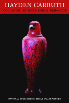
One of my favorite American poets, Hayden Carruth, died in September at the age of 87. I had the honor and the pleasure of designing two of his books, for Copper Canyon Press, as well as designing a new cover for a reissue of his Collected Shorter Poems. One of the new books I designed had the wonderfully evocative title quoted above (“It’s what we used to have for breakfast,” he said).

Recently, I finally got around to subscribing to the long-running magazine Poetry, and the first thing I read when my first issue arrived was not a poem but W.S. di Piero’s account of spending time with Hayden Carruth. Di Piero’s final anecdote, about Hayden going walkabout before a TV interview, particularly pleased me. I can’t claim to have known Hayden more than slightly, but I do recall an evening in New York City a few years ago when Michael Wiegers and I picked up Hayden at his hotel and took him downtown to the New School, where he was supposed to do a reading. He claimed it was going to be his last city reading (“I hate this place,” Mike remembers him saying), and perhaps it was; I haven’t checked.

The taxi we caught to take us downtown was driven by a classic New York cabbie, the kind of long-time driver who regaled us with tales of his encounters with savvy traffic cops over the years. (“But officer, there was no sign there telling me I couldn’t turn left.” “Sure, buddy, but you’ve been driving a long time; you know perfectly well that there used to be a sign there. I’m giving you a ticket.”) This character and his stories delighted Hayden.

At the New School, there was a noisy social gathering upstairs before the event, and after a while I noticed Hayden ducking out the fire door to the stairs. I figured I’d better follow him; I knew Mike had told me that he worried that Hayden would bolt. I found Hayden on the sidewalk out front, sitting on the curb and smoking a cigarette. I don’t smoke, but I joined him on the sidewalk, and we talked companionably for a while. When he was done with his cigarette, we just got up and took the elevator back up to the event, where Hayden gave his reading to great applause.

Minister without fontfolio

Published

Well, someone must be reading this stuff. The other day, John D. Boardley, who runs the website I Love Typography, posted this Photoshop mash-up (it’s rather far down the page in his “week in type” for November 11). He was presumably inspired by my off-the-cuff remark a couple of weeks ago about the need for a Minister of Typography. Thanks to Jennifer Kennard, who pointed this out to me; it cracked me up when I saw it. And you certainly won’t find me complaining; I think I’m in good company.

Boardley made a connection between this notion and an idea expressed by Robin Kinross in Unjustified texts: “Could typography be a topic of regular and intelligent discussion in newspapers? […] If music, architecture, cookery and gardening have critics and columnists, then why not typography?” Kinross was taking off from an idea of Erik Spiekermann‘s (“The typographer Erik Spiekermann set off this hare in his book Rhyme & reason, in which he complained that one could never read discussion of typography there”), and it’s a point I’ve made myself when arguing for more public design and typography criticism. Although Boardley says the Kinross quotation is “not completely related – this is just how my mind works,” the connection seems logical enough to me.

Toronto: design, tech, celebration

Published

Last weekend Eileen and I were in Toronto for the wedding of Cory Doctorow and Alice Taylor. It was my first time in Toronto since 1973, except for changing planes once or twice in the airport, and Eileen’s first visit ever. The hotel of choice for incoming guests was the Gladstone, once a notorious flophouse at the far edge of Queen Street West, now meticulously restored as a boutique hotel with each room decorated by a different artist. The neighborhood, known as West Queen West, seemed to be the funky artistic center of the city (or at least one of them) – the sort of place we would naturally gravitate to. It was a good setting for this confluence of digitally and geographically dispersed people, ideas, and creative energy.

This was a gala affair, though not exactly…um, traditional. The ceremony itself – admirably brief and amusing – was conducted by a magician, and there was a sort of steampunk Halloween theme to the whole celebration. Jack-o-lanterns were carved on the day before, and the event took place in a haunted house – well, actually in a great Victorian pile known as Casa Loma, the extravagant folly of a wealthy Toronto capitalist who went broke getting his mansion built. Costumes were the order of the day; Cory appeared at the Mad Hatter, and Alice as, well, Alice. The star of the show, of course, was their eight-month-old daughter, Poesy Emmeline Fibonacci Nautilus Taylor Doctorow (“Poe”).

Toronto had its share of type and design; in fact, the Queen West neighborhood is officially designated the “Art + Design District,” something I’ve never seen in any other city. And who could resist a bookstore named “Type”? (The sign “pre-loved” is actually the name of the shop nextdoor.) That’s where I bought Robert Bringhurst’s new book about Canadian book design, The Surface of Meaning.

A bookstore called Type

Toronto subway signage

[Photos: left, Alice Taylor (top), Cory Doctorow holding Poesy (middle), brain pumpkin as table centerpiece (bottom); above, signage on the street (top) and in the subway (bottom).]

Microsoft typography

Published

After more than eight years of working for myself, I’ve just taken a job in the typography group at Microsoft. The focus of the team is on providing fonts for all of Microsoft’s markets around the world, in whatever language or writing system, though I also hope to have some influence on how fonts are used – i.e., typography.

“In any case,” as I said to some friends, “it looks like we’ll be staying in Seattle for the foreseeable future.” Eileen and I had been thinking about moving back to San Francisco, which we also consider home, and I had looked at a couple of possibilities in the Bay Area. “Well, unless President Obama asks me to become Minister of Typography.”

Okay, that may be just a riff, but in reality I think it would be a good thing to have a Secretary of Design, or someone with a similarly high level of government responsibility. (I’m tempted to call this Minister With Portfolio.) As I keep saying: since we live in a designed world, we might as well get good at it.

[Photo: Logos have a life cycle of their own, or at least their physical embodiments do. This broken sign, on the back side of a concrete slab in front of one of the buildings on the corporate campus, appealed to my love of missing, crumbling, or distressed lettering in the environment.]