
In 1995, at the same time that I was acting as book designer and art director on a freelance basis for Copper Canyon Press, I took on a regular job: as Design Director at Marquand Books in Seattle.
As I recall, Ed Marquand approached me, though that could be a false memory. In any case, I agreed to take on the position but on a three-quarter-time basis; I didn’t think I could manage a full-time job and still do justice to Copper Canyon. This was fine with Ed. So I began spending several days a week in the Marquand Books office in the iconic Smith Tower: a building I had admired for years, but never expected to find myself working in.
Smith Tower was, briefly, the tallest building west of the Mississippi. It was built in 1914, and it towered over the Pioneer Square neighborhood. It’s a tall, neo-classical office building clad in terracotta, topped by a narrow tower with a pyramidal roof: a conspicuous landmark in Seattle, though overtopped by any number of newer skyscrapers. In the 1990s, its elevators were still controlled by human operators; you would tell the operator what floor you wanted, the latticed scissor gates would close, and you could watch each floor slide past you on your way up or down. Getting to work in such an iconic environment was certainly a plus.
Although the interiors of the offices looked as though they were framed in wood, I learned only after I’d been there a while that everything that appeared to be wood, including the door and window frames, was in fact painted metal, faux’d to a fair-thee-well. The reason was entirely practical: in 1914, Seattle still had vivid memories of the disastrous fire of 1889, which burned most of downtown. Let’s make that skyscraper fireproof!
I had been designing and producing books, some of them complex, for several years, but working at Marquand was the first time since Microsoft Press that I had been part of a design and production team. It wasn’t a large business, but there must have been a dozen people in all, including designers, production people, marketers, editors, and basic staff. The heart of the business was art books: both trade books and catalogs for art museums. This kind of book required both superb reproduction of images and careful, elegant, appropriate design of the text that accompanied the art. I learned quite a bit about the design and production of art books during my time at Marquand.
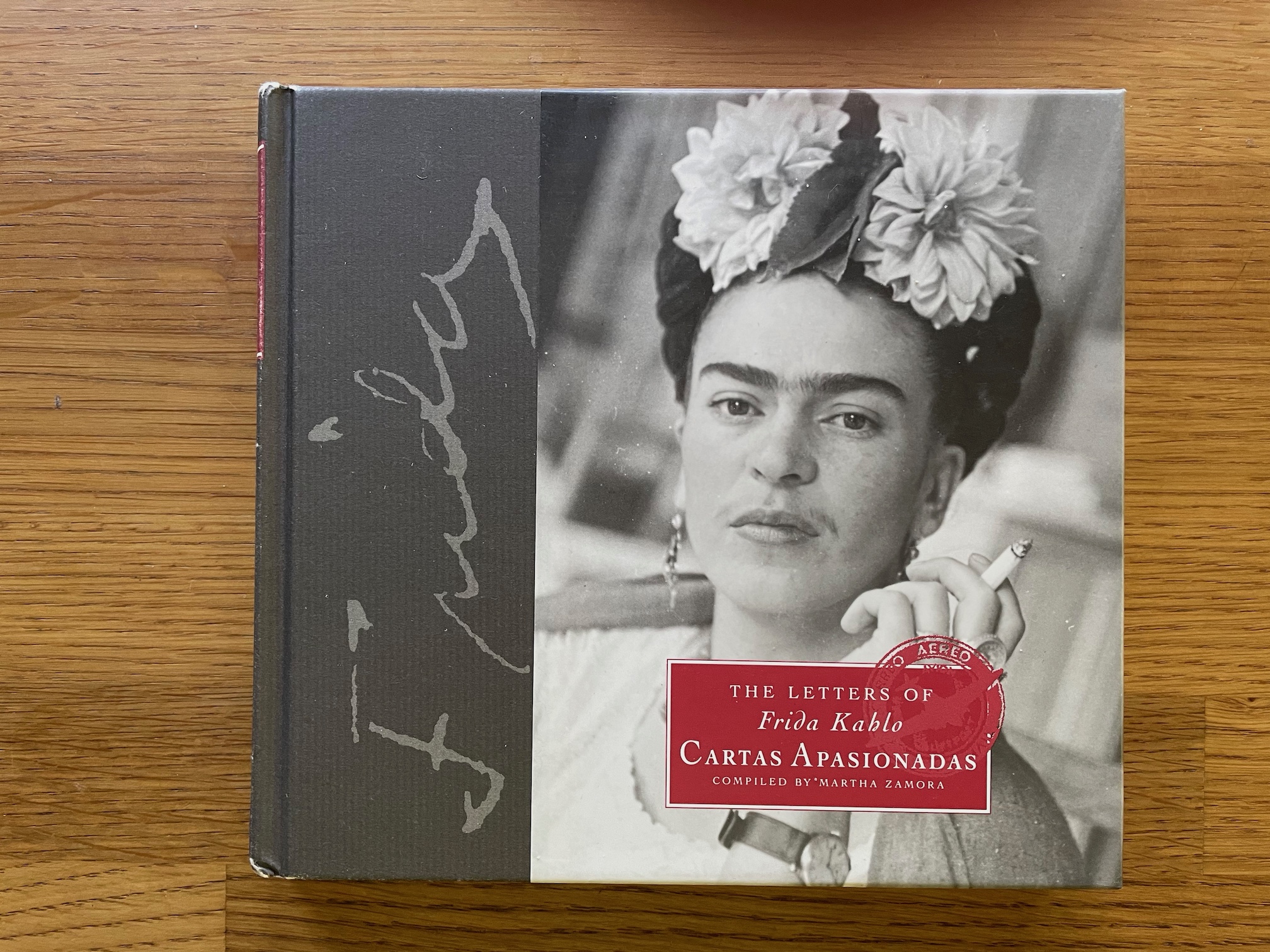
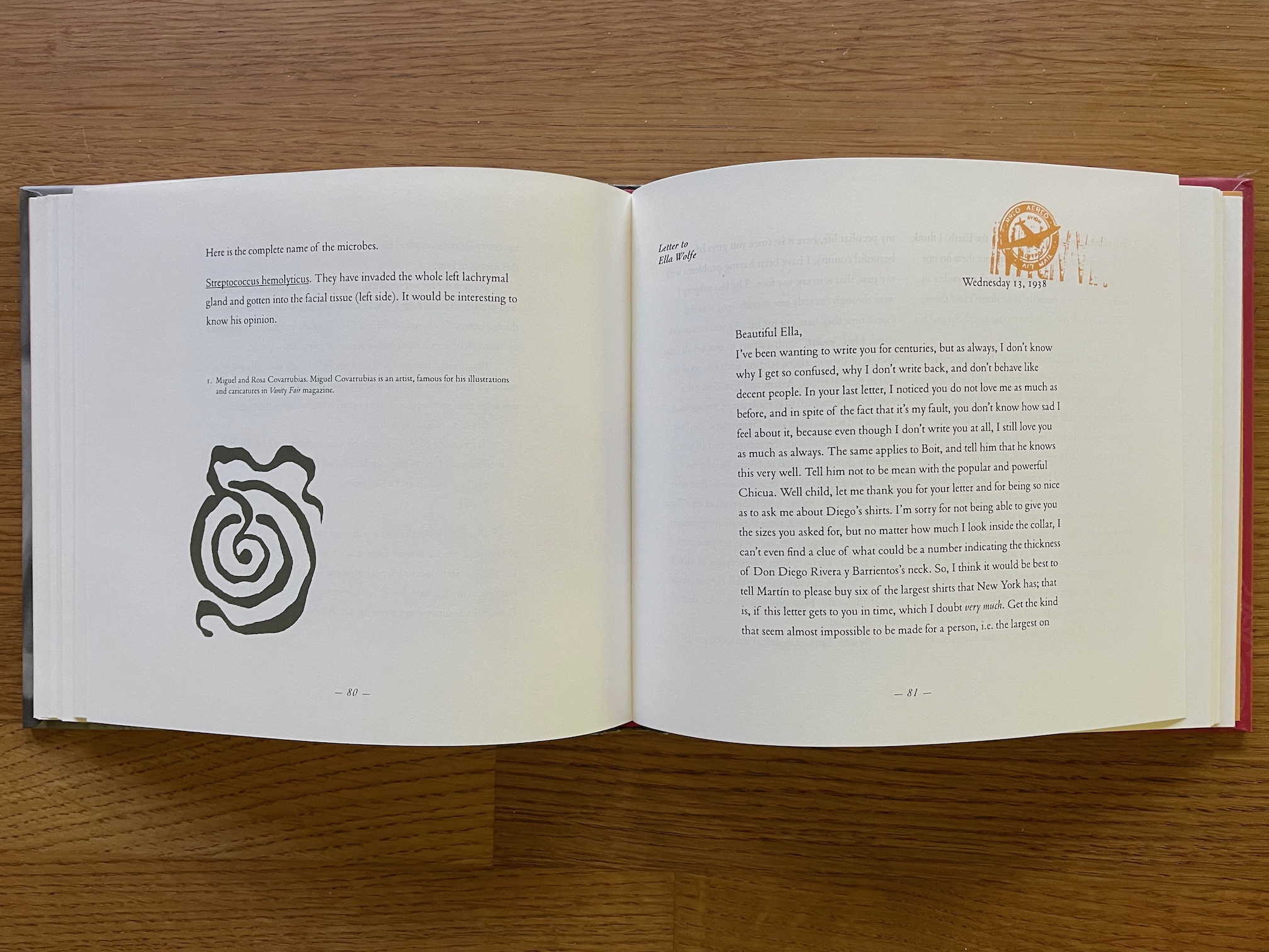
When I first arrived, Ed was dealing with the loss of his premier designer, Bret Granato, who was in the hospital dying of AIDS. Although I never met Bret, it was obvious that he was held in great regard by everyone at Marquand Books. One of my first projects was one that he had started: The Letters of Frida Kahlo: Cartas Apasionadas. Bret had created a cover design and sample pages, which I then had to turn into a book. It was to be a small, oblong book that interspersed simple, evocative images, some of them drawn by Frida Kahlo, some sourced from Mexican or Southwestern symbol collections, with an open, variable layout for the texts of the letters. Every spread was different. It was a fascinating challenge, and I did my best to make sure that Bret’s original design was carried through the way he had envisioned it.
In the course of designing this book, I learned a useful trick. Ed pointed out to me how you could get the effect of a multi-color book while printing in only one second color, by carefully mapping out the way the signatures would be bound, and changing the second color from one signature to the next. This is the kind of attention to production in the process of design that always fascinates me.
When Ed first interviewed me for the job, he pointed out that it might require me to travel to Hong Kong or Singapore for press checks, as that was where most of the art books were being printed. I allowed as how it might seem to him like a burden, but to me it sounded more like a perk. (In the end, disappointinglyl, I never did make an Asian press-check trip.)
There was one peculiarity of the production system at Marquand Books: it was the only design studio I knew of that ran on IBM PCs rather than Macs. Our design tool of choice was PageMaker (this was still before the advent of InDesign), so I got to see how the Aldus Corporation had succeeded in making PageMaker work much the same way in both Windows and Mac versions. Since I was still designing books at home on my Mac, I would often switch back and forth between my daytime work and my evening work. I found that the only problem was remembering the modifier keys: Command and Option on the Mac were pretty much equivalents to Control and Alt on a PC, but their positions were exactly reversed. This played hell with muscle memory for keyboard shortcuts. The other difference was that at that time the visual representation of pages and especially of type was much inferior on a PC screen to what you’d see on a Mac. But the output was what counted in printed books, and you could produce fine design from either platform.
Another lesson that Ed taught me was the important distinction between the trade-book market and the gift-book market. “Gift books” are those usually small books that you see next to the cash register, in both gift shops and institutions like art museums and galleries. The marketing and sales channels for gift books were (and probably still are) entirely different from the trade-book channels. Gift books can be ephemeral (see so much of the back list of Chronicle Books, for instance), but if they strike a chord with an audience, they can become steady sellers. One book that Ed himself designed, which he had me execute, was a Bullfinch Press edition called Memento: Solace for Grieving, edited and compiled by Michele Durkson Clise. It was small, almost pocket-sized, but cloth-bound in signatures; the contents were poems and sayings related to death and grief, juxtaposed with antique images that seemed to complement the text. I don’t believe it had the good fortune to become a steady seller.
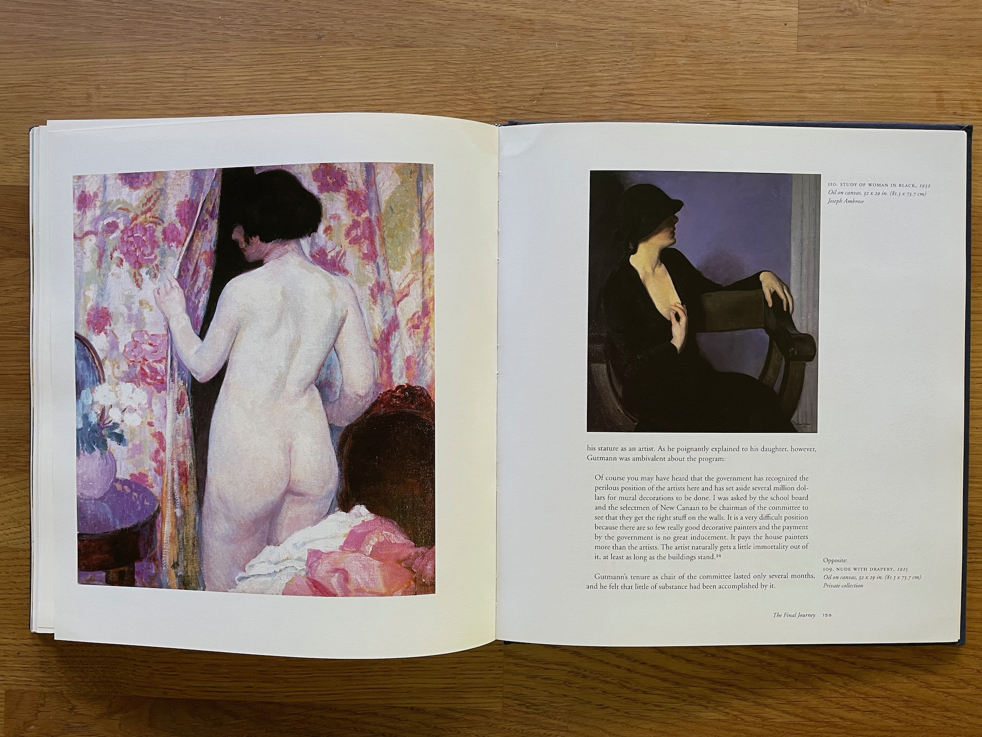
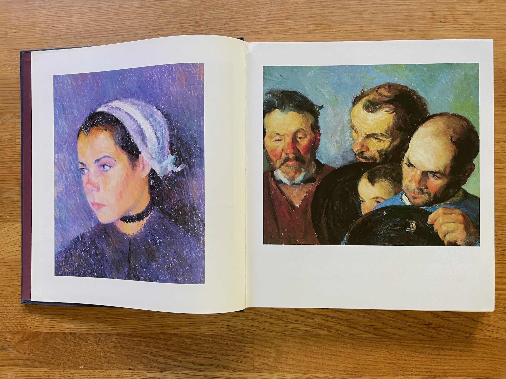
Most of the books I worked on at Marquand Books were much larger in format. My first big project was a large-format volume for Abbeville Press called Bernhard Gutmann: An American Impressionist, 1869–1936. The book was chock-full of full-color art, which was hardly surprising, since the real impetus for it came from the DeVille Galleries in Los Angeles, which represented Gutmann’s art. I set up a clear but flexible grid for the pages, with a generous column for text and a side column that could contain notes and small images. The larger images either fit within the width of the text column or within the width of both columns together, except for the images at each chapter opening, which had a full bleed.
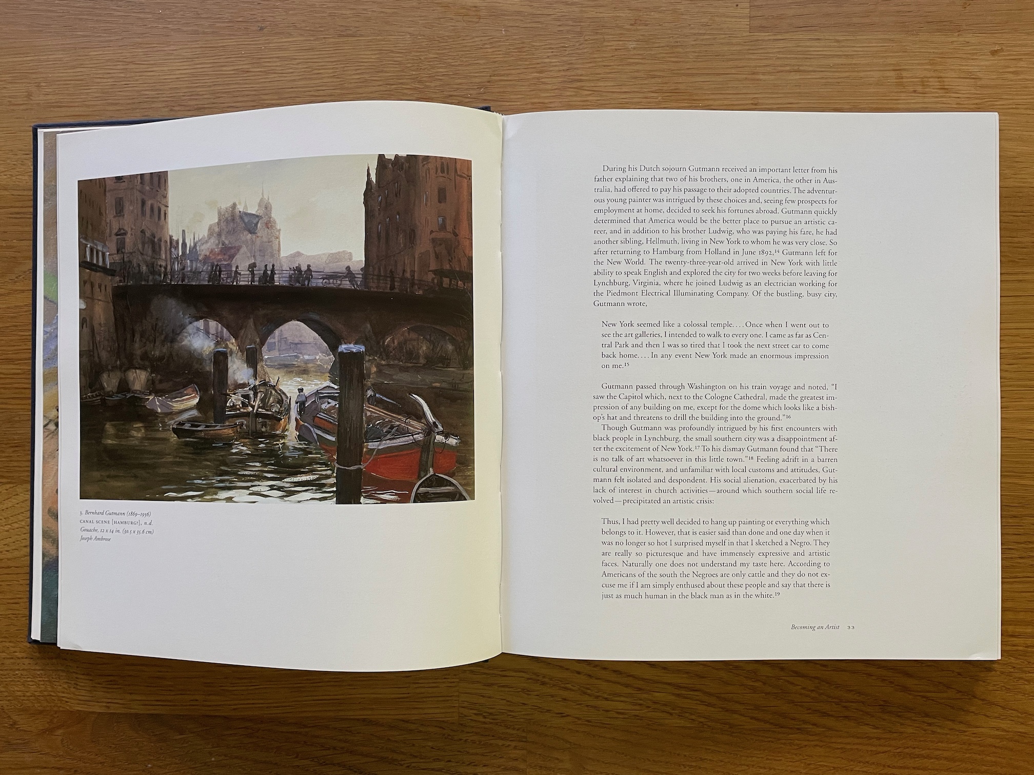
This was the project where I learned the intricacies of dealing with a client’s requirements. Most of the images could not be cropped, but had to be reproduced in their entirety. Some had to be full-page images (with margins). Yet it was a requirement that no image should appear more than a certain number of pages (two, I think) away from its reference in the text. Of course, sometimes these requirements conflicted with each other, especially when there were references to several different images in the same paragraph. We had to get approval for any arrangement that exceeded these restrictions.
There were so many full-page paintings in this book that I had to invent ways to place several of them in sequence on their pages before the normal front matter, and again between the front matter and the body of the book.
Page spread from “Bernhard Gutmann: An American Impressionist” with two facing paintings, both sized to full width within the grid, and no text or captions.
I was reasonably happy with what I achieved, though I can’t say that ever became a fan of Bernhard Gutmann’s work.
I hadn’t quite started with a blank slate: there had already been sample pages designed and approved, which I used as the basis for my own page design. In particular, I kept the title page arrangement — but the publisher kept adding new elements to it, right up to the last minute. I managed to accommodate almost all of these, but after finding a place for the last new element, I realized, too late to do anything about it, that it would really have been better to go back and design a whole new title page.
Hindsight is a wonderful thing, in book design as in everything else.
*
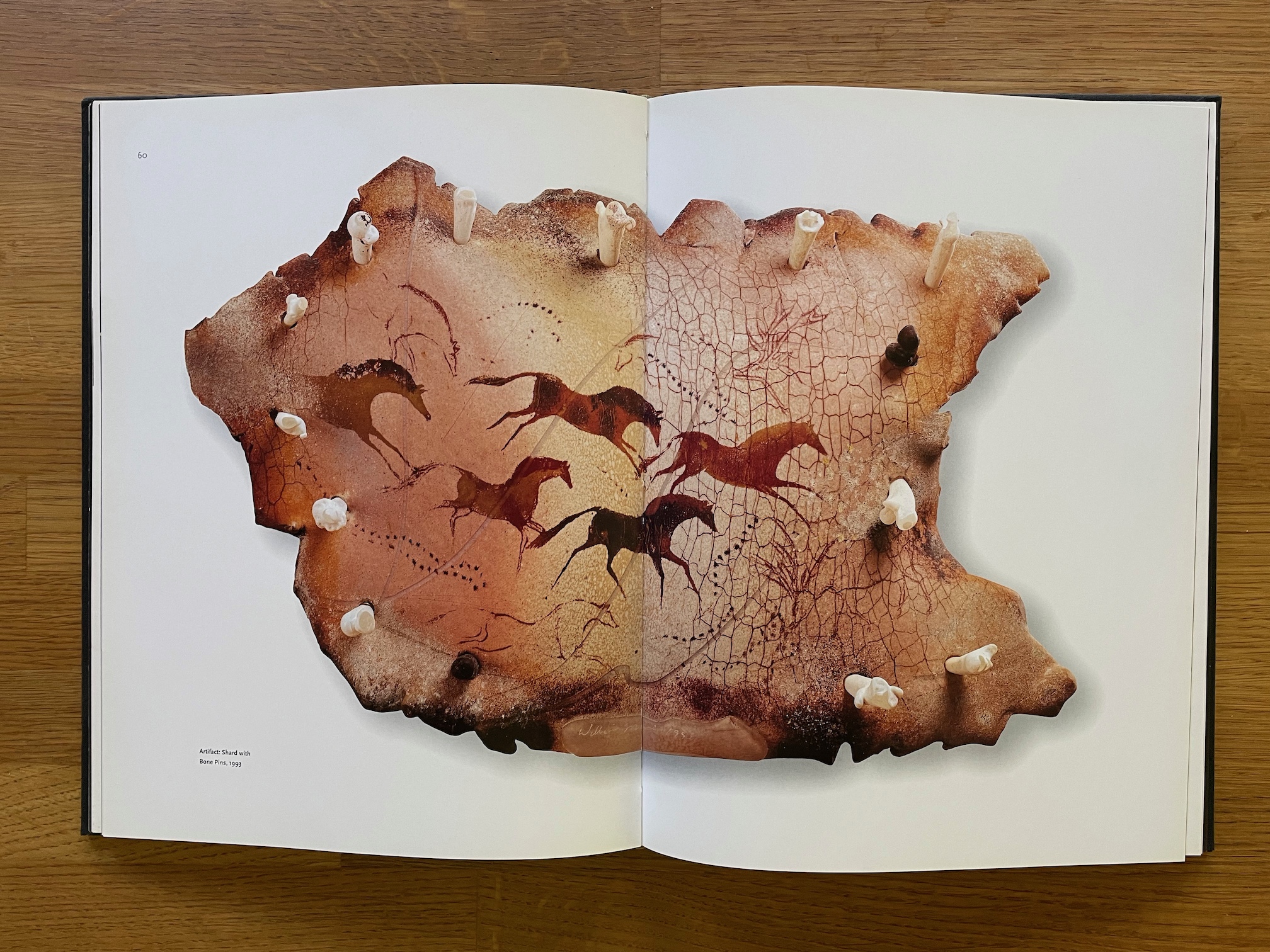
One of the books I most enjoyed working on was William Morris: artifacts/glass. This was not the William Morris of Arts & Crafts fame, but the modern-day glass artist. Although he began as a protégé of Dale Chihuly’s, Morris took his work in a very different direction. Many of his art pieces don’t look like glass at all; they look like they might be ancient bone or stone. He taps into a prehistoric sensibility and creates evocative sculptures that might have been dug up by patient archaeologists. As it happens, I’m not particularly drawn to glasswork, but Morris’s sculptures appealed to me immediately. And they demanded to be given big treatment, in dramatic page layouts. Silhouetting some of the photos (dropping out their backgrounds) to make the images appear to sit on top of the page worked very well.
As it happened, I left Marquand Books before this book was quite finalized. The new designer who took over the project did a fine job, but when I saw the finished book, I didn’t like the way he had handled the title page or table of contents, and he had added extra elements to some pages that made the design busier. Still, it’s almost entirely my design.

When I had started at Marquand Books, Ed was already thinking that the studio might outgrow its current space. As the lease was coming up for renewal soon, he began looking at alternate possibilities. His first choice was to find another, larger office in Smith Tower, so one day a number of us accompanied Ed into the elevator and rode it up to look at a potential new space. Offices in the narrower tower filled the entire floor, and as we wandered about we admired the magnificent views in every direction and imagined ourselves working there. It would have been a step up, quite literally. (Well, many steps up.)
In the end, though, Ed decided that it didn’t really fit our needs. So instead the business moved to larger space in a less picturesque building near the main post office, at the other end of downtown. It meant farewell to Pioneer Square, to Smith Tower, and to the wonderful little Hole in the Wall BBQ, in the same block just around the corner, where I had often eaten lunch.
My tenure at Marquand Books was shorter than I had intended, because in the end I found that I couldn’t keep up with both this job and my work for Copper Canyon Press. I had to choose one or the other, and I chose Copper Canyon. For all the quality and excellence of the art books I was designing for Marquand Books, I felt that the books of poetry that Copper Canyon was publishing would probably have a longer and deeper value in the long run. This was, of course, a foolish choice from a career standpoint — neither the first nor the last foolish career choice that I’ve made.
*
There’s a coda, however. Some time after I had left Marquand, Ed called me up and asked if he could forward a job to me. It had come in from the University of California Press with no forewarning, at a time when the Marquand shop was up to its ears in projects. Would I be interested in taking it on?
Of course I would. The sample design had been done by Steve Renick, the art director at UC Press, who was one of my design heroes. But the samples were only a bare start; this book, it turned out, was complicated in the extreme.
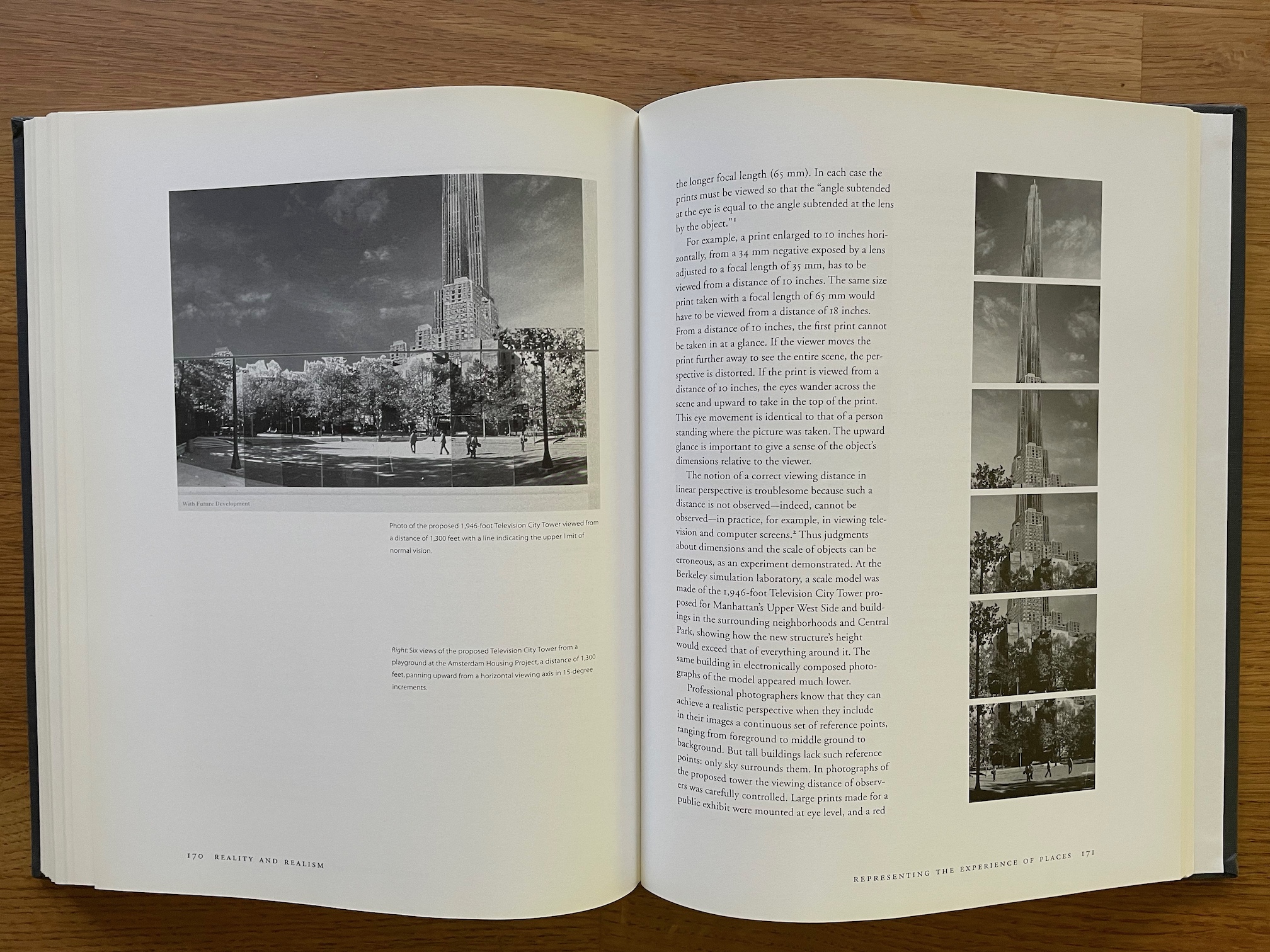
Representation of Places: Reality and Realism in City Design, by Peter Bosselmann, was a study of all the ways that the complexities of real-world cities have been represented visually, including architectural plans for new buildings or neighborhoods. It’s a wide-ranging subject, and Bosselmann’s text treated it in compelling narrative form. He had all kinds of accompanying images — in all kinds of formats. When the package arrived from Marquand, I began to see why Ed might have wanted to pass it on to someone else. Images came in just about every form imaginable, from sketches on onionskin and maps in tubes to a digital disk that nobody in Seattle could read. (When I found a shop in Spokane that could open the files, it turned out that they weren’t even that big; there had been no reason to put them on that particular kind of hardware.) I started telling people that I had received imagery in every format short of being carved in stone.
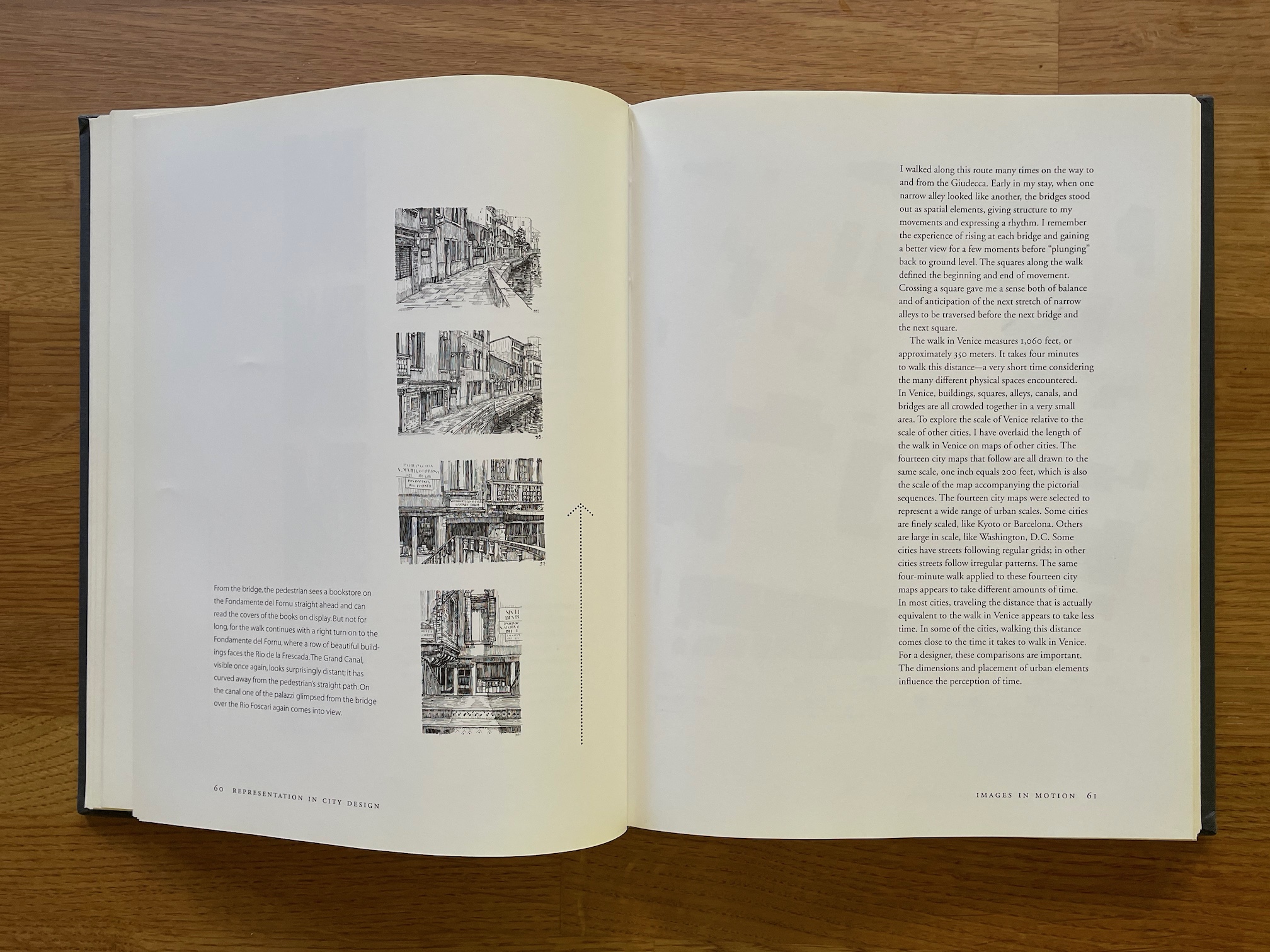
One of the more unusual elements in the book was a series of drawings by the author, illustrating a walk through the streets of Venice. These could be arranged in vertical columns down the page, but he was insistent that the order should go from the bottom of the page to the top; he felt that that was a better visual representation of how you’d actually see each new view as you walked forward. I had to come up with a simple way of indicating this, something that would make it obvious but not be too obtrusive. I ended up using a plain vertical arrow running up the page next to each series of views. Positioning most of the accompanying short paragraphs flush to the bottom of the page also emphasized the “start at the bottom” sequence. (I never did hear whether any readers found this confusing, or helpful.)
[Copyright 2023. Originally published in Medium.]