
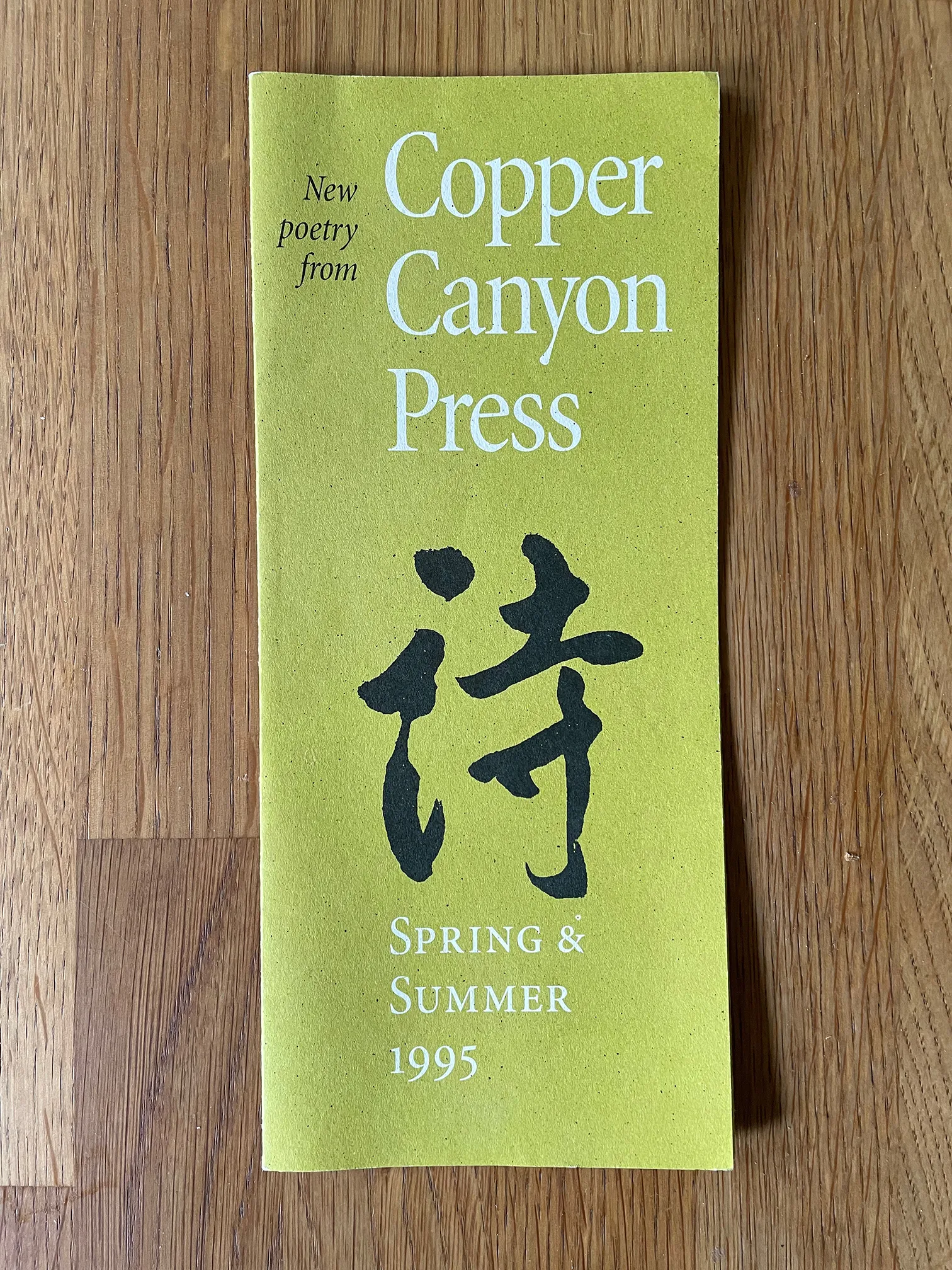
I can no longer remember how the call came: by email, by phone call, or by letter. Whatever the medium, the message was deceptively simple: “I’d like you to help me design a book,” said Sam Hamill, co-founder and editor of Copper Canyon Press.
This would have been sometime in 1993, not long after Tree Swenson, the other key founder of the press, left Copper Canyon. Tree had been Copper Canyon’s publisher and art director (designing the books of poetry that the press issued, as well as the catalogs, ads, and other collateral material). Tree and Sam had been in a personal relationship, which had ended badly a few years earlier. The split had not, I gathered, been a happy one, and with Tree gone, Sam needed some designing done.
What started out as “helping” with one book turned into my taking over the role of designer for the Press, trying to maintain continuity with the identity that Tree and Sam had established, and trying to step into Tree’s shoes — not a small undertaking.
The press’s earliest books had all been typeset by hand and printed on a letterpress. As Tree described it, “We made every mistake we could make,” in the early design and production; but after twenty years they had learned from their early mistakes, and Copper Canyon books were setting a high standard of design and production. For many years, Sam and Tree had produced elegant letterpress editions that sold at collectors’ prices, and those in turn financed the publication of less expensive trade editions — offset printed, Smythe sewn, and usually paperback. Eventually, however, they got fed up with the contradiction of publishing editions that neither the poets they published nor they themselves and their friends could afford to buy. By the time I got involved, Copper Canyon’s books appeared as either paperback originals or paperback and hardcover editions, commercially printed.
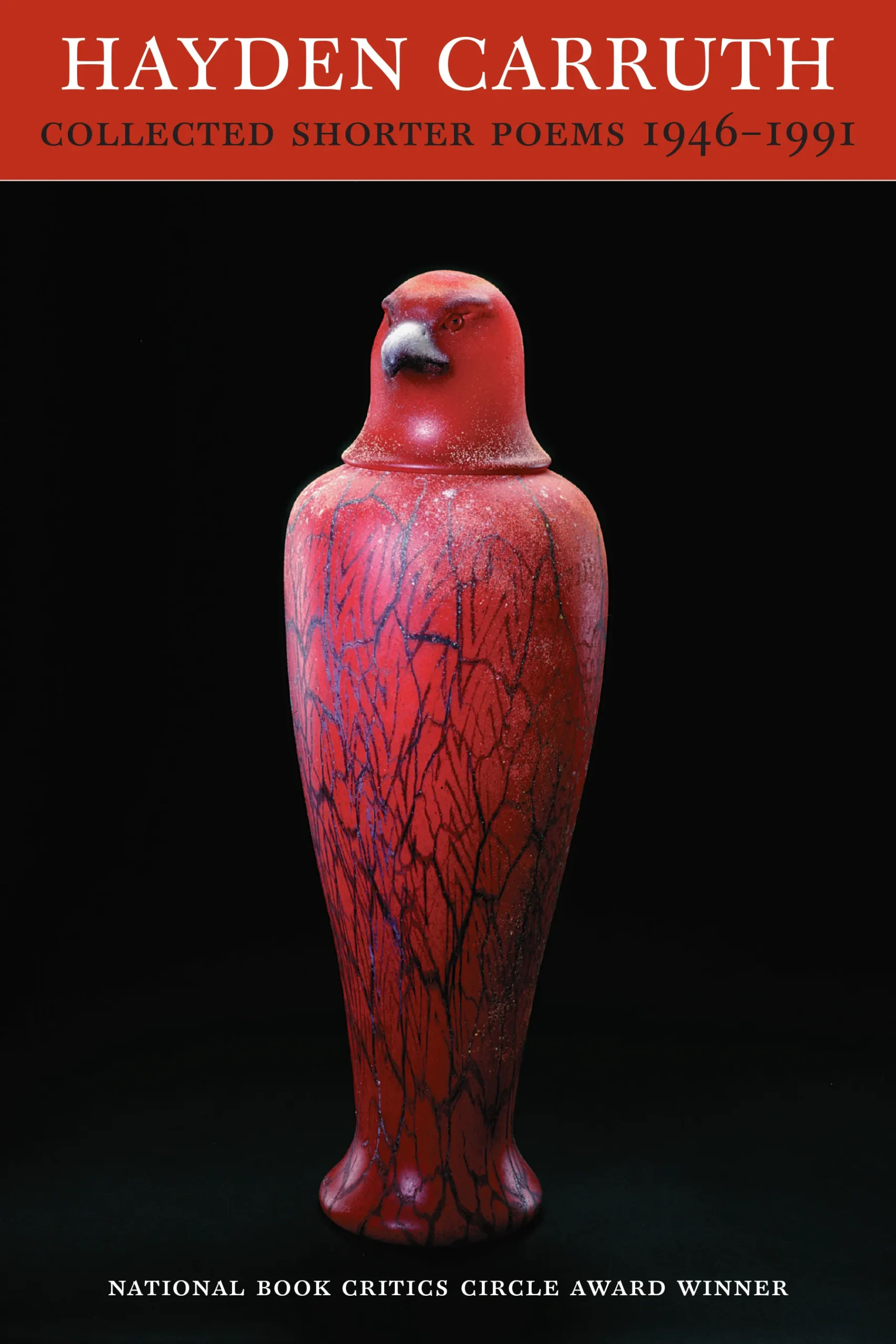
As I recall, that first book that Sam asked my help on was Hayden Carruth’s Collected Longer Poems, a companion volume to his Collected Shorter Poems, which Copper Canyon had just published. Tree had designed both books, but the Longer wasn’t quite completed; I helped prepare the cover files for the printer, following Tree’s design closely. (As it happens, several years later I got to redesign the cover for a new edition of Carruth’s Shorter Poems; I also had the pleasure of designing several new books by Hayden Carruth.)
Quickly enough, Sam turned over responsibility for designing Copper Canyon’s books to me. For the interiors, I had pretty much a free hand; my aesthetic was already in tune with the classical book design that the press had been practicing. Almost always, however, when it came to the covers, I was working with an image that Sam supplied. They were never illustrations; they were independent works of art, paintings or other forms, that he felt complemented the poetry and would also make a striking cover for each book.
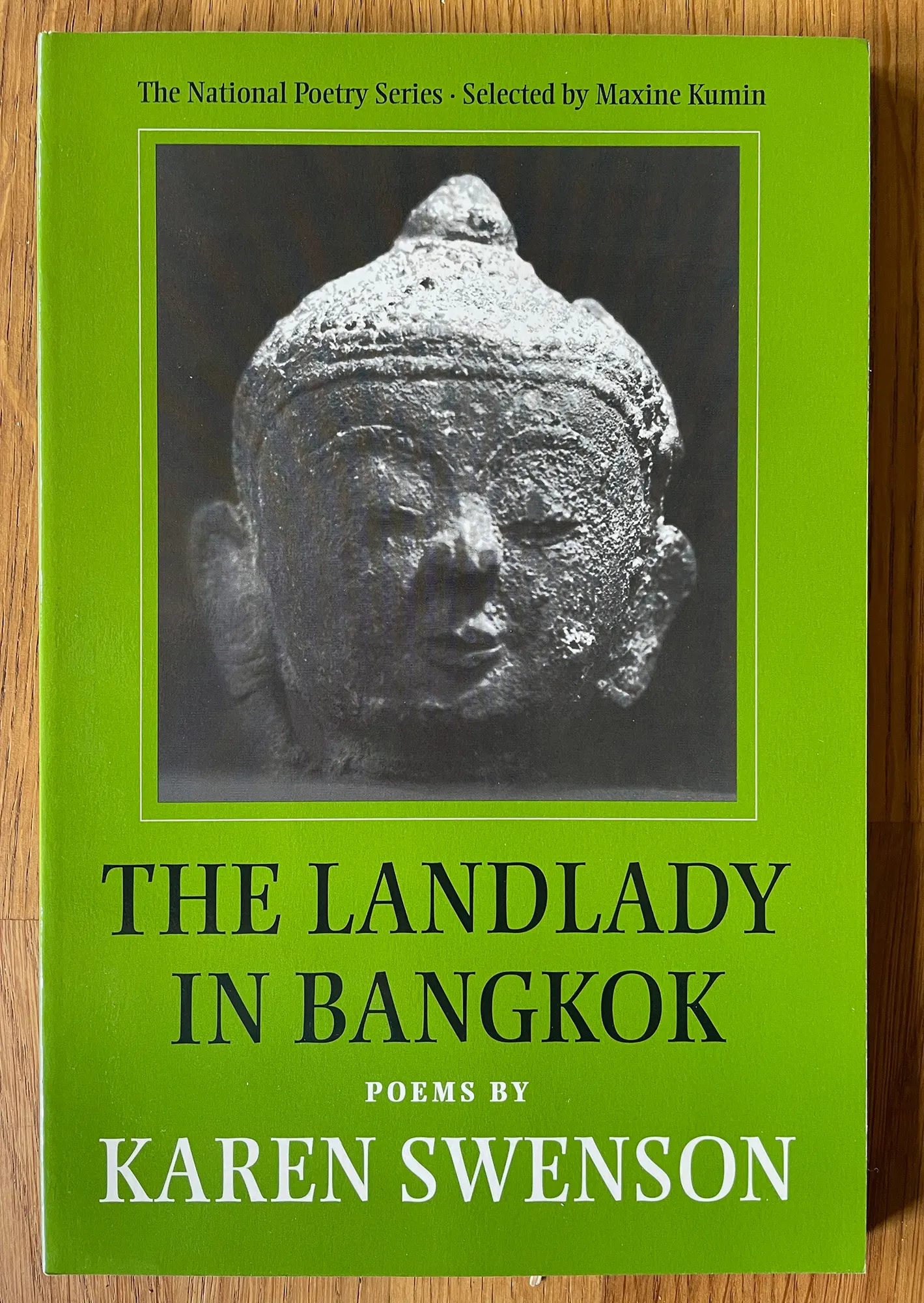
The very first book that I designed myself, however, did not come with a cover image. Sam knew what kind of thing he wanted, but had nothing specific in mind. He wanted a Buddhist image, but not one from Japan or China, as the book’s poems were set in Southeast Asia. So for Karen Swenson’s The Landlady in Bangkok, we found a little stone head of the Buddha (from Thailand, if I’m remembering right) in a local gallery in Seattle, and I asked Kenny Dixon, who was a photographer and filmmaker and also our housemate, to photograph it for the book. The simple, almost square black-and-white photo, lit from above, was outlined with a thin 1-point rule on a background of solid mossy green. The title and author’s name were typeset in Michael Harvey’s Ellington, a digital typeface in the spirit of the hand-lettering that Michael had done for many book covers in Britain.
I used Linotype’s digital version of Aldus, the text face by Hermann Zapf that is a more restrained sister of Palatino, for the body of the book, with the poems’ titles in Ellington. Altogether a simple, inviting design that fit into the aesthetic of a Copper Canyon book.
I was working in Aldus PageMaker 5.0, on a Macintosh IIvx, as I carefully recorded in the book’s colophon. I have always loved colophons that give the provenance of the typefaces used, and in an era of changing technology, it seemed appropriate to specify the software and hardware used in design and composition.
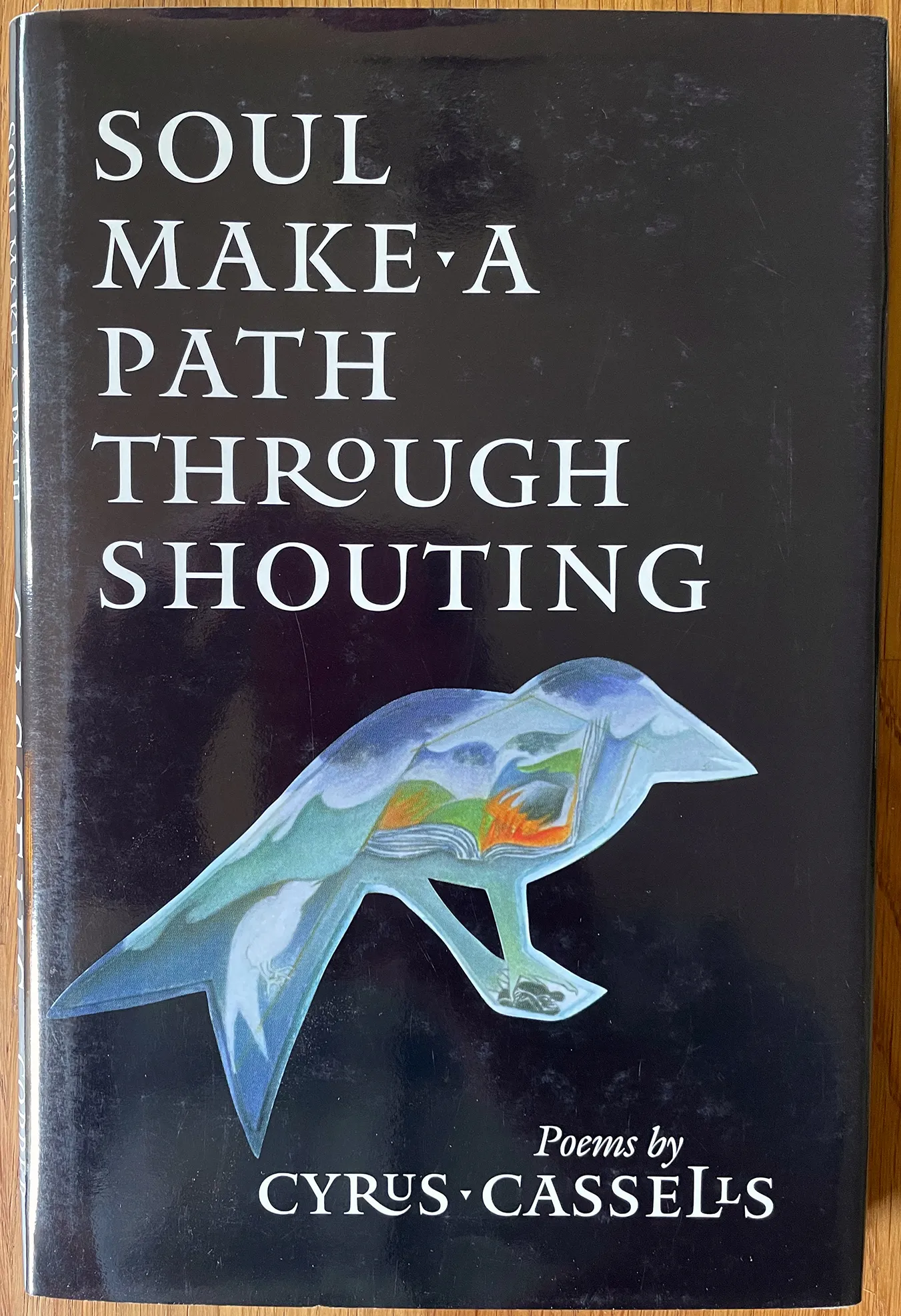
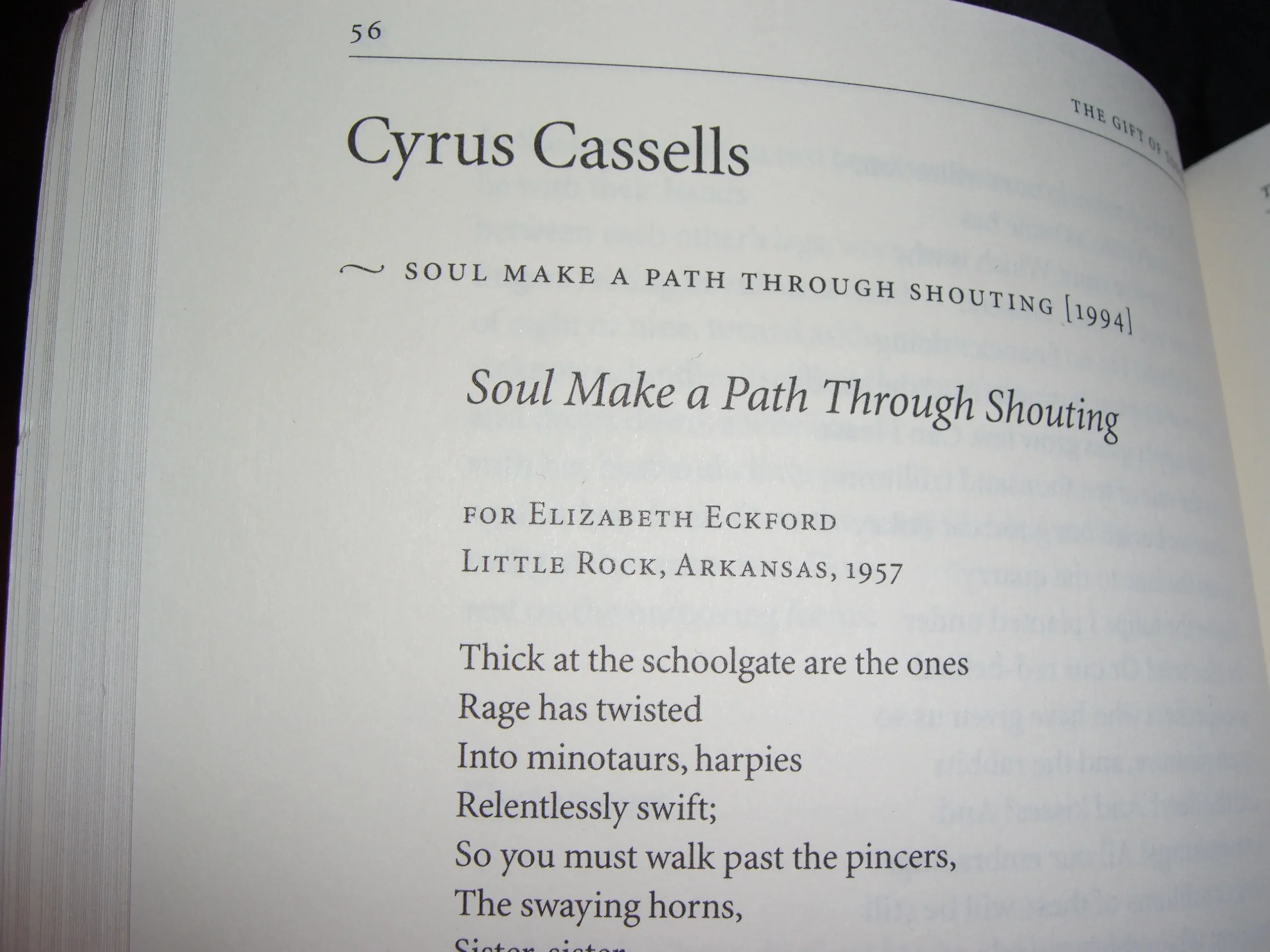
For the next book, Soul Make a Path Through Shouting by Cyrus Cassells, I pushed the envelope a little. Although the poems themselves were typeset in a conventional, conservative form (in Matthew Carter’s Galliard typeface, a brilliant, sparkling design with roots in the French Renaissance), I added an overt element of visual structure to the book with a short horizontal rule coming in from the left edge of the page and ending two picas from the edge of the text block. On pages where a new poem began, I added a shorter vertical rule, midway in the gutter between the horizontal rule and the poem’s title; on continuation pages, I just used the horizontal rule by itself. On all pages, the horizontal rule defined the upper edge of the text block, which was deliberately set somewhat low on the page. Now I look at this as an affectation, an unnecessary embellishment, though it does work nicely.
The cover image was oddly shaped: a painting within the outline of a bird, by Barbara Earl Thomas. The best way to present this seemed to be to set it against a solid black background, and to arrange the type in relation to the image. For the somewhat long title, I used another typeface by Matthew Carter, Mantinia, an all-caps titling face with spiky serifs and several alternate letters that can be combined to create unusual effects, such as cupping the smaller, raised ‘U’ of “Cyrus” in the extended leg of the capital ‘R’. This restrained flamboyance seemed to fit with the spirit of the poems.
Each time I designed a book, I had to read the poems (a very pleasant obligation!) and decide what would be the most appropriate way to present them on the page. I wanted the pages of each book to open comfortably and to read easily and naturally, letting the design get out of the way so the reader could concentrate on the poet’s words. But poems take many forms, and poets can have very different sensibilities; there’s no one way to lay out a poem on a book page.
Because of the exigencies of publishing, I always had to supply a cover design long before I had to deliver the interior of the book; the cover thumbnail would be used in catalogs and advertising and other kinds of promotion. But I always had an idea in mind of how I thought the interior should look, before I designed a cover.
Although I used many different typefaces for Copper Canyon books, I quickly decided that the house typeface, for collateral such as ads and catalogs as well as for some of the books themselves, should be Robert Slimbach’s Minion. Slimbach had designed Minion for the Adobe Originals collection after doing in-depth research for Adobe Garamond, his revival of Claude Garamond’s famous typefaces from 16th-century Paris. Minion wasn’t a revival, but it took its spirit directly from those French Renaissance types, and turned them into a versatile family of digital typefaces, roman and italic, with variations of weight and optical size. Adobe had developed a “multiple master” technology for letting the design of a typeface change along a linear design axis (for instance, from light to heavy), and Minion multiple master was the pride of the program. I enthusiastically used Minion MM in Copper Canyon’s books and collateral, taking full advantage of its fine typographic features (such as true small caps and old-style figures) and its optical-size axis (slightly weightier, chunkier forms of the letters for very small type, moving to lighter, airier, more elegant forms for large display type — a digital harking-back to what punchcutters would have done when all type was hand-cut in metal and they cut each size separately).
Minion seemed to me like a modern embodiment of the same typographic feel that Monotype’s Bembo produced in metal, but that the digital version of Bembo tended to lose, in the general lightening-up that came from adapting a hot-metal typeface to photosetting and from there to digital typesetting. (Monotype eventually released a beefed-up version, called Bembo Book, but that wasn’t available when I was designing books for Copper Canyon. I did use Bembo as the text face for one book, Burton Watson’s translations of the Selected Poems of Su Tung-p’o, with Minion for headings, but I took extra pains to make sure that the digital output was as dark as possible for the text pages.)
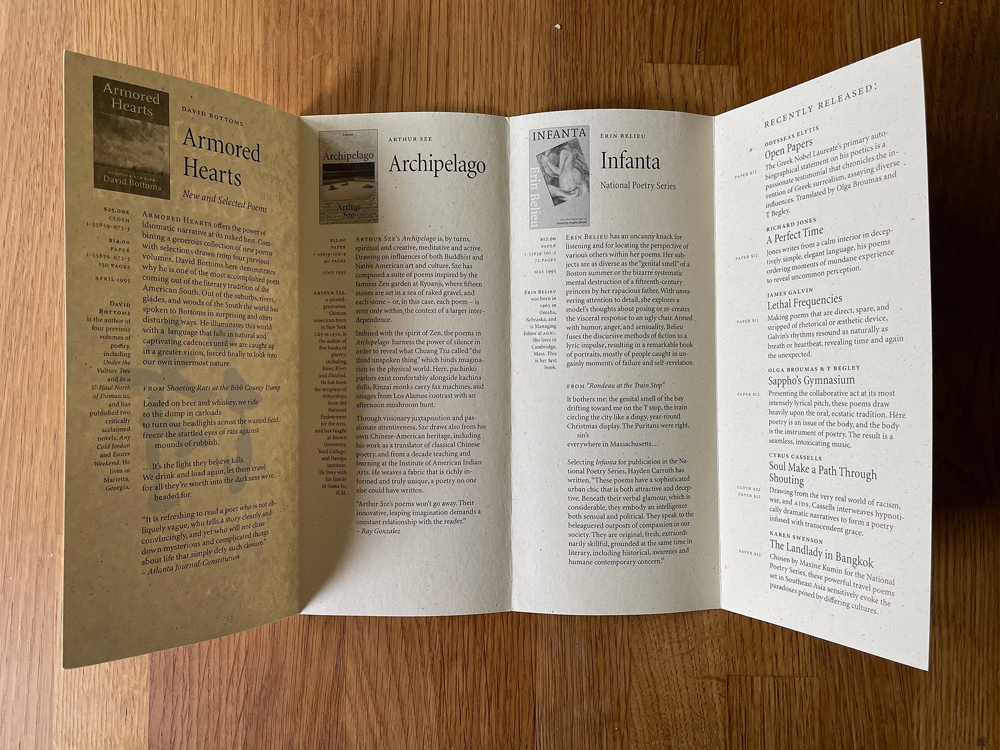
Copper Canyon’s seasonal catalogs had been small, stapled booklets, but I devised a format where a legal-size sheet of paper could be printed sideways and folded into four tall, narrow panels, for a total of eight pages: the front was the cover, the back had the ordering information, and in between there was room for each new book to get its own small page.
The main body copy was in a narrow column, flush left, that took up most of the width of the page; ancillary information was set in the narrower left column, flush right against the gutter between the two text blocks. I found it very frustrating that PageMaker, at that time, had no support for setting multi-line sideheads or side notes that would flow with the main text; I had to treat everything in the lefthand column as a separate text block, and align it by hand. This was not a very efficient production method, but I thought it created an elegant way of arranging information on the page. (I am still partial to this kind of asymmetrical layout, which is a lot easier to automate in today’s software.) The full annual catalogs were still in the form of booklets, with these seasonal “new books” brochures published at intervals in between.
The artwork to be used on the covers of Copper Canyon books sometimes came with strict requirements about how they could be used. Some were paintings or photographs that I could crop so they bled off the edges and filled the full cover space; others came with restrictions that disallowed cropping entirely. And for many we were not allowed to place any type over the image.
The trouble came when the requirements said that an image had to be reproduced in its full form, but it had an awkward shape that didn’t fit easily on a book cover. Then I had to find a way to incorporate the image as one element among many, with the title typography and the author’s name as other visual elements, and create a pleasing ensemble that would both represent the poetry and help sell the book.
One of the most problematic images was a painting that Carolyn Kizer wanted to use on her book Harping On: poems 1985–1995. The painting was an upright rectangle, with a semi-abstract standing figure holding a harp; no doubt it had seemed to Kizer as though it ought to fit easily on a cover. But its proportions were wrong. It was just enough shorter and wider than the cover dimensions that it would have to be framed somehow; if it was allowed to fill the cover’s width, it would leave too little space for title or author’s name (and she didn’t want any type overlaid on top of the image). I found a way to make it work, using a tan background color that I thought complemented the flat colors in the painting, but Kizer was never happy with it.
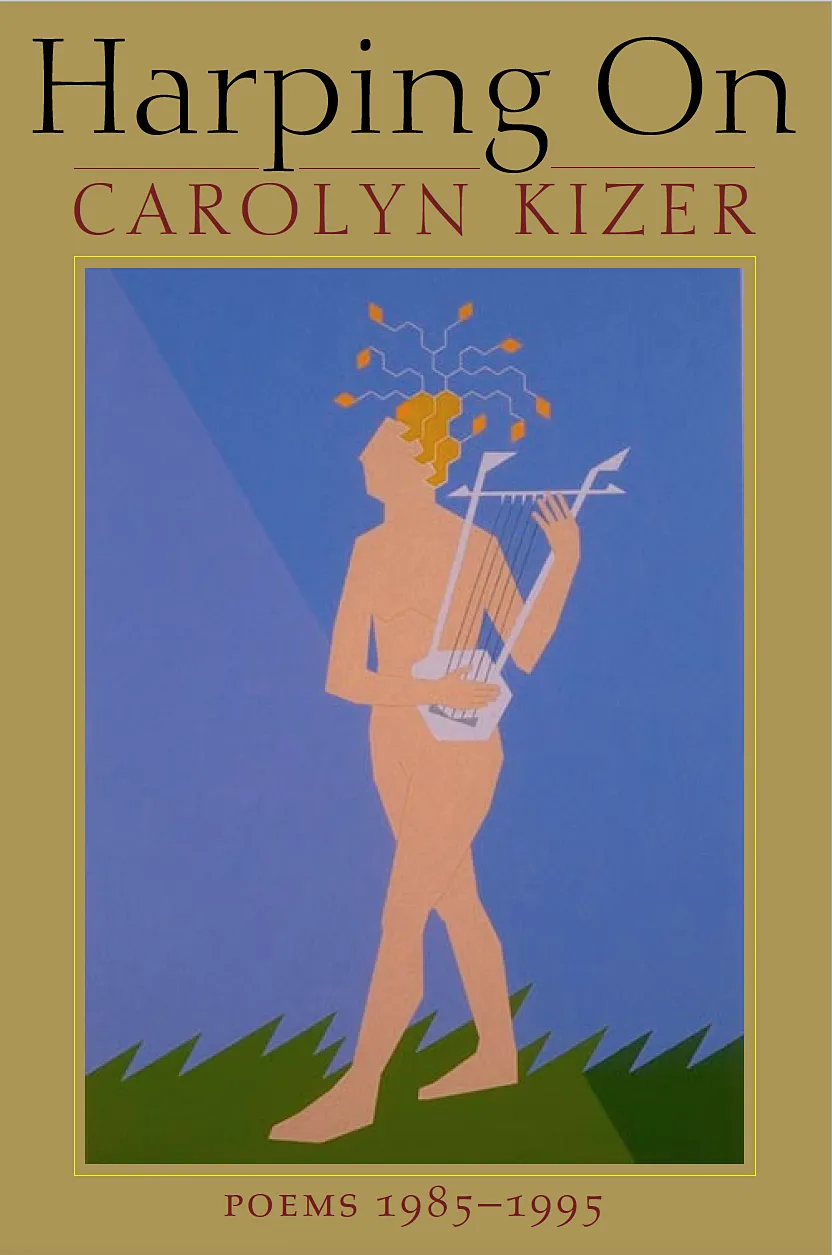
Some years later I had the opportunity to design a new cover for the paperback edition of her collected poems, and I gave her a cover that I was quite proud of. I never heard whether she liked it or not, but I hoped so.
Some of the easiest images to work with were the abstract paintings of Galen Garwood. Galen didn’t mind their being cropped or having type over them, so I could let his paintings bleed off the edges, and I would find a visually appropriate part of the art to add type to. One of my favorite Garwood covers was the book of essays by Odysseas Elytis, Open Papers, translated by Olga Broumas and T Begley. I gave the type a classic treatment, with both author’s name and title in all-caps Janson Text, centered and generously letter-spaced, and I found a dynamic tension between the typographic elements and the subdued shapes and colors in the painting. (I also gave the interior of that book a classic treatment, partly inspired by books of translations of Albert Camus, or at least my memory of them.)
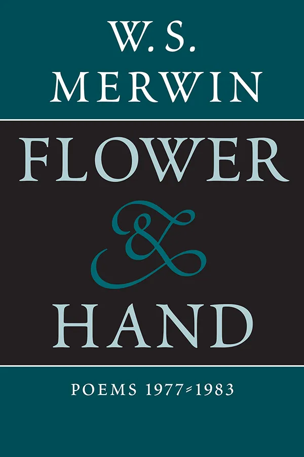
One of the most completely classical covers I designed had no image at all. It was for a book of poems by W.S. Merwin, Flower & Hand: poems 1977–1983, bringing together poems from three of Merwin’s earlier collections. And Sam had an agenda: he wanted to out-do the cover designs of Merwin’s own books. I didn’t have any such competitive goal in mind, but in creating a type-only cover, using just the capital letters from Robert Slimbach’s elegant typeface Poetica and one prominent, highly decorative ampersand from the same font, I came up with a design that Sam gleefully said “out-did Harry Ford.” (Poetica included an enormous number of alternate designs of the ampersand, which I took advantage of by using a different one for each ampersand that appeared in the title on the spine, the back cover, and the title and half-title pages.)
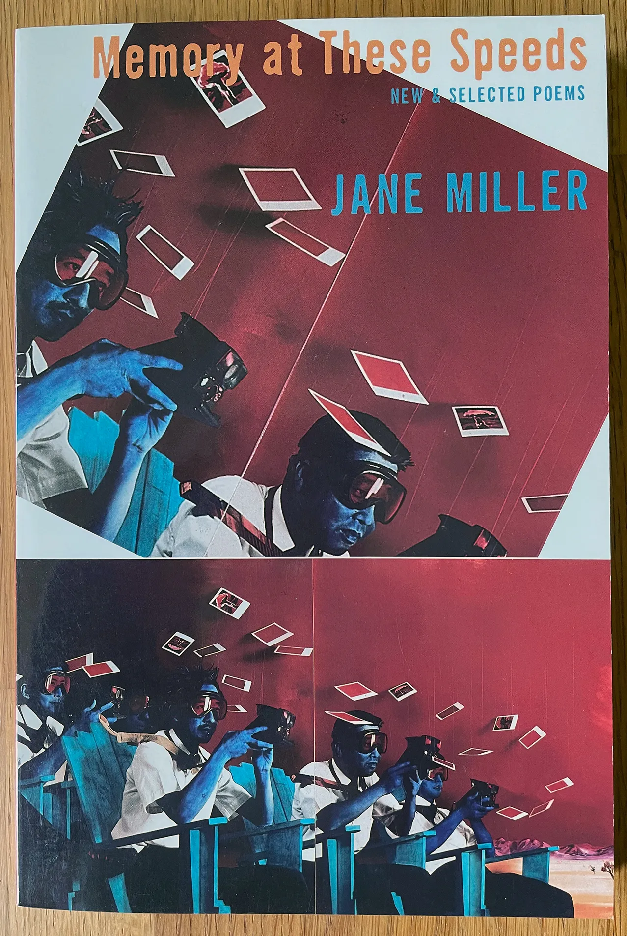
It was because of the success of the Merwin design that I got to push the envelope with another book, Jane Miller’s Memory at These Speeds: new & selected poems. The cover art was a remarkable collage painting by Patrick Nagatani and Andree Tracey, “Alamagordo Blues,” featuring a bunch of Japanese salarimen, their skin colored blue, seated in wooden Adirondack chairs with cameras in their hands, all facing something in the desert that was outside the frame; around their heads swirled a host of Polaroid prints, and on some of them you could see the image that they had just snapped: an atomic explosion. It was a striking image, but it was almost twice as wide as it was tall. I could have cropped it, but I was afraid that it would lose some of its punch without the wide sweep of the landscape. What I ended up doing was using the image twice: once uncropped, at the bottom of the cover, and again in a cropped, zoomed-in version in the top part of the cover. But I tilted the upper image about 30 degrees, making it much more dynamic and dramatic. Behind it was a plain white background, and over the top was the title, subtitle, and author’s name, all in a rough-edged, condensed sans serif typeface (Neville Brody’s FF Dirty Seven Two). This was, I believe, the first time that any Copper Canyon book had ever sported sans serif type, much less a “grunge” sans like this one. Sam was skeptical, but when he saw the final cover, he grudgingly agreed that it worked for Miller’s book, and since it was coming out at the same time as the classical-looking Merwin collection, he’d let it pass. (The only regret I have about that cover is that my choices of color for the type didn’t stand out well enough against the artwork.)
One of the more complicated book designs I did for Copper Canyon was for The Gift of Tongues, an anniversary anthology of poetry from the first 25 years of the press. Since it included nearly 300 poems by a variety of poets, and in a variety of forms, I had to come up with a page design that would be both consistent and flexible. I didn’t want any of the poems to look weirdly placed on the page, yet some featured very long lines, some had very short lines, and some poets worked with a variety of indents. I knew all this from working with many of the individual poets on their own books, but how would I incorporate all of them into a single book?
It would have been prohibitively time-consuming to position each poem individually on its page, although that would of course have been ideal. What I ended up doing was using just two left margins, one for poems dominated by long lines, and another, indented three picas from the first, for poems with short lines. This kept the flow of the pages looking consistent as you read through the book, without forcing every poem into a Procrustean format. I established a standard unit of indenting, for poems where that was needed, and a different, clearly distinguished indent for runover lines (where the line was simply too long to fit on the page without being broken). It was important to make it very clear which was simply a runover line, and which was a separate line, intentionally indented by the poet. The book’s format was generous enough so that there weren’t many runover lines, but it was impossible to avoid them entirely.
There were other elements to design for this book, too: not just the usual running heads and folios, and the poet’s name and the poem titles, but a consistent way to indicate what book each poem had come from, even when poems from more than one book might appear under the same poet’s name. And of course there were elements specific to individual poems, such as epigraphs, footnotes, or translation credits. Then I had to design the front and back matter, including a complex table of contents, an introduction, and extensive notes in the back on each book published by the press. It was a delightful challenge.
I keep saying “I,” but by this time I had expanded my one-person studio by hiring an assistant, Jenny Van West. The design of The Gift of Tongues, as I credited in the colophon, was not only mine; it was Jenny’s as well, along with a lot of input (not surprisingly) from Sam. Jenny had worked as an intern at Copper Canyon, so it was entirely natural, when I decided that I needed someone to work with me, that she should be my first employee. She worked part-time in my home office, which I had set up so we each had a work space; it was a small room, but we weren’t quite working cheek-by-jowl.
It was gratifying to have someone else to handle mundane office tasks, as well as to have someone else to talk with and to bounce ideas off of. I thought at the time that it might be the early days of a larger business, though in fact I never managed to create a full-fledged design studio.
Jenny had a solid grounding in book publishing from working at Copper Canyon, and while working with me she gained a lot of experience in the process of designing literary books. When she decided to leave, she started her own publishing company and began to publish poetry books. (In the end, she gave that up and went back to her first love, music; she now has a successful career as a singer-songwriter. But we still trade jokes about kerning.)
My second employee, Tricia Treacy, also came from Copper Canyon; we kept it all in the family, with a strong bent toward poetry publishing. Tricia’s role was pretty much what Jenny’s had been, but my business was still facing the same challenges. Tricia was well aware that we weren’t making much money, since she did the taxes; at one point she told me, “You know, you can’t afford to keep on paying me.” Too many of my clients were ones to whom I gave a “friends and good causes” rate. But we managed to stumble along. Eventually I had to face the fact that I wasn’t making a living, and I certainly wasn’t making enough to pay part of someone else’s living.
Tricia’s particular love was printing. She went on to become a respected letterpress printer and eventually a teacher at successive colleges, and to do remarkable collaborative projects exploring the limits of printing and reading.
I, meanwhile, was doing less book design and more writing about type and design, which eventually led me to New York and the editorship of U&lc magazine. But that’s another chapter.
[Copyright 2022. Originally published in Medium.]