function jdb_page_navigation()
sPageSlug = blog
sPageTitle = easily amused
header:139:aPageArgs:page_title = easily amused
header:140:aPageArgs:section_title =
functions-johndberry:262:aPageArgs:page_title = easily amused
functions-johndberry:298:sPageTitle = easily amused
functions-johndberry:359:sPageTitle = easilyamused

easilyamused |

Archive for the category ‘type designers’

TypeCon surges ahead

Published

TypeCon 2011 – the first one run by SOTA on an all-volunteer basis – seemed to be a successful conference, and it was held in a fascinating city: New Orleans. The single-track program was well designed to engender conversation; in fact, individual presentations seemed to be speaking back and forth to each other, even when they had not be planned with that in mind. A lot of that conversation was about web fonts, design for the screen, and new forms of publishing. That’s what I spoke about myself, in a rambling talk full of questions and explorations (“all questions; no answers!”) about the problems and possibilities of designing books for a digital age. You won’t be surprised to hear that I embraced flexible design and adaptive layout as the best way to design any extended text for a variety of screens.

Everyone enjoyed New Orleans – the food, the music, the culture – though some attendees weren’t prepared for the binary contrast between the hot, steamy outdoors and the brutal air-conditioning in the hotel and in the bars and restaurants. The hotel was in the heart of the French Quarter, however, right on Bourbon Street; a fun place to be, but definitely also a tourist bubble. Bourbon Street seemed the least changed of any part of the city that I saw, since my one previous visit back in 1988 (also for a conference, also in the summer). I’m sure this is not only because the Quarter is on high ground and Katrina’s flood waters mostly didn’t reach that far.

I couldn’t, of course, make it to everything on the program; and as I didn’t arrive until Thursday afternoon, I wasn’t there for the pre-conference Education Forum or workshops. Presentations that stood out for me were Bill Berkson’s provocative “Great Readability Scandal”; Amelia Hugill-Fontenel’s well-crafted and artfully delivered “Artifacts All Around,” about some of the typographic curiosities in the Cary Collection at RIT; Otmar Hoefer’s affectionate tour of the collection of the Klingspor-Museum in Offenbach; Veronika Burian and José Scaglione on their joint type-making venture; and the “three guys in hats” (Scott Boms, Brian Warren, and Luke Dorny) on how designers use web fonts. Particularly notable was the presentation by three guys from the Cherokee Nation, about designing type for the Cherokee syllabary; this was a real-world application of type design that really matters. (“Every font that’s made makes your culture stronger.”) I also liked the tail end of Nick Sherman’s talk, filling in at the last minute for the absent David Berlow, though I missed much of Nick’s talk because I was too busy preparing for my own, which was up next. It was also fun hearing Matthew Carter, John Downer, and Akira Kobayashi do an onstage type crit of each other’s well-known typeface designs.

The heart of the event is always just meeting and talking with people, often at the evening social gatherings. Sometimes they were just a late-night party overlooking Bourbon Street, or an expedition to go “type busking” in Jackson Square in the hot summer night. TypeCon traditionally concludes with a special Sunday-evening event, after the close of the official programming; usually it’s something type-related, such as the visits to printing museums in Boston and Los Angeles, but this time it was pure tourist indulgence: a ride on the riverboat Natchez up and down the river, with music and drinks and commentary as we viewed the city and its environs from the middle of the Mississippi. The ship was by no means ours alone; we were just one among many groups aboard. But despite the cliché’d nature of the voyage, it proved to be a relaxing and enjoyable way to end a conference, and also to get a better sense of just where we were.

I got an even better idea on Tuesday, before catching an evening flight back to Seattle, when my friend Nevenah Smith, an artist who has lived in New Orleans for more than ten years, gave me a whirlwind tour of the city’s neighborhoods. It was great to get away from the Quarter and see something more down home. Even seeing parts of the devastated Lower Ninth Ward or the flooded-out sections near Lake Pontchartrain was a welcome reality check – and encouraging, when Nevenah pointed out to me the new houses being built there by volunteers for returning locals, and the people hanging out on their front porches the way they always used to. New Orleans has been devastated, especially the poorer neighborhoods, and its people treated shabbily. There’s no reason to expect that it won’t happen again; but there’s a resilience among those who’ve stayed or come back. I had prepared for this visit by watching Spike Lee’s powerful documentary When the Levees Broke and by reading Ned Sublette’s excellent book The World That Made New Orleans; I was trying to finish Ned’s more recent Year Before the Flood before I left for TypeCon, but I’m still reading it now at home. All of these gave me a little bit of insight into the context of the city I was visiting. (Even after the fact, I would recommend them to anyone who was in New Orleans for TypeCon.)

No venue was announced for next year’s TypeCon. Perhaps you’d like to put it on.

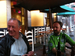
[Photos, top to bottom: what really goes on at a type conference (hint, hint); Ed Benguiat can’t escape his own typefaces; TypeCon attendees on the Natchez riverboat.]

When disaster strikes

Published

As I have followed the news about the earthquake and tsunami disaster in northeastern Japan, naturally my thoughts have turned to the many people we met in both the typographic and science-fiction communities when Eileen and I visited Japan in 2007. Our closest Japanese friends, we found out quickly, were all right, as was everyone in their circle of friends. I certainly hope that all of the wonderful, generous people that I met in the Tokyo Type Directors Club, in the Japan Typography Association, at Idea magazine, and from other parts of the Japanese typographic community are safe and sound; and that all of their families and friends are, as well.

[Photo by Taro Yamamoto, 2007.]

The MyFonts interviews

Published

“In the history of typography,” writes Jan Middendorp in his introduction to Creative Characters: the MyFonts interviews vol. 1, “the 1990s represented a phase of unprecedented democratization of the type design and production process… It seems the 2000s have accomplished a similar step for the user… Today, many managers, secretaries, bloggers or scrapbookers have preferences regarding the fonts they use.”

Creative Characters was launched in 2007 to give a peek behind the creative curtain and introduce “the faces behind the fonts,” the people who design type. The newsletter has been edited by Jan Middendorp, who has conducted interviews with type designers from all across the world of type. Twenty-six of them have been collected between covers in this book.

Middendorp is a good interviewer. He knows his subject, and he asks intelligent questions; he doesn’t ask long, rambling questions to get his own ideas across, but instead looks for for a response from the people he’s there to listen to. The nature of each interview, of course, varies with the interviewee.

Jim Parkinson, the lead-off subject, is self-deprecating in recounting his own notable history as a lettering artist. “Many people who worked for Rolling Stone in the early years still think it was the coolest job they ever had.” And: “Of all the people I have been lucky enough to bump into, Myron [McVay] taught me more about lettering and type design than everyone else put together, save Roger Black. I still do most things the ways Myron taught me.”

That’s not unusual. David Berlow, asked about his influences, says, “I’m still learning a lot from the people I’m supposed to be teaching.” Christian Schwartz, after receiving the Prix Charles Peignot from ATypI: “Although I have some really great collaborators, they’re all far away, so I spend almost all of my time working in my little office at home, by myself, which makes my job seem very anonymous. It’s a real honor to be recognized by my colleagues.”

The range of type designers interviewed here is wide; what they have in common, besides quality, is that they’re all active today, and they all have something to say about their careers and their work. Some dig deep into typographic history for their inspiration; others shun it. Some draw spectacular display faces; some craft meticulous text faces; some do both. The other thing they have in common is that at least some of their fonts are available from MyFonts.com.

These interviews all appeared first as e-mail newsletters from MyFonts. Like most of us, I receive these delightfully formated e-mails and, more often than not, put them aside in my inbox to read later. I find that it’s easier to read them in this invitingly designed physical book, which has spacious pages, colorful displays, readable text, and a format with flexible covers and loose sewn binding that is light enough to carry around and comfortable to hold in your lap and pore over at leisure. The page design not only shows off each designer’s typefaces, but has varied examples of other graphic designers’ real-world use of the faces – for example, a page of newspaper and magazine designs by Tony Sutton using a range of typefaces from Nick Shinn. Everything about this book is inviting and workable. This is only Volume 1; the series of interviews continues to appear in our e-mail, and I hope the next set will be collected soon in Volume 2.

American type design revealed

Published

I spent last Friday at the School for Visual Concepts, where a full day of talks about American type design was part of the two-day Type Americana conference. (The second day was hands-on workshops; they filled up and even had overflow sessions, but I didn’t participate in that aspect of the event.) We were shoehorned into a small, cozy space, the SVC gallery, but that made it easy to see and hear.

The individual talks all seemed to be carrying on a conversation with each other, as topics and historical people overlapped and interacted. Patricia Cost’s talk about Linn Boyd Benton fit naturally with Juliet Shen’s talk about his son Morris Fuller Benton; both of them shared references and contexts with Thomas Phinney’s talk about the American Type Founders (ATF), where both Bentons had worked. Steve Matteson’s talk about Frederic and Bertha Goudy intersected with Paul Shaw’s on W.A. Dwiggins, since Goudy and Dwiggins shared a home and a studio for two years in Massachusetts. Shelley Gruendler, talking about Beatrice Warde, said she had learned a fact she’d never known about Beatrice during Paul’s lecture. Jim & Bill Moran’s talk on the Hamilton Wood Type Museum didn’t directly impinge on the earlier designers, but it was part of the same hundred-year history. All in all, this was a remarkably concentrated dose of information and anecdote about the history of American type designers.

The final talk didn’t intersect quite so intimately with the others, but that’s because it was about a more recent period: Sumner Stone’s days as the first typographic director of Adobe, and the creation of Adobe’s program of original typefaces. Sumner said this was the first time he had spoken about that period publicly; it had been too close before. He not only told us tales of how Adobe hired him and how he developed the type program, but he set the stage by explaining the state of the type business and technology at the time Adobe started up. Most of it wasn’t new to me, apart from some of the anecdotes, but it was fascinating to hear Sumner put it all together. I hope he writes it up, or otherwise records it for posterity.

That could be said of all the talks: they all cried out to be expanded and recorded in more permanent form. The information communicated in that room last Friday could not be found anywhere else, at least not all together; it was the fruit of several people’s dedicated research, and much of it doesn’t exist anywhere online. (At least not yet.) Everyone spoke well, and the audience was rapt. Juliet Shen, who spearheaded the effort, and the supporting staff at SVC, put on a fine event.

[Photos: (top) Thomas Phinney & Sumner Stone; (middle) audience during a break; (bottom) Thomas Phinney, Michelle Perham, Kristine Johnson.]

Type Americana

Published

On November 12 & 13, the School of Visual Concepts in Seattle is hosting a two-day event on the history of American type design, called Type Americana. The first day features eight talks; the second day is workshops, one by Sumner Stone and one on wood type. You can attend just the day of lectures, or both days (spaces in the workshops are limited).

The talks: Thomas Phinney on American Type Founders, Paul Shaw on D.A. Dwiggins, Jim & Bill Moran on Hamilton Wood Type, Patricia Cost on Linn Boyd Benton, Sumner Stone on the early days of Adobe Type (Sumner was Adobe’s first Type Director), Shelley Gruendler on Beatrice Warde, Juliet Shen on Morris Fuller Benton, and Steve Matteson on Fred & Bertha Goudy.

The workshops: “Vintage Letterpress with Hamilton Wood Type,” taught by Jim Moran and Bill Moran; and “ThinkWrite,” taught by Sumner Stone.

In addition, Friday night will be the Northwest premiere of Richard Kegler’s film Making Faces: Metal Type in the 21st Century, about the work process (and the personality) of the late Jim Rimmer, working and talking at his home-based type foundry outside Vancouver. I’ve seen an unfinished version of this film, and it’s amazing.

Matthew Carter: MacArthur Fellow

Published

Matthew Carter has been named one of the 2010 MacArthur Fellows – a justly deserved honor with a very handy monetary package attached. It’s usually nicknamed the “genius grant,” and Matthew has lots of excellent company both this year and throughout the history of the fellowships.

This news follows hot on the heels of his being given the AIGA Boston Fellow Award just last Friday, at a sold-out event at the Cambridge Public Library. There must be a lot of feelings of good fellowship swirling around Cambridge this week.

Congratulations, Matthew!

Huronia

Published

At TypeCon in Los Angeles, Ross Mills is handing out nicely printed type specimens of his newly released typeface Huronia. It’s a sturdy, compact serif design that looks as though it will be immediately useful as a book typeface. Andrew Steeves of Gaspereau Press describes Huronia’s “tensile strength and character,” which seems a good way of expressing the nature of this text type.

The current release is the standard character/glyph complement, which contains an extended Latin character set – that is, the letters that we use in English and most other European languages. A later release will include full support for “all American languages,” including the writing systems used for Cherokee, Cree, and Inuktitut. Those beautifully designed glyphs are shown on the type specimen alongside the English text.

Typosexual

Published

Oded Ezer continues to be absurdly creative with the actual physical nature of type. And I don’t mean holding lead sorts in your hand. This time he’s in London, or he was last week, talking at the London College of Communication while wearing a slightly painful-looking typographic mohawk. Type roolz OK!

Font Aid for Haiti

Published

Font Aid IV is a project to raise money to help the recovery efforts in Haiti after this month’s devastating earthquake. SOTA (Society of Typographic Aficionados), which is a US-based nonprofit, is acting as organizer. The way it works is much like the three previous Font Aid efforts: type designers contribute one character each to a special font, which is then sold to benefit the needy cause. This time, the special font will consist entirely of ampersands; ostensibly this is because of the theme “Coming Together,” though I’m sure it can’t hurt that ampersands are fun to draw and easy to find a use for. All proceeds from sales of the font will go to Doctors Without Borders.

Typ09 happened

Published

I was too busy during Typ09, the 2009 ATypI conference in Mexico City, to write anything for this blog (or for much of anything else), but it wasn’t for lack of potential content. The conference was very well attended and full of ideas; everyone I’ve talked to seemed to think that the program was particularly stimulating, and the cultural and intellectual milieu was rich and intense.

Many thanks to the organizers of the conference – especially to Ricardo Salas, the mastermind of the whole event; to the indispensible Mónica Puigferrat and Paulina Rocha; to Marina Garone and Leonardo Vásquez, of the program and exhibitions committees, respectively; to Roger Black, who got the ball rolling; and to Barbara Jarzyna, ATypI’s conference organizer and executive director.

Although I didn’t have time to write anything, I did take a lot of photos. I posted an early batch to Flickr before the conference began, and later added quite a few more. Most of them even have captions! Here they are.

[Photos: Typ09 banner and posters at Anáhuac University (left); Mark Barratt & Simon Daniels at a sidewalk bar in the Centro Histórico (below, top, L–R); one of the multiple screens in the main program at MIDE (below, bottom).]

Mark Barratt & Simon Daniels

Main program at MIDE