As called out recently on FontFeed, Mexican designer Isaías Loaiza Ramírez has posted on Flickr a bunch of images of Mexican typefaces in action, from the presentation first shown at TypeCon 2007 in Seattle. These images serve as an excellent fore-taste of the typographic exuberance that will be on display in Mexico City at the 2009 ATypI conference, Typ09.
![]()
easilyamused |
Archive for the category ‘type designers’
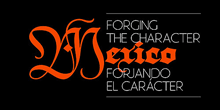
Type designs from Mexico
Published
TypeCon2009
Published
Since Thursday, I’ve been at TypeCon Rhythm in Atlanta. It’s a far cry from that first TypeCon, in a motel near an office park in Westborough, Massachusetts. Although this year’s TypeCon is noticeably smaller than in recent years (everyone’s feeling the economic pinch), it’s been lively. And the weather hasn’t been as brutal as you might expect in Georgia in July.
The program has been varied and mostly engaging. Gerard Unger was here to receive the 2009 SOTA Typography Award – richly deserved, and greeted with a standing ovation. As always, he has been friendly and approachable. I missed the Type Crit, when he, Matthew Carter, Akira Kobayashi, and John Downer offered their critiques and commentary on typeface designs that were submitted to them, but it’s always a high point, even for those who aren’t type designers. Bruno Maag did a heartfelt rant on the importance of non-Latin type design (and the wide-open markets for new non-Latin typefaces). Shelley Gruendler told the story of Type Camp, the hands-on learning experience that she started in frustration at the teaching of type in Vancouver and that she is now taking around the world. Rick Anwyl gave a somewhat scattershot but moving account of the origins and the saving of the CBS typographic wall, the “gastrotypographicalassemblage” created by Lou Dorfsman and Herb Lubalin, which once graced the wall of the employee cafeteria at CBS headquarters in New York and is now being slowly restored at Atlanta’s Center for Design Study. Zeena Feldman spoke provocatively about the idea of how visual design contributes to the sense of a globalized “non-place” wherever you go. Heather Shaw gave an intriguing account of how she had taught web typography by having students figure out how to reproduce classic layouts of the New Typography using HTML and CSS, thus connecting contemporary technology with the revolutionary typography of eighty years ago.
It goes on tomorrow, kicking off with a two-hour panel on the hot topic of web fonts – how you can give web designers a way to use real typefaces without either turning them into graphic images or giving away digital fonts to everyone who views a web page.
TypeCon is one of the two major typographic events of the year (the other being ATypI). Both of them share at least one characteristic: no matter how stimulating the program may be, the heart of it all is the social and personal interactions, among old friends, current colleagues, and new acquaintances – who may in turn become old friends in future years. And sometimes you go off on a tangent: on Friday night, I ended up accompanying Paul Shaw and Frank Wildenberg to an Atlanta Braves baseball game (my first live baseball game in thirty years). It was a way to get a little sense of Atlanta beyond the vicinity of the conference hotel. (And, as it turned out, to see some fireworks.)
Next year’s TypeCon will be in Los Angeles. It’ll be worth being there.
[Photos: Hatch Show Print posters after Jim Sherradan’s keynote talk; opening slide at the presentation of the SOTA Typography Award to Gerard Unger; and two sculptures by June Corley made out of physical letters, from a gallery exhibit at the Grand Hyatt. More photographs here.]
Typ09: call for presentations
Published
ATypI has just issued the “Call for Presentations” for this year’s conference in Mexico City, Typ09. We have also posted some preliminary information about the conference on the ATypI website, and we will have hotel and travel information there shortly.
This year, the main program will be a bit different from usual. Instead of two or more tracks of simultaneous program items, all timed to a uniform length, we’ll have a single continuous track, with varying lengths depending on what seems appropriate for each item. This will take some virtuoso juggling of the proposals and the final schedule, but it’s Roger Black‘s idea that this will enliven the proceedings and give everyone who attends a more cohesive experience. I’m looking forward to it.
The continuous three-day main program downtown will be followed by an intensive two days of workshops, including the now-traditional TypeTech but also several other workshop tracks, at Anáhuac University.
Every few years, ATypI needs to shake up its programming a bit. I was just looking at some issues of the TypeLab daily newsletter from the Antwerp conference in 1993, with emotional denunciations of the moribund state of ATypI programming and calls for livening it up through the fresh young blood brought in by TypeLab. (It worked.) Maybe now it’s time for another experiment in refreshing the mix.

TDCtoo | winners!
Published
The Type Directors Club in New York just announced the winners of its type-design competition, TDC2. Browsing the winners, in the TDC’s nifty new web interface, I was struck by how many useful-looking text faces were included, and also by the well-modulated peculiarities of a couple of the display faces (notably Orbe, by Rui Abreu, and Nebulon, by Carl Crossgrove). As often happens when I see the winners of the TDC type-design competition, I find myself itching to try them out.
The man who made Comic Sans
Published
Vincent Connare, who when he worked at Microsoft created the ubiquitous typeface Comic Sans, does a wonderful stand-up presentation of his handiwork and a small sampling of its overuse and misuse around the world. Vinnie’s original brief was to make a typeface for the word balloons in Microsoft Bob, the overly helpful little animated character in Windows 95, that would be based on lettering in comic books. He succeeded beyond his wildest dreams.
Comic Sans is one of those typefaces, like ITC Souvenir, that’s too successful for its own good. It’s curved and “friendly” in a way that irritates typophiles but appeals to everyday users. And it’s on everyone’s machine, so it’s available to be misused in every way conceivable.
Thanks to Cynthia Batty for pointing me (and the ATypI members’ list) to this brief video of Vinnie’s talk at the ROFLThing conference in New York. The type designer is not responsible for how the typeface gets used. You create a tool and let it loose on the world; sometimes it’s used the way you thought it would be, other times it’s turned to uses you never conceived of.
But I confess that I have this errant fantasy of the ultimate inappropriate typeface: Comic Sans Blackletter!
Guerrilla pixels
Published
In a daring daylight raid, elements of the Microsoft Typography team carried out an action targeted to advancing the cause of macro-typography and raising the visibility of fonts in the most literal way, says our anonymous informant.
Since the Microsoft Typography team, along with the rest of Windows International, was moving to a new building on the Microsoft corporate campus over the weekend of December 12, it seemed only appropriate to make a visible statement about the importance and ubiquity of type in the visual environment. Through the use of six-inch-square pixels cut out of sticky-backed black vinyl (a technique used previously for an installation at the Design Commission during TypeCon Seattle), these large-scale representations of bitmap characters from the Verdana and Georgia type families appeared without warning on the walls of the new building. This was reportedly achieved without a single X-acto-based industrial accident.
Verdana and Georgia were originally commissioned by Microsoft for onscreen reading of text. The way they were designed was the opposite of the usual process of designing type for the screen. Instead of creating outlines and then hinting the outlines (giving them rules to follow when turning into bitmaps at small sizes), type designer Matthew Carter started by designing the bitmaps – the end result that he wanted to see at each size – and then worked with hinting wizard Tom Rickner to create outlines and hinting that would achieve those shapes. The letters of the wordlet “typo” on the wall of Building 9 are taken from the bitmaps of 10pt Verdana and Georgia (in a mix of styles) at 96dpi. (Can you identify which letters are from which font, and in which style?)
The first versions of Verdana and Georgia were released in 1996; they now represent an early stage in the development of digital type at Microsoft. What will it look like when the MST commandos attempt to represent grayscale hinting and ClearType subpixel rendering at wall-size scale?
GGL
Published
I was sad to hear the news that Günter Gerhard Lange had just died. GGL, as he was frequently referred to, was a central force in the typographic world. Through his long-time work at the Berthold type foundry in Germany, he set the standards of quality for type design in metal and later in photo and digital typesetting. Even in the United States, where Berthold was less well known, the big, square E2 Body Types type-specimen book from the 1980s was treasured. Often enough, it was the Berthold interpretation – that is, Lange’s interpretation – of classic typefaces that were judged the best. It’s easy to see, from studying the type samples, that even when he made changes to the original design, he always did so with their usefulness in modern text typesetting in mind. (Some compromises are always required in adapting a typeface from an earlier time to modern equipment; it’s what choices you make, and how you implement them, and in what spirit you do so, that makes the resulting new typeface usable or not.)
The only time I met Lange was at the 2000 ATypI conference in Leipzig, where of course he was a major presence. I wished that I spoke and understood more than a smidgin of German; he was renowned as an articulate and forceful speaker, though not in English. At the conference, the New York Type Directors Club presented him with its TDC medal, and I wrote about that event in one of my earliest “dot-font” columns for Creativepro.
[Photo: © FontShop, Marc Eckardt]
“No independent or detached existence”
Published
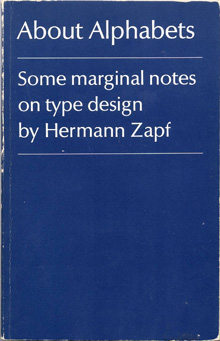
I had nothing new to bring with me to Seattle’s typographers’ pub last Tuesday, so I brought something old: my copy of Hermann Zapf’s little book, About Alphabets: Some marginal notes on type design by Hermann Zapf. I’ve always liked the ambiguity of that subtitle-cum-author’s-name: yes, the book is by Hermann Zapf, but it’s also true that the type designs discussed in it are all by Zapf as well. So it works either way.
It seemed appropriate to bring this particular book, since November 8 was Zapf’s 90th birthday. I’m not sure what kind of celebration was held in Darmstadt, but I know it was an anniversary that was appreciated in many corners of the world.
In Paul Standard’s preface to the 1960 book (my MIT Press paperback is the 1970 edition), he writes: “If the foregoing lines say much of books, it is because type designs have no independent or detached existence. Types are produced with great effort at great cost, produced for use in printed matter required for learning or study or for industrial or commercial needs. And HZ’s supreme concern, whether in writing or in printing, is never the single letter but the fusion of such letters into a working text.” Although digital type can be produced without the great cost inherent in the older industrial technology, a good text face – which is what Standard is talking about – still takes enormous effort and skill. And their purpose is still, as it always is, their weaving together into meaningful text.
Petersburg: the old · the new
Published
I got back last Tuesday from a week in St. Petersburg, Russia, for this year’s ATypI conference. The theme of the conference was “The Old · The New,” and we saw plenty of both – not only in contrast to each other but in many varied forms of both old and new. Our two principal venues, for instance, reflected different current uses for old buildings.
The main program was held in a 19th-century palace, the “pink palace” or Beloselsky-Belozersky Dvorets, which is situated right on the corner of Nevsky Prospekt, the Fifth Avenue of Petersburg, and the Fontanka river, which reminded me of the Seine in Paris. Inside the pink palace, we had two highly decorated function rooms, one an auditorium and the other more of a big seminar room. The old wooden floors creaked when people walked in or out, but otherwise the sound was good. The foyer in between was where we served lunch and had the coffee breaks, and where people could mingle (one of the main functions of an ATypI conference). In the evenings, we adjourned to a very different venue: the Loft Project Etagi (it should be spelled “Etazhi” in English, but the Latinization must be based on French), a five-storey former bread factory that’s been converted into art galleries, boutiques, and culture-related offices. As their description puts it, “The conversion of the space was minimal; as a result, many industrial artifacts have been kept as part of the interior setting: cast-iron floors, tied concrete columns, a boring mill [stet], backing equipment, etc.” This sort of “downtown” arts space contrasted nicely with the faded elegance of the pink palace. We put up the various exhibitions on the second floor of Etagi, and Friday night’s exhibition opening was open to the public; it was jammed. Saturday night we took over the top floor, a modern art gallery with a wine bar, for the main conference party. (This was a more informal replacement for the “gala dinner” that ATypI always used to have.) It was a fine party. Briefly we had to stop everyone from having fun so I could thank all the organizers and sponsors, and so a representative from the government press & arts entity could give a short speech and hand out commemorative plaques. After the party closed, I accompanied a group of typographers to a nearby bar, where we talked and drank until nearly 4 a.m. As I put it on Sunday, “I can no longer blame my exhaustion on jetlag; this time I’ve earned it fair and square.” But I was up for the first talk the next morning, ready to kick things off in my official capacity.
Everyone seemed to agree that the conference went well. There was a certain amount of division between the Russian-speakers and the non-Russian-speakers, as in general one track was in Russian and the other in English, but there was also a fair amount of fluidity and overlap. (We were trying to plan things to encourage as much cross-communication as possible, but some sorting by language is inevitable.) I couldn’t even begin to describe all the things that people spoke on or presented; it was generally a very good program. I ended up being the MC for one track some of the time, so I couldn’t be as flexible as an ordinary attendee in deciding which track to follow. And being president of ATypI, I was always feeling responsible, even when other people were actually carrying out the tasks.
Leaving on Tuesday meant that I had one full day free, after the end of the conference; and Monday turned out to be a gorgeous sunny day, not a cloud in the sky and temperatures around 60°F. I visited the Russian Museum, where I made a beeline for the 20th century art and found two iconic paintings of Anna Akhmatova; I also ran into a couple of people from the conference there. Otherwise I strolled up and down and over the canals, admiring the 19th-century buildings, most in a classic Italian style, and wandered through the Mikhailovsky Gardens and one end of the Summer Garden, past the brooding palace known as the Engineers’ Castle, finally enjoying a cup of coffee outside a Seattle-style coffee company (a local chain called “Coffee House”) on Malaya Sadovaya Street in the sunlight. Earlier, on Wednesday, after checking in with our conference director and making sure there wasn’t anything I needed to deal with, I walked my feet off (the long, wide avenues do go on a long way) and visited the Hermitage, where I finally got to reacquaint myself with the Van Gogh that I had first seen in DC in 1973, in a tour called “Impressionist and Post-Impressionist Paintings from the USSR.” That painting had brought tears to my eyes thirty-five years ago; today it didn’t, but still I spent ten or fifteen minutes just looking at it. I also renewed acquaintance with a number of other paintings that had been in that exhibition (Derain, Cézanne, Matisse) and saw many more that had not gone traveling.
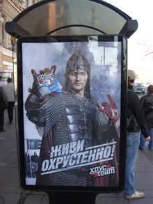
[Photos, top to bottom: transport: the old, the new; the second book printed in Cyrillic (Krakow, 1491); Oleg Genisaretsky delivering the keynote address; School #308; advertising poster at a bus stop on Nevsky Prospekt – another take on the old, the new.]
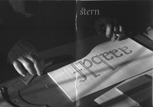
Stern, the type
Published
When I first opened the package from P22 with their press release and the specimen booklet for the typeface Stern, I didn’t make the obvious connection. I grasped quickly that it was a new design by Jim Rimmer, notable British Columbia punchcutter and type designer; and I understood that he was doing something unique by issuing the face both as a digital font and in foundry type for hand-setting. (There have been typefaces issued in multiple formats before, such as Sabon, and digital typefaces have been printed by letterpress, but I don’t think anyone has spanned the technologies quite this widely before.)
The obvious connection was the name: Rimmer had named his typeface in honor of artist/printer Chris Stern, whose work spanned the same broad swath of typesetting technologies, and who visited Rimmer and learned from him. It’s a fitting tribute, one that Chris would have appreciated.
He might even have put it to use in a book. The typeface Stern is unusual – “an upright italic type designed for hand-set poetry and diverse digital use,” as Rimmer describes it. The angle of the slant is very slight, as befits an upright italic, but the italic forms of e, f, m, and n give it a calligraphic feel.The wide, two-storey a creates a tension with the italic forms and makes it look more like a text face; there is, however, an alternate, single-storey a for occasions when you want a more consistently italic look. The caps are upright, and come in four different heights: tall, mid-height, small Aldine, and small caps. It looks like mid-height is the default, or at least that’s what was used in the elegant little specimen booklet designed by Rich Kegler.
In metal, Stern is a 16pt font, a size suitable for spacious settings of poetry or short prose passages. It’s a light and delicate-looking typeface, in both metal and digital form; digitally, of course, that lightness can be scaled up for use at display sizes. But it’s designed for use at large text sizes, and in the right circumstances, with careful treatment, it could shine. At first it looks peculiar, but it certainly grows on you.
Incidentally, the exhibit of Chris Stern’s printed work at Design Commission in Seattle has stayed up through July, and many of the broadsides and prints by printer friends of Chris’s are still available for sale; all proceeds go to paying off the huge medical bills that don’t go away even when you die.
In the spirit of technology-spanning, you can play with bits of the Stern letter forms at a site called Typeisart, which uses interactive Flash to let you create your own collage out of elements of the typeface. Watch out – it’s addictive.