When Tree Swenson asked me to create a new visual identity for the Academy of American Poets, the brief included creating a new logo. Tree was then Executive Director of the Academy, which was (and is) based in New York City but represents poets and poetry from all over the country. Other parts of the visual identity included the annual report, the website, and promotional material and program books for the Academy’s annual fundraising event in New York, which featured, each year, several very prominent people from the literary and entertainment worlds.
In the logo, Tree told me, the emphasis should be on “Poets”: that was the word she wanted people to remember, not “Academy.” So from the first I thought it should be a two-element logo, with “Academy of American” essentially modifying “Poets.”
As you can imagine, I played with all sorts of typefaces and all sorts of arrangements. At first I aimed for something symmetrical, preferably square or circular, because that’s the least troublesome shape for a logo that has to be used in a wide variety of circumstances. But then I began breaking the boundaries.
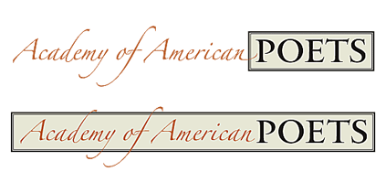
By turning the word “Poets” into the central element, spelled out in all-caps in Matthew Carter’s elegant, sparkling typeface Big Caslon, and placing it within a classical-looking rectangle, I gave the logo a solid, clearly recognizable mark. But what about the rest of the name?
For that, I tried something entirely different, though also in an elegant and somewhat old-fashioned tradition. I set the words “Academy of American” in Zapfino, Hermann Zapf’s swooping calligraphic typeface, a dramatic contrast to the solidity of the Big Caslon caps. And I let the calligraphic strokes overlap the main element.
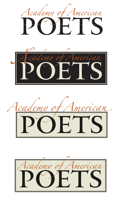
In fact, I tried out a large number of different placements of the Zapfino words, and what this process made me realize was that there was no one solution; in fact, there should not be a single solution. Instead, it became a modular logo that could change again and again in various uses.
Zapfino has an enormous number of swashes and alternate forms of letters, notably for both the lowercase f and the uppercase ‘A’. This meant that varying the logo wasn’t just a matter of moving around a calligraphic element, but of choosing a different arrangement of strokes for each instance.
The version we used most often had restrained A’s but an exuberant f in “of,” which swoops down into the word “POETS” and up outside the top of the box, plus somewhat restrained swashes on the d and y of “Academy.” Other versions substituted a swash version for the first A, breaking the box on the left as well as at the top.
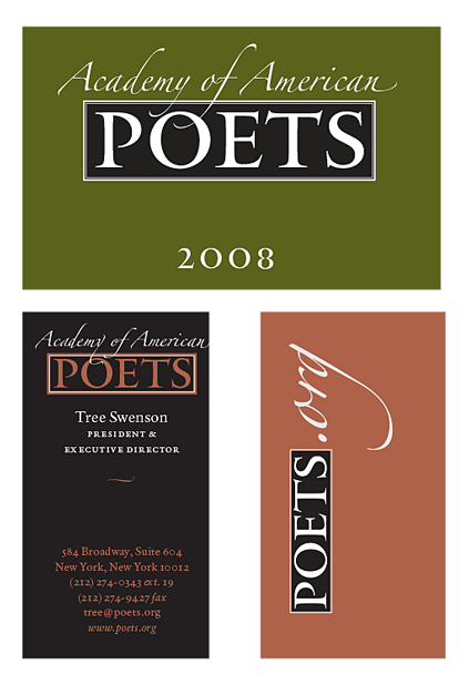
In some instances, we did away with the box altogether. The membership cards boxed “POETS” but left “Academy of American” outside the box, floating above it, with swashes penetrating the space of the box and a swash on the final n flying out to the right. For the mailing label, where a horizontal approach was called for, both elements were in the same line, rather than stacked; though they still had a little overlap.
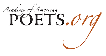
Then there was the website logo: poets.org. In ads in the New York Times and elsewhere, promoting National Poetry Month, we used a “poets.org” logo done in the style of the Academy logo: POETS in Big Caslon, and the “.org” in Zapfino, in a second color, with the tail of the g dramatically sweeping under the word “POETS.” (This proved to be a difficult design for use on the website itself. In the end the website design was done separately.)
On the cover of the annual report, the logo’s elements were rearranged along with the other typographic elements, including an enlarged ornament from the Zapfino font (which changed from year to year; the first one was the tip of a calligrapher’s pen). I would use Zapfino ornaments as occasional accents on later pages.
One other situation called out for a special treatment: when the logo would be displayed on the front of the lectern during the annual fundraising events at Lincoln Center. I tried out the slightly bold “Forte” weight of Zapfino, but decided that it wasn’t necessary. Instead, it was a simple stack of four words, in Zapfino and Big Caslon, on a black background, enclosed in a single-line box that some of the (relatively short) swashes burst through. It was meant to be readable at a distance in a large, dimly lit auditorium, yet still to be recognizably the logo of the Academy of American Poets.
This identity, with its ever-changing logo, was used for three years, until changes at the Academy brought on, as they often do, a change in its visual direction. The Academy’s current visual identity is very attractive and effective, though it is entirely different in style and feel.


