In the course of less than a month this summer, I attended three major events, each of which had a nametag that attendees were supposed to wear. The first, in Dublin, was this year’s World Science Fiction Convention, which was being held in Ireland for the first time. The second, a week later in Belfast, was the Eurocon, or European Science Fiction Convention, which moves around among European countries and was hosted by the organizers of Titancon, an annual Belfast science fiction convention; holding it in Northern Ireland the week after the worldcon made it easy for people visiting from other countries to attend both conventions on their trip. The third event was ATypI 2019, the annual conference of the Association Typographique Internationale, in Tokyo – ATypI’s second time in Asia, as it happens.
Aside from dueling jetlags (I was only home in Seattle for five days between the two trips), this juxtaposition provided a classic opportunity to compare approaches to designing the nametags or badges for such an event. I’ve written about this before, in an article about nametags published in FontShop’s Font magazine: “The moment when the design of nametags really matters is when you’re stumbling about at an opening reception, trying to spot familiar names without rudely staring at people’s chests.” Although the organizers might consider the first purpose of a nametag or badge to be labeling someone as a paying (or non-paying) official attendee of the event, for the attendees themselves the purpose is to be able to identify individual people by name. And the distance at which you want to be able to read the name is about three meters (ten feet), well before you find yourself face to face with that person whose name you know you ought to recall.
So how well did the badge-designers for these three 2019 events do?
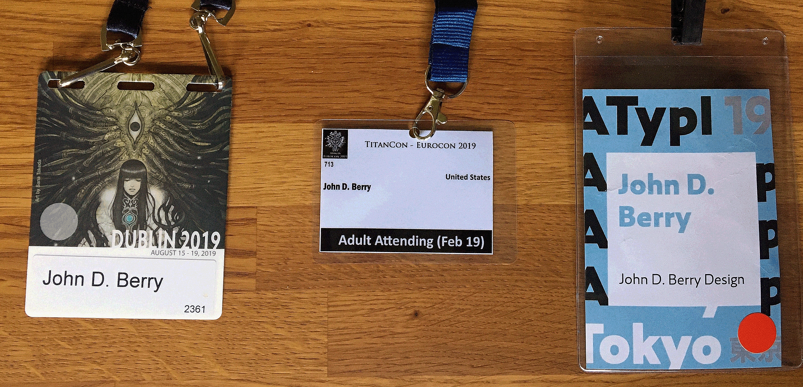
Well, the Dublin nametag does make the name fairly large, though not large enough to be read at any distance. Fully three-quarters of the area of the nametag is taken up with artwork, which incorporates the name of the convention. Not too bad, but not ideal.
The nametag for Eurocon/TitanCon seems perfunctory. It’s quite small, and the largest visual element is the label “Adult Attending.” The typeface used for the name is a pretty good choice – clear, condensed, bold, and set in upper- and lowercase – but it’s tiny. You can barely read it even if you’re peering at it up close. The same name set ten times larger would have been effective; and there’s plenty of white space to accommodate a much bigger name. The TitanCon nametag is basically not functional.
On the nametag for ATypI, which is the largest of the three, the attendee’s name is both big and bold, clearly set within a large white square. It might have accommodated longer names better with a somewhat condensed typeface (which would also let shorter names be set larger), but overall my only complaint is that the name isn’t set in black; instead, it’s set in a pale second color, which tends to drop back, visually. (The color varied depending on the status of the attendee.) But it was generally readable as you approached someone in the corridor, so it was doing its job.
I don’t understand why this is so difficult. It should be thought of as information design, not just branding. Combine the typeface and color of the TitanCon names and the size and placement of the ATypI names, and you’d have a near-perfect nametag. Yet year after year, organizers of conventions and conferences, even ones devoted to graphic design, reinvent the wheel. And they sometimes get it flat.