This year’s TypeCon, which went by the name “Capitolized” but really seemed to revel in being “Redacted,” was very enjoyable. It was a great reunion of colleagues and old friends, and a fine way to make new friends and meet new colleagues, as this sort of event always is. The hotel, the Hyatt Regency Washington (a few blocks from Union Station and the Capitol), had a nice open bar area in its lobby, with several surprisingly good beers on tap, and proved to be the sort of meeting place that you hope for when you’re organizing something like this.
There were some very good talks (and the occasional dud, of course), including some that I really wanted to hear but that started too early in the morning for me. As I was staying with local friends across town, a few stops away on the Red Line, it was often hard to tear myself away from breakfast and conversation – especially if I’d been up late the night before, doing much the same thing (except for the breakfast part). Theoretically, all the talks were videotaped (except for a couple where the speakers asked not to be recorded), so perhaps eventually we’ll have a chance to catch up on the ones that we missed, for one reason or another.
It was gratifying to see so many talks about non-Latin typefaces; TypeCon is showing an admirable international flavor, despite being the North American type conference. Emblematic of this was the choice of Bulgarian type designer Krista Radoeva as the recipient of this year’s SOTA Catalyst Award.
Even better – and carrying the non-Latin theme further – was the presentation of the SOTA Typography Award to Fiona Ross, who must have done more than any other single person to further excellence in non-Latin type design: most notably in Indian types, but in Arabic, Thai, and other non-Latin scripts as well. The enthusiasm with which everyone greeted the announcement that Fiona was this year’s awardee was palpable. It was a very well-deserved award.
Personal favorites among the talks that I did get to hear included Mark Simonson’s nostalgic paean to the pleasures of phototype, X-acto knives, waxers, and rub-down type; Liron Lavi Turkenich on a failed experiment in updating Hebrew type; Carl Crossgrove’s trawl through the much-neglected range of sans-serif types with contrast and modulated strokes; Thierry Blancpain showing us that, yes, there’s been some Swiss graphic design since the days of Max Bill and Müller-Brockmann; Nick Shinn on the visual marketing of recorded music, 1888–1967; and the very clever way that Victor Gaultney demonstrated to English-speaking readers what it’s like for readers whose scripts are barely and inadequately supported in common electronic communications media.
I can’t help pointing out that this year’s TypeCon featured one of the most unreadable nametag designs I have ever seen. The “redacted” bit was cute, but extending it to the nametags made them utterly nonfunctional. There’s a reason they’re call “name” tags.
Washington, DC, in the summertime is not an ideal climate experience, though we did get one soft, warm evening when it was a pleasure to sit outside at the bar across from the hotel and enjoy the evening breeze. The weather was not as fiercely hot as it could have been, but the humidity was up to its usual standard. I lived in the DC area for a couple of years in the early ’70s, first in northern Virginia and then for a year in the District, near Dupont Circle. (As the Metro train stopped at the Dupont Circle station on my daily commute, I found myself thinking, “When I lived above here, they were just building this station.”) I remember one summer without air-conditioning where I got through it only by pretending that I was underwater the whole time; I simply never expected to be dry, and I was never disappointed. Unfortunately, I can neither think nor work in that kind of climate.
I’ll be seeing some of the same people, as well as many who were missed in DC, next month at the ATypI conference in Barcelona. Must be the typographic season.

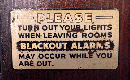
[Photos: a TypeCon2014 nametag (top); TypeCon attendees suddenly deciding to wear their nametags as headbands (middle); expressive typography in Washington (bottom); and the sign on the door in my friends’ apartment building (above).]
