function jdb_page_navigation()
sPageSlug = blog
sPageTitle = easily amused
header:139:aPageArgs:page_title = easily amused
header:140:aPageArgs:section_title =
functions-johndberry:262:aPageArgs:page_title = easily amused
functions-johndberry:298:sPageTitle = easily amused
functions-johndberry:359:sPageTitle = easilyamused

easilyamused |

Archive for the category ‘type designers’

Trajan & Hebrew & Arabic, oh my!

Published

Last year I wrote the texts for four new digital specimen books for extensions to Adobe Originals typefaces, and just last week Adobe posted those specimens online. All of them are additions to existing type families: two derive from Trajan (Trajan Pro 3, which extends both the number of weights and the language coverage, and the new Trajan Sans) and two from Myriad (Hebrew and Arabic versions of this widespread humanist sans). The project gave me an opportunity to delve into the history of the inscription on the Trajan column in Rome (which, almost every time I’ve tried to take a close look at it, was chiuso per restauro and wrapped in a blue plastic tarp), and an even more interesting chance to learn about the design of both Hebrew and Arabic typefaces. The latter pair gave me an excuse to engage the considerable knowledge and expertise of Scott-Martin Kosofsky, a typographer of fine sensibilities and an expert in bilingual Hebrew/English publishing, and Mamoun Sakkal, an expert in Arabic type design with a particular penchant for the style known as square kufic (though this is not, actually, the tradition that the Myriad Arabic extension draws on) and a friend who, happily, lives in the Seattle area. Mamoun, along with his software-coding daughter Aida, had been expanding my knowledge of Arabic for some time; Scott I met through this project, and have been learning from quite happily ever since.

I should be quite clear: I can neither read nor write either Hebrew or Arabic, although I’ve learned quite a lot about the design of typefaces in both scripts. And about the quixotic and sometimes contradictory nature of designing “sans serif” typefaces in either script. Not to mention the fraught question of what it means to have an “italic” in either Hebrew or Arabic, neither of which has any such tradition before the digital age.

P.S.: I was quite pleased to notice that one of the samples of Myriad Arabic in action was bilingual versions of three poems by Maram al-Massri (with English translation by Khaled al-Mattawa) that had been published by Copper Canyon Press, an excellent international poetry publisher for whom I have done a lot of book design in the past. Synchronicity is everywhere.

Ivan Fedorov’s books and types

Published

When Eileen and I went over to the University of Washington the other day, to take a look at the magnificent century-old Yoshino cherry trees in bloom around the quad, we walked past the Magus used-book store on our way to the campus; our eyes were caught by the display of enticing books in the front windows. In fact, the display seemed so well calculated to appeal directly to us that I began fantasizing that the windows were really smart displays that targeted whoever happened to pass by on the sidewalk; a different person or group of people would perceive an entirely different display, tailored to their tastes and buying habits.

“Hey,” said Eileen when I told her this, “you mean they’ve got real physical books in buildings now? Books that you can pick up and hold in your hand?” She shook her head. “Who’d have guessed!” No, no, I assured her, it was just a virtual display; behind the windows we’d find no actual books. Just a digital buying experience.

But we stopped in on our way back from the cherry trees, and what I found on a back shelf was not virtual at all. It was a beautifully bound large-format book called Artistic Heritage of Ivan Fedorov, by Yakim Zapasko. At least, that’s the title in English; the book was published in Lvov in 1974, and its proper title is displayed bilingually in Ukrainian and Russian. The book is a catalog of the work of the 16th-century printer Ivan Fedorov (“and the masters that worked in association with him,” as an English summary carefully adds), who worked first in Muscovy and then in the Polish-Lithuanian Commonwealth (Moscow, Lvov, and Ostrog) and who is one of the fathers of eastern Slavic printing. The main text of the book is in both Ukrainian and Russian, but for those of us who are not fluent in either language the most rewarding part (besides the typography, design, printing, and binding of this book itself) is the illustrations: books printed by Ivan Fedorov, types he cast (both Cyrillic and Greek), initial letters and decorative ornaments, and the wonderfully complex “ligature lines” of intertwined capital letters. Just for lagniappe, the book’s title page and section pages feature magnificently energetic calligraphy in two colors and five languages. (Summaries and labels are provided in English, French, and German as well as Russian and Ukrainian.)

Ligature line, from 'Artistic Heritage of Ivan Fedorov'

This copy is rubber-stamped by the Department of Slavic Languages and Literature of the University of Washington. What led the department to de-acquisition it, I have no idea; but it has found a good home now. Out of curiosity, once I got home I looked online; there were a number of copies available, at varying prices of course. One of the listings, through ABEbooks, had a note saying, “This copy is no longer available.” The listing was from Magus Books, so in fact “this copy” was the one I had in my hands. (Quick work, Magus!)

I love the early Cyrillic types, so much more vibrant to my eye than the westernized Civil Type introduced by Peter the Great. And I wondered, as I gazed over the pages, whether I had in fact seen some of these very books when I was in the rare-book libraries of Moscow or St. Petersburg.

It was a good day for both cherry blossoms and books.

[Images: top, cover of Artistic Heritage of Ivan Fedorov; middle, title page; bottom, a 16th-century book page; inline above, a red-printed ligature line.]

Garamond after Garamond

Published

James Felici has an article on CreativePro about the many different typefaces called “Garamond.” It’s not a new subject, but it’s one that we need to be reminded of every so often. As Felici explains, many of the typefaces that we know as “Garamond” are actually not based directly on the work of Claude Garamond, the 16th-century French punchcutter, but on the work of Jean Jannon, who was working several decades later. Jannon was inspired by Garamond, but his types are distinctly different.

I took a crack at explaining this myself in the early ’90s with a Garamond family tree that I put together for Aldus magazine. (When I say “put together,” I mean that I researched it, organized it, and wrote the text; I did not, however, design the actual page.) That’s what you see a snapshot of over there to the left.

The tree gets complicated. Monotype Garamond, for instance, is a Jannon revival; so is Garamond No. 3, released by Mergenthaler Linotype in the early 20th century. ITC Garamond, although its letter forms are clearly based on Jannon’s, is so wildly inflated and exaggerated that I always wish ITC hadn’t called it “Garamond” at all; it’s a useful advertising typeface, but never a book face. Stempel Garamond, on the other hand, is based on Claude Garamond’s own types; so is Adobe Garamond, and the even better Garamond Premier Pro (both designed by Robert Slimbach).

Garamond Premier Pro was Slimbach’s return to the source several years after he designed Adobe Garamond (and well after I created this family tree). Although both of them are based on the Garamond type specimens in the archives of the Plantin-Moretus museum, Garamond Premier draws on several sizes of Garamond’s types to create optical sizes for the digital typeface. I find it a more satisfying and versatile typeface.

[Images: Garamond family tree (top), from Aldus magazine, March/April 1993; samples (bottom) of optical sizes of Garamond Premier Pro.]

Verdigris goes Big & Pro

Published

People often ask me, “Which is your favorite typeface?” I always say that it’s a question that can’t really be answered, since it depends entirely on context: what’s the best typeface for this particular use? But, truth be told, for quite a while I have had a favorite, at least as a text face for books: Mark van Bronkhorst’s MVB Verdigris. I’ve used it a lot; it’s the text typeface of my two Dot-font books, and I even secured Mark’s permission to use it in the downloadable PDFs of those two books’ text. Inspired originally by small sizes of the types of Robert Granjon and Pierre Haultin, it’s wonderfully readable. The italic is especially striking.

Now Mark has released an OpenType Pro version, MVB Verdigris Pro Text, with expanded weights and styles, a few tiny reworkings, a lot of OpenType layout features, and a companion display face for use at large sizes, MVB Verdigris Pro Big.

What I wrote about Verdigris in 2004 still holds true today; but since then I can attest to my own happy experience using the typeface extensively. The one stumbling block for me in recent years has been that Verdigris wasn’t available as an OpenType font; in order to use its extensive typographic features, you had to jump through the old hoops of search-and-replace, choosing alternate characters or a separate font for such refinements as ligatures and small caps. No more! With Verdigris Pro, van Bronkhorst has given us a thoroughly workable book face, ready for the back-and-forth text flow of contemporary production.

Verdigris Big has no italic (at least so far), but its two weights ought to be quite useful in classical-looking display typography. The obvious comparison is with Matthew Carter’s wonderful Big Caslon. Although Carter’s sources and van Bronkhorst’s are different (18th-century Caslon vs. 16th-century van den Keere), they’re in the same ballpark; and neither of the two designers was after a strict revival. Like Big Caslon, Verdigris Big emphasizes contrast and sparkle at large sizes, though with a somewhat looser fit and a Renaissance stateliness.

As usual, Mark van Bronkhorst has produced an elegant PDF type specimen to accompany his new release.

JFP in SEA

Published

If you’re in Seattle in mid-February, you might want to come to one of these events to hear and meet Jean François Porchez, who is probably the most widely-known French type designer today. JFP will be giving a free talk on Wednesday, February 15 at Kane Hall at the University of Washington, as part of a week-long symposium: “Letters From France: On Designing Type.” He will also be speaking the following day at the Good Shepherd Center (4649 Sunnyside Avenue North, Seattle), with a Q&A session in both French and English. And I hope to entice him to our monthly typographers’ pub, on the second Tuesday, which will be February 14 (yes, Valentine’s Day), at the Pub at Third Place (6504 20th Avenue NE, Seattle), from 8 p.m. on; anyone interested in type is welcome. (Look for the table full of obvious typographers.) A bientôt!

[Update:] Videotape of Porchez’s talk at Kane Hall is available online. Below, a very poor snapshot of JFP (L) at the type pub, looking over sketches of a type design by Andrea Harrison (R).

Jean François Porchez & Andrea Harrison at Seattle typographers' pub

Georgia & Verdana’s expanded palette

Published

While I was a program manager at Microsoft Typography, two of the typefaces that fell within my purview were Georgia and Verdana, the highly readable screen fonts designed by Matthew Carter in the 1990s to make reading text onscreen easier on the eyes. So I was in a position to encourage and approve a joint project of Ascender Corporation (now a part of Monotype Imaging) and the Font Bureau to work with Carter to create a much-expanded set of fonts for both Georgia and Verdana. The project was announced two years ago; this week, Font Bureau and Monotype Imaging have released the new fonts.

Georgia Pro and Verdana Pro are now large type families, with five weights instead of two, each one with its accompanying italic, as well as small caps and several alternate kinds of numerals; and all of those weights and styles are repeated in condensed form. This makes it possible to have truly bold headlines in either typeface, or to fit copy into narrow measures, or to combine weights and widths in expressive ways within a typographically consistent page.

Not surprisingly, given the advent of downloadable web fonts, both Georgia Pro and Verdana Pro are being shown off in a web-based type specimen from Webtype. And they’ve been hinted to be as consistent as possible across platforms and browsers.

I’m looking forward to seeing them put to use.

ATypI Reykjavík 2011

Published

By all accounts, this year’s ATypI conference was a notable success. People kept coming up to me and telling me how much they were enjoying the event, how impressive the venue was, how well everything was organized, how intelligent the talks were, how much they liked the food. I kept telling them that I couldn’t take any credit for these things, that it was the organizers, both local and from ATypI, who had brought all this together. But it was certainly gratifying to hear.

The venue was spectacular: a brand-new building, Harpa, built right on the edge of the waterfront in the harbor of Reykjavík, which houses the national symphony as well as serving as a state-of-the-art conference center. Harpa’s irregular geometry and fishnet-over-glass windows all around highlighted the location and gave us a light, airy interior to inhabit and meet in. Its various meeting spaces were easy to configure for both talks and meals. And when the weather got bad – Sunday saw a good bit of wind and rain – it was satisfying to sit snug in Harpa and gaze out at the wind-whipped harbor.

There were fewer attendees than usual this year (no doubt a reflection of the dismal economy, and of the fact that while Reykjavík is easily accessible from both North America and Europe, it’s not exactly local to anyone but the Icelanders). But those who came were excited and stimulated, and came away talking about ideas.

How often do you have a head of state opening a typography conference? The President of Iceland, H.E. Ólafur Ragnar Grímsson, not only welcomed ATypI to Iceland but gave a twenty-minute talk about the Icelandic language and its typography – an intelligent, eloquent commentary that set a high standard and neatly prefaced our keynote speaker, Gunnlaugur SE Briem. Briem spoke wittily about type, letters, and language. Together, they kicked off the main conference brilliantly.

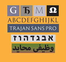
The theme of the Icelandic letter “eth” (ð, the voiced “th” sound found in English too) led naturally to a rich track of talks on other special characters, and on a wide range of non-Latin writing systems as well. We heard about the typography of Indic, Korean, Arabic, Mongolian, Chinese, and Khmer scripts, not to mention Danish, Irish, German, and Turkish letters within the Latin alphabet. The number of presentations on Indic typography on Sunday was particularly appreciated; and there was talk of making a proposal in a few years for holding an ATypI conference somewhere in India.

The structure this year seemed to work quite well: two preliminary days of workshops and technical and educational items, in two parallel tracks, followed by the official opening on Thursday night and then a single main track of programming on Friday, Saturday, and most of Sunday. This allowed for specialization in the preliminary days, but a common experience during the main conference – and no running around trying to switch from one track to another, or worrying about coordinating the timing between multiple simultaneous talks. Our program structure is partly determined by the venue, but I think we’ll try to repeat this success in the future.

Saturday night we clambered into city buses for a short ride out of town to a penthouse restaurant with wide views in all directions, where the restaurant’s staff were quickly accommodating when they discovered that we had more people for dinner than we had planned. That was followed by a crowded party back in town at the Icelandic Design Centre, and the usual dispersal to the bars of downtown Reykjavík.

The city is so small that it was easy to keep running into each other; at one point, one of the pleasant local bars was entirely filled with typographers. This also meant that no matter where you were staying, it wasn’t more than a walk away from the conference venue. So not only did Harpa provide excellent spaces for talking and mingling, but the city itself contributed to this lively interpersonal dynamic. Reykjavík is a very cozy capital.

For a flavor of the event, check out write-ups by Roger Black on his blog (“We are all one culture, here on Œŧħ. We’ve just taken different glyphs”) and by Dan Reynolds on ilovetypography (“Font editors & a book steal the show”), and scan the photos from various attendees on Flickr. (I’d be happy to hear of other reports that I’ve missed.) And take a look at the impressionistic, kaleidoscopic videos put together by a group of young Icelandic filmmakers who were roaming the conference, cameras in hand.

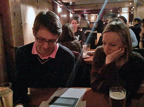
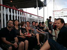
[Photos, top to bottom: the exterior of Harpa, with pool in front; the interior of Harpa, looking out; the bar before Saturday’s gala dinner; Thomas Phinney and Dawn Shaikh, at the pub; Mark Barratt and Dave Crossland, suitably out of focus, at another pub; Nick Sherman’s sartorial splendor (what, no hoodie?); and one of the images from the Typographer’s Guide to Iceland.]

A typographer is not a type designer

Published

Earlier this summer, I got e-mail from Abebooks.com, promoting a bunch of books about type and typography that they had for sale. It was a nice set of books. (Happily, I already owned most of them.) But in the text of the e-mail, the writer seemed to be misinformed about just what a typographer was:

“The book world revolves around typefaces. You might not even notice them but they are right under your nose. Typographers like Claude Garamond, John Baskerville, Eric Gill, Giambattista Bodoni, Adrian Frutiger and Hermann Zapf define the style of the words we read.”

And if you click through to Abebooks’ page about type books, you find that the very first two sentences contradict each other: “Typography is the art of arranging type and that includes the selection of typefaces, the point size and the leading. A typographer is someone who designs typefaces.”

This confusion has been creeping into print over the last couple of years: people who are newly come to writing about fonts start calling type designers “typographers.”

That’s like calling someone who makes violins a “violinist.” Typography is the art and craft of using type; it’s not the art and craft of designing type. That’s done by type designers. The classic type designers named by Abebooks may also have been typographers – Bodoni and Baskerville were renowned for their book design and printing as well as for the types they designed for those books – but what this e-mail is talking about is type design. Please don’t mix them up.

Talking about fonts

Published

Now download my other Dot-font book

Four years ago, Mark Batty published a pair of books by me, Dot-font: talking about design and Dot-font: talking about fonts, which were intended to be the first of a series of small, handy books on typography and design. Last year, I made the first one (on design) available as a free download. Now, I’m posting the second book (on fonts) as well, also as a free download.

Please download the text of both books and enjoy them.

You can download the complete text of Dot-font: talking about fonts as a PDF, designed and formatted for onscreen reading; as a Word document; or as a text file. The illustrations that appear in the printed book are not part of these downloads; I don’t have rights to reproduce and distribute all of the images in digital form, so for the full visual effect you’ll have to buy a copy of the physical book (which of course I encourage you to do). Some of those images appeared online at Creativepro when the original columns were published, but there are quite a few original images that were created for the book: for example, the series of photos that Dave Farey made from scratch, to illustrate the process of cutting a letter by hand out of Rubylith in order to create a Letraset font in the 1960s.

This book, like the last, is published under a Creative Commons license. Please do not distribute it without that license information.

The Creativepro columns that seemed worth collecting into a book broke down naturally into three categories: design in general, typefaces or fonts, and typography or how type is used. So I’ve still got the material for a third book, Dot-font: talking about typography. Is there a demand? You tell me.

Download dot-font

TypeCon surges ahead

Published

TypeCon 2011 – the first one run by SOTA on an all-volunteer basis – seemed to be a successful conference, and it was held in a fascinating city: New Orleans. The single-track program was well designed to engender conversation; in fact, individual presentations seemed to be speaking back and forth to each other, even when they had not be planned with that in mind. A lot of that conversation was about web fonts, design for the screen, and new forms of publishing. That’s what I spoke about myself, in a rambling talk full of questions and explorations (“all questions; no answers!”) about the problems and possibilities of designing books for a digital age. You won’t be surprised to hear that I embraced flexible design and adaptive layout as the best way to design any extended text for a variety of screens.

Everyone enjoyed New Orleans – the food, the music, the culture – though some attendees weren’t prepared for the binary contrast between the hot, steamy outdoors and the brutal air-conditioning in the hotel and in the bars and restaurants. The hotel was in the heart of the French Quarter, however, right on Bourbon Street; a fun place to be, but definitely also a tourist bubble. Bourbon Street seemed the least changed of any part of the city that I saw, since my one previous visit back in 1988 (also for a conference, also in the summer). I’m sure this is not only because the Quarter is on high ground and Katrina’s flood waters mostly didn’t reach that far.

I couldn’t, of course, make it to everything on the program; and as I didn’t arrive until Thursday afternoon, I wasn’t there for the pre-conference Education Forum or workshops. Presentations that stood out for me were Bill Berkson’s provocative “Great Readability Scandal”; Amelia Hugill-Fontenel’s well-crafted and artfully delivered “Artifacts All Around,” about some of the typographic curiosities in the Cary Collection at RIT; Otmar Hoefer’s affectionate tour of the collection of the Klingspor-Museum in Offenbach; Veronika Burian and José Scaglione on their joint type-making venture; and the “three guys in hats” (Scott Boms, Brian Warren, and Luke Dorny) on how designers use web fonts. Particularly notable was the presentation by three guys from the Cherokee Nation, about designing type for the Cherokee syllabary; this was a real-world application of type design that really matters. (“Every font that’s made makes your culture stronger.”) I also liked the tail end of Nick Sherman’s talk, filling in at the last minute for the absent David Berlow, though I missed much of Nick’s talk because I was too busy preparing for my own, which was up next. It was also fun hearing Matthew Carter, John Downer, and Akira Kobayashi do an onstage type crit of each other’s well-known typeface designs.

The heart of the event is always just meeting and talking with people, often at the evening social gatherings. Sometimes they were just a late-night party overlooking Bourbon Street, or an expedition to go “type busking” in Jackson Square in the hot summer night. TypeCon traditionally concludes with a special Sunday-evening event, after the close of the official programming; usually it’s something type-related, such as the visits to printing museums in Boston and Los Angeles, but this time it was pure tourist indulgence: a ride on the riverboat Natchez up and down the river, with music and drinks and commentary as we viewed the city and its environs from the middle of the Mississippi. The ship was by no means ours alone; we were just one among many groups aboard. But despite the cliché’d nature of the voyage, it proved to be a relaxing and enjoyable way to end a conference, and also to get a better sense of just where we were.

I got an even better idea on Tuesday, before catching an evening flight back to Seattle, when my friend Nevenah Smith, an artist who has lived in New Orleans for more than ten years, gave me a whirlwind tour of the city’s neighborhoods. It was great to get away from the Quarter and see something more down home. Even seeing parts of the devastated Lower Ninth Ward or the flooded-out sections near Lake Pontchartrain was a welcome reality check – and encouraging, when Nevenah pointed out to me the new houses being built there by volunteers for returning locals, and the people hanging out on their front porches the way they always used to. New Orleans has been devastated, especially the poorer neighborhoods, and its people treated shabbily. There’s no reason to expect that it won’t happen again; but there’s a resilience among those who’ve stayed or come back. I had prepared for this visit by watching Spike Lee’s powerful documentary When the Levees Broke and by reading Ned Sublette’s excellent book The World That Made New Orleans; I was trying to finish Ned’s more recent Year Before the Flood before I left for TypeCon, but I’m still reading it now at home. All of these gave me a little bit of insight into the context of the city I was visiting. (Even after the fact, I would recommend them to anyone who was in New Orleans for TypeCon.)

No venue was announced for next year’s TypeCon. Perhaps you’d like to put it on.

[Photos, top to bottom: what really goes on at a type conference (hint, hint); Ed Benguiat can’t escape his own typefaces; TypeCon attendees on the Natchez riverboat.]