Everything about the new design of iOS that was previewed this week looked nifty, except for the typography. Okay, I’m not wild about the candy colors, but that’s just taste. Typography isn’t just about taste; it’s about functionality. On the screen, and for information design, Helvetica – whether Neue or not – is not functional; it just gives the flavor of functionality. The letterforms are too closed, too uniform; they’re not easy enough to distinguish at a glance. And a glance is exactly what we give to the screen of our phone.
At huge size, the Helvetica Neue Thin numbers look all right; but at any other size, they lack clarity. It’s too easy to mix up a 3 and a 6 and an 8 and a 0, at small sizes – not a problem you really want to have when you’re dealing with dates and coordinates and addresses and phone numbers.
Please, can we have a moratorium on very thin sans-serif type that’s pushed tightly together? Trying to squeeze more information into a small space is useless if the information isn’t clearly readable. The lighter the weight of a typeface, the more space it needs between letters, to be easy to read. And it needs even more space when the text is displayed against a dark or mottled background, or seen at an angle rather than straight on. All of which is inherent in the iOS7 design.
For that matter, I wonder whether, in the age of Apple’s Retina display, there’s any need to stick with sans-serif faces on the screen. For years, I’ve felt that an open humanist sans was the most functional style of typeface for reading onscreen; but perhaps that’s no longer true. Or at least not necessarily.
Everything that Jony Ive says about design in his iOS7 video is true. Unfortunately, in the typography of the visual interface, he hasn’t followed through. What we’ve seen is only a preview; the UI is still in development, and it could change for the better before it’s released. But I know how the process of software development goes, and I’m sure there’d be a huge resistance to any change at this point that affected how much text fits on the screen. It’s disappointing, because a fundamental rethinking of the typography is what’s needed.
Some examples:
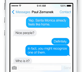
Can you read this exchange easily? Not “can you make it out when you squint and peer closely,” but can you read it easily?
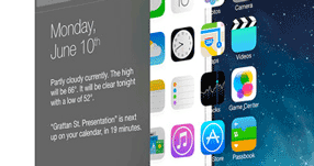
What’s on your calendar for June 10? (And what’s with that busy superior “th,” anyway? That’s 18th-century design, not 21st.) Can you read it when you see it at this angle?
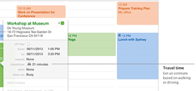
Ironically, Apple’s marketing typeface is much more readable than its iOS text face. The callouts in this example are clearer than the information in the Calendar panel.
[Images at left: top, part of a screenshot of a message from Siri in iOS7; below, the same words in a few different of typefaces, with looser spacing.]
Addendum (July 8):
Apparently the latest beta of iOS7 allows switching to Neue Helvetica Regular instead of Light for non-Retina displays. Gizmodo has a nice demo of the effect. (Thanks for pointing this out, Aaron Meek.) Alas, it’s clear when you see the font switching back and forth that somebody at Apple doesn’t understand how to track lighter typefaces so they’re readable. The lines of lighter type should be at least as long as the lines of heavier type, not shorter. Squeezed again!