function jdb_page_navigation()
sPageSlug = blog
sPageTitle = easily amused
header:139:aPageArgs:page_title = easily amused
header:140:aPageArgs:section_title =
functions-johndberry:262:aPageArgs:page_title = easily amused
functions-johndberry:298:sPageTitle = easily amused
functions-johndberry:359:sPageTitle = easilyamused

easilyamused |

Archive for 2018

TypeCon 2018 Portland

Published

At the beginning of August, I was in Portland, Oregon, for the 20th anniversary of TypeCon (which was also TypeCon XX, thanks to their having skipped 1999, the second year). As one of the few who attended the very first TypeCon, held in a crummy motel next to a business park in Westborough, Mass., I appreciated how the conference has grown and changed. It was founded by Bob Colby as a low-cost convention for type enthusiasts and appreciators; as it happened, many of the attendees of the first TypeCon turned out to be independent type designers, and that put a stamp on it for years to come.

As with any gathering of its kind, TypeCon for me is first and foremost an opportunity to see old friends and make new ones, and I did plenty of both in Portland. There were intriguing talks and presentations, and I managed to get to most of them on the first day, though more spottily after that. But the highlights for me tended to be things like sitting around one afternoon in the hotel lobby talking with Rod McDonald about Ed Cleary and old times in the type world. A nice mix of friends and new acquaintances was the TypeThursday lunch organized by Thomas Jockin, where those of us from various TT chapters got to meet up and chat for an hour or so.

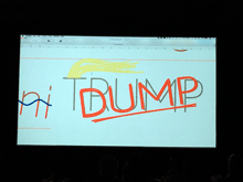
But there were also highlights among the official events. I particularly enjoyed Gemma O’Brien’s very hands-on keynote talk, and meeting her briefly later. Frida Medrano, who was given the SOTA Catalyst Award, impressed me with her cutting-edge knowledge of variable fonts. Rainer Erich Scheichelbauer did a live-action tapdance of OpenType Variations that was witty, entertaining, and eye-opening. Nina Stössinger delivered an excellent keynote talk (no surprise there!). The Sunday Type Crit, as usual, was a relaxed yet focused insight into the type designs of various volunteer designers, and into the minds of the very experienced critiquers. (I wouldn’t call them “judges” or a “jury,” as it wasn’t in any sense a competition; just helpful advice and suggestions.)
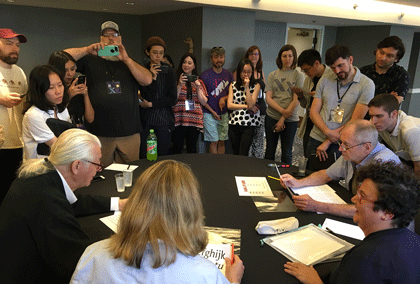
Type Crit

I had been skeptical about Matthew Wyne’s “Letters and Liquor: a Typographic History of Cocktails,” but he pulled off an entertaining slideshow, and afterward several of us cheerfully accompanied him to a local bar that served “barrel-aged Negronis,” a variation on my favorite cocktail that was new to me.

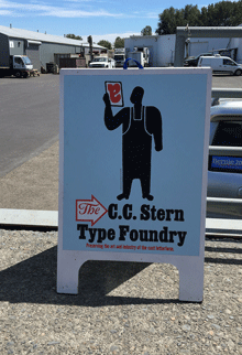
With Glenn Fleishman, I journeyed up to the northern edge of Portland to revisit the C.C. Stern Type Foundry, or as it’s calling itself now, the Museum of Metal Typography. I was welcomed by printers and typesetters I hadn’t seen since my previous visit, during the previous Portland TypeCon, and enjoyed the smells and sounds of metal type-founding (and the heat of a busy machine shop).
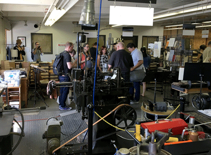
C.C. Stern Type Foundry

For North Americans (and visitors from overseas), TypeCon provides an annual place to get together and catch up with the typographic community. I must admit that I’m enjoying the current pattern, where TypeCon seems to return to the Pacific Northwest every couple of years. As has become habitual, though, the SOTA board had not decided on next year’s location yet when this year’s TypeCon ended. We’ll just have to wait and see.

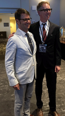
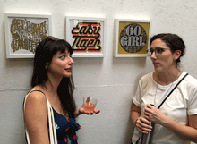
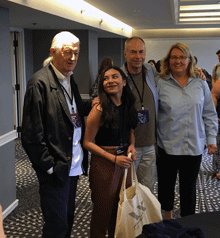
[Photos: (top, above) the Type Crit in action; a scene at the C.C. Stern Type Foundry; (left, top to bottom) (L–R) Matthew Carter, Frida Medrano, John Downer, Jill Pichotta after the Type Crit; (L–R) Jean François Porchez & Christopher Slye, looking spiffy; (L–R) Laura Serra & Erin McLaughlin at the closing party; the C.C. Stern Type Foundry sign; Rainer Erich Scheichelbauer’s live variable-fonts demonstration.]

Reading Le Guin

Published

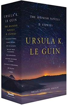
A few months back, I got the second two-volume set of Ursula K. Le Guin’s work in the Library of America, “The Hainish Novels and Stories.” (She is one of the very few writers to have their work published in the Library while still living.) Since then, I’ve been rereading these stories, or in a very few cases reading them for the first time. All of Le Guin’s fiction, even the earliest work, stands up to rereading; that’s one of the things I value about it. Her sensibility and her care for language have spoken to me from the moment I first encountered them, when I happened upon Rocannon’s World on the revolving wire paperback rack in a stationery store. (The book was an Ace Double, back-to-back with Avram Davidson’s The Kar-Chee Reign.)

As I read through this collection, I thought about how much the late Susan Wood would have appreciated it. First of all, Susan would have been delighted to see Le Guin’s work in the Library of America. Even more, though, I think she would have appreciated the later stories. Before Susan’s death in 1980, I can remember her lamenting that Le Guin had yet to write “the Hainish novel”: that is, a novel about the Hainish themselves, from their own perspective, not just about the many cultures that their ancestors had spawned. While Le Guin may not have written quite what Susan was anticipating, she did come back, after a gap of several years, to write a series of late stories that delved ever deeper into the culture and psychology of the Hainish and their interaction with the rest of humanity.

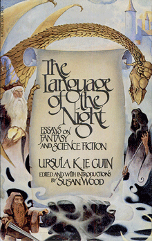
Susan and I both met Ursula at the same time, in August 1975, in Melbourne, where both Ursula and Susan were guests of honor at the first World Science Fiction Convention to be held in Australia. Later, Susan edited Le Guin’s first book of essays, The Language of the Night. Susan was a passionate scholar and an enthusiastic teacher. (At the University of British Columbia, and at earlier universities where she had taught, she created courses on science fiction and Canadian literature – both of which were looked on skeptically by the English department and both of which brought in large numbers of enthusiastic students.) Her introduction to Language of the Night was a major essay that she worked long and hard on, situating Le Guin’s writing and presenting it afresh to a thinking audience.

It’s entirely possible that, had Susan lived, she would have been the one to write the introduction to Le Guin’s Hainish novels and stories for the Library of America. I like to think so.

When I first started reading that volume, last winter, and started musing about how much Susan would have enjoyed it, I thought I ought to mention it to Ursula. She would appreciate it, I was sure. But I was slow to act; Ursula had been in poor health, and in January she died. I never managed to share that particular insight.

In June, I had the bittersweet pleasure of attending the celebration of Ursula’s life, in Portland, Oregon. It filled the magnificent Arlene Schnitzer Concert Hall, and after a star-studded program of appreciations, ended with a dragon parading up onto the stage and then out into the street. Her long-time home town certainly knew how to celebrate Ursula K. Le Guin.

Flexible typesetting

Published

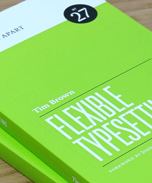
As soon as I saw the title of Tim Brown’s new book, Flexible typesetting, I knew it was on a subject that was close to my heart.

I spent more than thirty years perfecting the art and craft of text typography using digital tools, showing that if you knew what you were doing you could create every bit as fine a book page digitally as you could with metal type. (Not to mention exceeding the low standards of phototypesetting.) And I’ve spent more than a decade translating that craft into pages of fixed typography for the screen, trading concerns about ink and paper for the strictures of resolution and screen size.

Now we’re at the next stage. The challenge today, as I’ve pointed out more than once, is not fixed pages at all, but flexible ones. Tim Brown’s new book focuses clearly and tightly on how to meet that challenge.

Instead of talking about pre-set margins and fixed point sizes, Brown speaks of ideas like pressure, tempo, and focus, creating what he calls “a pattern language of typesetting pressures.” His approach to typesetting for the screen deals with variables rather than fixed values, and he gives a finely detailed look at how to set those variables and how to think about them. Much of the book deals with those details, but his main point is to make people aware of the problems and of the tools we currently have (or will have soon) to solve them. It is, first and foremost, an introduction to how to think about flexible typesetting.

One of the tools that Brown presents us with is the modular scale, which is a concept that takes a little while to get used to. It’s a set of numbers that you can use in setting the sizes of both type and other elements of a design. Obviously, if the design is to be flexible, those sizes can only be starting points; but you can use the modular scale to set the rate at which sizes grow or shrink as conditions change. This scale-based system is designed to make the variables all feel naturally related. Brown offers several different modular scales, for different kinds of projects.

This book is full of very specific recommendations and explanations, with links to useful tools created by himself and other web designers; it will be a very pragmatic guide to anyone sitting down to practice flexible typesetting in a hands-on environment. It’s also an eloquent plea for developing better and more finely tuned tools for the future.

Tim Brown’s conclusion: “Typography is ours to shape.”

[Flexible typesetting, by Tim Brown. A Book Apart no. 27. Copyright 2018 by Tim Brown. New York: A Book Apart, 2018.]

Sam Hamill

Published

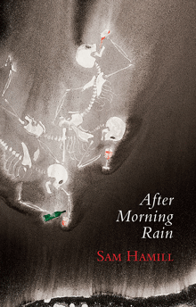
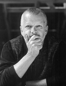
Sam Hamill would have turned 75 on May 9. He had planned to celebrate his birthday with a publication party for his final book, After Morning Rain, on May 15, but in the end he realized that his health wasn’t going to last long enough to do it. Sam died a month before the planned event. It went ahead, however, on a more informal basis, as a remembrance and celebration of Sam and a welcome for his last book.

I’m now reading that book. I’ve been reading it slowly, parceling out the poems, making it last. It’s filled with little gems, of feeling, observation, appreciation, lament – the distilled sensibility of a poet at the end of his life. Sam always felt that he was in conversation with the great poets of the past, especially those of ancient China and Japan; some of the poems in After Morning Rain explicitly echo that:

Coming to It

A midnight cup of sake,
a strange solitude.
Is this all I’ve become?

Old and alone, bending
over a poem
written in loneliness
by some old Chinese
bag o’ bones
more than a thousand years ago.

The book is a small, beautiful volume, designed by and with a cover painting by Ian Boyden.

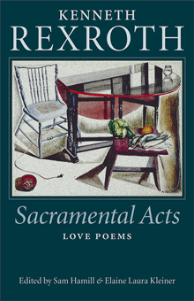
Sam was an evocative, insightful, lyrical poet, like his mentor Kenneth Rexroth. He was also, like Rexroth, a world-class curmudgeon. There’s bitterness, but also love, in Sam’s last poems. He transcended his own life through his work and his art.

Sam was an exacting and generous editor, and that’s where his greatest influence may lie. He co-founded Copper Canyon Press and was editor there for nearly thirty years, bringing innumerable books of fine poetry by greats and unknowns into print in the United States. That has been an important part of our cultural life.

I’m not sure when I first met Sam, but I came to know him when Loren MacGregor and I were publishing the short-lived Pacific Northwest Review of Books in 1977 & 1978. Sam was enormously helpful and encouraging to us in our efforts. I well remember the interview with Sam and his then-partner Tree Swenson that was conducted and submitted to us by a new writer; when we showed Sam the draft, he exclaimed grumpily, “I speak in paragraphs, dammit!” and insisted on correcting it – to the great benefit of our readers.

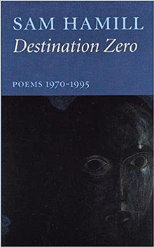
I’ve had the pleasure of designing several of Sam’s books, beginning with Passport, a collaboration with the artist Galen Garwood, which was published by Broken Moon Press in 1989. I’ve designed books of essays by Sam (Basho’s Ghost, A Poet’s Work) and poetry (Destination Zero). I always tried to give his work the typographical clothing that it deserved.

In 1993, I got a call from Sam, out of the blue. “Would you like to help me design a book?” He and Tree had just split up, and she had been the designer of Copper Canyon’s books. That early casual-sounding request led to my designing all of Copper Canyon’s books and collateral for the next five years (and several more at various times after that). As I said at the time, I was trying to live up to the standards that Tree had set, making each book recognizably a Copper Canyon book while letting each one take its own form and shape. And I was trying to maintain Sam’s vision with each book, often working with paintings that he had chosen for the covers. I like to think I succeeded reasonably well. I felt that those were books that would be worth reading a hundred years from now.

Ars longa, vita brevis.

[Images, top to bottom: After Morning Rain, designed by Ian Boyden; Sam Hamill; Destination Zero, designed by John D. Berry; Sacramental Acts, Kenneth Rexroth, designed by John D. Berry.]