![]()
Writing on type and design
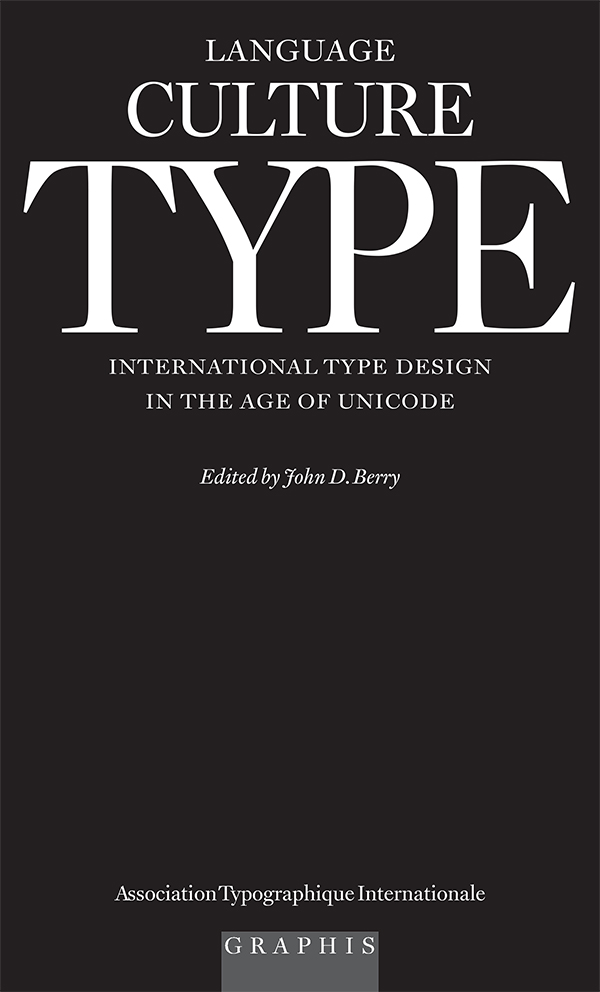
Language Culture Type, edited and designed by John D. Berry
Preface: Language culture type
Written communication around the world is accomplished almost entirely with type – not just in the traditional form of typography in books, magazines, and printed ephemera (advertisements, flyers, posters, tickets, labels, and so on) but on television and movie screens, in many kinds of public signage and wayfinding, and in all the myriad ways in which we now use digital fonts. The number of people who design type is small – a few hundred, perhaps – but the number who use it has become vast. Type matters.
Despite the dominance of English in the world today, and especially its preponderance on the Internet, only a portion of that global communication is done in English, or even in the Latin alphabet. The distribution of languages around the world is uneven, and any attempt to map them must of necessity lie, through oversimplification. People speak more than one language, whether well or badly; people move around, and learn or forget; people play with their language, making jargon and inventing new terms; people hear new words on television or radio, or in the local marketplace, and adapt them to their own use. Almost all the languages in the world today can be written, even those that were once purely oral; and once a language is written, there develops a constant back and forth between its written forms and its spoken forms, each influencing the other. In order to communicate in our many tongues, we need type.
The number of writing systems in the world is large, although a few have become especially widespread: the Latin alphabet, the Cyrillic, the Arabic; the Chinese ideographic system; Japanese syllabic writing; Devanagari and its relatives in India. Some scripts, such as the Hebrew and Greek alphabets, have a high profile even though the number of people speaking their languages is relatively small. Other writing systems are used by multitudes, but are not widely known outside their native areas.
All of these writing systems started out as handwriting, but today they are all reproduced – and widely read – as type. Now that we can send digital text to each other, we find ourselves up against a technological problem: how to make sure that the text we send can be read correctly when it is printed on paper, or when it appears on someone else’s computer screen. Anyone who has tried to use accented characters in an e-mail message knows how uncertain this can be.
The year 2001 was declared, by the United Nations, the ‘Year of Dialogue among Civilizations.’ The events of 2001 made it clear just how important that dialogue can be, and how much we suffer if it’s neglected or misunderstood. As part of this Year of Dialogue, the Association Typographique Internationale (ATypI) sponsored an international competition for the best type designs of the previous five years – in all alphabets and writing systems, used in any language, from anywhere in the world. The competition was organized in New York and Moscow, an office was set up in Moscow, and the whole project was given the somewhat playful name bukva:raz! (‘letter:one!’ in Russian). The judging was done in December 2001 by an international jury of distinguished typographers and type designers, who chose the 100 best type designs out of those submitted. The winning designs are shown in this book, along with information on the typefaces and their designers. To put them in context and provide some depth of information about a few of the different scripts shown here, we asked type experts from around the world to write essays on several different writing systems and the problems of designing type for them.
The voices heard in these essays are diverse and individual. This is not a definitive ‘official’ overview. In the spirit of the book’s ecumenical nature, we have made no attempt to homogenize them into a single style, and we have followed the authors’ preferences in using either American or British spelling conventions. (For clarity, though, we have adopted a consistent style of punctuation.) Although considerable thought has been given over the years to coming up with agreed-upon definitions for typographic terms like ‘character,’ ‘glyph,’ ‘letter,’ and so on, we have left it up to each writer to decide how to use them. The purpose of this looseness is not to create cacophony, but to allow each voice to be heard in its own cadences and accents.
The proportion of Latin and non-Latin typefaces among the bukva:raz! winners is not a reflection of the distribution of scripts or typefaces in the world. It is simply a reflection of the typefaces that were entered – and, among those, of which ones the jury chose. Not surprisingly, in an information world currently dominated by Western European languages, there were more Latin typefaces than any other kind. But such things are fluid; in another year, the mix might change. Language Culture Type is a benchmark of where we stand today in both the craft and the technology of making typefaces for use in global communication.
[Copyright 2002 Association Typographique Internationale. Originally published in Language culture type: international type design in the age of Unicode, edited by John D. Berry (New York: ATypI and Graphis, 2002).]