

How I became a phototypesetter.
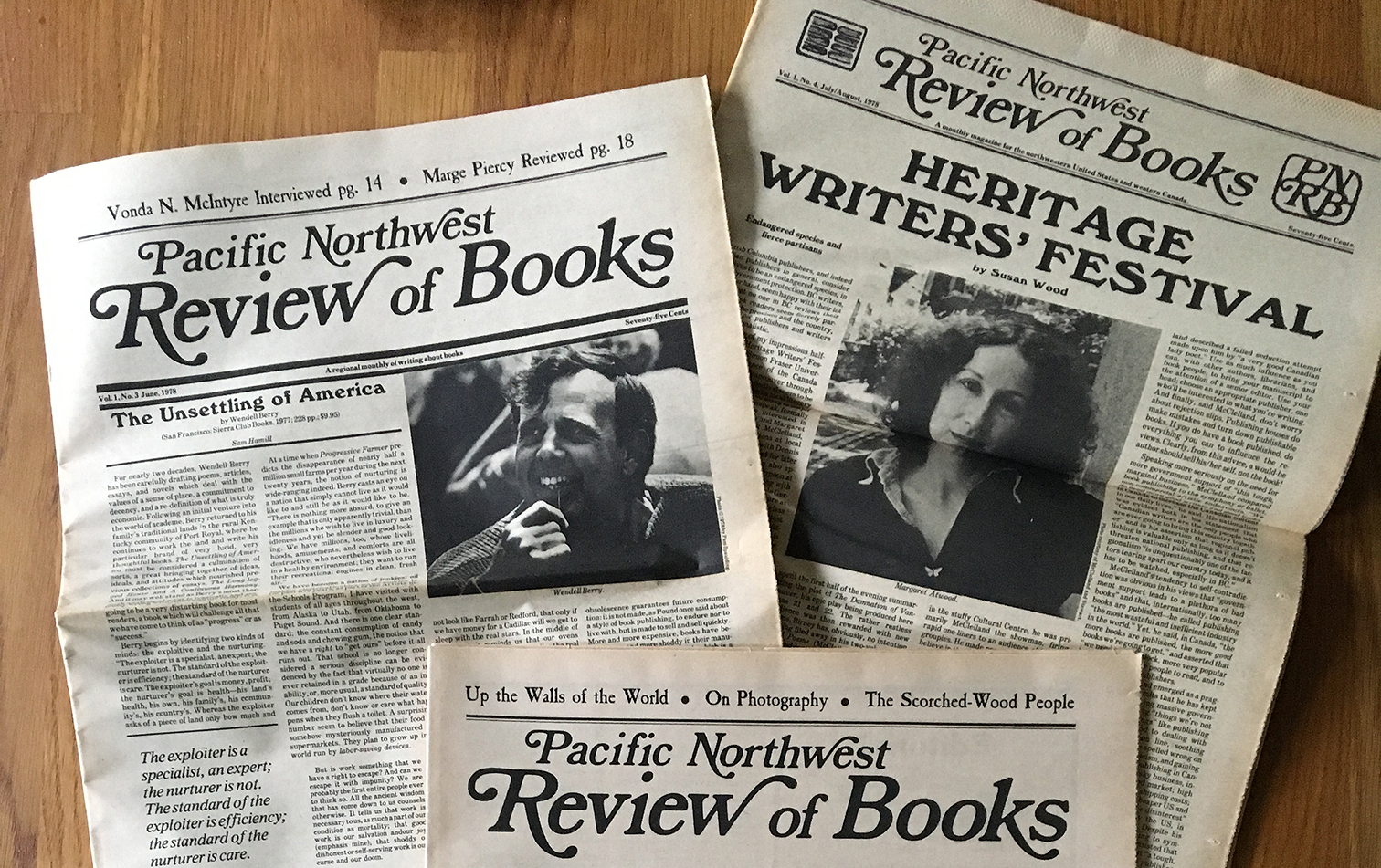
In 1977, my friend Loren MacGregor and I founded the Pacific Northwest Review of Books, a monthly tabloid magazine about books from the Pacific Northwest and western Canada. We started it because we wanted to read it, and nobody else was doing it. Although PNRB lasted less than a year, it led directly to what became my career in typography.
When we took the copy for the debut issue of PNRB to a printshop in our neighborhood to get the typesetting done, we discovered that they were hiring. The woman who typeset most of our first issue was about to leave, and they needed someone to replace her. No training necessary, at least if you were a good typist. I was. That’s how I ended up becoming a phototypesetter at Franklin Press.
:: :: ::
When I began my non-apprenticeship, Franklin Press was in transition.
Jim Behrend, the proprietor, was an American who had been born and raised in Germany, and who had gone through an apprenticeship as a compositor in Switzerland. For years, after he moved to Seattle, he worked as a Linotype operator for the Seattle Times. When that daily newspaper made its own transition, from hot-metal typesetting to photo-based cold type, management offered a buy-out option to its unionized typesetters: take a nice lump-sum payment and retire. For Jim, that lump sum became the nest egg that financed his start-up of an independent printshop, which he dubbed Franklin Press. (He had also read the fine print of the buy-out agreement: it didn’t actually prohibit him from continuing to set type for the Times, it just lost him all seniority and benefits. So he could make some extra money by essentially freelancing at the Times while he was getting his business up and running.)
The first phototypesetting machine I began learning on was a Mergenthaler, but almost before I had learned the basics, Jim decided to switch his shop’s typesetting equipment to Compugraphic, Mergenthaler’s cheaper competitor. So I first really got started setting phototype on what we dubbed a “Comp I” (CompuWriter Junior, I believe is what Compugraphic’s marketing department actually called it). It was a simple machine for setting text: a big blue box with a keyboard and a single, short, one-line display, which showed glowing letters as you typed on the keys. What you saw had nothing to do with what you’d get when the type was set; it showed only the actual characters you were typing, as generic letterforms, like what you might see on a moving electronic tickertape display. The parameters of typeface, size, leading, and column width were programmed in by the operator, but you only saw the result when you took the resulting canister of exposed RC paper and ran it through the developer, to create typeset galleys that could then be dried, waxed, and pasted down on the layout board.
The display on one of these Compugraphic machines wasn’t long enough to show an entire line, even when you were typesetting narrow columns of newspaper text (which was a common job at Franklin Press). And each time what you were typing reached the end of a line, the machine set that line of type. The line was not stored in memory; it was immediately exposed onto the photo-sensitive paper, and the display went on to the next line. So there was room for a lot of error.
The Comp I held only one typeface, in one size, on a single long filmstrip that wrapped around a large wheel inside the machine. The wheel rotated very fast, and type was set by light passing through the filmstrip at the appropriate moment while the letter you had typed was passing by the light source. (Other phototypesetting systems used disks or rectangular plates to hold the negative images of the actual font, but the principle was the same: light shining through the negative produced a positive image on photographic paper.)
The Comp I was adequate for typesetting long galleys of narrow columns for newspapers, and many of Franklin Press’s regular customers were exactly that: weekly newspapers for local colleges and universities, monthly tabloids for political or arts organizations, and all sorts of newsletters and brochures that were mostly text-based. (The headlines would be set separately, on a dedicated “headliner,” and then pasted down on the layout boards.) But Jim soon supplemented these simple machines with a more sophisticated CompuWriter IV, which could hold a four-font filmstrip and, crucially, had a series of lenses by which you could typeset a range of different point sizes from the same photographic image. The display, however, was still a single line, and the type would be exposed as soon as you reached the maximum width of the column, so a certain amount of foresight was needed as you typed in the text. The Comp IV had a “discretionary hyphen” key, below and to the right of the main keyboard, which would insert an invisible character that would only turn into an actual hyphen if it fell at the end of the line. The little finger of my right hand got quite strong, from hitting the discretionary-hyphen key repeatedly as each line that I was typing got closer and closer to its end.
The other transition for Franklin Press, just after I started, was a physical move. The press had been located for several years in an old house on Capitol Hill, the neighborhood that I lived in. But just a month or so after I started, Jim moved the business downtown, to a storefront in Pioneer Square, the old heart of the city. Instead of strolling easily to work, I had to take a bus downtown, then transfer to another one to get through downtown to Pioneer Square.
The ground floor of the old house on Capitol Hill was rented out, soon after, to a collective start-up business: the Cause Célèbre Café, which offered espresso and hand-made ice cream in a classic bohemian coffeehouse atmosphere. I pointed out to the owners that I had learned my first lessons in typesetting in what became the coffeehouse’s kitchen.
[Copyright 2020. Originally published in Medium.]
[Images: (top) Franklin Press letterhead, featuring Benjamin Franklin’s signature as a logo; (bottom) Before & after: the old house at 324 15th Avenue East, on Capitol Hill in Seattle, where Franklin Press was located when I first went to work there.]