
The world of alternative publishing in pre-digital Seattle
74 South Washington
When the Franklin Press moved to South Washington Street, the space had two storeys; the ground floor housed the front desk, a stat camera and darkroom, light-tables for paste-up, and the printing press; the Compugraphic typesetting machines were installed upstairs, in a low-ceilinged room that was essentially a mezzanine installed in the original tall ground floor of that 19th-century building.
The typesetting room tended to get hot. In the wintertime, this was a plus, but in the summer, we threw wide the windows and got all the air we could. We were right next to the waterfront, and in those days the ferries to Alaska still left from Seattle. (Some years later the southern terminus of the Alaska Marine Highway system relocated north to Bellingham.) The ferry dock was literally at the foot of our street, and on a Friday afternoon in summer, with the windows thrown open, I could hear the boarding announcements for that week’s ferry. I found myself fantasizing that I could just get up, go downstairs, walk down the street, buy a ticket, and board the ferry to Alaska. But I never did.
More practically, I wished that I could somehow just pick up my typesetting machine and take it with me on the ferry across Puget Sound. The Washington State ferries to Bainbridge Island and Bremerton left from the Colman Dock, just a few blocks up the waterfront, and in those days you could buy a ticket and stay on the ferry when it reached the other side. I could have gone back and forth all day, doing my job while crossing and re-crossing the inland sea. Today, of course, I could do exactly that, since my typesetting equipment would be nothing larger than a laptop. Except that you can’t stay on the ferry indefinitely anymore; you’re required to disembark at the end of each crossing.
The sort of things I would typeset in a typical day ranged from large and small display ads to the tally of bird sightings for each issue of the Audobon Society’s newsletter. I remember typesetting an issue of La Voz, an English-language Mexican-American tabloid, when Gabriel García Márquez won the Nobel Prize for Literature. I realized that what I was typesetting was García Márquez’s speech, in Spanish: but it was a rather awkward translation back into Spanish from the English translation. Although my Spanish was rudimentary, I knew enough to know that this made no sense. Happily, when I took it to the editor and pointed out it out, he agreed that they should get the Spanish-language original.
With most of our customers, we assiduously followed whatever text they gave us. But occasionally we made an exception. For the tabloid paper of Local 49 of the Alaska Cannery Workers union, which was edited and written largely by Filipino-American cannery workers who were great labor reformers but not very good writers, I would unobtrusively correct the occasional poorly constructed sentence. I figured they deserved to communicate their ideas as clearly as possible, and nobody ever objected.
Editing a labor paper wasn’t always a safe job. Two of the leaders of Local 49, Silme Domingo and Gene Viernes, whom I had known as they came in to paste up the galleys that we typeset, were gunned down in the union offices, a few blocks away, by thugs in the pay of the Marcos government in the Philippines.
Less fraught jobs included typesetting books for local presses like Madrona Publishers. I discovered the wonderful writer Angelo Pellegrini when I got to typeset the text of his book Lean Years, Happy Years, a reminiscence of his arrival in the United States and his journey from impoverished immigrant in a logging town to renowned professor of English at the University of Washington. His love was food, and the book wove many a recipe into the text. Some of them I still use to this day.
Madrona published quite a few cookbooks, but our typesetting fonts weren’t always adequate for the job. On those Compugraphic typeseters, you had to install a special version of the font filmstrip if you wanted exotic glyphs like accents and other diacritical marks. It frustrated me enormously to typeset a recipe that called, repeatedly, for sautéing ingredients, with no acute accent on the ‘e’ of sauté.
Across South Washington Street from the press was the office of the Weekly (later the Seattle Weekly), which I thought of as Seattle’s upscale alternative paper. The Weekly, founded by David Brewster, had a sense of style and literate writers, but I remember reading an early review of a very expensive restaurant in Vancouver, B.C., and thinking, “This is no longer aimed at me and my friends.” (It was the expensive part, not the out-of-town part, that triggered this reaction.) The Weekly even started its own book-review supplement, the Weekly’s Reader, though without the fiercely local focus that we had championed at the Pacific Northwest Review of Books. I remember being somewhat miffed that they would do this, in competition with us, though in fact I got on well with the editor and we tried to complement each other rather than compete. And I know which ended up having the more practical business model. (It wasn’t us.)
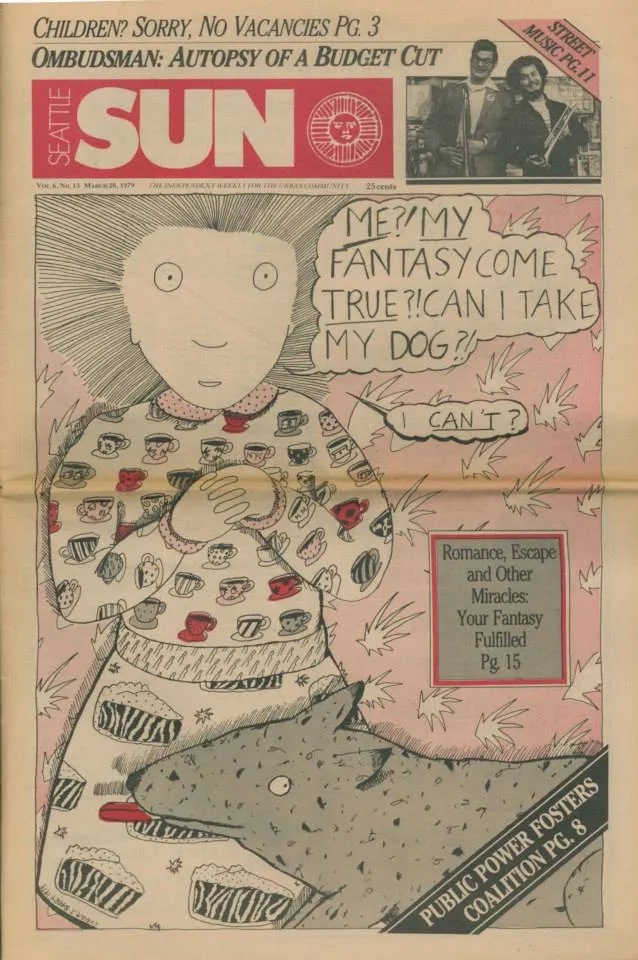
The Seattle Sun
The livelier, scruffier, more radical and subversive weekly paper in Seattle was The Seattle Sun. The Sun’s offices had been upstairs from Franklin Press in the old house on Capitol Hill, and the paper would get typeset in the evening, after business hours, on the same machines we used during the day — an arrangement that continued after the press moved from downstairs to downtown. It wasn’t long before I ended up working evenings for the Sun after putting in days on my regular job at the press.
One of the things I regularly typeset for the Sun was the classified ads, each of which started off with a few words in bold. Happily, the filmstrip fonts for even the Comp I could contain two versions of the typeface (regular & bold, or regular & italic), so we could set those ads continuously with little trouble. At one point, I was talking to someone who had typeset the classifieds in the very early days of the Seattle Sun, when they were using more primitive equipment — an IBM Composer, I believe — which could hold only one font at a time. So they had to physically stop and change the font every single time there was a switch from regular to bold. I could barely imagine how tedious that must have been.
I also set the entertainment listings, including all the club dates. Although I rarely went to hear any of the bands, it got to the point where I knew exactly how to spell the name of every performer who regularly showed up in town, and all the venues. It made me feel like a vicarious expert in the musical life of Seattle.
In those pre-internet days, it seemed that any weekly newspaper could satisfy its readers and make itself indispensible by publishing two things reliably and accurately: classified ads and entertainment listings. These were the lifeblood of local information dispersion. Anything else was lagniappe. (Really. The advertisers didn’t care what the editorial content of the paper was. It could be anything, as long as it didn’t actively discourage readership. Most weekly tabloids had banal, boilerplate content, but the same revenue streams could support a radical weekly or an intellectual one. Or both in one publication.)
The longtime art director of the Seattle Sun was Bob Newman. He was a very talented editorial designer, but every so often he’d get bored with the paper’s design and feel the need to redesign it. This made the Sun interesting, though it also made it confusing for some of the readers. One of his best redesigns was one that mimicked the then-current look of the Village Voice. Unfortunately, the Sun couldn’t live up that promise; it had a much smaller staff and a much smaller budget, just enough for one good investigative-reporting article every three or four weeks. I thought that the disconnect between the way the paper was presenting itself visually and the skimpiness of its content caused a certain amount of disappointment among its readers. That taught me a good lesson about making the visual package reflect the contents honestly; if it doesn’t, the readers won’t come back.
Working late on Monday nights getting the Sun ready for the printer could be exciting, as last-minute articles came in and the layouts took shape on the brightly lit paste-up tables. The smell of hot wax and late-night beer and pizza filled the shop. Sometimes we’d be there, typesetting the final corrections, so late that the buses had stopped running, and someone with a car would have to give us a lift home. Occasionally I’d go with the art director as we drove the finished paste-up boards to the printer, which was in the town of Snohomish, half an hour north of Seattle. (Well, maybe less at two o’clock in the morning.) It was always gratifying to see the printed papers hit the streets each Wednesday.
Bob Newman was one of the founders of The Rocket, which began as a monthly music supplement to the Sun and went on to become an independent publication at the heart of the Seattle music scene. In the end, it outlasted the Sun by several years.
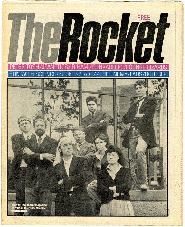
The Rocket drew on a very large proportion of Seattle’s magazine-design talent; eventually, quite a few of them, including Jesse Reyes, Helene Silverman, and Mark Michaelson, moved to New York City, where they became a sort of “Seattle mafia” in the editorial-design world of the metropolis. Bob Newman eventually did become the art director of The Village Voice (twice!) as well as president of the Society of Publication Designers, the top organization for magazine design in the United States.
The Rocket eventually got its own office, in the low-rent Belltown neighborhood north of the Pike Place Market, and its own Compugraphic EditWriter. The long-time typesetter and manager of Rocket Type was John Carl, who had worked at Franklin Press and whom I knew originally from the local science-fiction community. John had a particularly symbiotic relationship with Art Chantry, the talented and difficult designer who had revolutionized Seattle’s poster scene and went through more than one stint as The Rocket’s art director. By Art’s account, he could give layouts to John and know that he’d get back just what he intended — a perfectly symbiotic working relationship.
I actually ended up managing Rocket Type myself, briefly. It was just for a month or so, while John Carl had to be out of town. By coincidence, it was the same month that Steve Murray asked me to be a temporary caretaker of his independent type shop, so I found myself managing two typesetting businesses at once. (Steve was a book publisher and translator with his own excellent small publishing company, Fjord Press. He operated a typesetting job shop, called Accent & Alphabet, on the side. As you can guess from the name, he didn’t have any trouble setting diacritical marks! What he wanted me to do was keep the shop running while he was away. Steve’s business was a more difficult fit for me, as he was using Mergenthaler typesetting equipment rather than Compugraphic, and I wasn’t familiar with it. Although Steve showed me how everything worked before he left, I had a terrible time trying to get any typesetting done on an unfamiliar system, and I didn’t manage to complete much business for him during his absence.) Since I was supposed to be in charge of two typesetting businesses at once, I would spend the afternoon at the Rocket office, in Belltown, then catch a bus through downtown to Pioneer Square to spend the evening trying to make sense of Steve’s shop. It was not a very satisfactory situation.
[Copyright 2023. Originally published in Medium.]