I would like to direct your attention to a typographic element that is often ignored. Allow me to point out what makes it unique.
That element? The manicule. It’s also known as a fist, a hand, and by many other names, but it always takes the same basic form: a small image of a human hand, with the index finger pointing (usually to the right). Manicules date back to at least the Middle Ages, when it was quite common for readers to annotate their books, drawing a little hand in the margin to point out a particularly important or noteworthy passage. (“Manicule” comes from the Latin word for “little hand.”) Today they’re more likely to be part of a font, and to be used typographically, whether very large in a supermarket ad or at small size as an indicator of importance in a system of typographic hierarchy. They are often given a bright color to make them stand out. (Red is the traditional second color.)
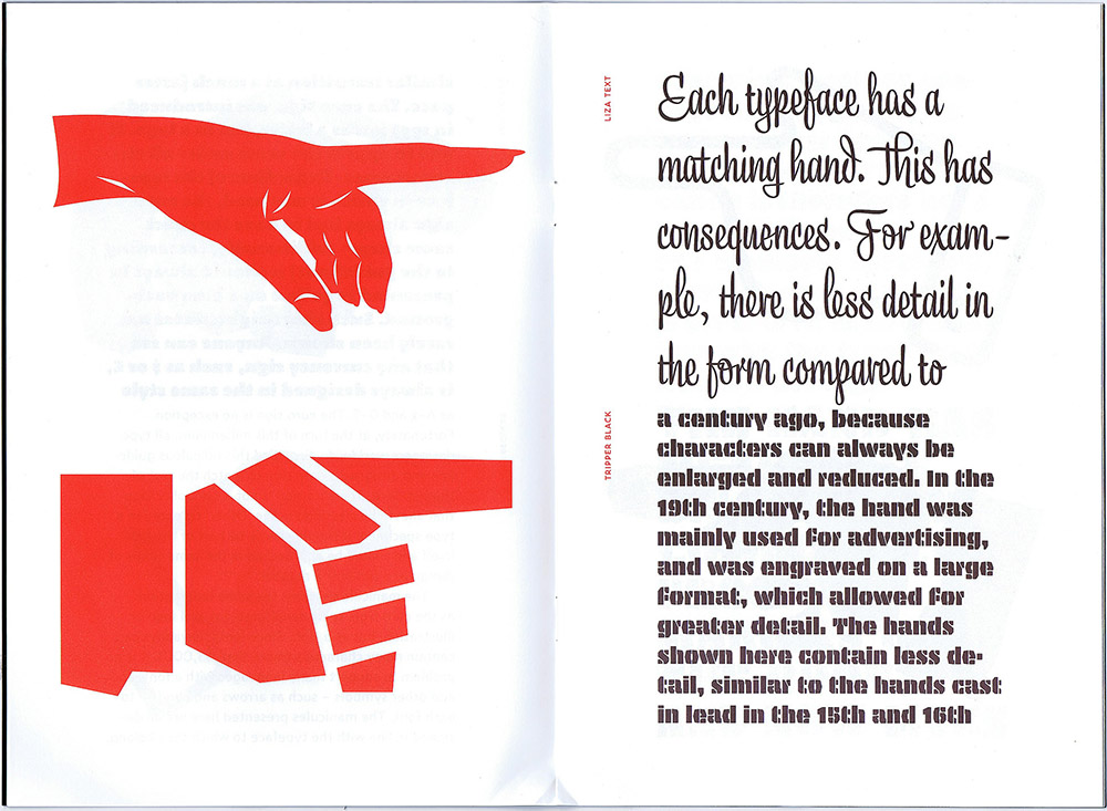
Manicules can take the style of the font they’re in, just like ampersands or currency symbols. And now, the Dutch/Finnish type studio Underware, whose typefaces range from one of my favorite book faces, Dolly, to the truly bonkers stencil typeface Plakato, has issued a small booklet they call a “Manicule specimen,” demonstrating their versatility at imagining new forms of manicules for every occasion.
This little limited-edition book has a short text running through it, changing typeface twice per page, facing enlarged manicules in the same typeface, two per page. It’s a tour-de-force in its own highly specific way. And it serves to remind us that we have manicules at our fingertips, in many digital fonts, and that sometimes it’s appropriate to use them.
[Image: page spread from Underware’s Manicule specimen.]
[Originally published on February 8, 2022, in PPN Post and Updates, the newsletter of the Publishing Professionals Network.]

