One of my favorite book typefaces is finally available as an OpenType font. (More precisely, it’s available as a family of OpenType fonts.) Dolly, designed by the Dutch/Finnish “pan-European design collective” Underware, was released in 2001 as a set of four PostScript fonts: roman, italic, small caps, and bold. It was intended from the first as “a book typeface with flourishes,” as the Underware website has it. I used the original version of Dolly as the text face for Stable Strategies and Others, the first short-story collection by my partner Eileen Gunn (Tachyon Publications, 2004), and I have used it in other books since.

But I’ve been hesitant to use it in recent years, simply because I’ve grown accustomed to only using OpenType fonts that incorporate advanced typographic features like small caps, old-style figures, ligatures, and alternate characters in the same font as the standard character set. With an OpenType font like that, you can apply those features within InDesign without altering the flow of the text; that is, the characters in the original text string remain exactly as they were, so reusing or repurposing the text is easy and almost seamless. (I say “almost” because I usually massage the text in a book by forcing line breaks here and there for better readability; if that text is going to be exported or copied for further use, those breaks need to be taken out. Similarly, I often insert a hair space between, say, an italic exclamation point and a roman close-quote, rather than using kerning to fix the spacing; but that might not be useful if the text is being exported for use in an e-book.)
Last spring, Underware finally upgraded their entire type library to OpenType, taking the opportunity to add new ligatures and alternate glyphs, alternate figures, and much wider multilingual Latin-script support to Dolly and many other of their type families. Of course, since no type designer can resist fiddling with the design when given the chance, Dolly has a lot of improvements to individual characters, most of them very slight but still adding up to enough difference that you couldn’t simply apply Dolly Pro to a passage typeset in Dolly and expect not to see some text reflow. But that’s often true of font upgrades; and the original Dolly fonts are still on my system and available if I need them.
Meanwhile, I’ve already used the new Dolly Pro in a book: a self-published memoir by my nephew Mark L Berry, a commercial-airline pilot and the other writer in the family. The book, 17,360 Feet: My Personal Hole in the Sky, is available now as an e-book (not designed by me) and a printed book from Amazon.
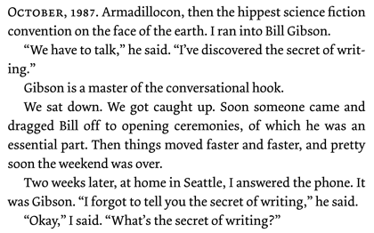
Dolly roman is a low-contrast old-style that appears comfortingly traditional at text sizes, although if you look at it closely you realize that it has some very odd angles and curves in the details of the letters; it’s a sort of rounded roman, with asymmetrical serifs and no real straight lines, despite its upright and sturdy demeanor. The italic is downright sinuous, although based on easily recognizable italic forms. There have been a number of type designs since 2001 that echoed Dolly’s characteristics, but none that has surpassed it for sheer usefulness.
[Images: logo from the Underware website page about Dolly Pro (above left); an example of text in Dolly, from Stable Strategies and Others (above).]
