A few months ago, the Font Bureau published a small book about the type designs of David Berlow. The typefaces shown in this specimen-style booklet are only a subset of the larger Font Bureau type library, but it’s remarkable to realize just how many of those typefaces are Berlow’s work. Seeing them all in one place like this is eye-opening.

David Berlow has always been a consummate type designer, crafting new faces and new versions of old faces for any number of specific, practical uses. He may have done a few designs just for the hell of it, but it’s obvious that the great majority of these typefaces were created for a purpose, often for a particular client. (Many of them first appeared as proprietary designs for publications, later released to the general font-buying public.)

When Berlow and Roger Black founded the Font Bureau in 1989, it was aimed squarely at the realm of editorial design. In the nearly twenty years since then, anyone reading a random sample of U.S. publications has probably spent a good deal of their time reading typefaces designed by David Berlow. He has designed subtly varied series for newspaper production, exuberantly expansive families for headline and display use, and carefully honed text faces that – if they’re deployed well – never call attention to themselves in a page of text.
He has worked with a wide variety of collaborators, and navigated the shoals of changing technologies. Anyone who has heard David speak at a design conference knows that he’s funny, quirky, and opinionated. He’s also prolific: according to this booklet, the Font Bureau has developed “more than 300 new and revised type designs” in the past nineteen years, and a large percentage of them have been partly or wholly David Berlow’s work.
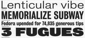
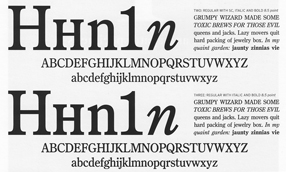
[Images | Above left: detail from the title page of the Berlow type-specimen book. Top: detail from a type-specimen page for Bureau Grot, the expanded family originally called Bureau Grotesque. Bottom: two of the five “grades” of the newspaper text face Bureau Roman.]
