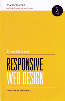
For the past couple of days I’ve been devouring Ethan Marcotte’s new book, Responsive Web Design. It’s the fourth in the series of “brief books for people who make websites” published by A Book Apart (an outgrowth of A List Apart). Each one focuses on a specific subject, and is written in a direct, conversational manner with a hands-on approach for web designers.
“Responsive web design” is Marcotte’s term for what I first heard referred to as “adaptive layout” by Microsoft’s Geraldine Wade (now Banes) when she was working on the original New York Times Reader. I usually just call it “flexible layout.” (As the Times Reader app suggests, it’s not only applicable to web pages.) The essential idea is visual design that adapts itself intelligently to the size, orientation, and resolution of the digital “page” it’s displayed on. This can be done well or badly, of course, but first you’ve got to understand the importance of doing it at all.
Marcotte is cogent and persuasive about that. And he shows you exactly how to do it, step by step, even though this is not strictly speaking a “how to” book. More important, he shows you why to do it. His last chapter suggests a reversal of the notion of “graceful degradation” in onscreen design: instead of making a complex design for a big monitor and the latest, most capable software, and then figuring out how it should deal with smaller sizes or less capable systems, he suggests starting by designing a simple, uncomplicated basic design that will work on the tiniest mobile device (“mobile first”), then adding features as (and if) they seem useful in a more expansive environment. Both approaches are adaptable and responsive, but this one seems cleaner and more elegant.
Now the area that interests me most is text typography, which Marcotte doesn’t go into in any great detail. But this just means that there’s more to be learned and invented in this area.
I’m a fan of small, handy, precisely targeted books, and the Book Apart series is just that. These books are consistently designed (by Jason Santa Maria), readable, and easily portable (despite somewhat heavy coated paper). There are a few bits of sloppiness; the proofreader could have caught the glitches in the hyphenation algorithm that produced “wides-creen” and “in-teract” as word breaks, and a copyeditor might have questioned the author’s frequent use of “to better [do this]” or “to better [do that],” but these are quibbles. Responsive Web Design and its predecessors in this series are useful, well-done tools in their own right.

