
Type90 was by far the largest ATypI event up to that time; indeed, it could properly be called a conference rather than a congress. Inspired by and organized by chairman Roger Black, with the heroic organizational abilities of conference manager Carol Wahler, it took place over several days in the heart of Oxford.
Type90 had a predecessor: Type 1987, also organized by Roger Black and managed by Carol Wahler, in New York City. That was not an ATypI event but rather a conference of the Type Directors Club, of which Carol Wahler was the Executive Director. Confusingly, there was an ATypI congress held in NYC that same year, but it was separate and much smaller.
In retrospect, Roger called Type90 “the Woodstock of ATypI.” It was more like a convention or a festival than a “congress.” Long-time member Jost Hochuli said afterward that this was when “ATypI became American,” and he resigned: “It was no longer the ATypI I had known in 1974.” For both those who were delighted by it and those who were taken aback, it was a watershed moment.
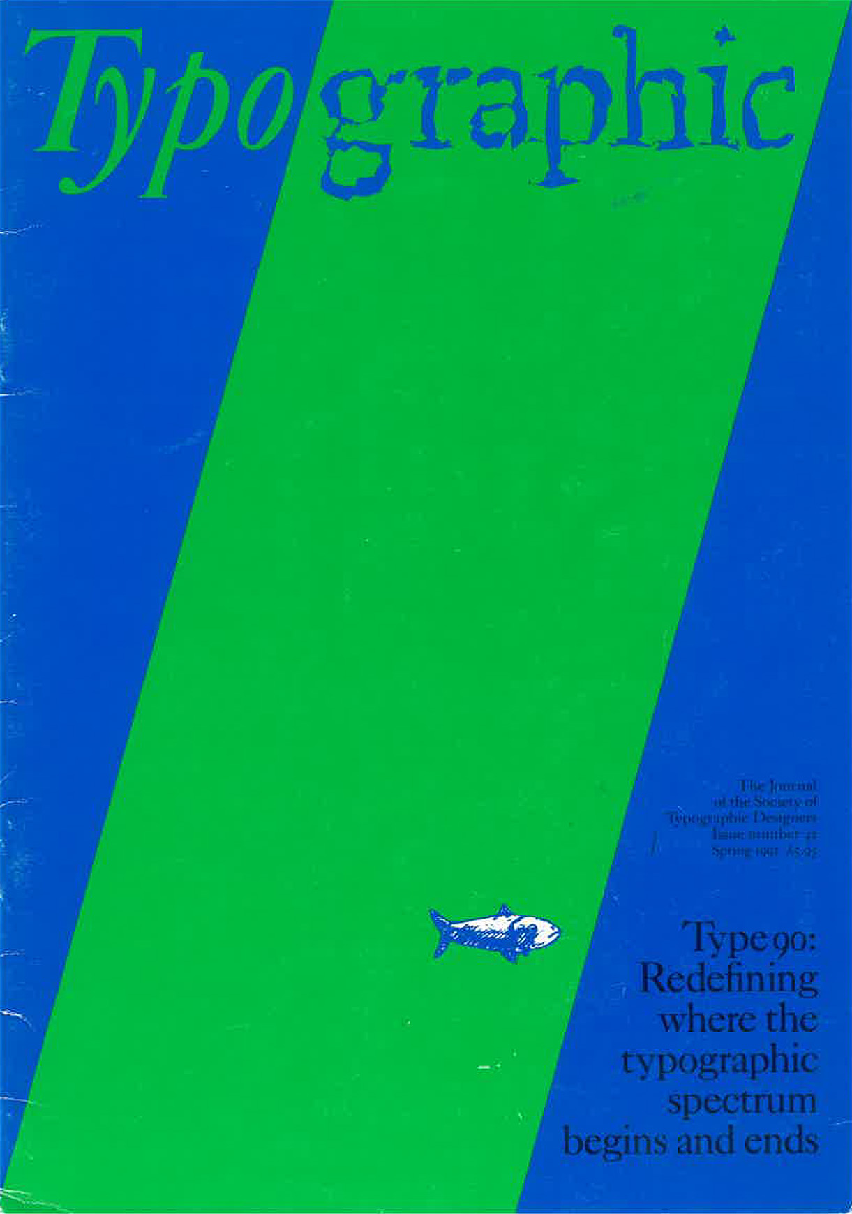
“If proof were needed that typography covers an ever expanding spectrum, Type90 provided the evidence,” wrote Mike Barden, editor of the Society of Typographic Designers’ periodical TypoGraphic, in a post-conference report. The cover of that issue (no. 42, Spring 1991) neatly represents the conflicting or complementary strands of typography in 1990: the first four letters of the title (“Typo”) are hand-set in Kis italic by San Francisco typographer Jack Stauffacher, representing the traditions of 17th-century punchcutter Niklaus Kis, while the rest of the word (“graphic”) is set in an instance of Beowolf (temporarily dubbed “Times New Random”), the spiky “randomizing” digital font developed by Dutch type designers Erik van Blokland and Just van Rossum (Letterror). Type90 proved to be both a conjunction and a clash of tradition & innovation.
“The programme is designed to bring together as many ideas about type design as we can in four days,” said Roger Black in his introduction in the pocket program book. The conference ran from August 31 to September 4, 1990, with an unprecedented attendance of more than 500 people. The program had several simultaneous tracks, scattered through different buildings in the venerable university. The organizational heart, and also the venue for communal lunches, was 16th-century Christ Church College. Major talks and presentations took place in the Town Hall, which was also where attendees registered. They could find accommodation in rooms at the college itself, or seek out reservations at Oxford’s limited range of hotels. (Some commuted in from as far away as Reading.)
The prospectus published before the conference identified four themes: “Type: the cultural legacy; the spread of the printed word; the new tools; beyond the page.”
In 1990, digital typesetting was becoming dominant, only a few years after the beginning of the desktop-publishing revolution, and reaction to technological change was at the heart of many of the discussions and conversations in Oxford. These encompassed not only formal presentations and lectures but informal social interactions at breakfast, lunch, and dinner, where newcomers could mix with established figures in the field of type. But with 500 attendees and several simultaneous program strands, nobody could keep track of everything. Comparing notes on what each attendee had seen that day became one of the features of breaks and meals. In addition to the formal program, there were seminars, workshops, and exhibits.
Embodying the new technology were two open spaces in the Randolph Hotel called the Playrooms, outfitted with Macintoshes and printers and typographic software, where people could get hands-on experience of digital type design and typesetting. This was where the daily conference newsletter was published, sometimes using fonts that had been developed onsite just the day before.
From Stanley Morison to Emigre
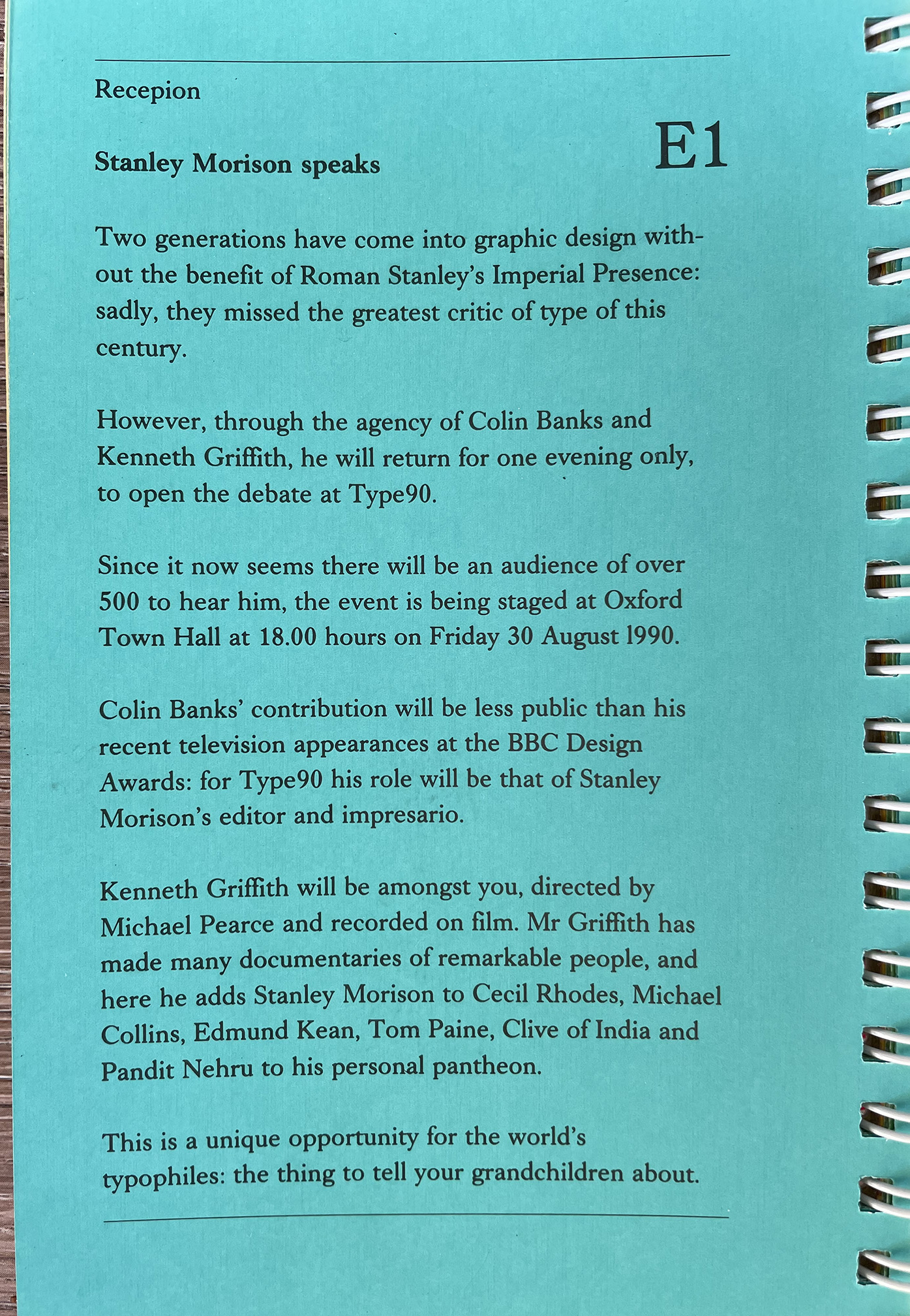
One of the more unusual program items took place at the opening-night reception on Friday: “Meet Stanley Morison.” Morison, who was famous for leading Monotype’s program of typeface revivals in the 1920s, had died in 1967, but in 1990 he was there in spirit, portrayed by a skillful actor (Kenneth Griffith) and produced and introduced by Colin Banks, in a Morison-esque speech to kick off the proceedings. “Mr Morison will be 102 next birthday!” announced a flyer for the event. It might be worth wondering (as many did) just what Morison himself would have made of Type90.
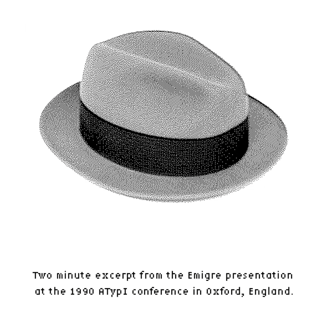
At the other end of the spectrum, Zuzana Licko’s Hypercard-based, rock-music-enhanced presentation, titled “New forms: do you read me?” and given immediately after Neville Brody’s talk, was an exercise in épater la typoisie as she introduced new kinds of digital fonts that enthusiastically embraced the limitations of the computer screen.
Lectures, town meetings, workshops
The program was organized into three categories: lectures (major talks, in the Town Hall), town meetings (usually in a panel format), and workshops (casual gatherings where everyone could participate).
Robert Slimbach, from Adobe, gave a workshop on designing digital typefaces on the Macintosh, showing off for the first time his new typeface Minion, which was forthcoming in the Adobe Originals type library. Minion would prove to be a very popular and widely used typeface, especially for books and other long text; not a revival but an expression of the style and characteristics of Renaissance typefaces in a wholly digital form. In a separate workshop, his Adobe colleague Carol Twombly talked about developing her typeface Lithos, based on classical Greek lettering styles. Lithos later became wildly popular when it was used extensively by MTV.
Jack W. Stauffacher gave a lecture about the making of his hand-set Odes HORACE (The Greenwood Press) and what it was like to approach the design of a book written 2,000 years ago which had been given treatments in both manuscript and printed form over hundreds of years. He called his talk “Typographic phrasing.”
John Dreyfus, co-founder of ATypI and the association’s second president, spoke about the first president, Charles Peignot. He described Peignot’s “initiatives in creating new types, promoting new typographical style, editing Arts et Métiers Graphiques, and encouraging photography as an art form,” and his ten years of presiding over the development of ATypI.
A workshop organized by Richard Gallafent, Cynthia Hollandsworth [now Batty], and Dr. Douglas Brotz, titled “Typeface protection: legal and ethical issues,” explored the current state of play in this essential yet frustrating long-term effort.
Jost Hochuli’s workshop on “micro-typography” dealt with the details that so many graphic designers ignore: “letters, the relationship between letter-spacing and words, word-spacing and lines, and interlinear spacing and type columns.” Three years before, Compugraphic had published his small book Detail in typography, which went on to become a classic in the field.
Gerard Unger’s lecture on the Dutch practice of making chocolate letters was accompanied by, of course, chocolate letters that the attendees could eat.
Although the majority of the talks focused on the Latin alphabet and the European typographic tradition (notably the British), a few program items touched on the challenges of type design and typography in non-Latin writing systems.
Eiichi Kono and Fiona Ross’s workshop “Kanji versus Roman” examined different approaches to designing for multilingual and multi-script documents. One of the main lectures was “Thunder in the East,” where Fiona Ross, Taro Yamamoto, Masahiko Kozuka, and Cleo Huggins considered the potential of digital technology for type design in Japanese and other Asian languages. Sami Ramadani offered a workshop on “Non-Roman type,” and R.K. Joshi ran one on “Computerized Latin and Hindi scripts.” In a town meeting called “Eastern Forum,” Ari Davidow, Ittai Joseph Tamari, and Kirti Trivedi looked at the history of multilingual page design and the design of typefaces for Hebrew and Devanagari.
These “non-Latin” talks and workshops opened questions that would be dealt with in greater detail and depth at much later ATypI conferences, but which were still sidelined as marginal concerns in 1990.
Business & social gatherings
Undoubtedly there was plenty of business done at Type90. That, after all, was traditionally one of the primary reasons why the senior officers of type foundries and printers would get together at ATypI – not just for camaraderie but to make sales and licensing deals.
But the social aspect was also a prominent part of the occasion. Not only did attendees gather informally in pubs and restaurants, and attend organized events like Jeff Level’s “Type and wine-tasting” and ITC’s cocktail party at the art museum, but they celebrated the typographic community in style at Type90’s “Gala Evening,” an hours-long outdoor “buffet and barbecue” on Saturday evening, at the historic Rose Revived hotel and restaurant on the banks of the Thames.
Keepsakes & swag
There’s a long tradition among printers and typographers of producing keepsakes for special occasions, and Type90 saw its share. Most striking was the gorgeous prospectus for the then-forthcoming Ornamented Types: Twenty-three alphabets from the foundry of Louis John Pouchée, which accompanied an exhibit of “Pouchée’s Ornamented Types,” newly printed from original patterns in the St Bride Printing Library. Printing historian James Mosley, the long-time librarian at St Bride’s, gave an illustrated talk about them in the Town Hall (followed, appropriately, by a wine reception).
The second most elegant keepsake must have been Jack W. Stauffacher’s hand-set and hand-printed broadside of one of the poems in his Odes HORACE, both in Latin and in a new translation by Michael Taylor. “Mycaenas / tells me my verses are swift and true / and my brow will strike the stars above.”
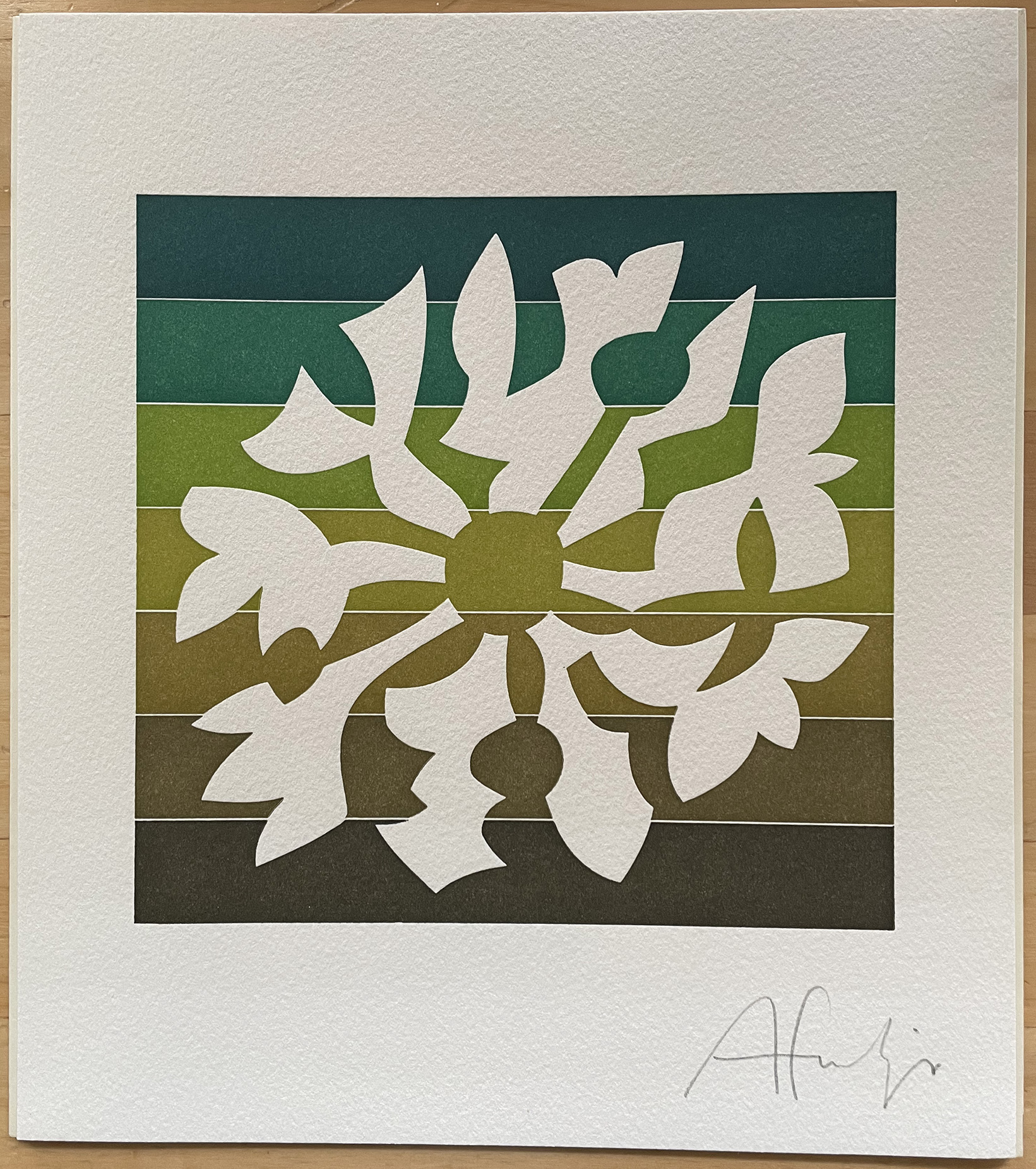
Linotype gave away a beautifully printed image created by Adrian Frutiger, and packaged like a fine art print, where the positive and negative forms of a floral design reflected the interplay of form and ground in type design. “The petals of the flower,” reads the accompanying text, “flowing out from the centre vibrantly illuminate the richness of the typographic spectrum.”
The other sort of thing that is handed out at a type conference is specimens and catalogs of typefaces, especially of new typefaces that the foundries want to introduce to the type world. At Type90 the attendees could walk away with specimens for Agfa Compugraphic’s newly released Rotis family, with its Sans Serif, Semi Sans Serif, Semi Serif, and Serif subfamilies, as well as elaborate promotional and technical brochures from Linotype, ITC, URW, Letraset, and Bitstream.
Bridging the gap between promotion and keepsake was the new issue of U&lc that was handed out at the ITC cocktail party. The issue was, as usual, large-size and offset printed on newsprint, but it came inside a two-page flong: full-size molds of pages in blue plastic, hinged together to make a container for the magazine. Flongs were used by newspapers and other publications that needed to send an exact duplicate of the printed pages to a distant printing press, in the days before electronic transmission was easy. Presenting U&lc within a flong was both an unusual give-away and a witty comment on changes in printing technology.
There were also flyers for two upcoming books, somewhat more modest than the expensive Pouchée collection: James Sutton and Alan Bartram’s comprehensive Typefaces for Books (British Library), and the collected correspondence of Eric Gill and Stanley Morison, edited by Nicolas Barker (Libanus Press).
In his welcome statement in the conference program book, President Martin Fehle wrote: “In this restless era of technological evolution, ATypI is proud to sponsor Type90, a far-reaching impressive world conference which is trying to shed a clear beam of light into the confusion of today’s high-tech developments. It is by far the largest and most influential venture that ATypI has undertaken since its foundation in 1957.”