Writing on type and design
Afterword | the shapes of language
The importance of non-Latin type design today almost goes with saying – almost, but not quite. In the culturally dominant English-speaking world, it’s all too easy to assume that everyone communicates in English, or at least in a language that uses the same Latin alphabet that we use. But that’s not true, and it has never been true.
The world’s languages take many written forms, and our current electronic systems of communication demand a transparent way of transmitting those written forms accurately and reliably from one point to another in the digital world. And, since we may be seeing texts in two or more different writing systems at the same time – in multilingual street signs, for instance, or in advertising aimed at more than one linguistic group, or simply in an online conversation that’s not limited to a single language – there’s a new consideration: how to make different writing systems work comfortably together, not looking like each other yet still looking consistent and stylistically related. A ramble down any airport access road in any multilingual country will make that necessity very clear.
Although these changeable electronic requirements have a huge effect on the design of type in the present day, the problems of how to adapt Western typesetting systems to non-Western writing systems have been with us for a very long time, as the examples shown in this exhibition amply demonstrate. All too often, the limitations of mechanical typesetting machinery developed for Western European languages have severely warped the way non-Western languages have been represented in print.
As other essays in this book have explained, the development of non-Latin typefaces (like the development of Latin ones) has been a constant dialogue between culture and technology: between the ever-evolving traditions of written language and the constantly changing limitations and opportunities of mechanical and electronic systems for setting type.
Today the tools of typographic development are widely distributed, and it’s possible for individuals in farflung locations to create their own fonts and their own typesetting software, which, with luck, will come to be used across the world. Although there is still a preponderant weight of both technology and economic might in the Latin-reading West, the balance is shifting, and the power to shape typographic communication is spreading out across the whole complex, multilingual world. The exchange of ideas and collaboration between type designers in the Latin-reading world and the non-Latin reading world is extremely fruitful and promising, both for creating better and more varied typefaces in non-Latin writing systems and for smoothing the hiccups and glitches that have, up till now, made writing across linguistic divides haphazard and prone to distortion.
From a practical standpoint, the purpose of all of this artistic, craft, and technical work is to communicate – or, more precisely, to give us the tools to communicate clearly and effectively. Whether it’s in the translation of a holy book or in the ephemeral contents of a phone text, we need to put our technological and our creative efforts into the service of clear communication, in whatever language, whatever writing system, whatever transmission method we may choose to use.
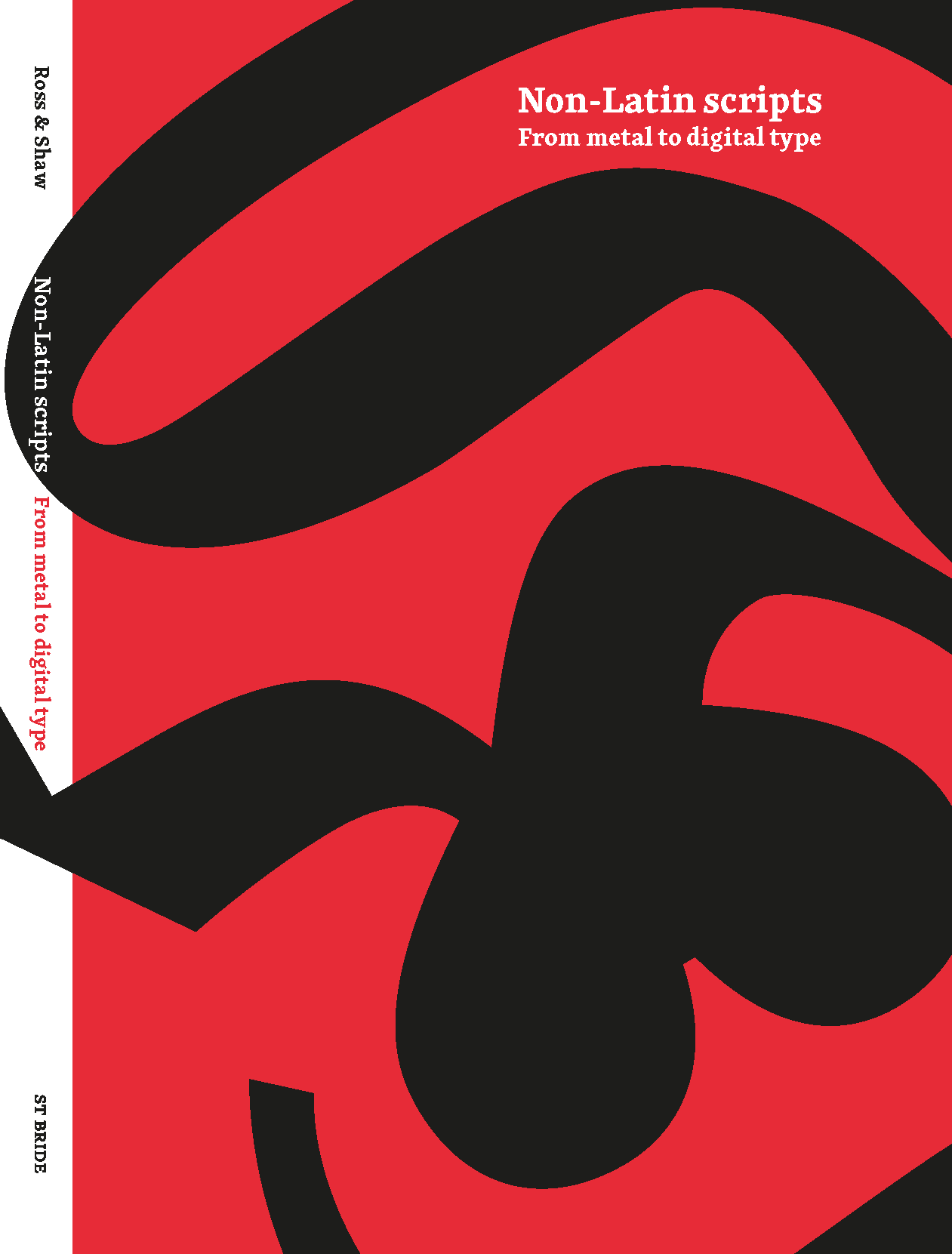
[Copyright 2012. Originally published in Non-Latin scripts: from metal to digital type, edited by Fiona Ross and Vaibhav Singh (London: St Bride Library, 2012).]

