The ATypI conference in Amsterdam last week was my last one as President of ATypI.
After six years as president, I was stepping down, and at Sunday’s annual general meeting the membership elected José Scaglione as the new president of ATypI. I will remain on the Board, and I expect to be actively involved with ATypI for years to come, but I’m looking forward to attending next year’s conference in Barcelona as a civilian.
I’m pleased with what we’ve done with ATypI in the past six years (and it was by no means just my doing; it was a collective effort). I’m especially pleased with how we have visibly expanded the organization’s reach beyond its heartland in western Europe, staging conferences in St. Petersburg, Mexico City, Reykjavík, and Hong Kong, and taking the design of non-Latin typefaces from a marginal sideshow to a central part of the programming at each ATypI conference, no matter where it’s held. ATypI may have begun fifty-odd years ago as an industrial trade group, but today its most important function is educational. At a time when type, type design, and typography are in the hands of everyone with a computer, there’s more need than ever for an explanation of the history, the standards, and the future possibilities of type.
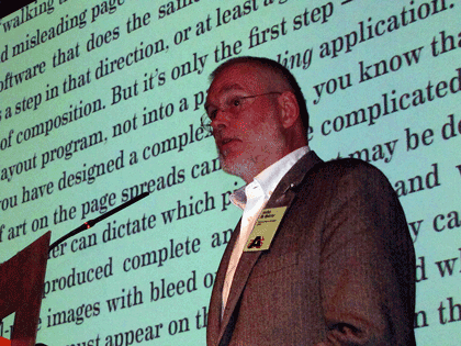
Which leads directly into my own talk on Sunday morning, just before the lunch break on the conference’s final day. I spoke about design for the onscreen page (something that anyone who has followed this blog knows that I’ve written and spoken about many times over the past two years), and I launched a new initiative: the Scripta Typographic Institute, a think tank and advocate for excellence in digital typography and the development of new tools for text typography on screens of every kind. At this point, it’s all about intentions; but by making it public at ATypI I meant to turn it into a real organization, with participation by many more than just myself. If it works the way I hope, Scripta will become a nexus for the development of new ideas and new ways of thinking about reading, and thus about designing for reading, onscreen.

Between my duties as ATypI president and my preparations for the launch of Scripta, I had very little time to enjoy being in Amsterdam. But I had an unexpected companion: thanks to the machinations of Barbara Jarzyna, ATypI’s executive director, and Thomas Phinney, our treasurer, with the connivance of the rest of the board of directors, my partner Eileen Gunn found her way paid to Amsterdam to join me; and we did manage to have a day or so of plain exploration before the conference itself drew us in.
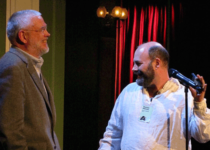
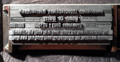
And on Saturday night, at the gala dinner, after the main event – the presentation of the Dr. Peter Karow Award to Donald Knuth – Tom Phinney grabbed me and said, “No, wait, you’re not done yet.” He then gave a short, moving speech to thank me (and embarrass me), handing me a most wonderful keepsake: a metal composing stick full of hand-set type, locked in place, with an inscription (if that’s the right word) that I had to read backwards and upside-down.* I can assure you that it beat the hell out of a gold watch (or any kind of certificate that could have been printed from the locked-up type). I felt honored.


That was only a minor part of this year’s ATypI conference, which featured two keynote addresses (by Alice Rawsthorn and Petr van Blokland), each of which presented different perspectives on the nature of design; three awards presentations (the TDC medal to Gerrit Noordzij, the Karow award to Donald Knuth, and, as the closing event of the conference, the Prix Charles Peignot to Alexandra Korolkova); and innumerable excellent talks and presentations by a wide variety of typographers, type designers, educators, and generally inspired people. We had the largest attendance since Mexico City in 2009, and as far as I can tell everyone regarded it as a successful and enjoyable conference.
There was a certain fittingness to ending my term as president in Amsterdam. The last time I had been in the city was in 1990, right after my very first type conference, Type90 in Oxford. At that time I was a rank neophyte, at least in the type world; today I’m at risk of becoming one of the old guard. (That still seems a little weird.) What has changed more than anything else in that time is that type is now in everyone’s hands; the need for understanding it is much greater, and much more widespread, than it has ever been before. Which, of course, offers us a truly wonderful opportunity.
[Images: photos by the ubiquitous Henrique Nardi of me opening the conference (top left), talking about the onscreen page (above), and with Thomas Phinney (also above); my own snapshots of Donald Knuth with Barbara Jarzyna (above left), of Alice Rawsthorn giving her keynote talk (above left, bottom), and of the composing stick full of type that was given to me (above).]
[*Oh, all right. The inscription reads: “Association Typographique Internationale | John D. Berry | President 2007–2013 | In appreciation of your tangible and significant | contributions to typography and graphic design.”]
