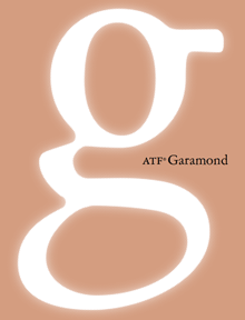
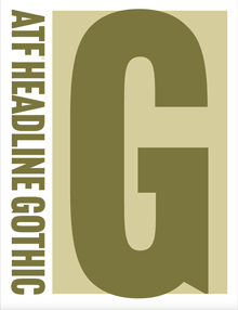
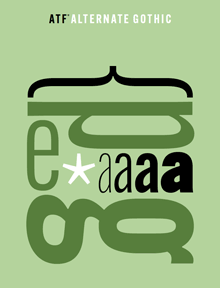
Just in time for this year’s TypeCon, the new digital ATF Collection arrived on the typographic scene. This is a remarkably broad range of typefaces and type families based on the metal typefaces issued by the American Type Founders Company from the late 19th century to the middle of the 20th. (These were not “hot metal”; that refers to type that was cast on a machine, such as a Linotype or a Monotype caster. ATF was a consolidation of the many American type foundries that manufactured type for hand-setting, in foundry metal. The metal was “hot” when it was first cast, but not when it was being set.) ATF was responsible for many of the best-known American typefaces of the 20th century, both original designs and revivals of classic European types. This release features a wide variety of sans-serif display faces, plus a classic text & display family and a funky brush-written display face.
I had the pleasure of writing most of the descriptions of the typefaces in the collection, as well as the background on ATF. (Stephen Coles wrote the copy for the peculiar ATF Wedding Gothic and a very amusing riff on the quirky yet familiar ATF Brush.) The new typefaces reference ATF’s original designs, but extend them into larger and more fully usable families. Many of the faces in the ATF Collection are sans display faces that we’ve been seeing, in one form or another, for most of our typographic lives.
The mind behind the ATF Collection is Mark van Bronkhorst, director of TypoBrand and founder of the respected digital type foundry MVB Fonts. (I’ve been using his MVB Verdigris as my go-to book text face for many years.) Mark is unusual among type designers for being both a talented and respectful designer of type and a very thoughtful and creative user of type, a typographer. I had ample experience of this when I was editing U&lc and Mark was the designer of the magazine.
Since the début of the ATF Collection a few weeks ago, a number of people have asked me about the back story, especially how Mark got the rights to the ATF name. The answer turns out to be remarkably simple,
“The ATF and American Type Founders trademarks were abandoned many years ago,” Mark told me. The old trademarks had expired by 1996; no one had renewed them, and in any case, “ATF had never been registered for use with digital fonts.” Mark discovered further that “it also appears that ‘American Type Founders’ has never been registered, and, except for our use, no other company appears to be registered as doing business under that name.” So, legally, the name was available for use.
“We started using the ATF and American Type Founders names and filed trademark applications for them in commerce seven years ago,” says Mark, “by releasing an ATF Franklin Gothic as a single digital font on fonthaus.com. (Technically, we had actually started using the ‘ATF’ trademark much earlier.) The USPTO after a diligent examination accepted and issued trademark registrations to TypoBrand for use of the trademarks with our digital ATF fonts. Our registrations have been live for seven years now.”
That’s the story behind the question of who now owns the ATF name (at least the short version). The point is that Mark and TypoBrand were very careful not to step on any toes, legally or ethically, in bringing these type designs back onto the market.
“Stated briefly,” says Mark, “I felt it was high time that the designs formerly associated with ATF see new life in digital form and that such an effort be branded accordingly as a collection, paying tribute to their legacy.” That is exactly what he is doing with the new ATF Collection. “It is my intent to honor the body of work that deserves a place in the digital community.” Mark adds that this is an ongoing effort, and that he’d love to see participation from other interested type designers.
It’s been fun working on this project, and seeing the typefaces take their present form. Reviving and expanding hundred-year-old metal typefaces involves a lot of careful work – not just adapting to a new medium and new technology but extending character sets far beyond what anyone was expecting back in the hand-setting days. I’m looking forward to seeing how people put these newly available fonts to use.


