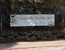
’Twas the eighteenth of April of Twenty-fourteen…” Yes, it was, actually and literally. That’s when I snapped this picture of the sign at the edge of the Calvary Cemetery, overlooking University Village in Seattle.
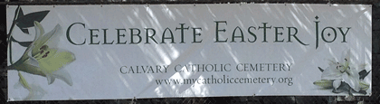
The typeface, with its postmodern ecclesiastical look, is Jonathan Barnbrook’s Mason, which was originally released by Emigre Fonts in 1992 under the name “Manson.” For reasons that you can imagine, that name caused a lot of unease, and Barnbook soon dropped one n and renamed it “Mason.” By either name, it’s very much in the tradition of ironic type design, taking recognizable features from the past and combining them in unusual ways to achieve a new effect.
The smaller type, identifying the cemetery and its web address, appears to be the appropriately named Requiem. Presumably, irony was not uppermost in the mind of the designer of this welcoming and wholly un-ironic sign.