function jdb_page_navigation()
sPageSlug = blog
sPageTitle = easily amused
header:139:aPageArgs:page_title = easily amused
header:140:aPageArgs:section_title =
functions-johndberry:262:aPageArgs:page_title = easily amused
functions-johndberry:298:sPageTitle = easily amused
functions-johndberry:359:sPageTitle = easilyamused

easilyamused |

Archive for April, 2013

Trajan & Hebrew & Arabic, oh my!

Published

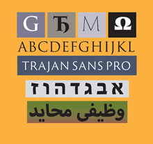
Last year I wrote the texts for four new digital specimen books for extensions to Adobe Originals typefaces, and just last week Adobe posted those specimens online. All of them are additions to existing type families: two derive from Trajan (Trajan Pro 3, which extends both the number of weights and the language coverage, and the new Trajan Sans) and two from Myriad (Hebrew and Arabic versions of this widespread humanist sans). The project gave me an opportunity to delve into the history of the inscription on the Trajan column in Rome (which, almost every time I’ve tried to take a close look at it, was chiuso per restauro and wrapped in a blue plastic tarp), and an even more interesting chance to learn about the design of both Hebrew and Arabic typefaces. The latter pair gave me an excuse to engage the considerable knowledge and expertise of Scott-Martin Kosofsky, a typographer of fine sensibilities and an expert in bilingual Hebrew/English publishing, and Mamoun Sakkal, an expert in Arabic type design with a particular penchant for the style known as square kufic (though this is not, actually, the tradition that the Myriad Arabic extension draws on) and a friend who, happily, lives in the Seattle area. Mamoun, along with his software-coding daughter Aida, had been expanding my knowledge of Arabic for some time; Scott I met through this project, and have been learning from quite happily ever since.

I should be quite clear: I can neither read nor write either Hebrew or Arabic, although I’ve learned quite a lot about the design of typefaces in both scripts. And about the quixotic and sometimes contradictory nature of designing “sans serif” typefaces in either script. Not to mention the fraught question of what it means to have an “italic” in either Hebrew or Arabic, neither of which has any such tradition before the digital age.

P.S.: I was quite pleased to notice that one of the samples of Myriad Arabic in action was bilingual versions of three poems by Maram al-Massri (with English translation by Khaled al-Mattawa) that had been published by Copper Canyon Press, an excellent international poetry publisher for whom I have done a lot of book design in the past. Synchronicity is everywhere.

Ivan Fedorov’s books and types

Published

When Eileen and I went over to the University of Washington the other day, to take a look at the magnificent century-old Yoshino cherry trees in bloom around the quad, we walked past the Magus used-book store on our way to the campus; our eyes were caught by the display of enticing books in the front windows. In fact, the display seemed so well calculated to appeal directly to us that I began fantasizing that the windows were really smart displays that targeted whoever happened to pass by on the sidewalk; a different person or group of people would perceive an entirely different display, tailored to their tastes and buying habits.

“Hey,” said Eileen when I told her this, “you mean they’ve got real physical books in buildings now? Books that you can pick up and hold in your hand?” She shook her head. “Who’d have guessed!” No, no, I assured her, it was just a virtual display; behind the windows we’d find no actual books. Just a digital buying experience.

But we stopped in on our way back from the cherry trees, and what I found on a back shelf was not virtual at all. It was a beautifully bound large-format book called Artistic Heritage of Ivan Fedorov, by Yakim Zapasko. At least, that’s the title in English; the book was published in Lvov in 1974, and its proper title is displayed bilingually in Ukrainian and Russian. The book is a catalog of the work of the 16th-century printer Ivan Fedorov (“and the masters that worked in association with him,” as an English summary carefully adds), who worked first in Muscovy and then in the Polish-Lithuanian Commonwealth (Moscow, Lvov, and Ostrog) and who is one of the fathers of eastern Slavic printing. The main text of the book is in both Ukrainian and Russian, but for those of us who are not fluent in either language the most rewarding part (besides the typography, design, printing, and binding of this book itself) is the illustrations: books printed by Ivan Fedorov, types he cast (both Cyrillic and Greek), initial letters and decorative ornaments, and the wonderfully complex “ligature lines” of intertwined capital letters. Just for lagniappe, the book’s title page and section pages feature magnificently energetic calligraphy in two colors and five languages. (Summaries and labels are provided in English, French, and German as well as Russian and Ukrainian.)

Ligature line, from 'Artistic Heritage of Ivan Fedorov'

This copy is rubber-stamped by the Department of Slavic Languages and Literature of the University of Washington. What led the department to de-acquisition it, I have no idea; but it has found a good home now. Out of curiosity, once I got home I looked online; there were a number of copies available, at varying prices of course. One of the listings, through ABEbooks, had a note saying, “This copy is no longer available.” The listing was from Magus Books, so in fact “this copy” was the one I had in my hands. (Quick work, Magus!)

I love the early Cyrillic types, so much more vibrant to my eye than the westernized Civil Type introduced by Peter the Great. And I wondered, as I gazed over the pages, whether I had in fact seen some of these very books when I was in the rare-book libraries of Moscow or St. Petersburg.

It was a good day for both cherry blossoms and books.

[Images: top, cover of Artistic Heritage of Ivan Fedorov; middle, title page; bottom, a 16th-century book page; inline above, a red-printed ligature line.]