function jdb_page_navigation()
sPageSlug = blog
sPageTitle = easily amused
header:139:aPageArgs:page_title = easily amused
header:140:aPageArgs:section_title =
functions-johndberry:262:aPageArgs:page_title = easily amused
functions-johndberry:298:sPageTitle = easily amused
functions-johndberry:359:sPageTitle = easilyamused

easilyamused |

Archive for the category ‘culture’

Reading Le Guin

Published

A few months back, I got the second two-volume set of Ursula K. Le Guin’s work in the Library of America, “The Hainish Novels and Stories.” (She is one of the very few writers to have their work published in the Library while still living.) Since then, I’ve been rereading these stories, or in a very few cases reading them for the first time. All of Le Guin’s fiction, even the earliest work, stands up to rereading; that’s one of the things I value about it. Her sensibility and her care for language have spoken to me from the moment I first encountered them, when I happened upon Rocannon’s World on the revolving wire paperback rack in a stationery store. (The book was an Ace Double, back-to-back with Avram Davidson’s The Kar-Chee Reign.)

As I read through this collection, I thought about how much the late Susan Wood would have appreciated it. First of all, Susan would have been delighted to see Le Guin’s work in the Library of America. Even more, though, I think she would have appreciated the later stories. Before Susan’s death in 1980, I can remember her lamenting that Le Guin had yet to write “the Hainish novel”: that is, a novel about the Hainish themselves, from their own perspective, not just about the many cultures that their ancestors had spawned. While Le Guin may not have written quite what Susan was anticipating, she did come back, after a gap of several years, to write a series of late stories that delved ever deeper into the culture and psychology of the Hainish and their interaction with the rest of humanity.

Susan and I both met Ursula at the same time, in August 1975, in Melbourne, where both Ursula and Susan were guests of honor at the first World Science Fiction Convention to be held in Australia. Later, Susan edited Le Guin’s first book of essays, The Language of the Night. Susan was a passionate scholar and an enthusiastic teacher. (At the University of British Columbia, and at earlier universities where she had taught, she created courses on science fiction and Canadian literature – both of which were looked on skeptically by the English department and both of which brought in large numbers of enthusiastic students.) Her introduction to Language of the Night was a major essay that she worked long and hard on, situating Le Guin’s writing and presenting it afresh to a thinking audience.

It’s entirely possible that, had Susan lived, she would have been the one to write the introduction to Le Guin’s Hainish novels and stories for the Library of America. I like to think so.

When I first started reading that volume, last winter, and started musing about how much Susan would have enjoyed it, I thought I ought to mention it to Ursula. She would appreciate it, I was sure. But I was slow to act; Ursula had been in poor health, and in January she died. I never managed to share that particular insight.

In June, I had the bittersweet pleasure of attending the celebration of Ursula’s life, in Portland, Oregon. It filled the magnificent Arlene Schnitzer Concert Hall, and after a star-studded program of appreciations, ended with a dragon parading up onto the stage and then out into the street. Her long-time home town certainly knew how to celebrate Ursula K. Le Guin.

Sam Hamill

Published

Sam Hamill would have turned 75 on May 9. He had planned to celebrate his birthday with a publication party for his final book, After Morning Rain, on May 15, but in the end he realized that his health wasn’t going to last long enough to do it. Sam died a month before the planned event. It went ahead, however, on a more informal basis, as a remembrance and celebration of Sam and a welcome for his last book.

I’m now reading that book. I’ve been reading it slowly, parceling out the poems, making it last. It’s filled with little gems, of feeling, observation, appreciation, lament – the distilled sensibility of a poet at the end of his life. Sam always felt that he was in conversation with the great poets of the past, especially those of ancient China and Japan; some of the poems in After Morning Rain explicitly echo that:

Coming to It

A midnight cup of sake,
a strange solitude.
Is this all I’ve become?

Old and alone, bending
over a poem
written in loneliness
by some old Chinese
bag o’ bones
more than a thousand years ago.

The book is a small, beautiful volume, designed by and with a cover painting by Ian Boyden.

Sam was an evocative, insightful, lyrical poet, like his mentor Kenneth Rexroth. He was also, like Rexroth, a world-class curmudgeon. There’s bitterness, but also love, in Sam’s last poems. He transcended his own life through his work and his art.

Sam was an exacting and generous editor, and that’s where his greatest influence may lie. He co-founded Copper Canyon Press and was editor there for nearly thirty years, bringing innumerable books of fine poetry by greats and unknowns into print in the United States. That has been an important part of our cultural life.

I’m not sure when I first met Sam, but I came to know him when Loren MacGregor and I were publishing the short-lived Pacific Northwest Review of Books in 1977 & 1978. Sam was enormously helpful and encouraging to us in our efforts. I well remember the interview with Sam and his then-partner Tree Swenson that was conducted and submitted to us by a new writer; when we showed Sam the draft, he exclaimed grumpily, “I speak in paragraphs, dammit!” and insisted on correcting it – to the great benefit of our readers.

I’ve had the pleasure of designing several of Sam’s books, beginning with Passport, a collaboration with the artist Galen Garwood, which was published by Broken Moon Press in 1989. I’ve designed books of essays by Sam (Basho’s Ghost, A Poet’s Work) and poetry (Destination Zero). I always tried to give his work the typographical clothing that it deserved.

In 1993, I got a call from Sam, out of the blue. “Would you like to help me design a book?” He and Tree had just split up, and she had been the designer of Copper Canyon’s books. That early casual-sounding request led to my designing all of Copper Canyon’s books and collateral for the next five years (and several more at various times after that). As I said at the time, I was trying to live up to the standards that Tree had set, making each book recognizably a Copper Canyon book while letting each one take its own form and shape. And I was trying to maintain Sam’s vision with each book, often working with paintings that he had chosen for the covers. I like to think I succeeded reasonably well. I felt that those were books that would be worth reading a hundred years from now.

Ars longa, vita brevis.

[Images, top to bottom: After Morning Rain, designed by Ian Boyden; Sam Hamill; Destination Zero, designed by John D. Berry; Sacramental Acts, Kenneth Rexroth, designed by John D. Berry.]

Facing the world, typographically

Published

On Dec. 1 & 2, Stanford University hosted “Face/Interface,” a small conference on “Type Design and Human-Computer Interaction Beyond the Western World.” The conference was held in conjunction with an exhibition at Stanford’s Green Library: “Facing the World: Type Design in Global Perspective.” The exhibition, organized by Becky Fischbach, runs until March 24. (Go see it!)

The organizer of Face/Interface was Thomas S. Mullaney, an associate professor of Chinese history at Stanford who has spoken at ATypI and who wrote the canonical book on the history of the Chinese typewriter. Tom is an indefatigable organizer and a generous host, with a clear idea of what is required to make an event like this a success (and a ruthless way with a stopwatch, if speakers run over).

The roster of scheduled speakers was impressive. I knew this would be a notable event, but, as everyone seemed to agree, it turned out to be even better than we had been expecting. There was not a single talk that I was willing to miss, even first thing in the morning, and the interplay among them, dealing with varying languages and technologies and cultures, wove a rich tapestry of ideas. Which is exactly what a scholarly conference ought to do.

Not surprisingly, there were a number of references to an earlier typographic event at Stanford: the famous 1983 ATypI Working Seminar, “The Computer and the Hand in Type Design,” which was recently written about in an article by Ferdinand Ulrich in Eye magazine. That 1983 seminar had been organized by Chuck Bigelow, who at the time was an associate professor of typography at Stanford (the only person ever to hold such a position there – so far). And Bigelow was one of the closing speakers this year, thus tying together these events 33 years apart. (Donald Knuth, also a key figure of the 1983 seminar, dropped by on Friday for a while, though he had no official involvement in this year’s event.) I wouldn’t be surprised if Face/Interface didn’t figure as prominently in future typographic memory as the 1983 gathering has over the last three decades. It felt like a pivotal moment.

Highlights for me included Thomas Huot-Marchand on the contemporary successor to the Imprimerie nationale; Bruce Rosenblum’s highly personal account of “Early Attempts to Photocompose Non-Latin Scripts”; Liron Lavi Turkenich‘s visual tour through trilingual signage in Israel; Lara Captan’s tour-de-force performance, “Facing the Vacuum: Creating Bridges between Arabic Script and Type“; Gerry Leonidas on Adobe’s treatment of Greek typefaces; and the other two closing talks (mine was sandwiched between them), by Chuck Bigelow and John Hudson. Other notable memories include Tom Milo projecting his ground-breaking live-text Qur’an technology on a wall-sized screen in the Stanford maps collection, upstairs from the exhibition reception, and a lively conversation with Chuck Bigelow over breakfast on the last day.

For those speakers who didn’t have to rush off on Sunday, there was an informal brunch and tour of the Letterform Archive in San Francisco, where Rob Saunders showed off his collection and ended up selling off some of his duplicates to eager collectors such as myself.

[Images, top to bottom:] Chuck Bigelow, John Hudson, & John D. Berry after the closing presentations (photo by Chen-Lieh Huang); Chuck Bigelow at the podium; Sumner Stone, asking a question from the audience; John D. Berry at the podium (photo by Eileen Gunn); Becky Fischbach & Fiona Ross outside the hotel in Palo Alto; Rob Saunders’s hands showing off the original Depero bolted book at the Letterform Archive.]

Farewell to Jack the printer

Published

“The splendid dawns — how many more of them will the gods toss into your basket of days?”

– Horace, Carminum Liber IV, trans. Michael Taylor

Jack Stauffacher died on Nov. 16, a month shy of his 97th birthday. He was both fiercely opinionated and self-deprecating; when he called you up, he would simply say, “This is Jack, the printer.” But what a printer!

I saw him for the last time just three weeks before he died, when Dennis Letbetter took me and Rob Saunders over to Tiburon for lunch with Jack and his wife Josie at their small house. The conversation ranged all over the place, as it always did, from ideas to reminiscences to literature and craft, but I was there for a purpose: to ask Jack questions about his life and career, for the biographical essay I’ve been asked to write. This essay will appear in a book by Chuck Byrne about Jack’s experimental prints, to be published next year by Letterform Archive. And, of course, I was there because I suspected that it might be my last chance to see Jack.

While I was there, Jack gave me a copy of his last book, a beautifully designed volume of “fragments from a Tuscan diary, 1956–1958,” which he had entitled Oxen. Plough. Bicycle. It is fully in the tradition of Jack Stauffacher’s long book-design and printing career, simple and unadorned yet exquisitely arranged. Its contents consist of photographs that he took while bicycling around the countryside outside Florence when he was living there on a Fulbright scholarship; the photographs are complemented by notes, almost poems – phrases and sentences of reflection on where he was and what he was seeing. It’s a fitting culmination to a publishing career, and I’m glad I got it directly from his own hand.

When Jack turned 90, seven years ago, his friends put together a spectacular celebration at the San Francisco Center for the Book. We won’t be able to celebrate his 97th birthday, except in his absence, but ideas are being floated for a fitting memorial sometime in the new year.

Several obituaries and moving reminiscences have been published already: by Chris Pullman in Design Observer, by Sam Whiting in the San Francisco Chronicle, and by Pino Trogu in Domus. Dennis Letbetter has been putting together a photographic record that he’s taken of Jack over the years (from which the photos at the left are taken).

More writing

Published

I have just added a couple of complete essays to the rather minimalist “Writing” page on this site, and links to several others.

That page has so far consisted of short, and I hope intriguing, excerpts from various longer pieces of my writing. Now I’ve added links to almost all of the originals, making this a sort of landing page or entry point to these essays.

I’ve added the introduction to Contemporary newspaper design (2004), where I attempted to look at the development of newspaper typography over several technological and economic revolutions, and “The Business of Type”, my account of the origins, development, and demise of U&lc, which was the introduction to U&lc: influencing typography & design (2005). Both of these were books that I edited for Mark Batty Publisher; both of them are now out of print. I think those essays are worth making available again.

I’ve added some more links, too. Check ’em out.

[Update, April 15, 2016:] I’ve now added the missing piece, the preface to Language Culture Type. It is a less substantive piece than the others, but still worth having intact.

Eyemag

Published

I just got the latest issue of Dennis Letbetter’s Eyemag, his more or less quarterly series of magazine-size books that showcase different aspects of his long and notable career as a photographer. (I’m not sure I can say “long career” about someone who’s younger than I am, but what the hell. He’s been doing it for a long time. And it’s certainly notable.)

These are printed privately and distributed to a very limited circulation, but after some prodding Dennis did allow as how he would welcome subscriptions. I believe the rate for four issues is $200, but you should check with him. It might be worth your while. Meanwhile, you can view the contents of individual issues on the website.

Dennis’s photography is remarkable. It’s not showy; it’s just good. The one thing that might be considered an affectation is his occasional use of an extremely wide aspect ratio (6x17cm): but he puts it to good use. The current issue, no. 8, uses these long, narrow apertures to document the city of Florence. The first half of the images is vertical, like some of the narrow streets, while the second half is horizontal, as our eyes tend to see a streetscape.

The previous issue documented a full year of daily portraits of his friend and mentor René Fontaine. “Who would submit to portraiture, let alone a serial portrait which requires an involvement of a year?” asks Dennis in his thoughtful essay at the end of the volume. But René did: he sat for 365 portrait photographs, from from the summer of 1980 to the summer of 1981, no matter how he was feeling, what he was doing, or what the rest of the day might hold. And Dennis was there to record it. Occasionally René would don a whimsical hat (the portrait on the left has always been a favorite of mine, even before I knew its context), but mostly he just sat down in his everyday garb and looked patiently at the camera.

What might be the most unusual issue of Eyemag is no. 4, “The Haight Street Project.” During the same period when Dennis was shooting portraits of designers and artists in the San Francisco Bay Area using a big old-fashioned camera with glass plates, he was also inviting his neighbors in the upper Haight into his garage, which he had converted into a studio, to take their portraits on 4×5 color film in a thoroughly informal situation. These photos let the people who live in or pass through the Haight show themselves however they wish.

Each issue of Eyemag ends with an essay by someone notable and appropriate, and one by Dennis himself. In the current issue, the essay, “Eye Level” (in Italian, with an English translation), is by Andrea Ponsi. In the Haight Street Project issue, the guest essay is by Herbert Gold.

The striking “i” logo of Eyemag was designed for Dennis by the late Michael Harvey, a good friend and an amazing artist in the creation of letters. That i is recognizable as a Michael Harvey letter from a mile away.

(Note: Yes, it can be confusing, but Eyemag is entirely different from the excellent Eye magazine.)

[Images (top to bottom): Covers of issues 1, 6, and 8, and portrait of René Fontaine, 21 March 1981. All images copyright by Dennis Letbetter.]

The Letterform Archive

Published

I recently had my first chance to visit the remarkable Letterform Archive in San Francisco. This is the fruit of thirty-five years of collecting by Rob Saunders, all of it related to type and lettering and printing – especially type specimens and printer’s samples, along with books, manuscripts, and all kinds of printed and hand-made ephemera. In 2013, Rob turned his private obsession into an institution and established the Letterform Archive as a formal entity. More recently, as he announced last month at TypeCon, he acquired the enormous collection of the late Dutch bibliophile Jan Tholenaar, consisting of thousands of type specimens from the last 400 years.

The purpose of the Letterform Archive is to make original research materials available to people for hands-on study: so you can not just look at them but pick them up and hold them in your hands. There are larger collections than his, as Rob freely admits; but too many of them are closed to the public and not easily accessible. With the Letterform Archive, Rob hopes to provide a resource to students, researchers, type historians, graphic designers, and anyone interested in the history of letters. It’s easy to arrange a visit; the space is bright and welcoming, and so are the people.

The other initiative that Rob announced at TypeCon is a new program in conjunction with Cooper Union: Type@Cooper West. This will be a West Coast equivalent of Type@Cooper, the post-graduate program in type design that Cooper Union has been offering for several years at its campus in New York City.

Rob has a few other ambitious plans in mind, too. I’m delighted to see such an energetic undertaking. And I can say from personal experience that it’s a pleasure to sit in the Archive and peruse type in all its many forms.

Traveling & listening & talking: Typo Day

Published

“I can’t believe this is your first time,” said the young Indian woman with whom I was sharing the auto-rickshaw.

“It is, though,” I replied, calmly clutching a handhold as the three-wheeled vehicle careered through the traffic of northern Mumbai.

I hadn’t even encountered yet the full roar of the city, but Indian traffic was proving to be everything I had expected it to be. Chaotic, crowded, incredibly varied, and resoundingly effective at getting everyone around, despite the lack of any perceivable patterns. Drivers seemed to navigate by echo-location, honking fairly constantly to let other drivers know that they were approaching; and they might approach from pretty much any direction, or any side. Lanes, although clearly marked, were completely ignored, and each participant in the mêlée of Mumbai road traffic claimed possession of every inch of available space, whether occupied or not. Private cars predominated, but alongside them you’d find gaily decorated trucks, flitting motorbikes, daredevil pedestrians, and of course swarms of putt-putting auto-rickshaws, all punctuated with occasional feral dogs and meandering cattle.

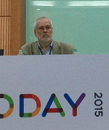
I was in Mumbai for only a few days, invited as a keynote speaker at Typography Day 2015, an annual event that moves around among various Indian universities. This year it was being held at its original home, IIT Bombay, or the Indian Institute of Technology Bombay. The large, leafy campus lies on the northern fringe of Mumbai, abutting the shore of Powai Lake and at the southern tip of the vast hilly Sanjay Gandhi National Park. The university has about 8,000 students in a variety of faculties, clustered throughout the campus; many of the central buildings are aligned along a covered open-air walkway known as the Infinite Corridor. Although the campus feels considerably less crowded than the heart of Mumbai, and it suffers much less from the ever-present air pollution, proximity to the national park requires signs like one I saw near the lake warning that a panther had been spotted in the vicinity. “Well,” as one local put it to me, “we’re encroaching on their territory, so why wouldn’t they came into ours?”

Typo Day was put on by the Industrial Design Center, the design school at IIT, and the talks were presented in the IDC’s large, modern auditorium. Outside the auditorium was a large common area where people could mingle during the breaks for the aptly named “tea and networking,” and just outside the building, a display of typographic posters was hung in the open air and a sculptural assemblage of 3D Indian letters climbed one of the twisting trees.

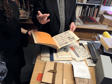
The displays, like the subjects of talks and workshops, were not only multilingual but multi-script. India is a land of many languages and many writing systems; Hindi is simply the largest, and the dominant one in northern India, but the only common language that educated Indians have throughout the country is English. Although most of the various Indian writing systems are somehow related to Devanagari, the complex script developed for ancient Sanskrit and used today for Hindi and several other North Indian languages, the relationship is tenuous enough that only scholars can really spot the similarities. As one Hindi-speaking designer from Mumbai put it, “If I go to Bangalore, I can only admire the writing there as shapes; I cannot read it.” Several of the talks at Typo Day dealt with the fine points of Devanagari type designs and manuscript traditions; others dealt with different writing systems, including one talk by a woman from Sri Lanka, Sumanthri Samarawickrama, about the lack of vocabulary to describe the letterforms of written Sinhala.

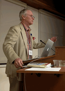
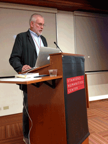
But it wasn’t just fine points and details. There was exuberant creativity on display, and the other keynote speaker, Itu Chaudhuri, gave an inspiring and well-illustrated talk about how a love of letters “will enrich your life.” He then proceeded to demonstrate how it had enriched his.

I was treated extremely well by the organizers of Typo Day, Prof. Ravi Poobaiah and his wife, Dr. Ajanta Sen. Not only did they fly me to Mumbai, have students meet me at the airport when my flight arrived in the middle of a hot March night, and put me up in the comfortable Guest House at IIT, but on the day after the end of the conference they arranged a car and driver for me to explore Mumbai (and its traffic), and the next night they had me staying at the Royal Bombay Yacht Club, which is every bit as luxurious as it sounds. We had met there for dinner the night before, but, as Ravi explained, there wasn’t a room available that night, so they drove me back to IIT, with Ajanta giving me a running commentary on the history of the heart of the city and which buildings she had grown up in.

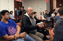
At the conference, I found myself being naturally adopted into the circle of gray-haired elders of Indian design, though I also met quite a few younger designers and students. Although I often missed the jokes, sometimes from lack of context, sometimes from not catching the accents, I enjoyed the company of these men and women with their shared history of typography and graphic design in India. (Accents varied. There was one brilliant, impassioned speaker that I had a very hard time understanding; when I mentioned this to someone else, he said, “Oh, yes, he has a strong Marathi accent. He sounds the same when he speaks Hindi.” What he was saying was so forceful that I regretted missing some of it through my own incomprehension.) I felt as though I had only scratched the surface of the typographic culture of the country.

I barely scratched the surface of Mumbai, too. I spent one afternoon walking around the streets near the Gateway of India, the monumental stone arch that once welcomed incoming ships of the British Empire during the Raj. (The Yacht Club was right across the street from the public park in front of the Gateway.) Although I clearly stood out as a foreigner, the only hassles I had on the streets were the expected attempts to sell me something; most of the time, people just ignored me and went about their way, as they ignored most of the teeming crowds around them. I visited a couple of museums, of which the oddest and thus most fascinating was the Mumbai City Museum, with its collections of objects and artifacts and models and dioramas depicting the city’s history. In one room was a current exhibit about the cultural and economic connections through history of the two sides of the Arabian Sea.

I also dropped in to the vast Chhatrapati Shivaji Maharaj Vastu Sangrahalaya, formerly known as the Prince of Wales Museum, to see the relatively small permanent exhibit on “Pre and Proto History,” the pre-Hindu Indus Valley civilization of Harappa and Mohenjo-daro. Most of the objects, however, were reproductions; the originals were in Delhi.

Impressions of Mumbai:

Very, very hot. No surprise there! I adopted a slow amble as I walked through the streets, in accord with the way most people seemed to be moving, just sort of easing through the humidity with a minimum of effort and disturbance.

Huge contrasts of affluence and poverty. Also no surprise, frankly; I knew I would encounter this, and I was neither shocked nor numbed by the inescapable poverty. I saw some of the upper levels of Indian society, but the top and the bottom mingle on the same streets. I did not try venturing into any slums, such as Dharavi, where Slumdog Millionaire was filmed; nor did I go to see colorful fisherfolk on the quay at Sassoon Dock. For that matter, I did not go see a Bollywood movie while I was in the town that makes them. I just looked and listened wherever I was, and experienced the city that I was presented with, in all its ordinary glory.

Traffic. But you already know about that. It was wild and wooly, yet I never saw an accident of any kind.

Urban texture. It seemed as though everything I saw in Mumbai was either crumbling away or in the midst of being built. When I mentioned this to Ajanta Sen, she said yes, that’s exactly the way it is. Many big cities give this impression, but Mumbai had it in spades.

Military bands. This wasn’t something I expected, but while I was staying at the Royal Bombay Yacht Club, the park across the street was closed off, with a police cordon all around the Gateway of India. It turned out that there was a huge celebration going on there during those couple of days: a big stage in front of the arch, with performances by military bands and orchestras from around the country. The music was loud; and it was eclectic, a blend of Bollywood show tunes and folk performances and military band music, accompanied by light shows. I never did quite figure out what the point was. One effect that it had was purely personal: I had hoped to catch the boat to Elephanta Island on my next-to-last day in Mumbai, to see the Hindu temple and its famous carvings, but because the quay was temporarily blocked off, the boats weren’t running.

One of the typographers I saw at the conference was Aurobind Patel, a type designer and design consultant whom I had met before, a friend of Roger Black’s. He made my last day in India memorable by inviting me to his weekend house, in a fishing village north of Mumbai, to spend a relaxing day out of the city; his driver would then drive me to the airport for my flight to Amsterdam, which didn’t leave until 2:45 a.m. So I got to see a little bit of what lies outside the city, and how the city is encroaching on the countryside year by year; and I got to walk on the beach by the shore and watch the sunset over the Arabian Sea. Aurobind’s house, which was newly built to replace a crumbling older house inherited by his wife, was in the process of being repainted and having the pool’s foundation reinforced. During the painting, the wall-size sliding-glass doors on the seaward side were covered by huge segments of Bollywood movie posters, their painted sides turned in; this gave the interiors a bizarre and dramatic look. But while I was there, that very afternoon, the workmen finished the painting of the exterior, and as I was taking a much-needed nap they removed the posters from the windows. So when I awoke I could look out through the glass directly to the sea. That was quite some transformation.

I have now seen a very tiny piece of India, and met a wonderful and eclectic range of Indian designers and typographers. Perhaps this will be just the first of many visits to the subcontinent.

Translated serifs

Published

My little book Hanging by a serif caught the eye of Bertram Schmidt-Friderichs, co-owner of Hermann Schmidt Verlag in Mainz, Germany, a fine small publishing company that specializes in books about typography and design. As a result, my book has been translated, revised, and slightly expanded, and is about to be published in Germany. The German title is Thesen zur Typografie (the someone whimsical “Hanging by a serif” proved resistant to translation), and its release coincides with the annual Frankfurt Book Fair, which opens today.

I haven’t held a copy in my hands yet, but I know it has a sewn binding and two-color printing – more ambitious than my original self-published edition. And a few different serifs. Perhaps it will see a more ambitious American edition, too.

Thesen will join other new books in the Hermann Schmidt line at their display at the Book Fair this week.

Display of new Hermann Schmidt Verlag books

Sprinting into the future

Published

My e-book essay “What is needed” has just been republished on the website of “Sprint Beyond the Book,” a project of Arizona State University’s remarkable Center for Science and the Imagination.

In May, Eileen and I met up with nine other invited guests to participate in CSI’s third “Sprint” event, a workshop/conference focusing on “The Future of Reading.” CSI’s first Sprint, with a theme of “The Future of Publishing,” had taken place last fall at the Frankfurt Book Fair, where the participants worked in the midst of the hurly-burly of the world’s biggest book festival; the second (“Knowledge Systems”) took place in January on CSI’s home turf at ASU. This third one was held at Stanford University, in conjunction with Stanford’s Center for the Study of the Novel.

The mix of people and ideas was invigorating, and the fruits of that brainstorming are intended to be published. (One description of what the Sprint was all about was “creating and publishing a book in three days.” But what kind of a book, exactly?) The other participants at the Stanford event were Jim Giles, Dan Gillmor, Wendy Ju, Lee Konstantinou, Andrew Losowsky, Kiyash Monsef, Pat Murphy, David Rotherberg, and Jan Sassano. The whole project was organized by its instigator and ringleader, Ed Finn, and his talented and indefatigable staff members Joey Eschrich and Nina Miller. I’ve been working with Nina, when we each have time, on the format for eventually publishing the results of the Sprint.

In the meantime, in somewhat kaleidoscopic form, parts of our conversations and digressions, and the texts that we created in the course of the three days, are available now on the “Sprint Beyond the Book” website.

“What is needed,” which I wrote more than two years ago as a post on this blog, is essentially a high-level technical spec for the missing tools that we need in order to do good e-book design. Most of these tools are still missing, two years later, despite the rapidly changing nature of digital publishing. Some of the ideas have made their way into various proposals for future standards, but not much has been reliably implemented yet. I’m still looking forward to the day when everything I was asking for will be so common as to be taken for granted. Then we can make some really good e-books; and our readers will be able to enjoy them.