function jdb_page_navigation()
sPageSlug = blog
sPageTitle = easily amused
header:139:aPageArgs:page_title = easily amused
header:140:aPageArgs:section_title =
functions-johndberry:262:aPageArgs:page_title = easily amused
functions-johndberry:298:sPageTitle = easily amused
functions-johndberry:359:sPageTitle = easilyamused

easilyamused |

Author archive

Visualizing with text

Published

I had fun recently collaborating with Richard Brath, the author of Visualizing with Text, on a cover for this upcoming book from CRC Press. It’s part of the AK Peters Visualization Series, a line of books from Routledge that focuses on different ways of visualizing information, largely scientific or technical. Brath has written a specialized yet informative study of the many ways that text can function as an element of visual design.

Not surprisingly, the book is richly illustrated, so we had lots of possibilities when it came to pulling images that might be used on the cover. But first I tried out a number of dramatic single images of type or letters that did not come from the book. Richard responded with a very dense collage of images from within his own text, which I found fascinating but probably overwrought for a book cover. Especially for the cover of a book that would most likely be seen as a thumbnail in a catalog or online, rather than displayed lavishly on the front table of a bookstore.

The process, as I said, was fun, going back and forth and trying out different combinations to find one that would both be dramatic and reflect the diversity of techniques that his book covers.

I also got the publisher’s permission to replace the ITC American Typewriter that they had been using on the covers of this series with David Jonathan Ross’s recent revival of Dattilo, a typewriter-inspired Italian typeface of the early 1970s that was originally issued by Nebiolo. Like American Typewriter, Dattilo is not actually monospaced at all; it just reminds us of a monospaced typewriter face. But Dattilo has a much richer variety of weights and optical sizes, enabling me to take the same series design and give it a much more dramatic typographic treatment.

Richard Brath has written his own informative blog post about designing the cover of his book. The book will be published this fall.

Trouble in Tiny Town

Published

We’re all locked away from our favorite bookstores during the current pandemic, so I haven’t seen the trade-paperback edition of Luis Alberto Urrea’s novel The House of Broken Angels in printed form. But I did see a little thumbnail image of the cover in Moira Macdonald’s recent book column in the Seattle Times. That image didn’t quite have the effect it was meant to have: I burst out laughing the moment I saw it.

The symmetrical arrangement of the principal words of the title, and the small size of the ancillary words, turns the title into what appears to be a stack of three words. And the tiny “OF” next to “HOUSE,” at this size, can easily be mistaken for a hyphen.

So you end up with “THE HOUSE-BROKEN ANGELS.” Which would no doubt be a very different book.

The paperback cover looks just fine at full size, as it would if you saw it displayed on a table in a bookstore. And the very different design of the hardcover jacket isn’t so symmetrical, which makes it less prone to this kind of misreading.

I’m not showing this to make fun of the book-cover design. I’m using it to point out how important it is for a cover designer to look at their design in all the contexts it may be seen in, including at Lilliputian size on a newspaper page or on a website on someone’s phone. How can it be misread? If it can be, it will be.

[Images: trade-paperback cover (top) and hardcover jacket (bottom) of Luis Alberto Urrea’s The House of Broken Angels]

Hanging by a serif (again)

Published

The visual concept behind Hanging by a serif came from something I was playing with for our 2012–2013 holiday card. “The stockings were hung by the serifs with care…” read the front of the card; inside, the text continued, “…in hopes that typographers soon would be there.” On the front, a wild cacophony of huge serifs barged in from the outer edges, with little green Christmas-tree ornaments appended to a couple of them. The background was a pale-green image of a potted conifer, drawn in stained-glass-style, taken from an image-based “Design Font” that Phill Grimshaw had designed in the 1990s for ITC. (The inside also featured a pale background image from the same font, this time of a wrapped package.) It was fun, though I wondered what our non-typographer friends and family would make of it when we sent it out.

Later that year, I began experimenting with the concept, juxtaposing short snippets of text from my own writing with big details from various serifs. I found that I had a lot of statements or fragments on the subject of design that seemed to fit into this format. Eventually, these epigrams and serifs took the form of the first edition of the book Hanging by a serif.

That first edition caught the eye of Bertram Schmidt-Friderichs, whose Mainz-based company, Hermann Schmidt Verlag, has published so many excellent books on typography and design. Bertram wanted to do a German edition of my little booklet, which would be a nice calling card for his publishing program and might even sell a lot of copies. (It didn’t.)

Bertram’s approach to publishing is thorough, and he wanted to include notes about which typefaces all the serifs had come from. This sent me back down the rabbit hole into my own production process, since I had been working with truncated images for most of the design of the book, and I hadn’t kept very careful track of what typefaces my serifs had originally been attached to. It took quite a bit of retrospective detective work to find all my sources. (Hint: a couple of the images had been reversed.) In this sense, the German edition is more thorough than mine. It also has a couple of serifs or serif-like glyphs that are different from the ones I used.

But one of the epigrams bothered Bertram: “Most graphic designers never get more than rudimentary training in typography.” While true, this struck him as too negative, and he suggested coming up with a replacement. In the end, we went with a statement in German that translated as, “Typography is never an end in itself, it targets the eye of the beholder.” (Probably pithier in German.)

When it came time to do a new English edition of the book (since I was running out of copies of the original), I decided to make two changes. The serif I had used on the cover of the first edition was taken from Justin Howes’s ITC Founder’s Caslon, a digital reproduction of William Caslon’s original types in which Justin attempted to re-create the exact effect of the metal type printed on hand-made 18th-century paper. The outline, therefore, was rough. This roughness around the edges bothered a number of people, some of whom asked me if perhaps the image had been printed at too low a resolution. It hadn’t; this was precisely the effect that the typeface was designed to have, but blown up to extra-large size like this, it was distracting. So for the new edition I searched out a new serif that would work well on the cover. (The serif I chose is from Matthew Carter’s newly released type family for Morisawa, Role.)

And I did replace the problematic epigram that had bothered Bertram Schmidt-Friderichs, though not with the one we used in the German edition. As I had mentioned once in this blog, a quip of mine had been making the rounds of social media for some time, being quoted repeatedly out of context, and I thought it really belonged in this compendium. So if you turn to page 16 of the new edition, you’ll find this: “Only when the design fails does it draw attention to itself; when it succeeds, it’s invisible.” It really wanted to hang with the other serifs, and now it does.

Designing the Poets’ flexible logo

Published

When Tree Swenson asked me to create a new visual identity for the Academy of American Poets, the brief included creating a new logo. Tree was then Executive Director of the Academy, which was (and is) based in New York City but represents poets and poetry from all over the country. Other parts of the visual identity included the annual report, the website, and promotional material and program books for the Academy’s annual fundraising event in New York, which featured, each year, several very prominent people from the literary and entertainment worlds.

In the logo, Tree told me, the emphasis should be on “Poets”: that was the word she wanted people to remember, not “Academy.” So from the first I thought it should be a two-element logo, with “Academy of American” essentially modifying “Poets.”

As you can imagine, I played with all sorts of typefaces and all sorts of arrangements. At first I aimed for something symmetrical, preferably square or circular, because that’s the least troublesome shape for a logo that has to be used in a wide variety of circumstances. But then I began breaking the boundaries.

By turning the word “Poets” into the central element, spelled out in all-caps in Matthew Carter’s elegant, sparkling typeface Big Caslon, and placing it within a classical-looking rectangle, I gave the logo a solid, clearly recognizable mark. But what about the rest of the name?

Poets horizontal logos

For that, I tried something entirely different, though also in an elegant and somewhat old-fashioned tradition. I set the words “Academy of American” in Zapfino, Hermann Zapf’s swooping calligraphic typeface, a dramatic contrast to the solidity of the Big Caslon caps. And I let the calligraphic strokes overlap the main element.

In fact, I tried out a large number of different placements of the Zapfino words, and what this process made me realize was that there was no one solution; in fact, there should not be a single solution. Instead, it became a modular logo that could change again and again in various uses.

Poets logo variations

Zapfino has an enormous number of swashes and alternate forms of letters, notably for both the lowercase f and the uppercase ‘A’. This meant that varying the logo wasn’t just a matter of moving around a calligraphic element, but of choosing a different arrangement of strokes for each instance.

The version we used most often had restrained A’s but an exuberant f in “of,” which swoops down into the word “POETS” and up outside the top of the box, plus somewhat restrained swashes on the d and y of “Academy.” Other versions substituted a swash version for the first A, breaking the box on the left as well as at the top.

In some instances, we did away with the box altogether. The membership cards boxed “POETS” but left “Academy of American” outside the box, floating above it, with swashes penetrating the space of the box and a swash on the final n flying out to the right. For the mailing label, where a horizontal approach was called for, both elements were in the same line, rather than stacked; though they still had a little overlap.

Poets business & membership cards

Then there was the website logo: poets.org. In ads in the New York Times and elsewhere, promoting National Poetry Month, we used a “poets.org” logo done in the style of the Academy logo: POETS in Big Caslon, and the “.org” in Zapfino, in a second color, with the tail of the g dramatically sweeping under the word “POETS.” (This proved to be a difficult design for use on the website itself. In the end the website design was done separately.)

Poets combined logo

On the cover of the annual report, the logo’s elements were rearranged along with the other typographic elements, including an enlarged ornament from the Zapfino font (which changed from year to year; the first one was the tip of a calligrapher’s pen). I would use Zapfino ornaments as occasional accents on later pages.

One other situation called out for a special treatment: when the logo would be displayed on the front of the lectern during the annual fundraising events at Lincoln Center. I tried out the slightly bold “Forte” weight of Zapfino, but decided that it wasn’t necessary. Instead, it was a simple stack of four words, in Zapfino and Big Caslon, on a black background, enclosed in a single-line box that some of the (relatively short) swashes burst through. It was meant to be readable at a distance in a large, dimly lit auditorium, yet still to be recognizably the logo of the Academy of American Poets.

This identity, with its ever-changing logo, was used for three years, until changes at the Academy brought on, as they often do, a change in its visual direction. The Academy’s current visual identity is very attractive and effective, though it is entirely different in style and feel.

A tale of three nametags

Published

In the course of less than a month this summer, I attended three major events, each of which had a nametag that attendees were supposed to wear. The first, in Dublin, was this year’s World Science Fiction Convention, which was being held in Ireland for the first time. The second, a week later in Belfast, was the Eurocon, or European Science Fiction Convention, which moves around among European countries and was hosted by the organizers of Titancon, an annual Belfast science fiction convention; holding it in Northern Ireland the week after the worldcon made it easy for people visiting from other countries to attend both conventions on their trip. The third event was ATypI 2019, the annual conference of the Association Typographique Internationale, in Tokyo – ATypI’s second time in Asia, as it happens.

Aside from dueling jetlags (I was only home in Seattle for five days between the two trips), this juxtaposition provided a classic opportunity to compare approaches to designing the nametags or badges for such an event. I’ve written about this before, in an article about nametags published in FontShop’s Font magazine: “The moment when the design of nametags really matters is when you’re stumbling about at an opening reception, trying to spot familiar names without rudely staring at people’s chests.” Although the organizers might consider the first purpose of a nametag or badge to be labeling someone as a paying (or non-paying) official attendee of the event, for the attendees themselves the purpose is to be able to identify individual people by name. And the distance at which you want to be able to read the name is about three meters (ten feet), well before you find yourself face to face with that person whose name you know you ought to recall.

So how well did the badge-designers for these three 2019 events do?

Close-up of three nametags

Well, the Dublin nametag does make the name fairly large, though not large enough to be read at any distance. Fully three-quarters of the area of the nametag is taken up with artwork, which incorporates the name of the convention. Not too bad, but not ideal.

The nametag for Eurocon/TitanCon seems perfunctory. It’s quite small, and the largest visual element is the label “Adult Attending.” The typeface used for the name is a pretty good choice – clear, condensed, bold, and set in upper- and lowercase – but it’s tiny. You can barely read it even if you’re peering at it up close. The same name set ten times larger would have been effective; and there’s plenty of white space to accommodate a much bigger name. The TitanCon nametag is basically not functional.

On the nametag for ATypI, which is the largest of the three, the attendee’s name is both big and bold, clearly set within a large white square. It might have accommodated longer names better with a somewhat condensed typeface (which would also let shorter names be set larger), but overall my only complaint is that the name isn’t set in black; instead, it’s set in a pale second color, which tends to drop back, visually. (The color varied depending on the status of the attendee.) But it was generally readable as you approached someone in the corridor, so it was doing its job.

I don’t understand why this is so difficult. It should be thought of as information design, not just branding. Combine the typeface and color of the TitanCon names and the size and placement of the ATypI names, and you’d have a near-perfect nametag. Yet year after year, organizers of conventions and conferences, even ones devoted to graphic design, reinvent the wheel. And they sometimes get it flat.

In search of ATypI

Published

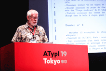
This is the text of the talk I gave yesterday at ATypI 2019 in Tokyo, about the project I’ve been working on for the past year: a history of ATypI. A draft of the first part of the history is now available on Medium.

*

I’ve given this talk the title “In Search of ATypI” because it really did require a search, to uncover the Association’s early history.

The Association Typographique Internationale (ATypI) was founded in 1957. The driving force behind the creation of ATypI was Charles Peignot, managing director of Deberny et Peignot, one of the most important French type foundries. (This, incidentally, is the reason why the Association’s name is in French.) The first official general meeting of ATypI took place in Lausanne, Switzerland, during an exhibition called “Graphic 57.” The list of people involved in that first meeting is a virtual Who’s Who of the type world of the 1950s.

Over the 62 years of ATypI’s existence, we haven’t always been very good at keeping records and preserving the association’s institutional memory. Most of the records we have are now kept at the University of Reading, but those records don’t go back past the 1970s and a little bit of the 1960s. And only some parts of them have been organized and catalogued.

When the Board of Directors commissioned me last year to write a history of ATypI, I had to see if I could find some documentation for those early years, and try to talk to the relatively few people left whose memory goes back that far.

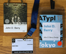
My own involvement with ATypI began in 1990, when I attended Type90 in Oxford, my first type conference. So I have several decades of first-hand knowledge; but when ATypI was born I was barely seven years old. On the other hand, in subsequent years I served on the Board of Directors for fourteen years and as President for six, I have written quite a lot about typographic history, and I’m willing to talk to pretty much anyone while I’m doing research. So it may be that I was the right person to ask to write this history.

I only wish we had begun this project ten years ago. But I suppose everyone writing a history of a contemporary organization has a similar regret.

*

There are many boxes and file cabinets of ATypI records at the University of Reading, and right after the 2018 conference in Antwerp, I spent several days in Reading digging into those boxes. Some of them were well organized; some were not. My work was made easier because Ferdinand Ulrich had done some organizing and cataloging of the materials as part of his postgraduate research at Reading, so I had Ferdinand’s very useful outline of what kinds of materials we had and where they were in the archive.

And by following up on a couple of serendipitous leads, I discovered earlier collections of papers from both Charles Peignot and John Dreyfus, co-founders of ATypI and the association’s first and second presidents, respectively. These were not in Reading.

*

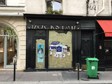
The Peignot lead came from Jean François Porchez, who was ATypI president from 2004 to 2007, and who organized the 1998 ATypI conference in Lyon. I stopped over in Paris for a couple of days on my way from Antwerp to Reading, and over dinner, Jean François told me that he thought that Peignot had given his papers to the Librairie Paul Jammes, a highly respected rare-book dealer. This antiquarian bookshop is located in a very old building in the heart of Paris, in the Saint-Germain-des-Prés quarter of the 6th Arrondissement. The very next day, I visited the bookshop and met the director, Isabelle Jammes, the granddaugher of the founder. She was very helpful, but she told me that the Peignot archives had been donated many years ago to the Bibliothèque Forney, the city of Paris’s specialist library for, among other things, the graphic arts.

I had no time during my brief stopover to visit the Bibliothèque Forney myself, but luckily one of my American friends who lives in Paris is an art historian and editor, and she is also a member of the Forney. She was quite familiar with the library, she speaks French, and she was willing to go to the library and dig into the Peignot archive.

So I got permission from the Board to commission her to do exactly that.

It turned out that the Peignot archive, or “le fonds Peignot” in French, had an unusual condition attached to it: only items that had already been published could be photographed or scanned; original documents could not, although they could be quoted. This meant that Allison had to copy out by hand any information that seemed relevant.

Not all of the Peignot archive was concerned with ATypI, but among the papers were many records of early meetings when the Association was first being planned and when it first got going – the institutional memory that was missing from the archives in Reading. There wasn’t much personal correspondence, unfortunately.

*

But here is where the other unexpected lead comes in. One of the long-time ATypI members that I got in touch with was the Swiss book designer and publisher Erich Alb. Erich told me that John Dreyfus, the second president of ATypI, had donated four boxes of ATypI-related papers to the St Bride Printing Library in London many years ago, and recommended that I go find them.

When I got to Reading, I told Gerry Leonidas about this. I didn’t have time to go to St Bride’s myself, but Gerry of course is very familiar with the library and said he would visit it and see what he could find. A few weeks later, when he had a chance to do that, he discovered that the Dreyfus papers were indeed there, but that nobody had been aware of it. Apparently the four boxes had somehow been put into storage with their labels to the wall, so that they appeared to be just four more unidentified boxes in an already over-stuffed library.

What Gerry found in those boxes was exactly what we had been looking for: not just official documents but correspondence between John Dreyfus and other founding members of ATypI, including of course his friend Charles Peignot. There are missing pieces and blank holes in the historical record, but between the Dreyfus papers at St Bride and the Peignot papers at the Forney, we now have a fair amount of documentation describing how ATypI got started.

*

The impetus behind the creation of ATypI was the advent of phototypesetting, which Charles Peignot supported but which he thought would make it much easier for competitors to copy each other’s type designs. Of course, copying of designs goes back as far as the early 16th century, when the printers in Venice accused the printers in Lyon of copying their type designs. But it was a major feature of the type business in the first half of the 20th century, with each major foundry or type-machine manufacturer rushing out new type designs that would echo the latest popular designs of their competitors.

In those days, type was either set by hand or cast on a mechanical typesetting system. Those systems were not mutually compatible; each manufacturer made its own type that worked only on its own typesetting machines. Even if a foundry licensed one of its designs to a manufacturing company like Linotype or Monotype, the design would have to be redrawn and engineered to work on their system. (This was also true of the new phototypesetting machines.)

Peignot’s goal was to have type design included in the system of international standards that was governed by the Hague Agreement of 1925 on industrial designs. A large part of ATypI’s early effort was devoted to achieving this goal, including participating in endless international standards meetings and trying to establish ATypI as an expert voice on matters of type and typography.

As it turned out, all these efforts were for nought. The quest for international protection of type designs was a quixotic effort that, over the course of more than 60 years, has never fully achieved its goal. But that’s a story for a later part of the ATypI history project.

What ATypI did achieve, through the efforts of Charles Peignot, John Dreyfus, Jan van Krimpen, G.W. Ovink, and many others, was to bring the leading figures of the typographic community together, creating an international forum for discussion of type design and typography. When they started, they were thinking in terms of a “European Typographic Union,” which quickly expanded to become an “International Typographic Association,” including the United States and Canada. I wonder what the founders would have made of ATypI today, with our focus on education rather than industrial protection, and our expanded reach around the world. I like to think that they would approve.

*

So far, my research has been mostly about the earliest years of ATypI’s history, since those are the least known. But here are a few highlights from later years.

The 1967 ATypI Congress at UNESCO in Paris was the first to be a real conference, not just a series of business meetings. As Matthew Carter recalls: “Over time, people realized that this single question, the protection of typefaces, was not really going to be enough of a reason for ATypI to exist. So these annual conferences got more and more important in the life of ATypI. They became more social and less industry-oriented. That was a novel idea at the time, to have a program of talks and so on. As far as I remember, all of them since then have had a program, some degree of talks.”

In 1973, the early efforts at type-design protection culminated at the Vienna Congress, which was a general effort at revising international standards for the protection of industrial designs. A special agreement about type design was reached, and hopes were high; when John Dreyfus concluded his term as President later that year, he did so with a feeling of “mission accomplished.” But that turned out to be premature. The agreement required at least five countries to ratify it. In the end, only two countries did.

In addition to its conferences, ATypI sponsored a series of “working seminars” between 1974 and 1992, each one focusing on a particular aspect of type or typography. (As you know, a new series of Working Seminars has just been launched, beginning with the one in Colombo, Sri Lanka, earlier this year.) The 1983 Working Seminar at Stanford University, “The Computer and the Hand in Type Design,” turned out to be a seminal event, focusing attention on the new possibilities of digital typography. It was organized by Chuck Bigelow, who at the time was an Associate Professor of Typography at Stanford, and featured, among others, Hermann Zapf, John Dreyfus, Donald Knuth, and Jack Stauffacher.

Type90, the 1990 conference in Oxford, England, was ATypI’s first event to be open to the wider community of visual design. It was organized by Roger Black, and it was a typographic extravaganza, presenting both the traditions of type and the effects of new digital technology. Sometimes it turned into a clash of cultures: I remember the shock with which some people reacted to Zuzana Licko’s all-digital presentation with its rock-music soundtrack, in one of the hallowed halls of Oxford. From that date on, ATypI was more outwardly focused than it had been in its earlier days.

In 2009, ATypI held its first conference in Latin America, in Mexico City. In 2015, the first ATypI conference in South America was held in São Paulo. The first ATypI conference in Asia was held in Hong Kong in 2012, and now here we are in Tokyo for our second Asian conference.

*

We have just published a draft of the first part of my history of ATypI on the ATypI website, so you can go there and read it now. It’s just a draft; it will be part of the first book in the ATypI history series, which will be published in time for next year’s conference in Paris. I welcome comments and any new information from anyone who was involved in ATypI’s early years. I would be especially happy to hear from anyone who has usable images from those early years; what we have is pretty sparse.

Thank you for your attention. I hope this short talk has given you a bit of historical context for the ongoing project that is ATypI.

Adieu, W.S. Merwin

Published

The wonderful poet W.S. Merwin died two weeks ago. I had the pleasure of meeting him once and being in his presence twice, and I had the honor of designing one of his books (Flower & Hand: poems 1977–1983, a reissue of his early work by Copper Canyon Press) and designing the cover of one more (East Window: the Asian poems, also for Copper Canyon). I came to his poems from designing the first of these books, but his work has become a touchstone for me and an example of what poetry can be.

The time I got meet him was when he was in Seattle for a reading at the Seattle Asian Art Museum (in fact, it might have been so long ago that it was still the Seattle Art Museum, before SAM opened a new site downtown and the Art Deco building in Volunteer Park became the Asian). After the reading proper, Merwin was ready sign books – but the art museum was strict about its closing time, so we ended up on the loading dock at the north end of the building, in chilly weather, with Merwin gamely signing books for everyone who had bought one and wanted a signature. I’m sure he later remembered that somewhat trying moment.

He came back to Seattle for a later reading, at the Seattle Public Library’s main branch downtown, and afterward there was a party at the tippy-top of Smith Tower. It was hosted by a patron who was living in the almost-secret apartment at the top of Seattle’s oldest skyscraper (for a brief time, around the turn of the last century, the Smith Tower was the tallest building west of the Mississippi), tucked into the top, above the level formerly known as the Chinese Room (now an observatory and bar) that everybody thinks of as the highest part of the tower. The family that lived there was well-off, obviously, or they wouldn’t have been there; and they welcomed a bunch of artsy types into their home to celebrate the work and the presence of W.S. Merwin. Details I remember: the Dale Chihuly glass-sculpture chandelier (bottom left) hanging down from the pointed top; the mezzanine/balcony level running around the interior of the pyramidal space; lots of very fine food and wine catered on tables on the main floor; and the ladder to the actual tip of the tower, where you could crawl out into the night air and view the lights of downtown Seattle (I decided that I was probably not svelte enough to make this ascent, and declined). I never did actually talk with Merwin at that event, but I think he had sufficient attention from the other admirers present.

Merwin’s elegiac poems from his later years speak volumes to me, and fit my own autumnal sensibility as my friends and I age and as the world seems (sometimes) to be descending into darkness. But then, the world always seems to be doing that, at least when you yourself have gotten old. I take Merwin’s late-in-life poems as a guide and a voice in the mist; and I appreciate all of his words, recent and old, as an expression of what it means to be human. Thank you, Bill Merwin.

Gerard Unger, Theory of Type Design

Published

I recently finished reading Gerard Unger’s final book, Theory of Type Design, which I bought at the ATypI conference in Antwerp last September and which Gerard signed at the book-launch event there. It was the last time I saw him, as he died of cancer only a couple of months later.

It took me quite a while to read through Theory, not because it’s at all difficult but because each time I finished a chapter, I wanted to put the book aside and savor what I had just read. It is not, after all, a book with a plot, like a novel; it is, however, a book with a theme and a clear development of that theme.

What Gerard Unger does in this book is nothing less than provide a comprehensive look at every aspect of the design of type, from its origins to the ways we design, read, and design with digital type today on a multitude of screens. Unger always thought about type systematically and observantly, looking for the connections and common elements that bind together such a disparate and unruly history. He was himself a consummate type designer, and a famously thoughtful and helpful teacher. You can hear his voice on every page.

Although his range as a designer was wide, you can often tell a Gerard Unger typeface at a glance; they have a commonality of approach and feel that transcends individual style. One element that I’ve noticed for many years is the way he would pare away what isn’t necessary, including connections within letters: he explored how much you could delete while keeping a typeface happily readable – a useful experiment when you design type for unfavorable conditions of printing or screen viewing. In a note (on page 196), he remarks, “The purest forms I have made as a type design are those of Decoder (1992).” Decoder was a purely experimental typeface (based on the shapes in his typeface Amerigo) issued as an early part of the FUSE project, to see what people would make of the detached yet recognizable parts of Latin letters.

I had hoped to have a chance to interview Gerard for the history of ATypI that I’m working on, since he had been closely involved for many years, but his deteriorating health made that impossible. Despite this, amazingly, he took the trouble after the conference to write me a short note, to let me know that he wouldn’t be able to help after all. That’s the kind of person Gerard Unger was.

Watch out for falling rockstars

Published

It’s been a while since I posted a photo of shop-front lettering that’s been removed. I always find such artifacts fascinating. This one is from last September, in Paris, in the 7th arrondissement. “ROCKSTAR,” I think, the sign must originally have read.

Detail of lost shopfront lettering in Paris.

TypeCon 2018 Portland

Published

At the beginning of August, I was in Portland, Oregon, for the 20th anniversary of TypeCon (which was also TypeCon XX, thanks to their having skipped 1999, the second year). As one of the few who attended the very first TypeCon, held in a crummy motel next to a business park in Westborough, Mass., I appreciated how the conference has grown and changed. It was founded by Bob Colby as a low-cost convention for type enthusiasts and appreciators; as it happened, many of the attendees of the first TypeCon turned out to be independent type designers, and that put a stamp on it for years to come.

As with any gathering of its kind, TypeCon for me is first and foremost an opportunity to see old friends and make new ones, and I did plenty of both in Portland. There were intriguing talks and presentations, and I managed to get to most of them on the first day, though more spottily after that. But the highlights for me tended to be things like sitting around one afternoon in the hotel lobby talking with Rod McDonald about Ed Cleary and old times in the type world. A nice mix of friends and new acquaintances was the TypeThursday lunch organized by Thomas Jockin, where those of us from various TT chapters got to meet up and chat for an hour or so.

But there were also highlights among the official events. I particularly enjoyed Gemma O’Brien’s very hands-on keynote talk, and meeting her briefly later. Frida Medrano, who was given the SOTA Catalyst Award, impressed me with her cutting-edge knowledge of variable fonts. Rainer Erich Scheichelbauer did a live-action tapdance of OpenType Variations that was witty, entertaining, and eye-opening. Nina Stössinger delivered an excellent keynote talk (no surprise there!). The Sunday Type Crit, as usual, was a relaxed yet focused insight into the type designs of various volunteer designers, and into the minds of the very experienced critiquers. (I wouldn’t call them “judges” or a “jury,” as it wasn’t in any sense a competition; just helpful advice and suggestions.)

Type Crit

I had been skeptical about Matthew Wyne’s “Letters and Liquor: a Typographic History of Cocktails,” but he pulled off an entertaining slideshow, and afterward several of us cheerfully accompanied him to a local bar that served “barrel-aged Negronis,” a variation on my favorite cocktail that was new to me.

With Glenn Fleishman, I journeyed up to the northern edge of Portland to revisit the C.C. Stern Type Foundry, or as it’s calling itself now, the Museum of Metal Typography. I was welcomed by printers and typesetters I hadn’t seen since my previous visit, during the previous Portland TypeCon, and enjoyed the smells and sounds of metal type-founding (and the heat of a busy machine shop).

C.C. Stern Type Foundry

For North Americans (and visitors from overseas), TypeCon provides an annual place to get together and catch up with the typographic community. I must admit that I’m enjoying the current pattern, where TypeCon seems to return to the Pacific Northwest every couple of years. As has become habitual, though, the SOTA board had not decided on next year’s location yet when this year’s TypeCon ended. We’ll just have to wait and see.

[Photos: (top, above) the Type Crit in action; a scene at the C.C. Stern Type Foundry; (left, top to bottom) (L–R) Matthew Carter, Frida Medrano, John Downer, Jill Pichotta after the Type Crit; (L–R) Jean François Porchez & Christopher Slye, looking spiffy; (L–R) Laura Serra & Erin McLaughlin at the closing party; the C.C. Stern Type Foundry sign; Rainer Erich Scheichelbauer’s live variable-fonts demonstration.]