Writing on type & design
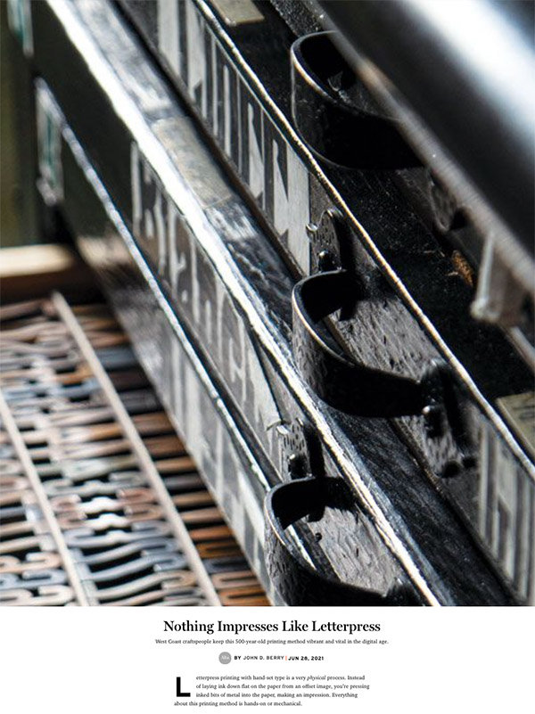
Traditionally, letterpress printing is done with foundry type – little chunks of metal with backward letters carved on their ends – which you can hold in your hand. This type is hand-set, which means placing each piece of type, one after the other, into a line of words held in a small metal frame – the composing stick – that you hold while you work; as you add more letters to the stick, it gets noticeably heavier. There’s nothing digital or virtual about any of this. The process of setting type by hand and then using it directly on a mechanical press dominated all printing until the arrival of photographic and then digital techniques in the 20th century.
Yet there are craftspeople, many of them young, who are still setting type by hand. In an age when the digital has overtaken the analog in so much of our lives, the hands-on process of letterpress printing has a clear appeal for anyone whose creative work is otherwise done in front of a screen. And some of these people are experimenting with combining letterpress and the digital world.
[See the full essay: “Nothing Impresses Like Letterpress”, Alta no. 15, Spring 2021]
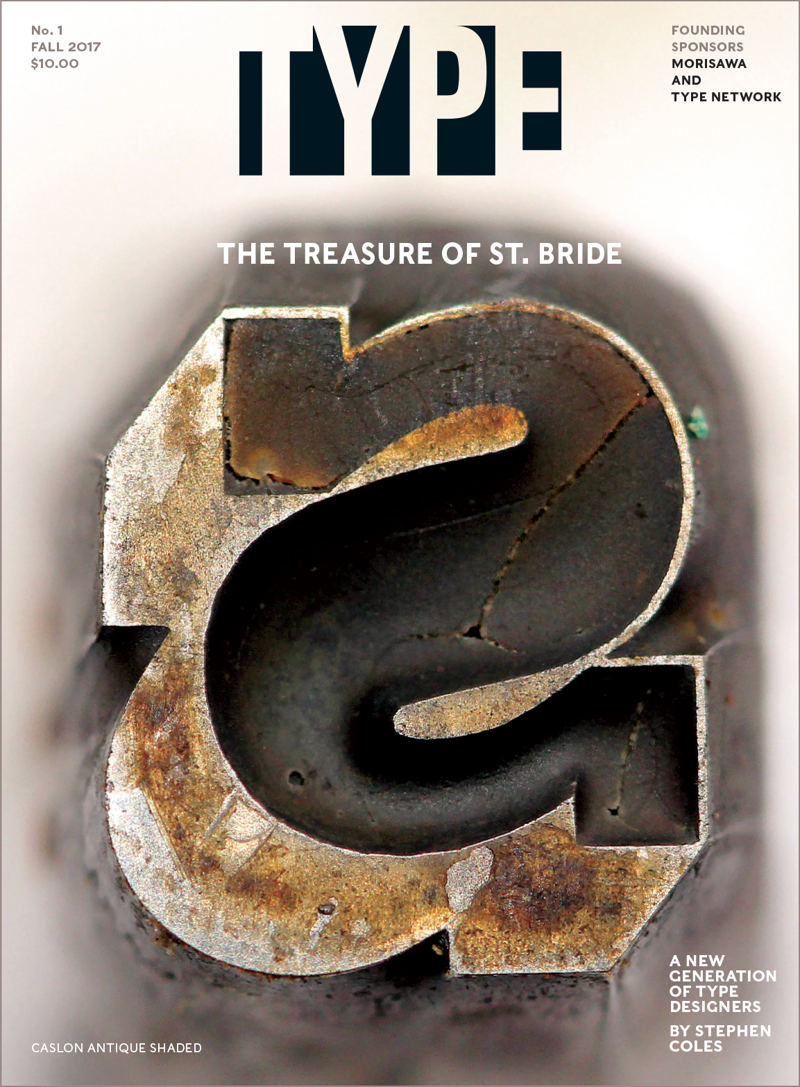
Robert Norton was a huge Englishman, six-foot-six and “broad to match” (as typographic historian Nicolas Barker has described him), with a large head and a shambling gait. He loved sailing, food, and drink; he once started a factory in Jamaica; and in the Swinging Sixties, when he owned one of the hot typesetting shops in London, he was known to drive around town in a lavender Bentley. He hosted parties on an old German river ferry that was called Belwe, after a revived German typeface. He had a self-deprecating sense of humor, a keen eye for technical detail, and many years of experience in putting new typesetting technologies to profitable use.
“Robert Norton changed the world on us,” says Greg Hitchcock in retrospect. “He’d look at what we were doing and say, ‘You can do better than that.’”
[See the full essay: “The faces of Microsoft”, TYPE no. 1, Fall 2017]
Reading is a cultural act. What we preserve in writing and pass on through reading is our cultural knowledge, whether it’s instructions on how to change a lightbulb or a lyric poem written in response to someone’s death. For more than half a millennium we have relied on printed books for transmission of culture, along with an ever-expanding cloud of printed ephemera.
In recent decades, our dissemination of written knowledge has expanded without the need for physical printing. But we’re still learning how to read the unprinted word; and the people who lay out pages for readers are just now figuring out how to present those words in an easy-to-read form. That form isn’t always the same as the ones developed for books, magazines, and other members of the print family.
[See the full essay: “Unbound pages”, The Magazine no. 13, March 28, 2013.]
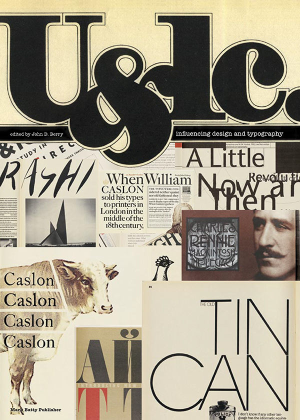
Nothing that we did in my tenure as editor created as much of a stir as changing the logo. Readers were outraged. Many of them had been reading U&lc since their student days, and in their nostalgic eyes the old logo had become one of the eternal verities. Some even referred to it as “classic” – though that description might have caused Herb Lubalin to laugh. Lubalin had been an iconoclast, someone who shook things up; our remaking of U&lc was entirely within that changeable tradition. Nonetheless, the new logo (though appreciated by some) was a bone of contention to the end.
[See the full essay: “The Business of Type”, introduction to U&lc: influencing design & typography]
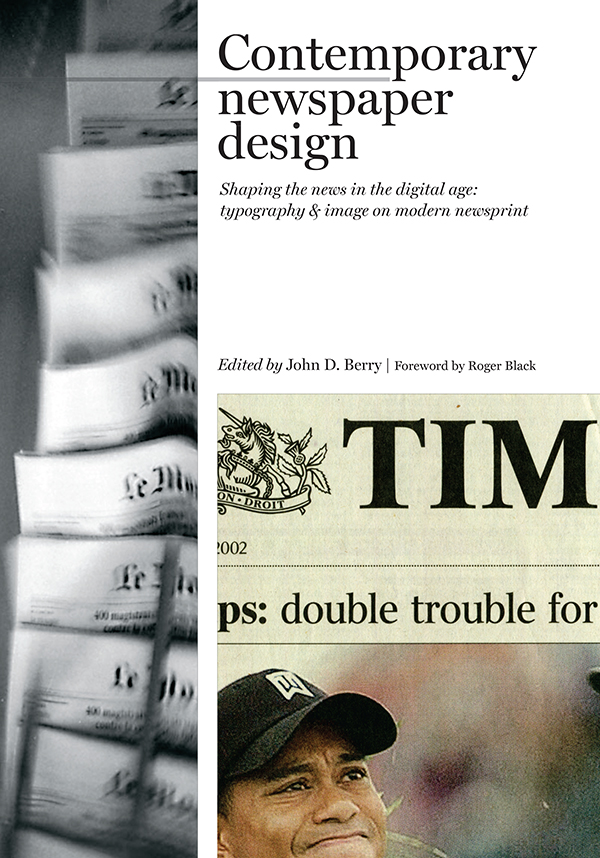
Getting the right look in the type on a newspaper page is a hard task. It not only has to convey the actual information, it has to promise the kind of reading experience that the reader expects and that the paper does, in fact, deliver. Nothing is more disruptive of reader loyalty than a redesign that changes the terms of the transaction between paper and reader: that promises something different from what it delivers. The Times Classic typefaces, and the redesign that they were a part of, had to deliver, in essence, “more of the same, only better.”
[See the full essay: “Introduction”, Contemporary newspaper design: Shaping the news in the digital age: typography & image on modern newsprint]
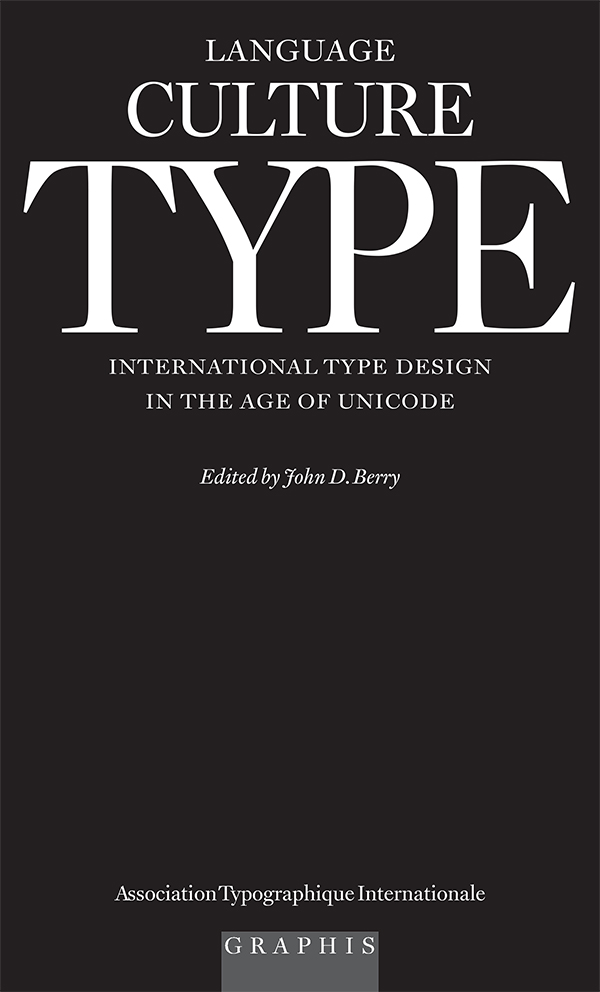
Despite the dominance of English in the world today, and especially its preponderance on the Internet, only a portion of that global communication is done in English, or even in the Latin alphabet. The distribution of languages around the world is uneven, and any attempt to map them must of necessity lie, through oversimplification. People speak more than one language, whether well or badly; people move around, and learn or forget; people play with their language, making jargon and inventing new terms; people hear new words on television or radio, or in the local marketplace, and adapt them to their own use. Almost all the languages in the world today can be written, even those that were once purely oral; and once a language is written, there develops a constant back and forth between its written forms and its spoken forms, each influencing the other. In order to communicate in our many tongues, we need type.
[See the full article: “Preface”, Language Culture Type: international type design in the age of Unicode, 2002]
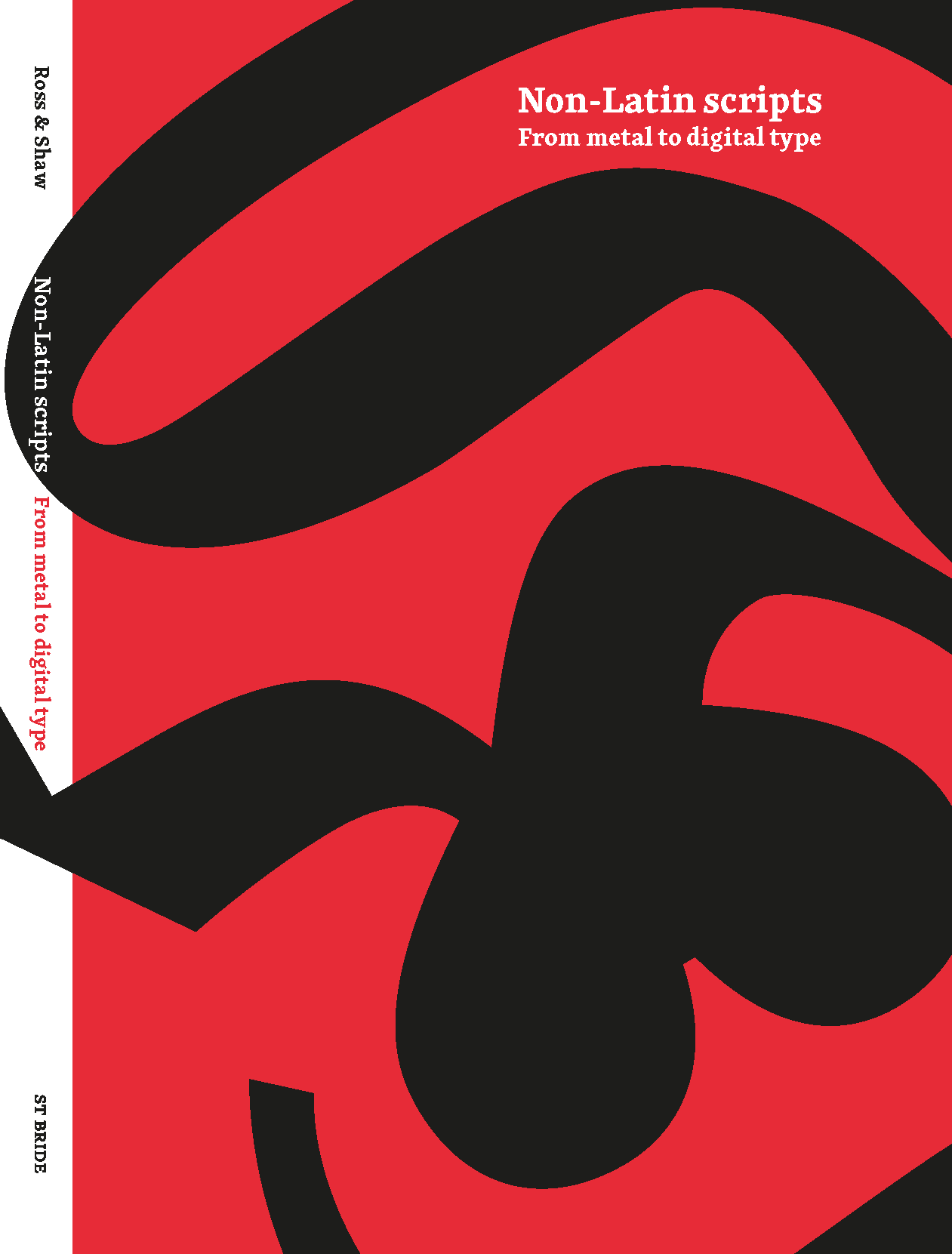
The importance of non-Latin type design today almost goes with saying – almost, but not quite. In the culturally dominant English-speaking world, it’s all too easy to assume that everyone communicates in English, or at least in a language that uses the same Latin alphabet that we use. But that’s not true, and it has never been true.
[See the full article: “Afterword | the shapes of language”, Non-Latin scripts: from metal to digital type, 2012]
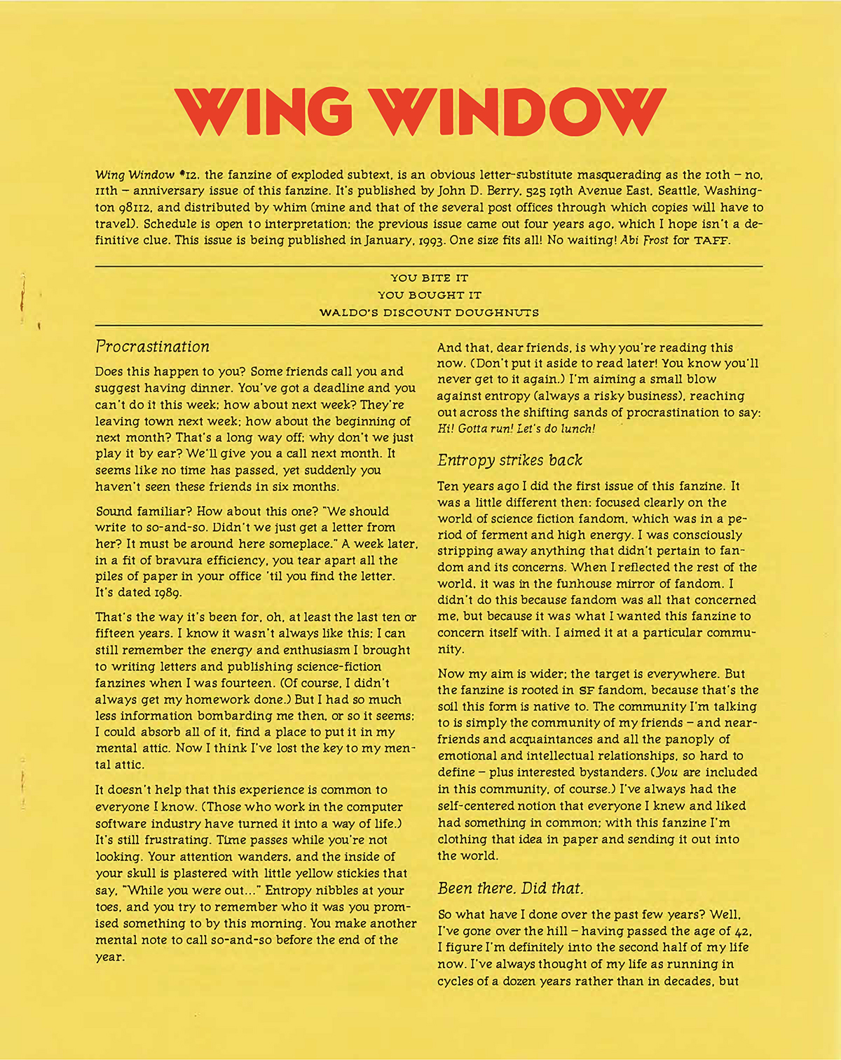
Is it possible that the reason people talk so eagerly about the death of paper and the rise of electronic books is that so many of the books they see are badly made? Most paperbacks are impossible to read, and even some of the hardbacks that you pay fancy prices for are so poorly constructed that they’re physically painful to read. You have to hold them open with a brick, or by the constant pressure of your fingers and thumbs. The type curves into the gutters and disappears, so you’re never able to read a line of type on a flat surface. No wonder people look forward to reading off a flat screen that they can control, one page at a time! Who would worship the “tactile feel” of reading a book when that feel consists of sore thumbs and abraded fingers?
[See the full essay: “The publisher’s dilemma”, Wing Window 12, 1993]
The moment when the design of nametags really matters is when you’re stumbling about at an opening reception, trying to spot familiar names without rudely staring at people’s chests. That surreptious sideways glance, trying to catch a glimpse of a person’s name without being too obvious about it, certainly has a better chance of being inconspicuous if the name on the tag is typeset in a large, clear typeface, in upper and lowercase letters (not all-caps), against a background that doesn’t clash with the type. Even 24-point Helvetica Bold will do, if there’s nothing around it on the card; far better would be something like 40-point Meta Bold Condensed, or perhaps 36-point Meta Medium. Given the distance at which these names will be read, you might even try a typeface that would normally be reserved for use at very small text sizes – Bell Centennial, for example. The idea is clarity, above all.
[See the full article: “What’s my name? Nametags in theory and in practice”, originally published by FontShop in Font magazine, 2006]

