function jdb_page_navigation()
sPageSlug = blog
sPageTitle = easily amused
header:139:aPageArgs:page_title = easily amused
header:140:aPageArgs:section_title =
functions-johndberry:262:aPageArgs:page_title = easily amused
functions-johndberry:298:sPageTitle = easily amused
functions-johndberry:359:sPageTitle = easilyamused

easilyamused |

Archive for the category ‘signage’

Drive-by typography

Published

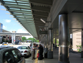
Last week we were in Madison and other bits of Wisconsin, and on the way home I noticed this bit of inadequate signage at the Dane County Airport in Madison. (This is, I should note, generally a very well designed small city airport.) We were flying on Northwest, but the signage problem would be the same for any airline. It’s all about, as I keep saying, space.

When you’re driving up to the Departures gates at an airport, what is the primary thing you’re looking for? The name of the airline. In an airport the size of Madison’s, there’s no question of multiple terminals; it’s just a matter of deciding where to pull up at the sidewalk and let your passengers off. The one and only thing that the signage needs to do at that point is identify each airline, distinguishing it clearly from all the others.

This sign for Northwest Airlines fails at its task. (The signs for the other airlines fared similarly poorly; this just happened to be the airline we were flying on.) The light, thin letters are squashed together so tightly that you cannot distinguish one from the next at any distance – and distance is exactly what counts in signage like this. The tight spacing might be readable if you were looking at this on a printed page held in your hands; at a distance of thirty or forty yards, as you drive up to the terminal looking for the right airline, it just merges into a single barely intelligible shape. (I almost wrote “unintelligible,” but since the name is set in caps and lowercase, rather than all in caps, at least it does have an irregular shape that you might potentially recognize.)

The two photos at the left are close-ups, one closer than the other; the one below is a more realistic example of what you might see as you arrive at Departures. (Except that I’ve sharpened the photographs in Photoshop, so they might be a little easier to make out.)

Sure, other airlines have longer names, which would fill up more of the area of the sign. But that’s not the point. The spacing is much too tight for a functional sign. The curbside signage at the Dane County Airport may look elegant, but it doesn’t do its job.

I only wish it were alone in this failure. Unfortunately, it has lots of company.

Distant shot of airline signage at Madison airport

Signage on the hoof

Published

I love seeing how things actually get made. This set of Flickr photos shows the shop that manufactures the highway signs for Washington State.

As successive photos reveal more of the underlying letters, and the visible part seems to be “ypo,” I find myself fantasizing that it will turn out to be spelling “Typography” – or perhaps the little-known Washington town of Typopolis. It is, however, “Keyport.” Oh well.

[Photo: Distributed by WSDOT under Creative Commons license.]

Toronto: design, tech, celebration

Published

Last weekend Eileen and I were in Toronto for the wedding of Cory Doctorow and Alice Taylor. It was my first time in Toronto since 1973, except for changing planes once or twice in the airport, and Eileen’s first visit ever. The hotel of choice for incoming guests was the Gladstone, once a notorious flophouse at the far edge of Queen Street West, now meticulously restored as a boutique hotel with each room decorated by a different artist. The neighborhood, known as West Queen West, seemed to be the funky artistic center of the city (or at least one of them) – the sort of place we would naturally gravitate to. It was a good setting for this confluence of digitally and geographically dispersed people, ideas, and creative energy.

This was a gala affair, though not exactly…um, traditional. The ceremony itself – admirably brief and amusing – was conducted by a magician, and there was a sort of steampunk Halloween theme to the whole celebration. Jack-o-lanterns were carved on the day before, and the event took place in a haunted house – well, actually in a great Victorian pile known as Casa Loma, the extravagant folly of a wealthy Toronto capitalist who went broke getting his mansion built. Costumes were the order of the day; Cory appeared at the Mad Hatter, and Alice as, well, Alice. The star of the show, of course, was their eight-month-old daughter, Poesy Emmeline Fibonacci Nautilus Taylor Doctorow (“Poe”).

Toronto had its share of type and design; in fact, the Queen West neighborhood is officially designated the “Art + Design District,” something I’ve never seen in any other city. And who could resist a bookstore named “Type”? (The sign “pre-loved” is actually the name of the shop nextdoor.) That’s where I bought Robert Bringhurst’s new book about Canadian book design, The Surface of Meaning.

A bookstore called Type

Toronto subway signage

[Photos: left, Alice Taylor (top), Cory Doctorow holding Poesy (middle), brain pumpkin as table centerpiece (bottom); above, signage on the street (top) and in the subway (bottom).]

Microsoft typography

Published

After more than eight years of working for myself, I’ve just taken a job in the typography group at Microsoft. The focus of the team is on providing fonts for all of Microsoft’s markets around the world, in whatever language or writing system, though I also hope to have some influence on how fonts are used – i.e., typography.

“In any case,” as I said to some friends, “it looks like we’ll be staying in Seattle for the foreseeable future.” Eileen and I had been thinking about moving back to San Francisco, which we also consider home, and I had looked at a couple of possibilities in the Bay Area. “Well, unless President Obama asks me to become Minister of Typography.”

Okay, that may be just a riff, but in reality I think it would be a good thing to have a Secretary of Design, or someone with a similarly high level of government responsibility. (I’m tempted to call this Minister With Portfolio.) As I keep saying: since we live in a designed world, we might as well get good at it.

[Photo: Logos have a life cycle of their own, or at least their physical embodiments do. This broken sign, on the back side of a concrete slab in front of one of the buildings on the corporate campus, appealed to my love of missing, crumbling, or distressed lettering in the environment.]