function jdb_page_navigation()
sPageSlug = blog
sPageTitle = easily amused
header:139:aPageArgs:page_title = easily amused
header:140:aPageArgs:section_title =
functions-johndberry:262:aPageArgs:page_title = easily amused
functions-johndberry:298:sPageTitle = easily amused
functions-johndberry:359:sPageTitle = easilyamused

easilyamused |

Archive for the category ‘printing’

Type Works: Will Powers

Published

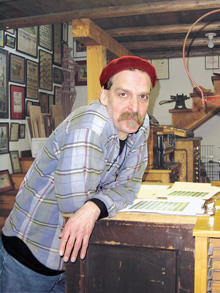
When Will Powers died suddenly two years ago, he left a gaping hole in the community of typographers, printers, and book-designers in this country. Now we have a small book to remind us of the work that he left behind: Type Works: the printing, design and writing of Will Powers.

It’s small in extent (50 pages) but not in format: its pages are a generous nine inches square, as befits a book that’s got to show a lot of examples of the design of other books. Oddly, there’s no one named as author or editor, which will perplex book dealers and annoy librarians; it’s simply credited to Interval Press, Birchwood, Minnesota. My copy was sent to me by Cheryl Miller, Will’s wife, and the copyright is in her name. (The information page on the distributor’s website confirms that Cheryl is the book’s editor.)

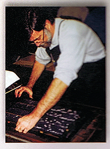
This collection of essays and reminiscences by Will’s many friends and collaborators gives a kaleidoscopic picture of the man. Although by the time I first met him, he was living and working in Minneapolis, as design and production manager for the Minnesota Historical Society Press, Will had spent many years in the San Francisco Bay Area as a letterpress printer. He and Wesley Tanner printed Fine Print for several years, and Will also wrote articles and designed covers for that remarkable publication. Reading about those times now, with names of people I came to know many years later, makes me imagine an alternate history in which, when I was living in San Francisco after I got out of college in 1971, I had somehow made contact with the local printing community. But at that young age I had no idea that typography was going to be central to my life, and I didn’t meet any of those people, or stay in the Bay Area.

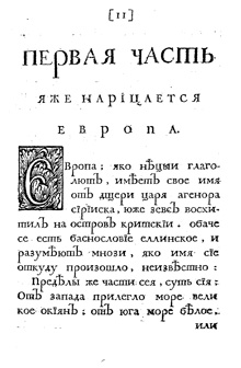
Type Works is a short-run book, printed by BookMobile in Minneapolis, who specialize in short-run and print-on-demand books (and who I know from experience can do a good job of it). Given the display purpose of this book, I could wish that it had a sewn binding that would lie perfectly flat, but that’s not an option in this short a run, unless you manufacture the book by hand. I also wish I could read every word on every printed example shown, but that’s just a reflection of how fascinating the texts that Will worked on (or wrote) tended to be. This is a fine presentation of examples of Will Powers’s excellent typography and book design, of the words written about him, and of a few of his own words as well. And I love the fact that the text uses Zuzana Licko’s typeface Journal, an idiosyncratic but very readable text face of the digital era.

Jack the printer at 90

Published

Sunday, December 19, was Jack Stauffacher’s ninetieth birthday, and more than 150 of his friends came to celebrate it at the San Francisco Center for the Book. It was a gathering that illuminated both the breadth of Jack’s knowledge and his influence, through the wide variety of talented, creative people who showed up for the occasion in the midst of a ferociously stormy winter weekend. (“It always rains on my birthday,” Jack told me the day before. “It’s December – what can I expect? The clouds to open, trumpets to sound, and the sun to shine?”)

In talking about Jack, I can’t do better than quote Chuck Byrne, who wrote twelve years ago: “Jack Stauffacher describes himself as a printer. It is a somewhat deceptive term for us today. His use of the term connects him to a five-hundred-year tradition of the entrepreneur-publisher-designer-typographer-printer. Like the best who made up that custom, he possesses a love of type and printing and the ability to convey meaningful words and thought.” (“Jack Stauffacher, Printer,” 1998; cribbed in this case from the AIGA’s webpage from when they awarded Jack the AIGA medal.)

Chuck was one of the organizers of this birthday event, which brought together people from all parts of the Bay Area’s book, printing, arts, and design communities (and a few of us from farther away). It would be impossible to tell you all the people who were there, even if my memory for names hadn’t turned into a sieve. It was certainly a celebration – not just of Jack Stauffacher but of the interlocking creative communities that he has influenced, and continues to influence.

As Andrew Hoyem, of Arion Press, said a couple of days afterward, “I ran into people there that I hadn’t seen in years!”

It was a printer’s occasion. In the course of the party, Jack approved the inking on a hand-set letterpress keepsake that he had designed for the occasion, and many people ran off copies. There were a number of other keepsakes distributed, too (I brought one that I had commissioned from Jack leNoir and Maura Shapley at Day Moon Press in Seattle), but the most spectacular was the single big foldout artifact created by Pat Reagh, featuring Jack’s favorite typeface, Kis.

Several of Jack’s friends, and his two daughters, spoke briefly, and Chuck Byrne unveiled the hand-carved alphabet in slate that Chris Stinehour had made for Jack.

When Jack himself took the microphone, he spoke of the ongoing conversation, of how he delights in asking deep questions of everyone he meets, finding out about new things and gaining new understanding. And he urged us to carry this conversation forward – then he put down the mike to let us get on with it.

After all, this was just a birthday party, a punctuation point in a long discourse that’s not done. At 90, Jack may have slowed down a bit – all right, he no longer plays bicycle polo – but he’s still a vigorous voice for excellence, intellectual curiosity, and attention to our cultural history. And he’s intensely interested in what we have to say.

[Photos: (top) keepsake that Day Moon Press created for me for the occasion, designed by Jack leNoir and printed by Maura Shapley; (2nd from top) Jack Stauffacher holding the stone plaque hand-carved by Chris Stinehour; (3rd from top) Jack and Patrick Reagh, holding up Pat’s Kis keepsake; (4th from top) the milling throng; (bottom) milling around a couple of the hand presses at the San Francisco Center for the Book.]

Update: Chuck Byrne has posted three pages of photos taken by him and Dennis Letbetter at the event. For your convenience and amusement – no captions!

Type Americana

Published

On November 12 & 13, the School of Visual Concepts in Seattle is hosting a two-day event on the history of American type design, called Type Americana. The first day features eight talks; the second day is workshops, one by Sumner Stone and one on wood type. You can attend just the day of lectures, or both days (spaces in the workshops are limited).

The talks: Thomas Phinney on American Type Founders, Paul Shaw on D.A. Dwiggins, Jim & Bill Moran on Hamilton Wood Type, Patricia Cost on Linn Boyd Benton, Sumner Stone on the early days of Adobe Type (Sumner was Adobe’s first Type Director), Shelley Gruendler on Beatrice Warde, Juliet Shen on Morris Fuller Benton, and Steve Matteson on Fred & Bertha Goudy.

The workshops: “Vintage Letterpress with Hamilton Wood Type,” taught by Jim Moran and Bill Moran; and “ThinkWrite,” taught by Sumner Stone.

In addition, Friday night will be the Northwest premiere of Richard Kegler’s film Making Faces: Metal Type in the 21st Century, about the work process (and the personality) of the late Jim Rimmer, working and talking at his home-based type foundry outside Vancouver. I’ve seen an unfinished version of this film, and it’s amazing.

Dublin & Birmingham, Nov. 2009

Published

Last month I went to Dublin, and to Birmingham and London in the UK – so soon after returning from Typ09 in Mexico that it felt as though I was just visiting this interesting city called “Seattle” for a brief time. The main purpose of the trip was to check out venues and talk to organizers for next year’s ATypI conference in Dublin, but the timing was occasioned by my being invited to speak at the one-day Typographic Horizons conference in Birmingham (and incidentally to stay an extra day and address the Chitterlings typographers’ dinner). We flew into and out of London, so we had a chance to see a small sampling of our friends in London, too.

Typographic Horizons was a small but enthusiastic conference, bringing together some of the energy of Birmingham’s design community. Caroline Archer and Alexandre Parré, and the hosts at the Birmingham Institute of Art and Design, have ambitions to make Birmingham a design center. London, of course, is the metropolis, but second-city Birmingham actually finds it easier to attract people from around the country, including London, according to Caroline. And besides, it’s got three-foot-high stone statues of John Baskerville’s punches.

Dublin Castle is a remarkable venue, well set up for conferences of all kinds; and Dublin is a delightful city. We certainly enjoyed the Guinness (“the wine of the country,” as James Joyce called it) and the comfortable pubs that served it. Clare Bell and Mary Ann Bolger, the principal organizers of next year’s conference, were well organized and cheerful hosts; so were their colleagues at the Dublin Institute of Technology, which will be hosting the conference. We saw only a small bit of the city, but enough to be sure that it will be a good site for ATypI; Irish culture is so intimately tied up with literature that naturally the theme of the conference is going to be “The Word.” On the last day, before Mary Ann headed off to the picket lines for a one-day public-service strike, we managed to see the National Print Museum, which is full of presses, type, and printing artifacts of all kinds, as well as printed matter, including one of the few remaining copies of the 1916 proclamation of the Irish Republic.

I’ve posted a few photos from the trip on Flickr. This is just a taste; I took lots of shots of the interior spaces of Dublin Castle, but most of them will only be of interest to the organizers. You’ll see them all – the spaces, that is – when you show up next September for the conference.

Cyrillic goodies

Published

A little-noticed item was tucked into the goody bags handed out to members of the ATypI conference in St. Petersburg: a CD-ROM with a bright red label sporting the logo of the conference, plus titles, in Russian and English, saying: Первенцы гражданскйо печати / The first-borns of secular printing. The English subtitle explains it: Moscow editions 1708–1711. This little CD contains full scans of thirty-two books printed in Moscow in the very first years after Peter the Great’s drastic reform of the Russian alphabet.

“As they say in the supermarkets, an ‘unadvertised special’,” explained Maxim Zhukov on the ATypI members’ list. “A little gem hidden deep in the bag, just sitting there, waiting to be discovered.

“The idea of throwing into the ATypI’o8 goodie bag the CD-ROM prepared by Irina Fomenko and her friends of the Russian State Library (earlier known as Lenin Library) came very late in the game, two weeks before the conference opened. It turned out that (a) the ‘autorun’ thing only worked on IBM-compatibles, and (b) the introduction was in Russian. That was not surprising, given the usual target audience (domestic) of the RSL and its Rare Book Dept., and the OS most of the people in the world use (Windows). Translating, reformatting and reprogramming the CD-ROM would have taken forever, so we decided to offer the CD-ROM to the attendees of the SPb conference as is.”

The content is in Russian, but the images are wonderful no matter what language you read. And even if you’re viewing on a Mac and can’t take advantage of the “autorun” feature, it’s easy enough to just click on the links to the various PDFs, or open the PDFs directly, and browse through them. Among other things, this CD includes the complete printed specimen of the new Civil Type; we’re used to seeing an image of the first page, with Peter’s hand-scrawled corrections, but how many of us have seen the rest of the booklet? It’s here.

“Of course,” says Maxim, “the image resolution is not press quality. And yet, we never had it this good. For decades, all there was were the tenth-generation reproductions, heavily retouched, most of them coming from Abram Shitsgal books. And now… thirty-two Petrine books and other printed pieces scanned cover-to-cover! Isn’t that something.”

It is.

[Photos: top, interior spread from the first type specimen of the new Civil Type; below, a page from a 1710 book on geography, in the new type.]

Orphan fonts

Published

Okay, ’fess up: who left the bag of type on the doorstep? A couple of weeks ago, I went out to pick up the morning paper and found a paper bag filled with metal type sitting on the front porch. No explanation; no note, no clue, no context. Was it you?

There’s about twenty-five pounds of individual type sorts in that bag, neatly arranged in smaller paper bags labeled “W” or “XY” or “H.” Each of those little bags contains sorts that have been, well, sorted by letter – but in any number of different typefaces. Most of them seem to be text sizes, though not all of them are what I would think of as text typefaces. A few are italic, with slanted edges to facilitate setting seriously slanted type. There’s a bag marked “SPACERS,” and another with no label, which seems to be just a fistful of pied type; that latter includes a few broken rubber bands, which suggests that once they may have been carefully organized. One clear plastic bag, at the top of the heap, seems to be all ornaments – again, in various styles, from various fonts.

Among the bags of type I found a small, dessicated slice of cheese – havarti, perhaps, or something that had once been havarti. A defector from someone’s lunch?

Anybody missing a whole mess o’ type?

Wayzgoose

Published

Summer’s been busy, though not always with things that are easily written up. But last Saturday I stopped by the letterpress printing fair at Seattle’s School of Visual Concepts, where a bunch of enthusiastic printers were creating great big posters – really big posters – by inking up linoleum blocks and then driving a steamroller over them. Well, it wasn’t technically a steamroller, since it didn’t run on steam; but it was certainly an impressive piece of roadbuilding equipment. This operation was publicized by the local AIGA, who entered a winning team in the “letterpress smackdown”; the event took its inspiration from Roadworks, the “Steamroller Printing Street Fair” that the San Francisco Center for the Book has been hosting every summer for several years. (The fifth annual Roadworks is coming up in September – unfortunately while I’ll be in Russia.)

For a short “slideshow” (with a bit of video) of the whole process put together by the AIGA folks, look here.

Showing off a freshly printed poster

Stern, the type

Published

When I first opened the package from P22 with their press release and the specimen booklet for the typeface Stern, I didn’t make the obvious connection. I grasped quickly that it was a new design by Jim Rimmer, notable British Columbia punchcutter and type designer; and I understood that he was doing something unique by issuing the face both as a digital font and in foundry type for hand-setting. (There have been typefaces issued in multiple formats before, such as Sabon, and digital typefaces have been printed by letterpress, but I don’t think anyone has spanned the technologies quite this widely before.)

The obvious connection was the name: Rimmer had named his typeface in honor of artist/printer Chris Stern, whose work spanned the same broad swath of typesetting technologies, and who visited Rimmer and learned from him. It’s a fitting tribute, one that Chris would have appreciated.

He might even have put it to use in a book. The typeface Stern is unusual – “an upright italic type designed for hand-set poetry and diverse digital use,” as Rimmer describes it. The angle of the slant is very slight, as befits an upright italic, but the italic forms of e, f, m, and n give it a calligraphic feel.The wide, two-storey a creates a tension with the italic forms and makes it look more like a text face; there is, however, an alternate, single-storey a for occasions when you want a more consistently italic look. The caps are upright, and come in four different heights: tall, mid-height, small Aldine, and small caps. It looks like mid-height is the default, or at least that’s what was used in the elegant little specimen booklet designed by Rich Kegler.

In metal, Stern is a 16pt font, a size suitable for spacious settings of poetry or short prose passages. It’s a light and delicate-looking typeface, in both metal and digital form; digitally, of course, that lightness can be scaled up for use at display sizes. But it’s designed for use at large text sizes, and in the right circumstances, with careful treatment, it could shine. At first it looks peculiar, but it certainly grows on you.

Incidentally, the exhibit of Chris Stern’s printed work at Design Commission in Seattle has stayed up through July, and many of the broadsides and prints by printer friends of Chris’s are still available for sale; all proceeds go to paying off the huge medical bills that don’t go away even when you die.

In the spirit of technology-spanning, you can play with bits of the Stern letter forms at a site called Typeisart, which uses interactive Flash to let you create your own collage out of elements of the typeface. Watch out – it’s addictive.

The work of Chris Stern

Published

If you’re in Seattle this Thursday, don’t miss the opening of an exhibit of brilliantly creative letterpress printing by the late Chris Stern, at the Design Commission (121 Prefontaine Place S., near 4th & Yesler). Chris and his wife and partner, Jules Remedios Faye, formed Stern & Faye, Letterpress Printers, and founded their “printing farm” in the Skagit Valley north of Seattle. Each of them was a fine, and unusual, printer and artist before they met, and their work together has been amazing. When Chris died of cancer a year and a half ago, many of us lost a friend and we all lost an original talent.

The exhibit is in several parts: in addition to Chris’s printed work, there will be photos and artifacts from the printing farm, and prints produced by friends, colleagues, and students of Chris and Jules’s, inspired by their work. Much of this will be for sale, to benefit Jules and help pay off Chris’s outstanding medical bills.

The opening runs from 5 to 10 p.m. (this is “First Thursday,” Seattle’s monthly arts walk in Pioneer Square). If you can’t make the opening, the exhibit will be accessible during business hours at the Design Commission for the rest of the month.

Yes, the exhibit includes a copy of the magnificent volume that Chris created from my little story “Roman Seattle.”

Update June 6:

I’ve posted a few photos from last night’s opening.

Adventures in POD

Published

I’ve just recently gotten printed copies of two books that I designed, for different publishers, both printed by print-on-demand or extremely short-run printers. And I’ve been surprised and pleased by the results.

The main problem with POD printing has been in the paper and the binding – the manufacturing, essentially, rather than the printing. Too many POD books are printed on overly bright white paper, often with the grain running the wrong way (the grain should be parallel to the spine; otherwise, the pages tend to curl from top to bottom), and bound much too tightly for easy opening and reading. The binding is still not perfect (despite being what’s misleadingly called “perfect bound” – a poor excuse for properly sewn signatures), but it’s more flexible than it used to be; and once you know how the bound book will open, you can design your pages with sufficient space in the gutter so none of the text gets lost in the glue.

These two books both have personal connections for me: the first, The WisCon chronicles: volume 2 (Aqueduct Press), is co-edited by L. Timmel Duchamp and by my partner Eileen Gunn; the second, Pushing leaves towards the sun, is a first novel self-published by my nephew Mark L. Berry, who in his “real” life is a pilot for American Airlines. I designed and typeset both books, naturally. The WisCon Chronicles was printed by Applied Digital Printing, in Bellingham, Washington, who have done quite a few short-run books for the publisher, Aqueduct Press; I made specific requests about paper stock and how flexible the books would be, and they managed to make it happen. Pushing leaves was printed by BookMobile, which was recommended by Michael Wiegers at Copper Canyon Press (when Copper Canyon has to reprint a book with a short run, they often use BookMobile); not surprisingly, the result is quite readable. Both books were printed on off-white paper, so that the pages won’t glare brightly in your face while you’re reading. While neither book lies flat when it’s opened, as a book should, they’re no worse in this than most commercially printed books these days. What this means is that both books can be comfortably read – and that POD or short-run printing is no longer the spavined, jury-rigged approximation of real printing that it once was.