function jdb_page_navigation()
sPageSlug = blog
sPageTitle = easily amused
header:139:aPageArgs:page_title = easily amused
header:140:aPageArgs:section_title =
functions-johndberry:262:aPageArgs:page_title = easily amused
functions-johndberry:298:sPageTitle = easily amused
functions-johndberry:359:sPageTitle = easilyamused

easilyamused |

Archive for the category ‘onscreen design’

New JDB website

Published

After a mere 13 years, this website is getting an overhaul and a brand-new design. Besides being updated to look like something from the modern world, it’s more directly focused on showing the breadth of my work. The primary purpose, of course, is to make it absurdly easy for people who might want to engage my professional services. (That might be you.)

The images on the portfolio pages are meant as examples, not case studies. If you’re interested enough to want to know the details of how a project was done, and with what purpose in mind, we should talk directly.

All the pages of the old site will still be accessible from the “legacy site” link on the main menu. (I say “will be” because at the moment it’s hiding behind a technical glitch.) The design, although not responsive, was at least intended to be comfortably viewable and readable on a phone as well as on a larger screen. (The even less responsively designed “dot-font.com” website is also still there, if you’d care to check it out. It’s got pretty pictures and free text downloads from two of my books of essays.) And of course the standalone website for the Scripta Typographic Institute, which was already responsive, remains unchanged.

Like most design projects, this one has been collaborative. I took on much more of the hands-on coding than I had ever done before, figuring out how to build the responsive grid that I wanted to use for the portfolio pages. But, as always, much of the heavy lifting and correction of misconceptions has been done by Paul Novitski, my long-time webmaster. (Remember that term?) Paul had been encouraging me for years to dive under the hood; at last, this year, I started doing so. It’s been fun as well as useful. I should also call out Dave Miller at Artefact for useful strategic thinking when I was starting this project, and Alexandru Năstase of TypeThursday Bucharest for insightful advice near the end.

Although she could have no hand in this new iteration, I still owe a lot of thanks to the late Julie Gomoll for her advice and guidance on the initial form of this website.

What really got me interested in creating a new website was the possibilities now available for responsive grids. At last, it seemed, web design was beginning to do things that interested me! I found Rachel Andrew’s CSS grid newsletter and tutorials especially helpful. I’ve had lots of fruitful discussions with Jason Pamental about flexible design and typography on the web (although I have not tried using variable fonts in this design). And as someone who originally came to design through production, and who takes a production-based approach to any design project, I was happy to finally get my hands dirty. (“How do you clean all this syntax out of your fingernails, anyway?”)

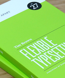
Flexible typesetting

Published

As soon as I saw the title of Tim Brown’s new book, Flexible typesetting, I knew it was on a subject that was close to my heart.

I spent more than thirty years perfecting the art and craft of text typography using digital tools, showing that if you knew what you were doing you could create every bit as fine a book page digitally as you could with metal type. (Not to mention exceeding the low standards of phototypesetting.) And I’ve spent more than a decade translating that craft into pages of fixed typography for the screen, trading concerns about ink and paper for the strictures of resolution and screen size.

Now we’re at the next stage. The challenge today, as I’ve pointed out more than once, is not fixed pages at all, but flexible ones. Tim Brown’s new book focuses clearly and tightly on how to meet that challenge.

Instead of talking about pre-set margins and fixed point sizes, Brown speaks of ideas like pressure, tempo, and focus, creating what he calls “a pattern language of typesetting pressures.” His approach to typesetting for the screen deals with variables rather than fixed values, and he gives a finely detailed look at how to set those variables and how to think about them. Much of the book deals with those details, but his main point is to make people aware of the problems and of the tools we currently have (or will have soon) to solve them. It is, first and foremost, an introduction to how to think about flexible typesetting.

One of the tools that Brown presents us with is the modular scale, which is a concept that takes a little while to get used to. It’s a set of numbers that you can use in setting the sizes of both type and other elements of a design. Obviously, if the design is to be flexible, those sizes can only be starting points; but you can use the modular scale to set the rate at which sizes grow or shrink as conditions change. This scale-based system is designed to make the variables all feel naturally related. Brown offers several different modular scales, for different kinds of projects.

This book is full of very specific recommendations and explanations, with links to useful tools created by himself and other web designers; it will be a very pragmatic guide to anyone sitting down to practice flexible typesetting in a hands-on environment. It’s also an eloquent plea for developing better and more finely tuned tools for the future.

Tim Brown’s conclusion: “Typography is ours to shape.”

[Flexible typesetting, by Tim Brown. A Book Apart no. 27. Copyright 2018 by Tim Brown. New York: A Book Apart, 2018.]

Web Typography

Published

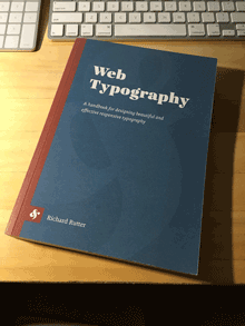
At TypeCon last week in Boston, I picked up a copy of the newly published book Web Typography by Richard Rutter. While I have certainly not had time yet to read the whole thing, I’ve been perusing it haphazardly and joyfully. I’m impressed. It’s living up to the recommendations I was hearing in Boston.

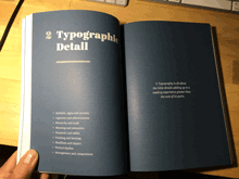
It’s fitting that the largest section of this book is the one called “Typographic Detail.” Rutter has obviously absorbed a wealth of typographic knowledge; the resources he cites in his bibliography include not just Bringhurst’s Elements and Cyrus Highsmith’s Paragraphs but Dowding’s Finer Points in the Spacing & Arrangement of Type, Tschichold’s Asymmetric Typography, and Jost Hochuli’s Detail in Typography. (It also includes, to my appreciative amusement, Erik Spiekermann’s 1987 Rhyme & Reason: a Typographic Novel.

Rutter is adept at explaining and demonstrating the fine points of typographic composition, and doing so in the context of responsive design for the web. His writing is fluid, direct, and informal; even when he’s making a technical point, it’s never less than clear.

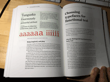
Writing about choosing robust typefaces for text onscreen: “Although modern screens have a pixel density capable of rendering intricate glyphs, the nature of emitted rather than reflected light eats into those forms. Robust forms stand up to this bullying, leaving high resolutions to render any subtleties, thereby rewarding you and your reader in tempering the ruggedness of the type.”

I don’t always agree with Rutter’s aesthetic opinions, but they are always well thought out and defensible. He recommends tightening up the letter-spacing of Univers (“Tightening Univers by 1% gives a more contemporary feel”), while I think it crams the letters together and loses the woven texture that was at the heart of Adrian Frutiger’s type designs; but it’s arguable, and in shorter lines than his visual example, it might work. Disagreements like this, however, are rare as I’m reading through the book; on the whole, and in detail, I would trust Richard Rutter’s taste and typographic choices.

This well-made, well-printed 330-page book is also well designed and well thought out. The body text, set in Thomas Gabriel’s Premiéra (which I hadn’t encountered before), is inviting and comfortably readable, although I think it would have been even more so with the line length a pica shorter. The organizational hierarchy is easy to follow, the illustrations are clear and to the point, and the book is full of useful cross-references.

There’s a good bit of back matter, but for a reference book, there’s one thing obviously missing: an index. Rutter provides a “CSS Index,” which is logical given the subject matter, but that’s only helpful if you already know the name of the CSS term you’re looking for. A regular index of subjects or even of terms would be helpful in a printed book (“Where was it that you were talking about letter-spacing Univers?”). But there is one very useful thing tucked into the back pages: a list of “Guidelines,” in sequence by chapter, with page numbers. “This book is written as a series of guidelines,” says Rutter, and this list serves as an excellent guide to the book’s essential information. It really belongs up front, as a sort of expanded table of contents.

My only production quibble is that the physical book is heavier than it needs to be. A somewhat lighter stock would have made it lighter in the hand, feeling less like a tome.

One little surprise that I discovered was a short section at the end, “Communicating your design.” If you’re not doing all the coding yourself, you’ll have to communicate accurately all the details of your typographic design to the person who is going to implement it in HTML, CSS, JavaScript, and perhaps more arcane languages and tools. Which brings us back around, full circle, to where I came in: as a phototypesetter in a small Seattle printshop in the early 1980s, offering workshops to our clients on how to spec their type properly so they would get back the typeset results they were hoping for.

You could quite easily use Rutter’s book as an introductory guide to typography, not just to typography on the web. It is aimed squarely at the most flexible and problematic area of publishing today, but its advice is grounded in principles drawn from five centuries of typography in print, and it’s applicable to any form of visual communication that uses words.

[Images: cover and a couple of page spreads from Web Typography.]

Typography of the future: variable fonts

Published

I’ve just finally watched the Special OpenType session, ATypI 2016 Warsaw of the “Special OpenType Session” from the ATypI 2016 Warsaw in Warsaw in September. (Because of scheduling and flight conflicts, I didn’t arrive in Warsaw until the evening of that day, so I missed the live event. Not surprisingly, it was the talk of the town among attendees at the conference.) The discussion in the video is highly technical, but the upshot of this development is exciting.

Variable fonts” seems to be the name that everyone’s adopting for this new extension of the OpenType font format. What it means is that an entire range of variations to a basic type design can be contained in a single font: all the various styles from Extra Light to Extra Bold, for instance, and from Compressed to Extended. Instead of a super-family of separate font files, you can have one font that, conceivably, contains them all.

The presentation had representatives from Adobe, Microsoft, Apple, and Google, reflecting the fact that this is truly a cooperative effort. All four major companies (and several smaller ones) have committed to supporting and implementing this new standard. That’s a very important fact: usually, adventurous people come up with an ambitious new spec for wonderful typographic features, but the problems arrive when the developers of operating systems and applications don’t fully commit to supporting them. This time, from the very first, the companies that develop those apps and OSes are committed.

What that means is that, if it’s implemented properly, the new format will make it possible for font developers to create fonts that adapt to changing circumstances. For instance, in a responsive web layout, you might change the width of the text font as the width of the window gets narrower or wider. You could also change the weight subtly when the screen colors are reversed. These small, almost unnoticeable, but very important variations could make reading onscreen much more comfortable and natural.

This is a watershed. What it reminds me of is two different nodal points in the development of digital type: multiple master fonts, and web fonts. The introduction of variable fonts at this year’s ATypI conference has the same “Aha!” and “At last!” feeling that the introduction of the WOFF font format standard for web fonts had at Typ09, the 2009 ATypI conference in Mexico City. Both events mark the coming-together of a lot of effort and intelligent work to make a standard that can move the typographic world forward.

The history of multiple master fonts is sadder, and it points up the pitfalls of creating a good idea without getting buy-in from all the people who have to support it. The multiple-master font format was a breakthrough in digital type; with its flexible axes of variable designs, it made possible a nearly infinite variation along any of those design axes: a weight axis, a width axis, or (most promising of all) an optical-size axis, where the subtleties of the design would change slightly to be appropriate to different sizes of type.

But the multiple master technology, developed by Adobe, never made it into everyday use. The various Adobe application teams didn’t adopt it in any consistent or enthusiastic way, and it wasn’t adopted by other companies either. Instead of being incorporated into the default settings of users’ applications, giving them the best version of a font for each particular use, multiple master was relegated to the realm of “high-end typographers,” the experts who would know how to put it to use in airy, refined typographic projects. That’s not the way it should have worked; it should have been made part of the default behavior of fonts in every application. (Of course, users should have had controls available if they wanted to change the defaults or even turn it off; but the defaults should have been set to give users the very best, most appropriate typographic effects, since most users never make any changes to the defaults at all. It’s important to make the defaults as good as possible.)

Now it sounds like the new variable-fonts technology is going to be incorporated into the operating systems and the commonly used applications. If this really happens, it will improve typography at the everyday, ordinary, pragmatic level. And what that means is the improvement of communication.

I’m looking forward to seeing how this works in practice. And to putting it to use myself, and helping in any I can to improve and implement these new standards.

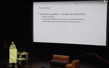
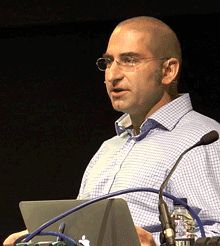
[Images: (left, top) Peter Constable speaking at the Special OpenType Session at ATypI Warsaw, September 2016; (left) schematic of the design variations of Adobe’s Kepler, designed by Robert Slimbach.]

FontCasting

Published

During last year’s TypeCon in Washington DC, FontShop’s David Sudweeks videotaped interviews with a number of type designers, and with at least one non-type-designer: me. He asked questions about how I’d gotten started in the field of typography (“sideways”) and about book design, which gave me an opportunity to set out my ideas about the typography of onscreen reading, and the nascent Scripta Typographic Institute. (That’s a subject that I’ll be taking up again at ATypI 2015 in São Paulo next month.)

Now that interview has been published. The parts about book design & e-book design start at 1:25, after some introductory material.

All of the FontCast interviews are short, focused, and well edited.

Structured writing for the web

Published

At the end of June, at the Ampersand conference in Brighton, Gerry Leonidas gave a shout-out to an early version of the prospectus for Scripta (“Typographic Think Tank”) in his talk. I had somehow missed this until Tim Brown mentioned it in an e-mail recently inquiring about Scripta. I can highly recommend Gerry’s talk, and not only because he quotes me (7:07–7:49 in the video). Although he starts out with a disclaimer that “this is a new talk” and he’s not sure how well it will hang together, in fact it’s extremely coherent; Gerry is both articulate and thoughtful about the wide range of questions (and, rarely, answers) involved in typography on the web.

Gerry used my “wish list” from “Unbound Pages” (in The Magazine last March) as a jumping-off point for his own ideas about the structure of documents and the tools that he wants to see available. He wants tools for writers, not just for designers, that will make it easy to create a well-structured digital document, one that will maintain its integrity when it gets moved from one format to another (as always happens today in electronic publishing). Gerry’s own wish list begins at 20:47 in the video, though you won’t want to skip the entertaining steps by which he gets there.

What he proposes is a way to separate the sequence of information from its relative importance and interrelatedness. “This is what I really want: I want someone to go out there and take Markdown, which I use constantly, and take it from something that clearly has been written to deal with streams of stuff with some bits thrown on the side … and allow me to have this extra intelligence in the content – while I’m writing it – that will tell me how important something is, what sequence it has with other things, and will then allow me to ditch quite a lot of this stuff that is happening there.” The “stuff” he wants to ditch is all the hand-crafted formatting and positioning that makes a digital document cumbersome and difficult to translate from one form to another.

The problem is, as Gerry admits, training people to write with structure in mind. (Every editorial designer who has tried to get writers to use paragraph and character styles will break out into a hollow laugh at this point.) What he’s advocating is tools that will make this easy to do, instead of something that only makes sense to experts. I think he was a little disappointed that nobody leapt up at the end of his talk to say, “We’ve already done that!” But perhaps he has planted the seed.

In Amsterdam

Published

The ATypI conference in Amsterdam last week was my last one as President of ATypI.

After six years as president, I was stepping down, and at Sunday’s annual general meeting the membership elected José Scaglione as the new president of ATypI. I will remain on the Board, and I expect to be actively involved with ATypI for years to come, but I’m looking forward to attending next year’s conference in Barcelona as a civilian.

I’m pleased with what we’ve done with ATypI in the past six years (and it was by no means just my doing; it was a collective effort). I’m especially pleased with how we have visibly expanded the organization’s reach beyond its heartland in western Europe, staging conferences in St. Petersburg, Mexico City, Reykjavík, and Hong Kong, and taking the design of non-Latin typefaces from a marginal sideshow to a central part of the programming at each ATypI conference, no matter where it’s held. ATypI may have begun fifty-odd years ago as an industrial trade group, but today its most important function is educational. At a time when type, type design, and typography are in the hands of everyone with a computer, there’s more need than ever for an explanation of the history, the standards, and the future possibilities of type.

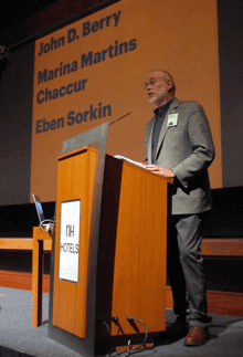
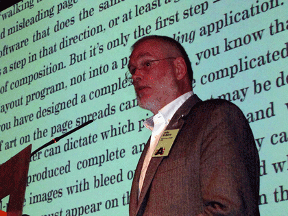
Which leads directly into my own talk on Sunday morning, just before the lunch break on the conference’s final day. I spoke about design for the onscreen page (something that anyone who has followed this blog knows that I’ve written and spoken about many times over the past two years), and I launched a new initiative: the Scripta Typographic Institute, a think tank and advocate for excellence in digital typography and the development of new tools for text typography on screens of every kind. At this point, it’s all about intentions; but by making it public at ATypI I meant to turn it into a real organization, with participation by many more than just myself. If it works the way I hope, Scripta will become a nexus for the development of new ideas and new ways of thinking about reading, and thus about designing for reading, onscreen.

John D. Berry talk: The onscreen page

Between my duties as ATypI president and my preparations for the launch of Scripta, I had very little time to enjoy being in Amsterdam. But I had an unexpected companion: thanks to the machinations of Barbara Jarzyna, ATypI’s executive director, and Thomas Phinney, our treasurer, with the connivance of the rest of the board of directors, my partner Eileen Gunn found her way paid to Amsterdam to join me; and we did manage to have a day or so of plain exploration before the conference itself drew us in.

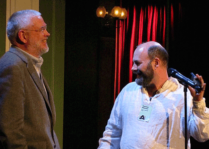
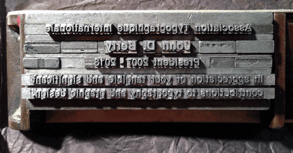
And on Saturday night, at the gala dinner, after the main event – the presentation of the Dr. Peter Karow Award to Donald Knuth – Tom Phinney grabbed me and said, “No, wait, you’re not done yet.” He then gave a short, moving speech to thank me (and embarrass me), handing me a most wonderful keepsake: a metal composing stick full of hand-set type, locked in place, with an inscription (if that’s the right word) that I had to read backwards and upside-down.* I can assure you that it beat the hell out of a gold watch (or any kind of certificate that could have been printed from the locked-up type). I felt honored.

John D. Berry & Thomas Phinney share a laugh

Commemorative stick full of type

That was only a minor part of this year’s ATypI conference, which featured two keynote addresses (by Alice Rawsthorn and Petr van Blokland), each of which presented different perspectives on the nature of design; three awards presentations (the TDC medal to Gerrit Noordzij, the Karow award to Donald Knuth, and, as the closing event of the conference, the Prix Charles Peignot to Alexandra Korolkova); and innumerable excellent talks and presentations by a wide variety of typographers, type designers, educators, and generally inspired people. We had the largest attendance since Mexico City in 2009, and as far as I can tell everyone regarded it as a successful and enjoyable conference.

There was a certain fittingness to ending my term as president in Amsterdam. The last time I had been in the city was in 1990, right after my very first type conference, Type90 in Oxford. At that time I was a rank neophyte, at least in the type world; today I’m at risk of becoming one of the old guard. (That still seems a little weird.) What has changed more than anything else in that time is that type is now in everyone’s hands; the need for understanding it is much greater, and much more widespread, than it has ever been before. Which, of course, offers us a truly wonderful opportunity.

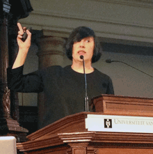
[Images: photos by the ubiquitous Henrique Nardi of me opening the conference (top left), talking about the onscreen page (above), and with Thomas Phinney (also above); my own snapshots of Donald Knuth with Barbara Jarzyna (above left), of Alice Rawsthorn giving her keynote talk (above left, bottom), and of the composing stick full of type that was given to me (above).]

[*Oh, all right. The inscription reads: “Association Typographique Internationale | John D. Berry | President 2007–2013 | In appreciation of your tangible and significant | contributions to typography and graphic design.”]

iOS7 typography: too thin, too tight

Published

Everything about the new design of iOS that was previewed this week looked nifty, except for the typography. Okay, I’m not wild about the candy colors, but that’s just taste. Typography isn’t just about taste; it’s about functionality. On the screen, and for information design, Helvetica – whether Neue or not – is not functional; it just gives the flavor of functionality. The letterforms are too closed, too uniform; they’re not easy enough to distinguish at a glance. And a glance is exactly what we give to the screen of our phone.

At huge size, the Helvetica Neue Thin numbers look all right; but at any other size, they lack clarity. It’s too easy to mix up a 3 and a 6 and an 8 and a 0, at small sizes – not a problem you really want to have when you’re dealing with dates and coordinates and addresses and phone numbers.

Please, can we have a moratorium on very thin sans-serif type that’s pushed tightly together? Trying to squeeze more information into a small space is useless if the information isn’t clearly readable. The lighter the weight of a typeface, the more space it needs between letters, to be easy to read. And it needs even more space when the text is displayed against a dark or mottled background, or seen at an angle rather than straight on. All of which is inherent in the iOS7 design.

For that matter, I wonder whether, in the age of Apple’s Retina display, there’s any need to stick with sans-serif faces on the screen. For years, I’ve felt that an open humanist sans was the most functional style of typeface for reading onscreen; but perhaps that’s no longer true. Or at least not necessarily.

Everything that Jony Ive says about design in his iOS7 video is true. Unfortunately, in the typography of the visual interface, he hasn’t followed through. What we’ve seen is only a preview; the UI is still in development, and it could change for the better before it’s released. But I know how the process of software development goes, and I’m sure there’d be a huge resistance to any change at this point that affected how much text fits on the screen. It’s disappointing, because a fundamental rethinking of the typography is what’s needed.

Some examples:

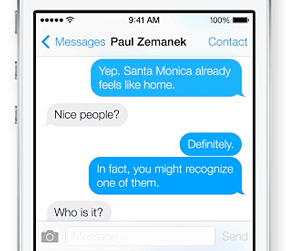
Can you read this exchange easily? Not “can you make it out when you squint and peer closely,” but can you read it easily?

Messaging in iOS7

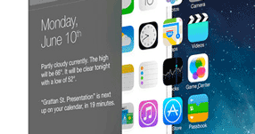
What’s on your calendar for June 10? (And what’s with that busy superior “th,” anyway? That’s 18th-century design, not 21st.) Can you read it when you see it at this angle?

iOS7 interface at an angle

Ironically, Apple’s marketing typeface is much more readable than its iOS text face. The callouts in this example are clearer than the information in the Calendar panel.

iOS7 Calendar with callouts

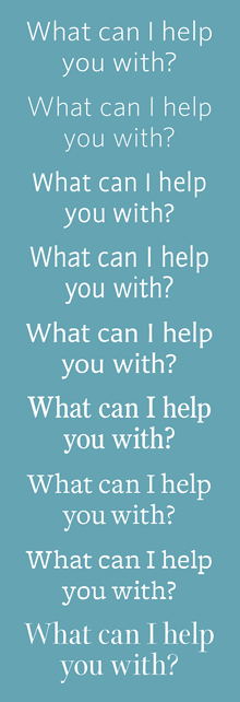
[Images at left: top, part of a screenshot of a message from Siri in iOS7; below, the same words in a few different of typefaces, with looser spacing.]

Addendum (July 8):

Apparently the latest beta of iOS7 allows switching to Neue Helvetica Regular instead of Light for non-Retina displays. Gizmodo has a nice demo of the effect. (Thanks for pointing this out, Aaron Meek.) Alas, it’s clear when you see the font switching back and forth that somebody at Apple doesn’t understand how to track lighter typefaces so they’re readable. The lines of lighter type should be at least as long as the lines of heavier type, not shorter. Squeezed again!

The Magazine & I

Published

There’s something curiously recursive about linking to a website to read an article I wrote for an app-based magazine. But happily, The Magazine has just expanded its subscription base from its iOS6 app to include web subscriptions; and even non-subscribers can access and read one full article each month. (Other links that month will just show previews: the first couple of paragraphs.) So you can go right now and take a look at “Unbound pages,” my article about the typography of reading onscreen, in the Mar 28 issue.

I questioned the initial limitation of The Magazine as an iOS-only app (indeed, one that requires iOS6, which lets out older iOS devices like my first-generation iPad). But what that limitation did was focus squarely on a specific audience: tech-savvy readers who are likely to be early adopters and who work or play in one of the creative fields (which tilt strongly toward Apple’s digital ecosystem). It also meant that the app itself could be clearly and simply designed.

While there’s a difference between how the app displays an issue on an iPhone and on an iPad, the basic typographic treatment is fixed; the only real change appears if you shift the orientation, which affects how long the lines of text are. (This is all directly related to what I was writing about.) The display of the articles on the website is similarly simple and limited, but by the nature of current web-design tools (again, directly related!) it’s less typographically sophisticated, less well adapted to the screen “page.” But you can subscribe to the web version even if you don’t own an iOS6 device; that expands the potential readership.

With the current update to The Magazine’s software, you can also link, as I’ve just done, to a single article that a non-subscriber can read in its entirety, along with previews of other articles in the issue. That “porous paywall” is a smart marketing move: it encourages dissemination of material from The Magazine without giving it all away. (And the terms of The Magazine’s contracts are that they’re only buying one month of exclusivity anyway; authors can do anything they want after that first month, including posting the article for free on their own website or broadcasting it to the entire world. This seems like a model that’s well adapted to the realities of current online publishing.)

Go ahead and subscribe. There’s a bunch of other good material in the new issue, and I expect that I’ll write for The Magazine again.

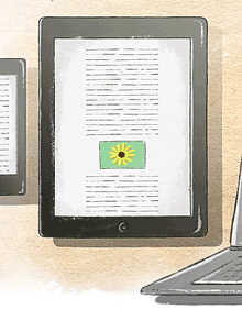
[Image: detail of one of the illustrations done for my article by Sara Pocock.]

Copper Canyon e-book potlatch

Published

On Wednesday I was in Port Townsend for an “E-book Potlatch” at Copper Canyon Press. The press is housed in one of the old wooden buildings at Fort Worden, a former military base turned into a state park and cultural & arts center; Copper Canyon has been there since the 1970s, publishing some of the best in modern and international poetry. Right now they’re figuring out how to bring their backlist (and their front list) into e-book format alongside their printed books – and how to do it right. Consortium, the independent-books distributor, and the “e-book aggregator” Constellation (both part of the Perseus Books Group) sent three people to this planning meeting; according to Consortium’s Michael Cashin, Copper Canyon is on the cutting edge of creating readable e-books for poetry.

For five years in the ’90s, I was the designer for Copper Canyon’s books and collateral, and I’ve done a few projects since then, but my only current connection is as a friend and supporter of the press. Still, e-book typography is what I’ve been thinking about for the past year, so it made sense to participate in the meeting. I was impressed by the level of thinking and planning that was already going on. Both Copper Canyon and Consortium are committed to finding good ways to get books into practical e-book form right now, for immediate sale, and at the same time to developing formats that will be true to the unique demands of poetry and the future demands of technology. It’s not an easy task, but it’s well worth doing. This is an essential part of our culture.

The all-day summit was productive but exhausting. At the end of the day, Copper Canyon hosted a cook-out on the beach at Discovery Bay, where executive editor Michael Wiegers cooked up clams and prawns and salmon, and a few bottles of wine were drunk. It was one of this summer’s rare warm, sunny days, and some of the madder members of the crew ran out into the cold, cold water for a refreshing dip. That’s how the future of publishing happens.

[Photo: Michael Wiegers (left) and me on the beach at Discovery Bay. Photo by Valerie Brewster.]