function jdb_page_navigation()
sPageSlug = blog
sPageTitle = easily amused
header:139:aPageArgs:page_title = easily amused
header:140:aPageArgs:section_title =
functions-johndberry:262:aPageArgs:page_title = easily amused
functions-johndberry:298:sPageTitle = easily amused
functions-johndberry:359:sPageTitle = easilyamused

easilyamused |

Archive for the category ‘letters’

PLINC is in the House

Published

It was impossible resist: when I got the package from House Industries with the catalog for their new Photo-Lettering collection, I had to use my old Photo-Lettering, Inc. letter-opener to slit the envelope. It seemed the right thing to do.

The catalog showcases lots and lots of newly digitized Photo-Lettering fonts from the heyday of over-the-top advertising typography in New York. Like all of House Industries’ productions, it’s a keepsake in itself. The cover stock for the catalog was milled exclusively for House by the only other business that could match their flair and sensibility, French Paper.

Most of the lettering styles sold by Photo-Lettering, then and now, are playful and exuberant; they were headline styles, sold to type shops that would price headlines for their clients by the letter or the word. Today you can buy headlines the same way, but in digital form, from photolettering.com.

The letter-opener? It was on my desk when I started at ITC as editor of U&lc, just down the block from where Photo-Lettering’s shop used to be; and it’s on my desk today.

Handle of the PLINC letter-opener

Madame Wahler’s Lucky Serif Dream Book

Published

There are always plenty of reasons to be a member of the Type Directors Club, the New York–based organization that fights a never-ending battle for truth, justice, and really great typography. But a particularly wonderful reason arrived in the mail just the other day: a little 16-page booklet called Madame Wahler’s Lucky Serif Dream Book.

This invaluable guide, written and designed by Gail Anderson and illustrated by Bonnie Clas, could set you on the road to a better life. “This book will make you a winner!” exclaims the back cover, and who could doubt it? As the introduction explains, “The Type Directors Club is the first international organization to make public a genuine and authentic guide to the connection between typography and dreams.”

The contents include a list of dream types (“To dream of ligatures denotes popularity with the opposite sex”), a typographic horoscope (“As the most sensitive sign of the zodiac, Pisces is easily devastated by poorly drawn characters”), and small ads for everything imaginable (“Miracle Open Type Necklace,” “Go Away Comic Sans Cologne,” and “PROFESSOR INA’S Tattoo Type Removal Cream”).

Remember: “Madame Wahler’s Lucky Serif Dream Book will prove itself valuable as a reference because it uses small words and lists the meanings of many popular lettering dreams.”

When s changed

Published

The best use I’ve seen yet of Google Labs’ nifty new Books Ngram viewer is from Frank Chimero: “Rest in peace, medial s.” By doing a little intelligent searching on several words that would have used the long-s in earlier books but had lost that form in more recent times, he pinpointed when it changed: right around the year 1800.

Which is just about what I would have guessed, based on a thoroughly unscientific analysis of what I recall from books and publications I’ve seen from various periods. It also corresponds reasonably closely to the much more detailed summary given by James Mosley in his article “Long s,” which records not only changes in usage around the turn of the 19th century but also changes in the availability of the long-s in new type fonts.

[Image: long & short italic s, and a long-s/t ligature, from Adobe Jenson Light]

Type Americana

Published

On November 12 & 13, the School of Visual Concepts in Seattle is hosting a two-day event on the history of American type design, called Type Americana. The first day features eight talks; the second day is workshops, one by Sumner Stone and one on wood type. You can attend just the day of lectures, or both days (spaces in the workshops are limited).

The talks: Thomas Phinney on American Type Founders, Paul Shaw on D.A. Dwiggins, Jim & Bill Moran on Hamilton Wood Type, Patricia Cost on Linn Boyd Benton, Sumner Stone on the early days of Adobe Type (Sumner was Adobe’s first Type Director), Shelley Gruendler on Beatrice Warde, Juliet Shen on Morris Fuller Benton, and Steve Matteson on Fred & Bertha Goudy.

The workshops: “Vintage Letterpress with Hamilton Wood Type,” taught by Jim Moran and Bill Moran; and “ThinkWrite,” taught by Sumner Stone.

In addition, Friday night will be the Northwest premiere of Richard Kegler’s film Making Faces: Metal Type in the 21st Century, about the work process (and the personality) of the late Jim Rimmer, working and talking at his home-based type foundry outside Vancouver. I’ve seen an unfinished version of this film, and it’s amazing.

Huronia

Published

At TypeCon in Los Angeles, Ross Mills is handing out nicely printed type specimens of his newly released typeface Huronia. It’s a sturdy, compact serif design that looks as though it will be immediately useful as a book typeface. Andrew Steeves of Gaspereau Press describes Huronia’s “tensile strength and character,” which seems a good way of expressing the nature of this text type.

The current release is the standard character/glyph complement, which contains an extended Latin character set – that is, the letters that we use in English and most other European languages. A later release will include full support for “all American languages,” including the writing systems used for Cherokee, Cree, and Inuktitut. Those beautifully designed glyphs are shown on the type specimen alongside the English text.

Palimpsest

Published

As part of my ongoing collection of faded, broken, and disinherited lettering, I snapped this sign outside one of the Microsoft buildings that once belonged to a different company; you can see the faint spoor of an older building name in the holes below the current sign. Typographic entropy always interests me.

Imperial identity system unearthed

Published

(Lyons, France; 1 April 2010) – Researchers from the Institut internationale de l’identité romaine reported on Thursday that they had discovered fragments of what might be the first graphic-design manual in history. According to Jean-Claude Garamond-Jannon, head of the research team that excavated the find, it appears to be part of a manual for the presentation of the visual identity of the Roman Empire, dating from the early 2nd century A.D., during the reign of the emperor Trajan.

Although the unit system used is unclear, it appears that the Roman design administration had a thoroughly worked-out system for the measurement of inscriptional letters, which allowed them to cut inscriptions in matching lettering styles and in consistent sizes throughout the extremely widespread area under Roman rule.

“It was part of a visual identity that shouted ‘Rome!’,” said the Institut’s vice-director, Robespierre Danton, waving his arms enthusiastically at the partially excavated site. “They projected their power and their brand through a coordinated system of graphics that was instantly recognizable anywhere in the Mediterranean world.” The manual’s threadbare pages, according to Danton, specify exactly how the visual system should be implemented, with hints (barely legible) of extreme penalties for misuse of the empire’s intellectual property.

Although the fragments are in a poor state of preservation, one intriguing supplementary find has excited the interest of Dr. Giambattista Farben, a color researcher with the Institut. “This broken tablet, made of baked and polished tufa,” he says, “was found in close proximity to the manual itself. The tablet shows traces of a pattern of varying colors in lead-based paint, and scratches that may be notations to identify the different colors.” Dr. Farben was cautious, but he said that one theory of the colored tablet was that it constituted a color chart for painters who would turn the Romans’ marble walls into a panoply of colors. “It could be the earliest Pantone matching system,” admitted Dr. Farben.

Scholars from the University of Northern California dispute the primacy of the Roman identity system. Professor Chien Su-ma of UNC says that he has spent more than twenty years cataloging a collection of inscribed tortoise shells found under a pile of Han-dynasty tax receipts at Dunhuang, on the edge of the Taklamakan Desert, in China’s Gansu province. “The Han Dynasty had a clearly defined visual identity,” claims Prof. Chien, “and I believe these fragments, which were preserved at a major entrepot and outpost of empire, are a key to the system in its earliest form. They certainly predate this Western find by at least a century.”

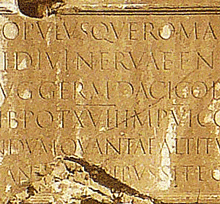
[Photo: Detail of the lettering at the base of Trajan’s column, in Rome.]

Typosexual

Published

Oded Ezer continues to be absurdly creative with the actual physical nature of type. And I don’t mean holding lead sorts in your hand. This time he’s in London, or he was last week, talking at the London College of Communication while wearing a slightly painful-looking typographic mohawk. Type roolz OK!

Swiss-style Latin in Montreal

Published

When I was in the Mile End neighborhood of Montreal a couple of weeks ago, I happened to spot this idiosyncratic logo on a local shop. First I noticed the van, pulling into a parking space outside the shop; then I realized that the shop itself was the business with the logo.

The letters are clearly a heavy, wide variation of Helvetica (or something modeled on it very closely), but someone has given these precise Swiss letters little tails, joining them up into a connected script. Nobody re-drew the letters; that’s obvious from the mismatch between the curl of the “t” and the much narrower joining stroke. (My guess is that the capital-L is really a cap-I with the joining stroke added.) It’s clever, even it’s mechanically rendered. And it’s certainly a strange juxtaposition of cultural tropes, all in a few letters on a shop awning and a delivery truck.

Logo on shop awning

Type designs from Mexico

Published

As called out recently on FontFeed, Mexican designer Isaías Loaiza Ramírez has posted on Flickr a bunch of images of Mexican typefaces in action, from the presentation first shown at TypeCon 2007 in Seattle. These images serve as an excellent fore-taste of the typographic exuberance that will be on display in Mexico City at the 2009 ATypI conference, Typ09.