function jdb_page_navigation()
sPageSlug = blog
sPageTitle = easily amused
header:139:aPageArgs:page_title = easily amused
header:140:aPageArgs:section_title =
functions-johndberry:262:aPageArgs:page_title = easily amused
functions-johndberry:298:sPageTitle = easily amused
functions-johndberry:359:sPageTitle = easilyamused

easilyamused |

Archive for the category ‘writing & editing’

Word play

Published

In a completely self-referential bit of digital navel-gazing, I’ve used the little online toy Wordle to generate a “word cloud” from the text of this very page. Wordle takes whatever text you feed it – or the text from a webpage whose URL you give it – and turns it into a visual representation of how frequently the text repeats certain words. The more often the word is used, the larger it appears. Wordle has several controls for changing what the visual representation looks like (color, orientation, language, even whether to exclude or include certain kinds of words), but the end result is generated at random. If you run the same text through again, with the same set of parameters, the sizes of the words will stay the same but the word cloud they form will be different.

As you can imagine, Wordle is a wonderful time-suck. (It’s also hard to type; my fingers keep wanting to type “World” instead.) The word cloud at the left has no significance whatsoever; it just represents what I’ve written in recent blog posts right here (at least, before this post itself is added). But it’s recursive fun.

Download my book!

Published

Do it now! Act without thinking! Do it now!

Inspired by the success of Cory Doctorow in giving away the texts of his books in every conceivable electronic form, and yet ending up selling more copies of the printed books than his publishers would otherwise expect, I have put together a digital version of Dot-font: talking about design, which you can download for free.

This PDF is designed for easy onscreen reading – or for printing out two-up on your laser printer and reading in a comfy armchair. I am also including the full text in a Microsoft Word file (.doc) and in a “plain text” file (.txt), for those who prefer either of those formats.

This electronic version is published under a Creative Commons license; you’re free to share the files, though not to claim them as your own or make money off them. (For the details of the license, look here or see the copyright page of the digital book.) I haven’t included the right to create “derivative works” based on this book – but hey, if you’ve got an idea for a stirring adventure series set in the “dot-font” universe, or if you have an uncontrollable urge to make “dot-font” action figures, let me know.

Unlike Cory’s novels and essay collections, the print version of Dot-font: talking about design is illustrated. The electronic version is not. I can’t give away other people’s images, but I can freely distribute the full text.

So go ahead, download the book. Pass it on. Let me know what you think. And let Mark Batty, my excellent publisher, know too. Let a hundred dot-fonts bloom!

Download dot-font

With a little text

Published

Cory Doctorow was in town Friday, as part of his whirlwind tour for his new book For the Win, and Linda Stone hosted a small late-afternoon gathering for him on her back deck. (Linda’s house has a glorious view of Lake Washington, and Friday turned out to be a warm, sunny day. We even spotted a bald eagle cruising overhead. “The emperor will die,” muttered Matt Ruff, gnomically.)

Cory had with him four printed copies of his next new book, the quixotic project With a Little Help, each with a different cover. This is a collection of short stories, which Cory is publishing himself in a variety of formats, some of them given away – largely to find out what happens when you do this without a regular publisher. I had designed and typeset the interior of the book, creating pages that I hoped would work both printed and bound as a perfect-bound paperback by Lulu and read as a PDF onscreen, but until Friday I hadn’t seen it printed out, except as drafts from my laser printer. Now I have an advance copy, with a cover by Frank Wu, and I’m pretty pleased with the way it all came out. The binding is flexible, and the paper is an off-white with no glare. (Cory was going to get some galleys printed at a quick-print shop in London, but found that it was cheaper just to order copies for himself from Lulu and have them delivered to him en route. A truly dispersed publishing method!) The pages seem readable, which is the whole point.

I’m not sure when the official launch is, but no doubt it’ll be soon. Meanwhile, if you’re in San Francisco this Wednesday, Cory will be doing a benefit reading at the 111 Minna Gallery, as a fundraiser for EFF (Electronic Frontier Foundation).

The typography of e-books

Published

It’s gratifying to see, at last, some attention given to the shortcomings of the various e-readers. It took the hoopla around the introduction of the iPad to get us to this critical state. Perhaps the most telling thing about the iPad as a reading device is where it doesn’t improve on its predecessors.

None of the existing e-reading devices – or at least none that I’ve seen – have good book typography. They look superficially impressive – “a decent simulacrum of printed pages,” as Ken Auletta said of the Kindle in his recent New Yorker article – but when you look closely at the actual words on the page, you find that they’re rather crudely typeset. I’m not talking about the fonts or how they’re rendered onscreen; I’m talking about spacing, which is what typography is all about. Most notably, none of the most popular e-readers employ any kind of decent hyphenation-and-justification system (H&J, in digital typesetting terms). And yet all of them default to fully justified text.

Kindle text sizes

As anyone who has done production typesetting or has designed a book meant for reading knows well, the factors that make a block of text easy or hard to read all occur at a scale smaller than the page. The most obvious is the length of the line, but line length is engaged in a complicated dance with the space between lines, the space between words, and the spaces between letters. The choice of typeface is almost irrelevant; any legible typeface can be made readable with enough care given to the spacing. (Well, almost any legible typeface.) Finding the right combination of all these factors for a particular typeface, and for a particular author’s words, is what text typography is all about.

All of these space relationships will be thrown to the winds if you typeset a page with justified text but no hyphenation. There’s a reason why the words “hyphenation” and “justification” are used together.

In producing a printed book, you can massage all these variables until you get pages that look consistent and that are effortlessly readable. You can do the same for a book that’s going to be read on a screen, but only if the end result is in a static format, such as a PDF document – essentially, a printed page by other means.

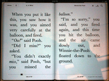
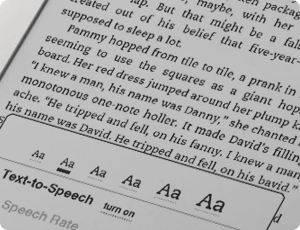
But one of the great advantages of e-readers is that you can change the type size at will. (In some, you can also change the typeface, within a narrowly circumscribed range of choices.) Lovely! But then what happens to all those careful choices about line length and word spaces and so on? They have to be made again, on the fly, automatically, by the software. And if the software isn’t smart enough to know how and when to divide words, then the spacing is going to look like hell.

Which is pretty much the way it does look, except when we get lucky, on all of the popular e-reading platforms. Great big holes appear in some lines, or a cascade of holes opens up on adjacent lines, which typographers call a “river.” It’s not just ugly; it slows down reading.

This is bad enough on a normal rectangular page, but it gets even worse when some visual element – an illustration, for instance – intrudes into the text block and the text has to wrap around it. Bad examples abound.

Some people like justified pages on an e-book page because they’re used to it in printed books. Fine. But they’re also used to better typesetting in printed books (even sloppily done ones) than we’re getting so far in e-books. The simplest solution is to give the reader a choice: justified or unjustified. And make the default unjustified. A ragged right-hand edge is easier to read than a ragged middle that’s full of holes.

The ideal solution, of course, is to have a good H&J system built into the e-book reader. But creating a really good hyphenation and justification program isn’t a trivial undertaking. Not only does the software have to know where it can break a word, and have some parameters for knowing when to break it, but the program should also modify these choices depending on the lines above and below the current line. This is what Adobe InDesign’s “multi-line composer” does. No automated system is perfect, but InDesign’s default text composition is pretty good. Certainly something like that would be a vast step upwards from what we see in e-books today.

Since we’ll all be stuck reading digital books at least some of the time, I’d like to see the standards of book composition improve, and improve fast. It might start with reviewers not blithely passing over the poor typesetting and getting wowed by the hardware or the pretty pictures. There has to be a demand for good composition in e-books. Attention to quality on that level doesn’t often get rave reviews; most people never consciously notice it. But they definitely notice it on an unconscious level, and it affects their willingness to read a book or abandon it. This is true in printed books; it’s just as true in e-books.

Who will bring out the first really good e-book reader?

[Photos: iBooks page spreads from iPad in landscape mode (left); animated GIF of Kindle page as the font size changes (above).

Four score and three cheers

Published

Time to mark one of those arbitrary points on the calendar that mean so much to us. October 21 is the 80th birthday of one of the finest American writers, Ursula K. Le Guin. Her novels have embodied a thoughtfulness, a humanity, and a pragmatic sensibility that have resonated with me since I read the earliest ones when I was just a teenager. Her essays, beginning with The Language of the Night, edited by Susan Wood, joined the most intelligent conversations in print, the ongoing weaving of ideas and their telling that humans have been engaged in since they first had time to speculate.

She’s got a great laugh, too. Happy birthday, Ursula!

[Photo: Ursula Le Guin, by Eileen Gunn]

The Guardian on Little, Big

Published

Both publisher Ron Drummond and I were pleasantly surprised to discover a story in Wednesday’s Guardian all about the upcoming 25th anniversary edition of John Crowley’s Little, Big. It’s another excellent goad to finishing up the preparatory work (which often seems endless) and getting the book ready for the printer. Several people asked me about the state of the project at the recent Potlatch, a small literary science-fiction convention that Eileen and I were at last weekend in Sunnyvale, California. As I assured them (truthfully), we’re in the endgame now. Of course, since this project is being executed by an exaltation of perfectionists, even the endgame isn’t simple or easy.

The Guardian story, by David Barnett, is appreciative and informative, even if he never mentions that this edition will include a sumptuous selection of artwork by Peter Milton that complements Crowley’s text (without in any way being illustration). It’s the integration of art and text that has taken so long, but it’s one aspect that will make this edition unique.

Scrambled Eggs & Whiskey

Published

One of my favorite American poets, Hayden Carruth, died in September at the age of 87. I had the honor and the pleasure of designing two of his books, for Copper Canyon Press, as well as designing a new cover for a reissue of his Collected Shorter Poems. One of the new books I designed had the wonderfully evocative title quoted above (“It’s what we used to have for breakfast,” he said).

Recently, I finally got around to subscribing to the long-running magazine Poetry, and the first thing I read when my first issue arrived was not a poem but W.S. di Piero’s account of spending time with Hayden Carruth. Di Piero’s final anecdote, about Hayden going walkabout before a TV interview, particularly pleased me. I can’t claim to have known Hayden more than slightly, but I do recall an evening in New York City a few years ago when Michael Wiegers and I picked up Hayden at his hotel and took him downtown to the New School, where he was supposed to do a reading. He claimed it was going to be his last city reading (“I hate this place,” Mike remembers him saying), and perhaps it was; I haven’t checked.

The taxi we caught to take us downtown was driven by a classic New York cabbie, the kind of long-time driver who regaled us with tales of his encounters with savvy traffic cops over the years. (“But officer, there was no sign there telling me I couldn’t turn left.” “Sure, buddy, but you’ve been driving a long time; you know perfectly well that there used to be a sign there. I’m giving you a ticket.”) This character and his stories delighted Hayden.

At the New School, there was a noisy social gathering upstairs before the event, and after a while I noticed Hayden ducking out the fire door to the stairs. I figured I’d better follow him; I knew Mike had told me that he worried that Hayden would bolt. I found Hayden on the sidewalk out front, sitting on the curb and smoking a cigarette. I don’t smoke, but I joined him on the sidewalk, and we talked companionably for a while. When he was done with his cigarette, we just got up and took the elevator back up to the event, where Hayden gave his reading to great applause.

Legible in Poland

Published

My recent article for Eye magazine, “Legible in public space” (first image at left), has been translated into Polish and will be published in the next issue of the Polish magazine 2+3D (second image at left), a design quarterly published in Kraków and devoted to “grafika plus produkt.”

2+3D looks like an interesting magazine, and I’m pleased to be in it. Wish I could read Polish.

Six summer evenings of science fiction & fantasy

Published

Jacob McMurray does highly original design work. We just took delivery of this year’s publicity poster for the Clarion West Writers Workshop and its summer reading series (one reading a week by each of the six instructors during the grueling six-week workshop), and it’s gorgeous. You can see a tiny version of it over there, to your left. Jacob has been producing these silkscreened wonders for Clarion West for several years, each one more striking than the last. His day job, which takes up all his time, is as a senior curator at the Experience Music Project/Science Fiction Museum, in Seattle; in his copious spare time, he is co-publisher with Therese Littleton of the quirky small book publisher Payseur & Schmidt, which does little projects with high production values and high-texture materials. Somehow each year he finds time as well to do a poster for Clarion West.

The Stone Canal

Published

I’ve been reading Ken MacLeod’s 1996 novel The Stone Canal, in its 2000 U.S. edition (actually its 2001 mass-market paperback edition, published by Tor). The book’s enjoyable and well written, but what struck me was the editing. Ken MacLeod is a Scottish writer, and his books have been published first in the United Kingdom, then republished in the United States. I know that the U.S. editions have been given an editorial once-over to “Americanize” the language; it’s a common practice, at least in popular-genre writing, though it’s one that I dislike and that I feel shows a fundamental lack of respect for our shared language. (Do American publishers “Americanize” the prose of Kingsley Amis, Doris Lessing, Patrick White, Rebecca West, Evelyn Waugh?)

There was one point where the prose of Ken MacLeod’s novel had not been Americanized, and I suspect it was a slip on the part of the copyeditor: a reference to a husband getting someone’s address out of his wife’s “diary.” In the UK, a diary might be nothing more personal than an appointment calendar – my own annual calendar is a hardbound datebook called A4 architects & designers diary – but in the US a diary is something a great deal more personal: one’s intimate daily thoughts, recorded privately in a handwritten book for no one’s eyes but our own. (Or published far and wide on Livejournal; it depends on the diarist’s sense of privacy.) The American sense of “diary” gave that brief sentence an emotional weight that it was clear MacLeod didn’t intend; figuring that out took me out of the story and broke my concentration for a moment, which was not what was called for at that point in the novel. Tinkering with a writer’s prose is risky; but smoothing it out and then missing something gives whatever you’ve missed more importance than it warrants.

Whoever copyedited this book also had a habit of combining “on” and “to” into “onto” profligately, without apparently stopping to think about whether they really did belong together. They don’t always; and the same may be said of “in” and “to” vs. “into.” If you drive down the street and turn in to the police station, you haven’t suddenly metamorphosed into a police station; you’ve simply entered its parking lot. By the same token, moving on to the next subject is not the same as moving onto the next subject. (Ouch!) I have no idea whether this thoughtless glitch was introduced in the U.S. edition or the original British edition, but either way, its results were distracting. Editing can never be done automatically.

I enjoyed the book, though.