function jdb_page_navigation()
sPageSlug = blog
sPageTitle = easily amused
header:139:aPageArgs:page_title = easily amused
header:140:aPageArgs:section_title =
functions-johndberry:262:aPageArgs:page_title = easily amused
functions-johndberry:298:sPageTitle = easily amused
functions-johndberry:359:sPageTitle = easilyamused

easilyamused |

Archive for the category ‘typography’

Flexible typesetting

Published

As soon as I saw the title of Tim Brown’s new book, Flexible typesetting, I knew it was on a subject that was close to my heart.

I spent more than thirty years perfecting the art and craft of text typography using digital tools, showing that if you knew what you were doing you could create every bit as fine a book page digitally as you could with metal type. (Not to mention exceeding the low standards of phototypesetting.) And I’ve spent more than a decade translating that craft into pages of fixed typography for the screen, trading concerns about ink and paper for the strictures of resolution and screen size.

Now we’re at the next stage. The challenge today, as I’ve pointed out more than once, is not fixed pages at all, but flexible ones. Tim Brown’s new book focuses clearly and tightly on how to meet that challenge.

Instead of talking about pre-set margins and fixed point sizes, Brown speaks of ideas like pressure, tempo, and focus, creating what he calls “a pattern language of typesetting pressures.” His approach to typesetting for the screen deals with variables rather than fixed values, and he gives a finely detailed look at how to set those variables and how to think about them. Much of the book deals with those details, but his main point is to make people aware of the problems and of the tools we currently have (or will have soon) to solve them. It is, first and foremost, an introduction to how to think about flexible typesetting.

One of the tools that Brown presents us with is the modular scale, which is a concept that takes a little while to get used to. It’s a set of numbers that you can use in setting the sizes of both type and other elements of a design. Obviously, if the design is to be flexible, those sizes can only be starting points; but you can use the modular scale to set the rate at which sizes grow or shrink as conditions change. This scale-based system is designed to make the variables all feel naturally related. Brown offers several different modular scales, for different kinds of projects.

This book is full of very specific recommendations and explanations, with links to useful tools created by himself and other web designers; it will be a very pragmatic guide to anyone sitting down to practice flexible typesetting in a hands-on environment. It’s also an eloquent plea for developing better and more finely tuned tools for the future.

Tim Brown’s conclusion: “Typography is ours to shape.”

[Flexible typesetting, by Tim Brown. A Book Apart no. 27. Copyright 2018 by Tim Brown. New York: A Book Apart, 2018.]

Facing the world, typographically

Published

On Dec. 1 & 2, Stanford University hosted “Face/Interface,” a small conference on “Type Design and Human-Computer Interaction Beyond the Western World.” The conference was held in conjunction with an exhibition at Stanford’s Green Library: “Facing the World: Type Design in Global Perspective.” The exhibition, organized by Becky Fischbach, runs until March 24. (Go see it!)

The organizer of Face/Interface was Thomas S. Mullaney, an associate professor of Chinese history at Stanford who has spoken at ATypI and who wrote the canonical book on the history of the Chinese typewriter. Tom is an indefatigable organizer and a generous host, with a clear idea of what is required to make an event like this a success (and a ruthless way with a stopwatch, if speakers run over).

The roster of scheduled speakers was impressive. I knew this would be a notable event, but, as everyone seemed to agree, it turned out to be even better than we had been expecting. There was not a single talk that I was willing to miss, even first thing in the morning, and the interplay among them, dealing with varying languages and technologies and cultures, wove a rich tapestry of ideas. Which is exactly what a scholarly conference ought to do.

Not surprisingly, there were a number of references to an earlier typographic event at Stanford: the famous 1983 ATypI Working Seminar, “The Computer and the Hand in Type Design,” which was recently written about in an article by Ferdinand Ulrich in Eye magazine. That 1983 seminar had been organized by Chuck Bigelow, who at the time was an associate professor of typography at Stanford (the only person ever to hold such a position there – so far). And Bigelow was one of the closing speakers this year, thus tying together these events 33 years apart. (Donald Knuth, also a key figure of the 1983 seminar, dropped by on Friday for a while, though he had no official involvement in this year’s event.) I wouldn’t be surprised if Face/Interface didn’t figure as prominently in future typographic memory as the 1983 gathering has over the last three decades. It felt like a pivotal moment.

Highlights for me included Thomas Huot-Marchand on the contemporary successor to the Imprimerie nationale; Bruce Rosenblum’s highly personal account of “Early Attempts to Photocompose Non-Latin Scripts”; Liron Lavi Turkenich‘s visual tour through trilingual signage in Israel; Lara Captan’s tour-de-force performance, “Facing the Vacuum: Creating Bridges between Arabic Script and Type“; Gerry Leonidas on Adobe’s treatment of Greek typefaces; and the other two closing talks (mine was sandwiched between them), by Chuck Bigelow and John Hudson. Other notable memories include Tom Milo projecting his ground-breaking live-text Qur’an technology on a wall-sized screen in the Stanford maps collection, upstairs from the exhibition reception, and a lively conversation with Chuck Bigelow over breakfast on the last day.

For those speakers who didn’t have to rush off on Sunday, there was an informal brunch and tour of the Letterform Archive in San Francisco, where Rob Saunders showed off his collection and ended up selling off some of his duplicates to eager collectors such as myself.

[Images, top to bottom:] Chuck Bigelow, John Hudson, & John D. Berry after the closing presentations (photo by Chen-Lieh Huang); Chuck Bigelow at the podium; Sumner Stone, asking a question from the audience; John D. Berry at the podium (photo by Eileen Gunn); Becky Fischbach & Fiona Ross outside the hotel in Palo Alto; Rob Saunders’s hands showing off the original Depero bolted book at the Letterform Archive.]

Farewell to Jack the printer

Published

“The splendid dawns — how many more of them will the gods toss into your basket of days?”

– Horace, Carminum Liber IV, trans. Michael Taylor

Jack Stauffacher died on Nov. 16, a month shy of his 97th birthday. He was both fiercely opinionated and self-deprecating; when he called you up, he would simply say, “This is Jack, the printer.” But what a printer!

I saw him for the last time just three weeks before he died, when Dennis Letbetter took me and Rob Saunders over to Tiburon for lunch with Jack and his wife Josie at their small house. The conversation ranged all over the place, as it always did, from ideas to reminiscences to literature and craft, but I was there for a purpose: to ask Jack questions about his life and career, for the biographical essay I’ve been asked to write. This essay will appear in a book by Chuck Byrne about Jack’s experimental prints, to be published next year by Letterform Archive. And, of course, I was there because I suspected that it might be my last chance to see Jack.

While I was there, Jack gave me a copy of his last book, a beautifully designed volume of “fragments from a Tuscan diary, 1956–1958,” which he had entitled Oxen. Plough. Bicycle. It is fully in the tradition of Jack Stauffacher’s long book-design and printing career, simple and unadorned yet exquisitely arranged. Its contents consist of photographs that he took while bicycling around the countryside outside Florence when he was living there on a Fulbright scholarship; the photographs are complemented by notes, almost poems – phrases and sentences of reflection on where he was and what he was seeing. It’s a fitting culmination to a publishing career, and I’m glad I got it directly from his own hand.

When Jack turned 90, seven years ago, his friends put together a spectacular celebration at the San Francisco Center for the Book. We won’t be able to celebrate his 97th birthday, except in his absence, but ideas are being floated for a fitting memorial sometime in the new year.

Several obituaries and moving reminiscences have been published already: by Chris Pullman in Design Observer, by Sam Whiting in the San Francisco Chronicle, and by Pino Trogu in Domus. Dennis Letbetter has been putting together a photographic record that he’s taken of Jack over the years (from which the photos at the left are taken).

A tale of two cons

Published

I just got back from almost a week in Montréal, where I was attending this year’s ATypI conference; just a couple of weeks before that, I had been in Boston at TypeCon. There was, as you might expect, a lot of overlap among the attendees at both conferences, though the close proximity, both geographical and temporal, meant that many people had to choose between them. (I chose both.)

In both cities I was staying with friends, rather than at the official hotel. In Boston, that meant hopping the Red Line in from Cambridge each day. (Since my journey took me right by the Charlie Card store at Downtown Crossing, I stopped in and got myself a senior pass. It took only a few minutes, and now I’m an official Old Person in the eyes of Boston’s transit system.) In Montréal, it was a straight shot on the no. 80 bus down Avenue du Parc from the Mile End neighborhood, where I was staying, to the UQAM campus on Sherbrooke. One day, since the weather was lovely, I borrowed my friend Will’s bike helmet and his key to the public-bike system and bicycled down to the conference.

From the conversations at both events, it has become clear to me that the next big thing is flexible publishing: publishing on any and all platforms, without dividing them up or treating them differently (print vs. screen, tablet vs. phone, website vs. ebook). Variable fonts, which were last year’s bombshell announcement, are on track to becoming a key ingredient in the mix. Evolving layout capabilities in web design are another. The great challenge, as these tools finally begin to be available at a practical level, is achieving excellence across all those platforms.

One of the key events at ATypI wasn’t on the program: it was a lunch discussion organized by Gloria Kondrup of HMCT about “type education.” There must have been thirty or forty people there, not all involved directly in educational institutions. What grew out of that was a clear sense that it wasn’t students who needed to rethink their approach to design, but teachers and practitioners. The old categories, and the assumptions about those categories, are standing in the way. But how do you rethink your approach to doing design and teaching design, and still maintain the highest standards? A conundrum well worth pondering.

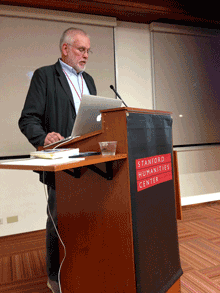
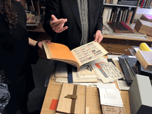
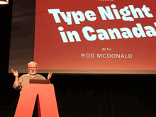
Highlights of ATypI this year included the three keynote speeches, by Paula Scher, Rod McDonald, and Roger Black; Stephen Coles’s visual feast of pre-digital type specimens from the Letterform Archive; Peter Constable’s report on the current state of variable fonts; Paul Shaw’s history of the Electra typeface by W.A. Dwiggins; Sergio Trujillo’s funny, articulate presentation of designing a typeface for an endangered language from Assam in northeastern India; Sahar Afshar on new and old approaches to designing Arabic typefaces; a four-person panel discussion that interrogated job titles and what we mean by them; and Veronika Burian and José Scaglione on the need for giving credit where credit is due in the complex teamwork of designing typefaces and producing fonts. And of course the interstitial schmoozing and networking that are at the heart of any conference.

[Above: a quick panorama of the exhibits room during one of the coffee breaks at ATypI 2017 Montréal.]

As always, there were talks I would have liked to see but had to miss. Happily, the AV team not only videotaped the entire program, but they got much of it up online and freely available while the conference was still going on.

Aside from any formal events, I enjoyed conversations, some long, some short, with Lucie Lacava, Katy Mawhood, Gerry Leonidas, Paul Luna, Jason Pamental, Mary Catherine Pflug, Matt Soar, Laurence Penney, Rod McDonald, Liu Zhao, Natalie Dumont, Roger Black, Sahar Afshar, Tom Foley, and Will Hill – and no doubt with others who have slipped my mind at the moment. This is the essence of a good conference.

This year marked a personal watershed, as I finally left the ATypI board of directors after 17 years. I was first elected in Leipzig in 2000, when Mark Batty suggested that I ought to run. I certainly didn’t expect to remain a board member for such a long stretch of time – possibly the longest continuous run, though I’m not sure about that – including two three-year terms as ATypI president. I’m very pleased with the directions that ATypI has taken in that time, and of course I’m not going away. But I’m looking forward to attending next year’s conference in Antwerp as a civilian (and not having to take time out for board meetings).

José Scaglione stepped down this year as president, after leading ATypI through a smooth transition from our ancient, outdated bylaws and into a newly outward-facing approach. The new president, Gerry Leonidas, has plenty of experience on the board and a lot of new ideas, which strikes me as a fine combination. And I’m glad that José is helping to establish a tradition by continuing as a board member after his term as president. That’s a useful kind of continuity in any organization.

In August at TypeCon, I spent a fruitful lunch talking with Jason Pamental, whose zeal for online typography matches my own and whose knowledge of web design outstrips mine by a mile, about how to encourage higher standards in flexible publishing and what can be demonstrated right now. We continued this conversation in Montréal, along with others like Gerry Leonidas and Paul Luna. This is the sort of thing I’m talking about above, the direction that typography seems to be going right now.

(Why “A tale of two cons”? Two conferences, of course. But why “con”? Jean François Porchez once asked, “Why do they call it by a rude word in French?” The answer is simple (and ignorant of the French meaning of con). TypeCon was founded in 1998 by Bob Colby, who had also been one of the founders of the literary science-fiction convention Readercon. And in the SF community, “con” is shorthand for “convention,” the annual or occasional gatherings that have been going on, in the United States and elsewhere, since the late 1930s. I’m sure it seemed quite natural to Bob Colby to name his new creation in the same tradition, as “TypeCon.” The shortened term works equally well for a convention or a conference.)

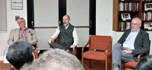
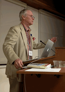
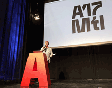
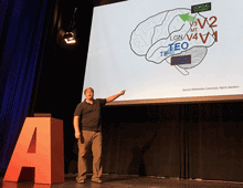
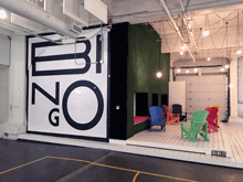
[Photos, top to bottom: outgoing president José Scaglione kicks things off; Rod McDonald’s keynote talk, “Type Night in Canada”; Kevin Larson pointing, not really saying, “This is your brain on type!”; 8 Queen, the highly typographic venue for the workshops & the final-night closing party; at the Morisawa party; at the final-night party; at the after-party, very late Saturday night.]

Web Typography

Published

At TypeCon last week in Boston, I picked up a copy of the newly published book Web Typography by Richard Rutter. While I have certainly not had time yet to read the whole thing, I’ve been perusing it haphazardly and joyfully. I’m impressed. It’s living up to the recommendations I was hearing in Boston.

It’s fitting that the largest section of this book is the one called “Typographic Detail.” Rutter has obviously absorbed a wealth of typographic knowledge; the resources he cites in his bibliography include not just Bringhurst’s Elements and Cyrus Highsmith’s Paragraphs but Dowding’s Finer Points in the Spacing & Arrangement of Type, Tschichold’s Asymmetric Typography, and Jost Hochuli’s Detail in Typography. (It also includes, to my appreciative amusement, Erik Spiekermann’s 1987 Rhyme & Reason: a Typographic Novel.

Rutter is adept at explaining and demonstrating the fine points of typographic composition, and doing so in the context of responsive design for the web. His writing is fluid, direct, and informal; even when he’s making a technical point, it’s never less than clear.

Writing about choosing robust typefaces for text onscreen: “Although modern screens have a pixel density capable of rendering intricate glyphs, the nature of emitted rather than reflected light eats into those forms. Robust forms stand up to this bullying, leaving high resolutions to render any subtleties, thereby rewarding you and your reader in tempering the ruggedness of the type.”

I don’t always agree with Rutter’s aesthetic opinions, but they are always well thought out and defensible. He recommends tightening up the letter-spacing of Univers (“Tightening Univers by 1% gives a more contemporary feel”), while I think it crams the letters together and loses the woven texture that was at the heart of Adrian Frutiger’s type designs; but it’s arguable, and in shorter lines than his visual example, it might work. Disagreements like this, however, are rare as I’m reading through the book; on the whole, and in detail, I would trust Richard Rutter’s taste and typographic choices.

This well-made, well-printed 330-page book is also well designed and well thought out. The body text, set in Thomas Gabriel’s Premiéra (which I hadn’t encountered before), is inviting and comfortably readable, although I think it would have been even more so with the line length a pica shorter. The organizational hierarchy is easy to follow, the illustrations are clear and to the point, and the book is full of useful cross-references.

There’s a good bit of back matter, but for a reference book, there’s one thing obviously missing: an index. Rutter provides a “CSS Index,” which is logical given the subject matter, but that’s only helpful if you already know the name of the CSS term you’re looking for. A regular index of subjects or even of terms would be helpful in a printed book (“Where was it that you were talking about letter-spacing Univers?”). But there is one very useful thing tucked into the back pages: a list of “Guidelines,” in sequence by chapter, with page numbers. “This book is written as a series of guidelines,” says Rutter, and this list serves as an excellent guide to the book’s essential information. It really belongs up front, as a sort of expanded table of contents.

My only production quibble is that the physical book is heavier than it needs to be. A somewhat lighter stock would have made it lighter in the hand, feeling less like a tome.

One little surprise that I discovered was a short section at the end, “Communicating your design.” If you’re not doing all the coding yourself, you’ll have to communicate accurately all the details of your typographic design to the person who is going to implement it in HTML, CSS, JavaScript, and perhaps more arcane languages and tools. Which brings us back around, full circle, to where I came in: as a phototypesetter in a small Seattle printshop in the early 1980s, offering workshops to our clients on how to spec their type properly so they would get back the typeset results they were hoping for.

You could quite easily use Rutter’s book as an introductory guide to typography, not just to typography on the web. It is aimed squarely at the most flexible and problematic area of publishing today, but its advice is grounded in principles drawn from five centuries of typography in print, and it’s applicable to any form of visual communication that uses words.

[Images: cover and a couple of page spreads from Web Typography.]

Typography of the future: variable fonts

Published

I’ve just finally watched the Special OpenType session, ATypI 2016 Warsaw of the “Special OpenType Session” from the ATypI 2016 Warsaw in Warsaw in September. (Because of scheduling and flight conflicts, I didn’t arrive in Warsaw until the evening of that day, so I missed the live event. Not surprisingly, it was the talk of the town among attendees at the conference.) The discussion in the video is highly technical, but the upshot of this development is exciting.

Variable fonts” seems to be the name that everyone’s adopting for this new extension of the OpenType font format. What it means is that an entire range of variations to a basic type design can be contained in a single font: all the various styles from Extra Light to Extra Bold, for instance, and from Compressed to Extended. Instead of a super-family of separate font files, you can have one font that, conceivably, contains them all.

The presentation had representatives from Adobe, Microsoft, Apple, and Google, reflecting the fact that this is truly a cooperative effort. All four major companies (and several smaller ones) have committed to supporting and implementing this new standard. That’s a very important fact: usually, adventurous people come up with an ambitious new spec for wonderful typographic features, but the problems arrive when the developers of operating systems and applications don’t fully commit to supporting them. This time, from the very first, the companies that develop those apps and OSes are committed.

What that means is that, if it’s implemented properly, the new format will make it possible for font developers to create fonts that adapt to changing circumstances. For instance, in a responsive web layout, you might change the width of the text font as the width of the window gets narrower or wider. You could also change the weight subtly when the screen colors are reversed. These small, almost unnoticeable, but very important variations could make reading onscreen much more comfortable and natural.

This is a watershed. What it reminds me of is two different nodal points in the development of digital type: multiple master fonts, and web fonts. The introduction of variable fonts at this year’s ATypI conference has the same “Aha!” and “At last!” feeling that the introduction of the WOFF font format standard for web fonts had at Typ09, the 2009 ATypI conference in Mexico City. Both events mark the coming-together of a lot of effort and intelligent work to make a standard that can move the typographic world forward.

The history of multiple master fonts is sadder, and it points up the pitfalls of creating a good idea without getting buy-in from all the people who have to support it. The multiple-master font format was a breakthrough in digital type; with its flexible axes of variable designs, it made possible a nearly infinite variation along any of those design axes: a weight axis, a width axis, or (most promising of all) an optical-size axis, where the subtleties of the design would change slightly to be appropriate to different sizes of type.

But the multiple master technology, developed by Adobe, never made it into everyday use. The various Adobe application teams didn’t adopt it in any consistent or enthusiastic way, and it wasn’t adopted by other companies either. Instead of being incorporated into the default settings of users’ applications, giving them the best version of a font for each particular use, multiple master was relegated to the realm of “high-end typographers,” the experts who would know how to put it to use in airy, refined typographic projects. That’s not the way it should have worked; it should have been made part of the default behavior of fonts in every application. (Of course, users should have had controls available if they wanted to change the defaults or even turn it off; but the defaults should have been set to give users the very best, most appropriate typographic effects, since most users never make any changes to the defaults at all. It’s important to make the defaults as good as possible.)

Now it sounds like the new variable-fonts technology is going to be incorporated into the operating systems and the commonly used applications. If this really happens, it will improve typography at the everyday, ordinary, pragmatic level. And what that means is the improvement of communication.

I’m looking forward to seeing how this works in practice. And to putting it to use myself, and helping in any I can to improve and implement these new standards.

[Images: (left, top) Peter Constable speaking at the Special OpenType Session at ATypI Warsaw, September 2016; (left) schematic of the design variations of Adobe’s Kepler, designed by Robert Slimbach.]

More writing

Published

I have just added a couple of complete essays to the rather minimalist “Writing” page on this site, and links to several others.

That page has so far consisted of short, and I hope intriguing, excerpts from various longer pieces of my writing. Now I’ve added links to almost all of the originals, making this a sort of landing page or entry point to these essays.

I’ve added the introduction to Contemporary newspaper design (2004), where I attempted to look at the development of newspaper typography over several technological and economic revolutions, and “The Business of Type”, my account of the origins, development, and demise of U&lc, which was the introduction to U&lc: influencing typography & design (2005). Both of these were books that I edited for Mark Batty Publisher; both of them are now out of print. I think those essays are worth making available again.

I’ve added some more links, too. Check ’em out.

[Update, April 15, 2016:] I’ve now added the missing piece, the preface to Language Culture Type. It is a less substantive piece than the others, but still worth having intact.

t for 2

Published

You don’t get wonderful bound specimen books from type foundries very often these days. Digital foundries tend to produce digital specimens, for all the obvious reasons. But a few days ago The Terminal Design Type Catalog arrived in my (physical) mailbox, and I was delighted.

James Montalbano, the Chief Cook and Bottle-Washer of Terminal Design, has been designing extensive, carefully coordinated type families for twenty-five years. “Ever since my days as a magazine art director,” he writes in his brief Preface, “I have both loved and been disappointed by type. I loved mixing, arranging and discovering different type designs, but was always disappointed by the lack of weights and widths of most designs.” That disappointment will not await anyone browsing this catalog.

This a well-made, well-bound hardcover book, designed by Charles Nix. The embossed red t that takes up the whole cover is striking and dramatic. Each type family is given several pages, with a display of the full character set and large one-line showings. For text faces, there are also pairs of sample text pages with the type shown at different sizes and sometimes different weights.

Terminal Design catalog text spread

The display faces don’t require extensive text settings, but they’re shown off in dramatic form. My favorite page in the whole book must be the final page for the 20-weight typeface Yo.

Terminal Design catalog display spread

The back matter shows sample pairings of display and text faces, comparison of x-heights, the variations in OpenType stylistic sets, and, most notable of all, a visual index of “earmarks,” the distinguishing features of glyphs from different typefaces.

Terminal Design catalog earmarks

James Montalbano’s typefaces are always thoroughly considered, cleanly designed, and well produced. His squarish text face Choice Sans, with multiple widths, gives a lovely, modern texture to both text and display. The sharply serifed Consul takes high-contrast Didot style and freshens it, with six weights and four optical sizes, in both roman and italic. Even the wonderfully weird Fervent, with its pitchfork e and its double-wide w, looks assured and solid on the page.

There are two things that bother me in this catalog. One is the lack of any descriptions of the various typefaces: each one has a careful list of all its features, but there’s no hint of its history and nature, or of how its designer thinks about it.

The other thing is a choice: in the text samples, facing pages of the same typeface at different sizes have the same amount of added leading (3 points). The effect of that is to give the text blocks of smaller type looser line spacing than the text blocks of larger type. That makes it harder to compare them usefully.

Opening up OpenType

Published

Besides their other useful aspects, OpenType fonts may include a variety of alternate glyphs for the same character: anything from capital and lowercase forms to small caps, superscripts, subscripts, or swash versions. In non-Latin fonts, they may include other related variants, such as the several forms that each character takes in Arabic, and alternate forms preferred in different languages. In some large calligraphic fonts, there may be quite a lot of alternate forms available – but in the past it’s been hard to find them and put them to use.

The most recent update to Adobe’s InDesign CC (2015.2, released Nov. 30) finally addresses this problem. You could always go spelunking in the Glyphs palette to find alternates, but now you have a more direct method: simply select a single character in a text string, and any OpenType alternate forms appear in a small pop-up right on your layout page. Choose one, and it replaces the selected character.

This is the first fruit of a popular groundswell that got started at the ATypI conference in Barcelona last year: type users needed better ways of using OpenType layout features, and petitioned Adobe to improve their products. This new feature in InDesign is a good start.

It has a few glitches, though. Sometimes the relationships among the displayed alternates is not obvious. In Adobe Caslon Pro, for instance, many of the ordinary letters show among their alternates one of the Caslon ornaments. That’s a little odd.

One practical limitation of the current version of this feature is the size of the glyphs in the pop-up. The example shown on Adobe’s tutorial page (left, above) uses a large, bold, flashy typeface (Lust Script) with obvious swash features; it’s not hard to make out the alternates on the screen. But if you try the same thing with a typeface like Bickham Script Pro, which has a very small x-height, it’s virtually impossible to tell one alternate from another.

InDesign pop-up showing OpenType alternates for Bickham Script Pro

The InDesign team added another useful capability while they were figuring out how to access alternate glyphs. Since an OpenType font may include real fractions, you can now select a string of numerals, with a slash in the middle, and turn it into a fraction, using a pop-up much like the one for glyph alternates. How well the fraction is constructed will depend on the font, but if the function is in the font, you can now get at it easily.

Way to go, Adobe! Don’t stop now.

P.S. Yves Peters has done a more in-depth exploration of these features, pointing out some useful things that I had missed. Check it out.

The Letterform Archive

Published

I recently had my first chance to visit the remarkable Letterform Archive in San Francisco. This is the fruit of thirty-five years of collecting by Rob Saunders, all of it related to type and lettering and printing – especially type specimens and printer’s samples, along with books, manuscripts, and all kinds of printed and hand-made ephemera. In 2013, Rob turned his private obsession into an institution and established the Letterform Archive as a formal entity. More recently, as he announced last month at TypeCon, he acquired the enormous collection of the late Dutch bibliophile Jan Tholenaar, consisting of thousands of type specimens from the last 400 years.

The purpose of the Letterform Archive is to make original research materials available to people for hands-on study: so you can not just look at them but pick them up and hold them in your hands. There are larger collections than his, as Rob freely admits; but too many of them are closed to the public and not easily accessible. With the Letterform Archive, Rob hopes to provide a resource to students, researchers, type historians, graphic designers, and anyone interested in the history of letters. It’s easy to arrange a visit; the space is bright and welcoming, and so are the people.

The other initiative that Rob announced at TypeCon is a new program in conjunction with Cooper Union: Type@Cooper West. This will be a West Coast equivalent of Type@Cooper, the post-graduate program in type design that Cooper Union has been offering for several years at its campus in New York City.

Rob has a few other ambitious plans in mind, too. I’m delighted to see such an energetic undertaking. And I can say from personal experience that it’s a pleasure to sit in the Archive and peruse type in all its many forms.