function jdb_page_navigation()
sPageSlug = blog
sPageTitle = easily amused
header:139:aPageArgs:page_title = easily amused
header:140:aPageArgs:section_title =
functions-johndberry:262:aPageArgs:page_title = easily amused
functions-johndberry:298:sPageTitle = easily amused
functions-johndberry:359:sPageTitle = easilyamused

easilyamused |

Archive for the category ‘signage’

Typographer’s lunch 7: NYC subway map debate

Published

In 1978, in the Great Hall of Cooper Union in New York, a heated debate took place over a proposed redesign of the NYC subway map. In 2021, Gary Hustwit and Standards Manual published the transcript of that debate, accompanied by photos taken that same evening, in a smart-looking little book called The New York Subway Map Debate. It’s a document of design in the very real world.

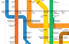
The debate was a battle of two antagonistic concepts of what a transit map was supposed to do. In 1972, Massimo Vignelli and his studio had designed an elegantly abstract new subway map, doing away almost entirely with geography and presenting a schematic, almost a wiring diagram, of how to get from one point to another within a closed system. In 1978, a new map, championed by railroad enthusiast and cartographer John Tauranac, was proposed as a replacement. The new map would restore a semblance of geography, connect the subway to the city streets above, and show how the complex tangle of New York’s subways really worked. It was, as designer and debate panelist Peter Laundy later described it, “really a tunnel map rather than a route map.”

I started riding the New York subways in 1966, when I was sixteen. Shortly before that, Vignelli and Bob Noorda had designed a new signage system for the subways, assigning color-coded numbers or letters to each route. I found this system easy to follow; what I didn’t find easy to follow was the old signs in all the stations, pointing to the “BMT trains” or the “East Side Local.” The new system had not fully replaced the old, and to a novice these mixed signals were confusing. The Vignelli map had not yet been created, but the then-current subway map did identify all the lines by number or letter. There was no clue on it to the old nomenclature, or to the fact that the NYC subway system had been cobbled together from three separate companies, the IRT, the BMT, and the IND.

That map, and the Vignelli schematic in 1972, was an attempt at imposing order on a fundamentally chaotic and contradictory system. This, it seems to me, is exactly what design is supposed to do.

[Originally published on January 1, 2022, in PPN Post and Updates, the newsletter of the Publishing Professionals Network.]

TypeCon2014 | Washington DC

Published

This year’s TypeCon, which went by the name “Capitolized” but really seemed to revel in being “Redacted,” was very enjoyable. It was a great reunion of colleagues and old friends, and a fine way to make new friends and meet new colleagues, as this sort of event always is. The hotel, the Hyatt Regency Washington (a few blocks from Union Station and the Capitol), had a nice open bar area in its lobby, with several surprisingly good beers on tap, and proved to be the sort of meeting place that you hope for when you’re organizing something like this.

There were some very good talks (and the occasional dud, of course), including some that I really wanted to hear but that started too early in the morning for me. As I was staying with local friends across town, a few stops away on the Red Line, it was often hard to tear myself away from breakfast and conversation – especially if I’d been up late the night before, doing much the same thing (except for the breakfast part). Theoretically, all the talks were videotaped (except for a couple where the speakers asked not to be recorded), so perhaps eventually we’ll have a chance to catch up on the ones that we missed, for one reason or another.

It was gratifying to see so many talks about non-Latin typefaces; TypeCon is showing an admirable international flavor, despite being the North American type conference. Emblematic of this was the choice of Bulgarian type designer Krista Radoeva as the recipient of this year’s SOTA Catalyst Award.

Even better – and carrying the non-Latin theme further – was the presentation of the SOTA Typography Award to Fiona Ross, who must have done more than any other single person to further excellence in non-Latin type design: most notably in Indian types, but in Arabic, Thai, and other non-Latin scripts as well. The enthusiasm with which everyone greeted the announcement that Fiona was this year’s awardee was palpable. It was a very well-deserved award.

Personal favorites among the talks that I did get to hear included Mark Simonson’s nostalgic paean to the pleasures of phototype, X-acto knives, waxers, and rub-down type; Liron Lavi Turkenich on a failed experiment in updating Hebrew type; Carl Crossgrove’s trawl through the much-neglected range of sans-serif types with contrast and modulated strokes; Thierry Blancpain showing us that, yes, there’s been some Swiss graphic design since the days of Max Bill and Müller-Brockmann; Nick Shinn on the visual marketing of recorded music, 1888–1967; and the very clever way that Victor Gaultney demonstrated to English-speaking readers what it’s like for readers whose scripts are barely and inadequately supported in common electronic communications media.

I can’t help pointing out that this year’s TypeCon featured one of the most unreadable nametag designs I have ever seen. The “redacted” bit was cute, but extending it to the nametags made them utterly nonfunctional. There’s a reason they’re call “name” tags.

Washington, DC, in the summertime is not an ideal climate experience, though we did get one soft, warm evening when it was a pleasure to sit outside at the bar across from the hotel and enjoy the evening breeze. The weather was not as fiercely hot as it could have been, but the humidity was up to its usual standard. I lived in the DC area for a couple of years in the early ’70s, first in northern Virginia and then for a year in the District, near Dupont Circle. (As the Metro train stopped at the Dupont Circle station on my daily commute, I found myself thinking, “When I lived above here, they were just building this station.”) I remember one summer without air-conditioning where I got through it only by pretending that I was underwater the whole time; I simply never expected to be dry, and I was never disappointed. Unfortunately, I can neither think nor work in that kind of climate.

I’ll be seeing some of the same people, as well as many who were missed in DC, next month at the ATypI conference in Barcelona. Must be the typographic season.

Blackout-alarm sign on the door in an old DC apartment

[Photos: a TypeCon2014 nametag (top); TypeCon attendees suddenly deciding to wear their nametags as headbands (middle); expressive typography in Washington (bottom); and the sign on the door in my friends’ apartment building (above).]

An ironic typeface used for a non-ironic purpose

Published

’Twas the eighteenth of April of Twenty-fourteen…” Yes, it was, actually and literally. That’s when I snapped this picture of the sign at the edge of the Calvary Cemetery, overlooking University Village in Seattle.

Easter sign using the typeface Mason, zoomed in

The typeface, with its postmodern ecclesiastical look, is Jonathan Barnbrook’s Mason, which was originally released by Emigre Fonts in 1992 under the name “Manson.” For reasons that you can imagine, that name caused a lot of unease, and Barnbook soon dropped one n and renamed it “Mason.” By either name, it’s very much in the tradition of ironic type design, taking recognizable features from the past and combining them in unusual ways to achieve a new effect.

The smaller type, identifying the cemetery and its web address, appears to be the appropriately named Requiem. Presumably, irony was not uppermost in the mind of the designer of this welcoming and wholly un-ironic sign.

Massimo Vignelli & organizing information

Published

When Massimo Vignelli died last month, the obituaries and remembrances all mentioned his famous 1972 map of the New York City subway system. The New York Times, of course, spent a good deal of ink and pixels on the subject. In retrospect, everyone keeps talking about how confusing that map was to people at the time, implying that it may have been a brilliant design object but that it was a failure as a navigational tool. That’s not what I remember.

I first learned how to navigate the complex, contradictory New York subways in the late 1960s, when the Vignelli map had not yet appeared but the Vignelli-inspired system of color-coding the lines and identifying them by numbers or letters had been implemented. This was truly a system, and it made sense of a wildly inconsistent tangle of lines; it also made the sometimes chaotic interiors of the subway stations themselves navigable and understandable, at least to an extent. The system was designed not to tame the chaos but to give its users – the subway riders, both straphangers who used the system every day and newcomers or first-timers like me – a tool for navigating, for making our way through the jungle and getting to a destination.

The maps we used before 1972 were already highly stylized; they were really diagrams, not maps, despite the nod to geography in the background shapes of the city’s waterways and landforms. The 1966 subway map, which would have been the first one that I used, was already nothing like a realistic map; the lines in the outer boroughs were compressed and condensed, while Manhattan was shortened and fattened, not reflecting the actual geography at all. But the lines still had names, not numbers or letters (“SEA BEACH, W. END” or “JEROME LEX AV”).

By 1968, the map was clearly a wiring diagram of the city, and it introduced the consistent system of identifying each line by a unique number or letter (6, F, RR). The lines were color-coded as well, just like the signs within the stations. (In the 1966 map, the only color distinction was used to show which lines were part of the old IRT, IND, or BMT systems.) The map was complex, because the city’s subway system was complex, but it formed a very useful and usable chart that enabled you to understand how the system was put together and how to get from one point within it to another efficiently.

The famous 1972 map was just a continuation of this to a slightly more abstract level. Actually, to a slightly more abstract-looking level; the abstraction was already there. Compare the 1968 map to the 1972 one: both are diagrams, it’s just that the ’72 map makes this even more obvious. The biggest innovation was how it showed potential transfer points: instead of inscribing all the line numbers or letters in little boxes, the Vignelli map placed black dots side-by-side where trains from adjacent lines stopped at the same station. It was simple and clear, and if your line passed by but didn’t show a dot, that meant it didn’t stop at that station.

None of these subway maps were intended as a way to understand the city; they were intended as a way to understand the subway system, and to use that to get around the city. They were superb at that, and the more abstract they got, the better they did that job. I know; I used them constantly.

The first “schematic” map of the New York subways was produced in 1959. If you want to see what that was an improvement on, take a look at the 1948 map, which makes a brave attempt to reflect the geography and still show the tangle of lines and where they go. The comparison is educational. I know which one I would want to use as a guide.

Strangely, many of the people who complained about the 1972 Vignelli subway map would be perfectly content to use the equally abstract London tube map, which was introduced decades before New York’s attempts. Nobody in London would claim that the tube map gives you any idea of the layout of the city; but it’ll get you from station to station within the system brilliantly. The 1972 NYC subway map did the same.

Thank you, Massimo, for making it easier for me and a lot of other people to get around.

[Image: a detail from the recent digital version of the Vignelli subway map, even more simplified and rationalized than the original.]

Hong Kong images

Published

After an absurdly long delay, I have finally put some of my photos from last October’s ATypI Hong Kong up on Flickr: here. Although I didn’t take a lot of snapshots, there are few images there that ought to be interesting to people who weren’t there – and to some of the people who were. In particular, I got to the very first letterpress workshop at Zi Wut, which contains the type and printing press from a former printshop in Kowloon, now operated by three women as a teaching resource, with the original owner of the printshop offering examples and showing how the processes worked. Zi Wut has a presence on Facebook, and there’s a nice short write-up, with more images, on the Metropolis magazine blog.

Unfortunate signage

Published

The street signs in the town of Alcoa, Tenn., which I found myself driving through a couple of weeks ago, have this unusual choice of typeface. It looks like Impact, though a bit straighter and narrower than even that impactful typeface. You can see what whoever chose this was thinking: keep it narrow but bold, something that will really stand out when seen from a car driving up to an intersection. The unfortunate part is that it’s too bold; it certainly draws your eye, but that doesn’t make it legible. The excessively fat strokes combined with the compressed shapes, and the very tight spacing and tiny counters, make it turn into a blob of black (or, in this case, white) against the background, so that it’s not in fact easy to read at all.

Oh well. Nice try.

Limbic artifice

Published

One of my favorite local shop-front signs (on Capitol Hill in Seattle) – not just for its contrast between the two typefaces used, but for the contrast between the pretty-looking type of the second line and the meaning of the words. It’s carefully composed (not vernacular or naïve at all), but the interplay of what it says and what it looks like is striking. As, no doubt, it was meant to be.

Palimpsest

Published

As part of my ongoing collection of faded, broken, and disinherited lettering, I snapped this sign outside one of the Microsoft buildings that once belonged to a different company; you can see the faint spoor of an older building name in the holes below the current sign. Typographic entropy always interests me.

Imperial identity system unearthed

Published

(Lyons, France; 1 April 2010) – Researchers from the Institut internationale de l’identité romaine reported on Thursday that they had discovered fragments of what might be the first graphic-design manual in history. According to Jean-Claude Garamond-Jannon, head of the research team that excavated the find, it appears to be part of a manual for the presentation of the visual identity of the Roman Empire, dating from the early 2nd century A.D., during the reign of the emperor Trajan.

Although the unit system used is unclear, it appears that the Roman design administration had a thoroughly worked-out system for the measurement of inscriptional letters, which allowed them to cut inscriptions in matching lettering styles and in consistent sizes throughout the extremely widespread area under Roman rule.

“It was part of a visual identity that shouted ‘Rome!’,” said the Institut’s vice-director, Robespierre Danton, waving his arms enthusiastically at the partially excavated site. “They projected their power and their brand through a coordinated system of graphics that was instantly recognizable anywhere in the Mediterranean world.” The manual’s threadbare pages, according to Danton, specify exactly how the visual system should be implemented, with hints (barely legible) of extreme penalties for misuse of the empire’s intellectual property.

Although the fragments are in a poor state of preservation, one intriguing supplementary find has excited the interest of Dr. Giambattista Farben, a color researcher with the Institut. “This broken tablet, made of baked and polished tufa,” he says, “was found in close proximity to the manual itself. The tablet shows traces of a pattern of varying colors in lead-based paint, and scratches that may be notations to identify the different colors.” Dr. Farben was cautious, but he said that one theory of the colored tablet was that it constituted a color chart for painters who would turn the Romans’ marble walls into a panoply of colors. “It could be the earliest Pantone matching system,” admitted Dr. Farben.

Scholars from the University of Northern California dispute the primacy of the Roman identity system. Professor Chien Su-ma of UNC says that he has spent more than twenty years cataloging a collection of inscribed tortoise shells found under a pile of Han-dynasty tax receipts at Dunhuang, on the edge of the Taklamakan Desert, in China’s Gansu province. “The Han Dynasty had a clearly defined visual identity,” claims Prof. Chien, “and I believe these fragments, which were preserved at a major entrepot and outpost of empire, are a key to the system in its earliest form. They certainly predate this Western find by at least a century.”

[Photo: Detail of the lettering at the base of Trajan’s column, in Rome.]

Elegance & credibility, blown

Published

Brooks Brothers has an amazing ability to project established elegance and solid reliability in the realm of men’s formal clothing. A Brooks Brothers suit is iconic. When Brooks Brothers first established a store in downtown Seattle, a few years back, they managed to make it look as though the shop had been established on that corner since the founding of the company in 1818 – despite the fact that there hadn’t even been a town, much less a street intersection, at that spot nearly two hundred years ago. In the spot they moved to later, a couple of blocks away, the building isn’t quite as convincing, but the shop still has that aura of conservative quality.

Except in the execution of its typography. The choice of Bodoni for the type on this window text was clearly meant to emphasize the classic elegance of the brand. But the effect is spoiled by the typewriter apostrophes, which neither Giambattista Bodoni nor any type designer up until the advent of desktop publishing had ever conceived of. (It’s further spoiled by the fact that the second apostrophe doesn’t even belong there: the adjective is its, not it’s.)

Window sign at Brooks Brothers shop in Seattle