function jdb_page_navigation()
sPageSlug = blog
sPageTitle = easily amused
header:139:aPageArgs:page_title = easily amused
header:140:aPageArgs:section_title =
functions-johndberry:262:aPageArgs:page_title = easily amused
functions-johndberry:298:sPageTitle = easily amused
functions-johndberry:359:sPageTitle = easilyamused

easilyamused |

Archive for the category ‘publishing’

Translated serifs

Published

My little book Hanging by a serif caught the eye of Bertram Schmidt-Friderichs, co-owner of Hermann Schmidt Verlag in Mainz, Germany, a fine small publishing company that specializes in books about typography and design. As a result, my book has been translated, revised, and slightly expanded, and is about to be published in Germany. The German title is Thesen zur Typografie (the someone whimsical “Hanging by a serif” proved resistant to translation), and its release coincides with the annual Frankfurt Book Fair, which opens today.

I haven’t held a copy in my hands yet, but I know it has a sewn binding and two-color printing – more ambitious than my original self-published edition. And a few different serifs. Perhaps it will see a more ambitious American edition, too.

Thesen will join other new books in the Hermann Schmidt line at their display at the Book Fair this week.

Display of new Hermann Schmidt Verlag books

Sprinting into the future

Published

My e-book essay “What is needed” has just been republished on the website of “Sprint Beyond the Book,” a project of Arizona State University’s remarkable Center for Science and the Imagination.

In May, Eileen and I met up with nine other invited guests to participate in CSI’s third “Sprint” event, a workshop/conference focusing on “The Future of Reading.” CSI’s first Sprint, with a theme of “The Future of Publishing,” had taken place last fall at the Frankfurt Book Fair, where the participants worked in the midst of the hurly-burly of the world’s biggest book festival; the second (“Knowledge Systems”) took place in January on CSI’s home turf at ASU. This third one was held at Stanford University, in conjunction with Stanford’s Center for the Study of the Novel.

The mix of people and ideas was invigorating, and the fruits of that brainstorming are intended to be published. (One description of what the Sprint was all about was “creating and publishing a book in three days.” But what kind of a book, exactly?) The other participants at the Stanford event were Jim Giles, Dan Gillmor, Wendy Ju, Lee Konstantinou, Andrew Losowsky, Kiyash Monsef, Pat Murphy, David Rotherberg, and Jan Sassano. The whole project was organized by its instigator and ringleader, Ed Finn, and his talented and indefatigable staff members Joey Eschrich and Nina Miller. I’ve been working with Nina, when we each have time, on the format for eventually publishing the results of the Sprint.

In the meantime, in somewhat kaleidoscopic form, parts of our conversations and digressions, and the texts that we created in the course of the three days, are available now on the “Sprint Beyond the Book” website.

“What is needed,” which I wrote more than two years ago as a post on this blog, is essentially a high-level technical spec for the missing tools that we need in order to do good e-book design. Most of these tools are still missing, two years later, despite the rapidly changing nature of digital publishing. Some of the ideas have made their way into various proposals for future standards, but not much has been reliably implemented yet. I’m still looking forward to the day when everything I was asking for will be so common as to be taken for granted. Then we can make some really good e-books; and our readers will be able to enjoy them.

Covering books

Published

Edward Rothstein’s review in last Friday’s New York Times of the current exhibit at the Morgan Library focuses attention on the book jackets that make up an obvious part of the exhibit. The show, “Gatsby to Garp,” is about 20th century American literature, and one of Rothstein’s points is that the book jacket embodied – and sold – that literature in book form. “Jackets were the way books announced their significance in the modern bookstore — an institution that had this single century of hearty life.” It was, as he says, “the jackets’ golden age.”

Another of Rothstein’s points is that any public exhibit like this cannot convey the content of the books; by its nature, a display is about the form. You might show several copies of the same book, open to different pages, but that’s only a series of glimpses at the interior, where the words live. Reading is a continuous experience; viewing a staged exhibit is a series of observations. “This is usually one of the difficulties in literary exhibitions: it is impossible to offer the actual substance of the books, so the curator must make something of their presence, use them to illuminate one another, show why they are gathered in one place.” The Morgan’s curators seem to have dealt with this inherent contradiction in imaginative ways, but it’s still a conundrum.

Book jackets are the most obvious representation of a book, yet they aren’t really part of the book itself. The older term “dust jacket” is telling: the first purpose of a book jacket was simply to protect the book’s actual cover, which might be a highly decorated binding. In the development of commercial bookselling, it didn’t take long for publishers to realize that they could use these functional paper wrappers as advertising for the book inside.

That’s the primary function of a book jacket. It’s meant to attract the attention of the potential reader. But since most books for several decades have been paperback rather than hardcover, the distinction between the jacket and the cover has been obscured. Instead of an advertising wrapper that you could strip off once you’d bought the book, the paperback cover remains an integral part of the book when it’s on your shelves. The packaging, in effect, stays with the product.

Today, the book cover – or book jacket – has to function in a new way: as a small image on a digital screen. It’s still meant to attract the eye, but it has to do this at thumbnail size; and the hoped-for action by the potential buyer isn’t to pick up a book off a table but to tap or click the image on the screen.

How, I wonder, will a future collector like Carter Burden, whose collection forms the basis of the Morgan Library exhibition, commemorate the complex interplay of reading, writing, marketing, and bookselling that makes up publishing in the 21st century?

Questionable practices

Published

Many of you know that I live with an author: my partner and wife Eileen Gunn is a well-respected short story writer, whose first collection, Stable Strategies and Others, was published in 2004 by Tachyon Publications. Not surprisingly, I designed and typeset that book (and ended up doing a good bit of design for Tachyon, sometimes covers, sometimes interiors, over several years). We also developed a visual identity for the book and its marketing campaign – a necessity in today’s publishing world – where I had fun putting the incendiary cover image to work in other contexts.

EileenGunn.com

Now I’ve designed her second collection, Questionable Practices, which will be out in April from Small Beer Press. The interior text design echoes the earlier book, but we gave this one a distinctly different cover design – though one that I think will sit comfortably on a bookshelf next to Stable Strategies. The publisher has just sent out ARCs (Advance Reading Copies) to reviewers.

The cover for Questionable Practices went through three entirely different versions, as these things often do (not counting the innumerable iterations of each still lurking on my hard drive). It’s in the nature of commercial book publishing that the publisher needs a cover image, for publicity and marketing purposes, long before they need a finished book; indeed, often enough the text isn’t finalized until long after a cover image has been widely distributed. When I was working as a typographer at Microsoft Press in the mid-1980s, we used to get outside “designs” from a local studio that simply provided cover sketches and sample pages with typical interior design elements; these were done long before the book was even written. Not only did we have to execute the final covers, but we often had to invent designs for new interior elements that came along as the books were written and edited. Eventually, since we were doing half the design work anyway, we took the interior design in-house.

Eileen’s stories don’t fit into obvious categories; they’ve almost all been published as science fiction, but she refuses to ever repeat herself, and her work rejects easy classification. When I designed the cover for her first collection, I was trying to do something that would stand out both on the general-fiction table and in the science-fiction section of a bookstore. As I discovered, though, few bookstores were willing to shelve copies of the same book in two different sections; it was always one or the other. Today, with online marketing and bookselling, perhaps it’s easier to place a book in multiple categories at the same time. In any case, today a book cover needs to be clear and work well as a little thumbnail image, not just at full size on the physical book.

Naturally, each of the three cover versions for Eileen’s book seemed perfect to me at the time, but in the end the one you see at the left worked best – and will be on the book. As a completely objective and nonpartisan observer, I can say: watch for it.

[Update, Jan. 16: I just sent the book to the printer today. Publication date: March. Typeface: Dolly Pro.]

Structured writing for the web

Published

At the end of June, at the Ampersand conference in Brighton, Gerry Leonidas gave a shout-out to an early version of the prospectus for Scripta (“Typographic Think Tank”) in his talk. I had somehow missed this until Tim Brown mentioned it in an e-mail recently inquiring about Scripta. I can highly recommend Gerry’s talk, and not only because he quotes me (7:07–7:49 in the video). Although he starts out with a disclaimer that “this is a new talk” and he’s not sure how well it will hang together, in fact it’s extremely coherent; Gerry is both articulate and thoughtful about the wide range of questions (and, rarely, answers) involved in typography on the web.

Gerry used my “wish list” from “Unbound Pages” (in The Magazine last March) as a jumping-off point for his own ideas about the structure of documents and the tools that he wants to see available. He wants tools for writers, not just for designers, that will make it easy to create a well-structured digital document, one that will maintain its integrity when it gets moved from one format to another (as always happens today in electronic publishing). Gerry’s own wish list begins at 20:47 in the video, though you won’t want to skip the entertaining steps by which he gets there.

What he proposes is a way to separate the sequence of information from its relative importance and interrelatedness. “This is what I really want: I want someone to go out there and take Markdown, which I use constantly, and take it from something that clearly has been written to deal with streams of stuff with some bits thrown on the side … and allow me to have this extra intelligence in the content – while I’m writing it – that will tell me how important something is, what sequence it has with other things, and will then allow me to ditch quite a lot of this stuff that is happening there.” The “stuff” he wants to ditch is all the hand-crafted formatting and positioning that makes a digital document cumbersome and difficult to translate from one form to another.

The problem is, as Gerry admits, training people to write with structure in mind. (Every editorial designer who has tried to get writers to use paragraph and character styles will break out into a hollow laugh at this point.) What he’s advocating is tools that will make this easy to do, instead of something that only makes sense to experts. I think he was a little disappointed that nobody leapt up at the end of his talk to say, “We’ve already done that!” But perhaps he has planted the seed.

Hanging by a serif

Published

Recently I published a little booklet called Hanging by a serif: a few words about designing with words. This is the culmination of a project I’ve been working on, off and on, for more than a year: pulling a selection of statements about typography and design from my own writing and presenting them, one to a page, along with a simple decorative element. The hook – quite literally, in some cases – is that those visual elements are all enlarged details of serifs, taken from a wide variety of typefaces. (You’d be surprised how much alike the serifs look on a lot of otherwise distinctive typefaces, when you blow them up in size and cut off the rest of the letter.) I had fun with this, as you might imagine. The hardest part was forcing myself to edit or rewrite my own words, to make them more appropriate to this format and purpose. It was also difficult choosing the quotes, and picking the serifs, but that was the kind of task that you can only revel in: a richness of choice.

One early recipient of a digital version, Scott-Martin Kosofsky, unexpectedly suggested that I “may have invented a new genre, design maxims, making you a kind of typographic Rochefoucauld.” I certainly doubt that my little booklet will go through as many editions and revisions as La Rochefoucauld’s Maximes, but I’ll be happy if it finds a use in the hands of its readers.

For an early draft, which I wanted to take with me on a visit to San Francisco to show to Jack Stauffacher and others at one of his weekly Friday lunches, I had trouble getting the booklet to print properly as page spreads, so I just printed the pages individually and bundled them into a wrap-around folded cover, just to suggest how it might all work as a booklet. What that inadvertant format showed me, however, was that these pages could also work singly, as individual cards. The actual content of those pages has undergone a good bit of revision since that San Francisco trip, but this is the reason why I’m offering Hanging by a serif both as a saddle-stitched booklet and as a set of cards.

When I showed a version of the cards to Juliet Shen at one of our local typographers’ pub gatherings, her immediate thought was, “I could give each of my students one of these and have them do a project based on it.” I hadn’t thought of that; perhaps they have a future use as a teaching tool. (You be the judge.)

This is the “first iteration” of Hanging by a serif; I’m sure it will evolve and appear draped in other clothes. Right now, you can buy the booklet or the cards from the newly created Shop page on this website, and they will undoubtedly be available through other sellers eventually. I sold a few at TypeCon in the SOTA store, and I expect I’ll have at least a few with me at next month’s ATypI conference in Amsterdam. Or you can use PayPal to buy a copy right here, and have me send it to you directly. (If you’re interested in a larger quantity, just send me e-mail at john <at> johndberry <dot> com and let me know.)

The Briem Report

Published

Last year, after a highly entertaining turn as the keynote speaker at the ATypI conference in Reykjavík in 2011, designer and lettering artist Gunnlaugur SE Briem asked around 100 practitioners of lettering or typography to contribute a two-page spread each to a new compendium, The Briem Report: Letterforms 2012. I was pleased to be among those invited to participate. The resulting volume was published earlier this year as a freely downloadable PDF, and recently Briem sent printed copies to all the contributors. (I recommend the print-quality PDF, as the hard copy is a black-and-white print-on-demand edition; you can order it from Amazon and it’s wonderful to have, but I consider the core edition to be the digital one.)

Briem did something similar once before, in 1986, when he edited and produced a book for Thames & Hudson called Sixty Alphabets, asking sixty noted calligraphers to introduce themselves and their work and to contribute a design of their own choice. That in turn had been inspired by a much earlier compendium, Dossier A–Z 1973, which had been put together in 1973 by Fernand Baudin for that year’s ATypI congress in Copenhagen, on the theme of “Education in the Design of Letter Forms.” Both Baudin’s 1973 volume and Briem’s 1986 one examined the place of written letter forms in a world dominated by print. The Briem Report takes this one step further: what is the place of both calligraphy and type design in a world that’s becoming thoroughly digital? Baudin was looking at the changing nature of type and letter design in 1973; Briem is asking much the same question today.

The answers are all over the place; there is no one thesis to be found in this anthology. But as a snapshot of current practice and ideas, it’s invaluable. The contributors include most of the people you might expect, and many that you might not be aware of; Briem drew from many different streams of practice. Some are artists, some are technical experts, many are educators. As Briem describes the book, aptly (and in thoroughly Briem fashion), on his Operina website: “Inspiring ideas, firm convictions, lovely dreams.”

Ivan Fedorov’s books and types

Published

When Eileen and I went over to the University of Washington the other day, to take a look at the magnificent century-old Yoshino cherry trees in bloom around the quad, we walked past the Magus used-book store on our way to the campus; our eyes were caught by the display of enticing books in the front windows. In fact, the display seemed so well calculated to appeal directly to us that I began fantasizing that the windows were really smart displays that targeted whoever happened to pass by on the sidewalk; a different person or group of people would perceive an entirely different display, tailored to their tastes and buying habits.

“Hey,” said Eileen when I told her this, “you mean they’ve got real physical books in buildings now? Books that you can pick up and hold in your hand?” She shook her head. “Who’d have guessed!” No, no, I assured her, it was just a virtual display; behind the windows we’d find no actual books. Just a digital buying experience.

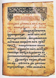
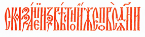
But we stopped in on our way back from the cherry trees, and what I found on a back shelf was not virtual at all. It was a beautifully bound large-format book called Artistic Heritage of Ivan Fedorov, by Yakim Zapasko. At least, that’s the title in English; the book was published in Lvov in 1974, and its proper title is displayed bilingually in Ukrainian and Russian. The book is a catalog of the work of the 16th-century printer Ivan Fedorov (“and the masters that worked in association with him,” as an English summary carefully adds), who worked first in Muscovy and then in the Polish-Lithuanian Commonwealth (Moscow, Lvov, and Ostrog) and who is one of the fathers of eastern Slavic printing. The main text of the book is in both Ukrainian and Russian, but for those of us who are not fluent in either language the most rewarding part (besides the typography, design, printing, and binding of this book itself) is the illustrations: books printed by Ivan Fedorov, types he cast (both Cyrillic and Greek), initial letters and decorative ornaments, and the wonderfully complex “ligature lines” of intertwined capital letters. Just for lagniappe, the book’s title page and section pages feature magnificently energetic calligraphy in two colors and five languages. (Summaries and labels are provided in English, French, and German as well as Russian and Ukrainian.)

Ligature line, from 'Artistic Heritage of Ivan Fedorov'

This copy is rubber-stamped by the Department of Slavic Languages and Literature of the University of Washington. What led the department to de-acquisition it, I have no idea; but it has found a good home now. Out of curiosity, once I got home I looked online; there were a number of copies available, at varying prices of course. One of the listings, through ABEbooks, had a note saying, “This copy is no longer available.” The listing was from Magus Books, so in fact “this copy” was the one I had in my hands. (Quick work, Magus!)

I love the early Cyrillic types, so much more vibrant to my eye than the westernized Civil Type introduced by Peter the Great. And I wondered, as I gazed over the pages, whether I had in fact seen some of these very books when I was in the rare-book libraries of Moscow or St. Petersburg.

It was a good day for both cherry blossoms and books.

[Images: top, cover of Artistic Heritage of Ivan Fedorov; middle, title page; bottom, a 16th-century book page; inline above, a red-printed ligature line.]

The Magazine & I

Published

There’s something curiously recursive about linking to a website to read an article I wrote for an app-based magazine. But happily, The Magazine has just expanded its subscription base from its iOS6 app to include web subscriptions; and even non-subscribers can access and read one full article each month. (Other links that month will just show previews: the first couple of paragraphs.) So you can go right now and take a look at “Unbound pages,” my article about the typography of reading onscreen, in the Mar 28 issue.

I questioned the initial limitation of The Magazine as an iOS-only app (indeed, one that requires iOS6, which lets out older iOS devices like my first-generation iPad). But what that limitation did was focus squarely on a specific audience: tech-savvy readers who are likely to be early adopters and who work or play in one of the creative fields (which tilt strongly toward Apple’s digital ecosystem). It also meant that the app itself could be clearly and simply designed.

While there’s a difference between how the app displays an issue on an iPhone and on an iPad, the basic typographic treatment is fixed; the only real change appears if you shift the orientation, which affects how long the lines of text are. (This is all directly related to what I was writing about.) The display of the articles on the website is similarly simple and limited, but by the nature of current web-design tools (again, directly related!) it’s less typographically sophisticated, less well adapted to the screen “page.” But you can subscribe to the web version even if you don’t own an iOS6 device; that expands the potential readership.

With the current update to The Magazine’s software, you can also link, as I’ve just done, to a single article that a non-subscriber can read in its entirety, along with previews of other articles in the issue. That “porous paywall” is a smart marketing move: it encourages dissemination of material from The Magazine without giving it all away. (And the terms of The Magazine’s contracts are that they’re only buying one month of exclusivity anyway; authors can do anything they want after that first month, including posting the article for free on their own website or broadcasting it to the entire world. This seems like a model that’s well adapted to the realities of current online publishing.)

Go ahead and subscribe. There’s a bunch of other good material in the new issue, and I expect that I’ll write for The Magazine again.

[Image: detail of one of the illustrations done for my article by Sara Pocock.]

Funny shapes

Published

At TypeCon in Milwaukee at the beginning of this month, Cyrus Highsmith gave a witty, illustrated talk about spacing in text typography, which served as an introduction to his new book, Inside paragraphs: typographic fundamentals (published by Font Bureau). It startled me, because I hadn’t been aware that he’d been working on such a book, and because it dovetails with what I’ve been talking and writing about for quite some time: that typography is all about space. Appropriately enough, though without any planning on my part, my former colleagues at Microsoft had brought stacks of one of my little typography booklets, Arranging fonts: it’s all about space, which is about exactly that.

Cyrus focused on the paragraph as the basic unit of text typography, which is a sensible way of looking at it; that neatly separates what Jost Hochuli calls “microtypography” from the “macrotypography” of the page. And Cyrus can draw a lot better than I can, so his illustrations – both in the book and in his talk – make his points brilliantly and lucidly.

The book itself is small, light, and oblong – very easy to carry around and read, with long paper flaps that you can use to mark your place. Cyrus wrote it because he wanted it for the typography classes that he teaches at RISD; and because he wished that he’d had it when he was studying design. It’s probably a good introduction to the subject for graphic-design students, but even more than that, it’s a basic explanation for anyone who uses type and wonders why it sometimes looks right and sometimes doesn’t.