function jdb_page_navigation()
sPageSlug = blog
sPageTitle = easily amused
header:139:aPageArgs:page_title = easily amused
header:140:aPageArgs:section_title =
functions-johndberry:262:aPageArgs:page_title = easily amused
functions-johndberry:298:sPageTitle = easily amused
functions-johndberry:359:sPageTitle = easilyamused

easilyamused |

Archive for the category ‘onscreen design’

What is needed

Published

Books are digital. This is not, strictly speaking, true; but it’s about to be, with a few honorable exceptions. Already today, pretty much all commercial books are produced digitally, although the end product is a physical one: ink printed on paper, then bound and marketed and sold. Already, the selling may be done as often online as in a bookstore. Already, the same books are being issued more and more in electronic form – even if, as yet, the e-books are mostly very shoddy in conception and execution.

But that will change. In order for it to change in a worthwhile way, we have to spell out just what form these books ought to take.

So what’s needed? How do we make good e-books? What should a good tool for designing and creating e-books look like and do? What should the result – the e-book itself – be capable of? And what should the experience of reading an e-book be like?

Last question first. If it’s immersive reading – a story or narrative of some kind – then you, as the reader, should be able to lose yourself in the book without thinking about what it looks like or how it’s presented. This has always been true for printed books, and it’s equally true for e-books.

But e-books present a challenge that printed books do not: the page isn’t fixed and final. At the very least, the reader will be able to make the font bigger or smaller at will, which forces text to reflow and the relative size of the screen “page” to change. That’s the minimum, and it’s a fair bet already today. But the reader many read the same book on several different devices: a phone, a laptop, a tablet, a specialized e-reader, or even the screen of a desktop computer.

For a real system of flexible layout in e-books and e-periodicals that might be viewed on any number of different screens at different times, what’s needed is a rules-based system of adaptive layout. I like to think of this as “page H&J”: the same kind of rules-based decision-making on how to arrange the elements on a page as normal H&J uses to determine line endings.

The requirements for this are easy to describe – maybe not so easy to implement. We need both design & production tools and the reading software & hardware that the result will be displayed on.

A constraints-based system of adaptive layout

The interesting problems always come when you have two requirements that can’t both be met at the same time. (For example: this picture is supposed to stay next to that column of text, but the screen is so small that there isn’t room for both. What to do?) That’s when you need a well-thought-out hierarchy of rules to tell the system which requirement takes precedence. It can get quite complicated. And the rules might be quite different for, say, a novel, a textbook on statistics, or an illustrated travel guide.

OpenType layout support. This means support for the OpenType features that are built into fonts. There are quite a few possible features, and you might not think of them as “layout”; they affect the layout, of course, in small ways (what John Hudson has called “character-level layout”), but they’re basically typographic. Common OpenType layout features include different styles of numerals (lining or oldstyle, tabular or proportional), kerning, tracking, ligatures, small-caps, contextual alternates, and the infinitely malleable “stylistic sets.” In complex scripts like Arabic, Thai, or Devanagari, there are OpenType features that are essential to composing the characters correctly. None of these features are things that a reader has to think about, or ought to, but the book designer should be able to program them into the book so that they’re used automatically.

Grid-based layout. It seems very obvious that the layout grid, which was developed as a tool for designing printed books, is the logical way to think about a computer screen. But it hasn’t been used as much as you’d imagine. Now that we’re designing for screens of varying sizes and shapes, using a grid as the basis of positioning elements on the screen makes it possible to position them appropriately on different screens. The grid units need to be small enough and flexible enough to use with small text type, where slight adjustments of position make a world of difference in readability.

Media query. This is the name used for the question that a program sends to the device: What kind of device are you? What is the resolution of your screen? How big is that screen? What kind of rendering system does it use for text? With that information, the program can decide how to lay out the page for that screen. (Of course, the device has to give back an accurate answer.)

Keep & break controls. These are rules for determining what elements have to stay together and what elements can be broken apart, as the page is laid out. This means being able to insist that, say, a subhead must stay with the following paragraph on the page (keep); if there isn’t room, then they’ll both get moved to the next page. It also means that you could specify that it’s OK to break that paragraph at the bottom of the page (break), as long as at least two lines stay with the subhead.

Element query. I’ve made up this term, but it’s equivalent to media query on a page level. The various elements that interact on a page – paragraphs, columns, images, headings, notes, captions, whatever – need a way of knowing what other elements are on the page, and what constraints govern them.

H&J. That stands for “hyphenation and justification,” which is what a typesetting program does to determine where to put the break at the end of a line, and whether and how to hyphenate any incomplete words. Without hyphenation, you can’t have justified margins (well, you can, but the text will be hard to read, because it will be full of gaping holes between words – or, even more distracting, extra spaces between letters). Even unjustified text needs hyphenation some of the time, though it’s more forgiving. When a reader increases the size of the font, it effectively makes the lines shorter; if the text is justified, those gaps will get bigger and more frequent. But there are rules for deciding where and how to break the line, and a proper H&J system (such as the one built into InDesign) is quite sophisticated. That’s exactly what we need built into e-book readers.

In digital typesetting systems, the rules of H&J determine which words should be included on a line, which words should be run down to the next line, and whether it’s OK to break a word at the end of the line – and if so, where. A system like InDesign’s paragraph composer can do this in the context of the whole paragraph, not just that one line. A human typesetter makes these decisions while composing the page, but when the font or size might be changed at any moment by the reader, these decisions need to be built into the software. In “page H&J,” where the size and orientation of the page itself might change, the whole process of page layout needs to be intelligent and flexible.

Up until now, in the digital work flow, the software’s composition engine has been used in the creation of the published document; the human reader is reading a static page. But now, with flexible layout and multiple reading devices, the composition engine needs to be built into the reading device, because that’s where the final page composition is going to take place.

It’s easy to create a document with static pages that are designed specifically for a particular output device – a Kindle 3, for instance, with its 6-inch e-ink screen, or a 10-inch iPad. I’ve done it myself in InDesign and turned the result into a targeted PDF. But if that’s your model, and you want to target more than one device, you’ll have to produce a new set of static pages for each different screen size and each different device. Wouldn’t it be better to have a flexible system for intelligently and elegantly adapting to the size, resolution, and rendering methods of any device at all?

[Photo: a 17th-century Mexican handbook, about the size of a hand-held device, from the collection of the Biblioteca Palafoxiana, displayed during Typ09 in Mexico City. With ink show-through from the back of the page, which will probably not be a feature of e-books.]

Substrate

Published

I’ve been musing about that wonderful word substrate, and contemplating its many permutations. The word has uses in biochemistry and philosophy, but the meaning that intrigues me is literal. By its etymology, a substrate is an “under-layer,” or what lies behind or underneath something. When it comes to letters, the substrate is the surface you write or print on.

The substrate gives typography its third dimension. Even when the surface is perfectly flat, it’s the surface of something. In printing, the substrate is the paper (and the occasional non-paper surfaces that people choose to print on). The substrate for digital type is the screen that it appears on, whether that screen is held in your hand or propped on your desk. (Or, indeed, mounted on the wall in your living room or a theater.)

Printing, in all its many forms, deposits ink on the paper. Type on screen is projected out of the substrate on the surface (and from there into our eyes). In e-ink and other kinds of smart paper, the letters are actually displayed inside the substrate. The substrate is the physical ground of “figure & ground.”

Essentially, type is about the nature of the substrate and how the type is rendered on that surface. In traditional printing, this is a matter of inking and presswork. On a screen (like this), this depends on resolution, and all the many tricks for making it appear finer than it really is.

Printing or display depends on the relationship between substrate and rendering. Everything else – the real heart of typography – is arranging.

[Photo: “Rock 6,” copyright Dennis Letbetter.]

Text on the pages of iBooks

Published

Two intelligent blog posts appeared today covering the new iBooks software and its choice of fonts; both of them included a link to my 2001 review of one of the new type choices: Iowan Old Style. I’m pleased to see John Downer’s Iowan Old Style get its due at last; I’m even more pleased to see iBooks expand its typographic palette in the direction of actual text typefaces. (Now about actual typography…)

Glenn Fleishman’s essay for Boing Boing is insightful and mindful of the cyclical development of typographic technology; he also mentions the current problems with trying to incorporate web fonts in e-books. Yves Peters in the FontFeed has more to say about the history of the typeface designs, and his illustrations cleverly show the fonts in all three of iBooks’ screen views or “themes.”

What I don’t understand is why Apple chose to drop three of the previous iBooks fonts (Cochin, Baskerville – really Monotype Baskerville – and Verdana). None of them were ideal for books onscreen, but why reduce the choices instead of simply adding to them?

And now the newly introduced Seravek is the only sans serif font available for reading in iBooks. It’s a nicely designed humanist sans, but it doesn’t have to be the only sans, humanist or otherwise, on the system. And the small eyes of Seravek’s e and a tend to visually close up under some circumstances.

[Image: one of the illustrations from Yves Peters’ review, showing Iowan Old Style. In the FontFeed original, you can click on any of the three sections to see the full page in that view.]

Type different

Published

Thomas Phinney wrote a thoughtful blog post last week about “The Impact of Steve Jobs on Typography”: about how the Mac pioneered proportional fonts on the screen, and how the combination of Aldus PageMaker and the LaserWriter created desktop publishing; and about a host of later improvements and developments: “Being able to see what fonts look like on screen. Showing proportional fonts on screen. Scaling the same font outlines for screen as for print. Putting a ‘font’ menu in applications, and having all applications share a pool of fonts installed at the system level (instead of associated with some specific printer).” Jobs was famously attentive to details; more to the point, he was famously attentive to the details of design. His flare and care for industrial design made Apple’s products desirable – and usable.

Which is why I’ve always been disappointed that Apple doesn’t bring that same level of perfectionism to its use of type. The graphic design, both in Apple’s marketing and in its products themselves, is always careful and clean; but the choices of fonts have been erratic, and they’re not always used consistently. Just looking at a current page of the Apple website, about Mac products, I see both their corporate font, Myriad, and the current Mac user-interface font, Lucida Grande. Both are well-designed humanist sans-serif typefaces, and either one works well; they actually play together better than you would think, but it’s still subtly jarring to see two competing sans serifs on the same page. But that’s not all.

Ever since the introduction of the iPhone, Apple has been moving toward using versions of Helvetica on screen. I’ve written before about the problem with reading numbers in Helvetica. The same repetition of shapes that makes Helvetica look consistent and “modern” (or at least retro-modern) creates ambiguity and makes it all too easy to mistake one number or letter for another. As Thomas Phinney said in a comment on his own post, “I love iOS, but I am still horrified that it uses Helvetica as a UI font.”

Designing digital books

Published

At TypeCon in New Orleans last month, I spoke about “New problems in book design” – basically the question of how to apply good typography to the design of books that are meant to be read on a screen. Here’s a little of what I said:

“What does it mean to design a book, at a time when books take multiple forms?

“I have no answers; this is all about questions. As Nick [Sherman] said, we’re in a period that people will look back on and see as a seminal time. It is; we’re inventing this as we go along. And the reason I find it interesting is that I read books, and I’ve been designing books for twenty-five years. I’ve spent most of that time — starting out demonstrating that you could use digital typesetting and design tools to do typography every bit as good as what could be done in old metal systems. And now it’s about time to translate that onto the screen.

“One of the reasons it’s interesting now is that I think the tools are beginning to be there for us. And publishers are desperate for it.

[…]

“Basically, what we need is control over all the typographic aspects – but give up the idea of control to make a static page. We want that level of control – I want that level of control – over a dynamic page. So I can say, if somebody decides to change the type size: okay, the line length should stay the same. The number of columns would change – not just making the font larger and making the leading change, which is what happens today in a website when you do that (depending on whether the browser allows you to do that or just blows the whole page up). All those factors need to be controlled together. What we need is dynamic design, we need flexible design, we need intelligent design – intelligently flexible, intelligently dynamic – in order to create good design. And the reason for that, the purpose of that, is the readers: for us, the readers. You can’t design books well if you don’t read them, and that’s true for the screen as well as for paper.

“Every publisher I’ve talked to, every editor, even most of the writers I’ve talked to, is desperate for some kind of solution here. I know writers with backlists that they have the rights to but they don’t know what to do with; they just want to say, ‘Can I put it on a Kindle somehow?’ So the marketing and the sales of books are going to change too – dramatically. But I think that what we need to do is think globally about that, think about how to design, and sell, and market books, both in printed form – for those where that’s appropriate – and in digital form. And as much as possible, for practical reasons, design it so that you actually…so the book can grow out of one file, one set of files. It’s hard! But that’s what we need. Because otherwise, again, you’re back to doing several different versions of everything.

“So in the spirit of it all being questions, I’m concluding inconclusively, and I will throw it open to questions.”

Some of the best stuff, as you can imagine, came out in the questions.

Roger Black: “John, are you saying that we need to set, basically, an extension of HTML rules for typographical things like the relationship between line breaks and leading?”

Me: “Absolutely. How you go about it is a good question, and it’s something that I’m working on right now; but it’s important to have the capability, just as it’s important to have, in browsers and the systems that support them, support for OpenType features.

“But it’s the layout and spacing controls that are the most important part. It’s hard – but not impossible. CSS3 and HTML5 are beginning to add these capabilities. Obviously, in terms of browser constraints, not everybody is going to support that, but… It may be that you use HTML-based systems to still make applications; essentially the book could be an app, if you need control that you can’t have otherwise. I suspect that we’ll do it in both formats. It’s an open question.”

[Thanks for Jill Bell for sending me a copy of the video she shot from her phone, so I could find out what we actually said. The photos above are snapshots grabbed from that video.]

Flexible, adaptive, responsive

Published

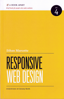
For the past couple of days I’ve been devouring Ethan Marcotte’s new book, Responsive Web Design. It’s the fourth in the series of “brief books for people who make websites” published by A Book Apart (an outgrowth of A List Apart). Each one focuses on a specific subject, and is written in a direct, conversational manner with a hands-on approach for web designers.

“Responsive web design” is Marcotte’s term for what I first heard referred to as “adaptive layout” by Microsoft’s Geraldine Wade (now Banes) when she was working on the original New York Times Reader. I usually just call it “flexible layout.” (As the Times Reader app suggests, it’s not only applicable to web pages.) The essential idea is visual design that adapts itself intelligently to the size, orientation, and resolution of the digital “page” it’s displayed on. This can be done well or badly, of course, but first you’ve got to understand the importance of doing it at all.

Marcotte is cogent and persuasive about that. And he shows you exactly how to do it, step by step, even though this is not strictly speaking a “how to” book. More important, he shows you why to do it. His last chapter suggests a reversal of the notion of “graceful degradation” in onscreen design: instead of making a complex design for a big monitor and the latest, most capable software, and then figuring out how it should deal with smaller sizes or less capable systems, he suggests starting by designing a simple, uncomplicated basic design that will work on the tiniest mobile device (“mobile first”), then adding features as (and if) they seem useful in a more expansive environment. Both approaches are adaptable and responsive, but this one seems cleaner and more elegant.

Now the area that interests me most is text typography, which Marcotte doesn’t go into in any great detail. But this just means that there’s more to be learned and invented in this area.

I’m a fan of small, handy, precisely targeted books, and the Book Apart series is just that. These books are consistently designed (by Jason Santa Maria), readable, and easily portable (despite somewhat heavy coated paper). There are a few bits of sloppiness; the proofreader could have caught the glitches in the hyphenation algorithm that produced “wides-creen” and “in-teract” as word breaks, and a copyeditor might have questioned the author’s frequent use of “to better [do this]” or “to better [do that],” but these are quibbles. Responsive Web Design and its predecessors in this series are useful, well-done tools in their own right.

Regional powers

Published

I’ve been looking with interest at “CSS Regions,” Adobe’s entry into the arena of flexible page design on the web. This is clearly the sanguinary bleeding edge of onscreen design today – designing intelligent layouts that will behave differently (but coherently) under different circumstances, most notably on screens or in windows of different sizes and shapes.

Adobe Labs has released an experimental WebKit-based web browser, as a platform for showing off what CSS Regions can do. The demonstrations are mostly about shapes: they include multiple columns, arbitrarily shaped text blocks, text that flows from one text block to any other text block on the page, and a couple of other, more specific tricks. In the demos, text wraps neatly around images or around other text, in a highly flexible manner.

It’s good to see these problems being tackled. But there’s something missing. As an earlier Wedmonkey article about this technology put it, “when it comes to the flow of text around images, pull quotes and other block level elements, well, web typography falls apart.” CSS Regions is clearly aimed at enabling design with these “block level elements.” But that’s only macro-level typography; what about the typography of the text that’s doing all that wrapping? We need the same level of control over text typography on the web that we’ve got today on the printed page. And not just in an inflexible page created in InDesign and turned into a static PDF.

More tools, please.

The typography of e-books

Published

It’s gratifying to see, at last, some attention given to the shortcomings of the various e-readers. It took the hoopla around the introduction of the iPad to get us to this critical state. Perhaps the most telling thing about the iPad as a reading device is where it doesn’t improve on its predecessors.

None of the existing e-reading devices – or at least none that I’ve seen – have good book typography. They look superficially impressive – “a decent simulacrum of printed pages,” as Ken Auletta said of the Kindle in his recent New Yorker article – but when you look closely at the actual words on the page, you find that they’re rather crudely typeset. I’m not talking about the fonts or how they’re rendered onscreen; I’m talking about spacing, which is what typography is all about. Most notably, none of the most popular e-readers employ any kind of decent hyphenation-and-justification system (H&J, in digital typesetting terms). And yet all of them default to fully justified text.

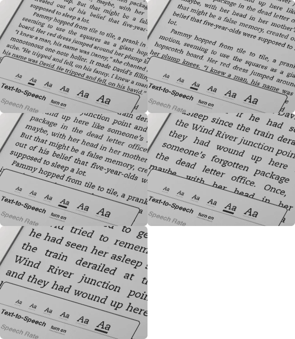
Kindle text sizes

As anyone who has done production typesetting or has designed a book meant for reading knows well, the factors that make a block of text easy or hard to read all occur at a scale smaller than the page. The most obvious is the length of the line, but line length is engaged in a complicated dance with the space between lines, the space between words, and the spaces between letters. The choice of typeface is almost irrelevant; any legible typeface can be made readable with enough care given to the spacing. (Well, almost any legible typeface.) Finding the right combination of all these factors for a particular typeface, and for a particular author’s words, is what text typography is all about.

All of these space relationships will be thrown to the winds if you typeset a page with justified text but no hyphenation. There’s a reason why the words “hyphenation” and “justification” are used together.

In producing a printed book, you can massage all these variables until you get pages that look consistent and that are effortlessly readable. You can do the same for a book that’s going to be read on a screen, but only if the end result is in a static format, such as a PDF document – essentially, a printed page by other means.

But one of the great advantages of e-readers is that you can change the type size at will. (In some, you can also change the typeface, within a narrowly circumscribed range of choices.) Lovely! But then what happens to all those careful choices about line length and word spaces and so on? They have to be made again, on the fly, automatically, by the software. And if the software isn’t smart enough to know how and when to divide words, then the spacing is going to look like hell.

Which is pretty much the way it does look, except when we get lucky, on all of the popular e-reading platforms. Great big holes appear in some lines, or a cascade of holes opens up on adjacent lines, which typographers call a “river.” It’s not just ugly; it slows down reading.

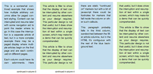
This is bad enough on a normal rectangular page, but it gets even worse when some visual element – an illustration, for instance – intrudes into the text block and the text has to wrap around it. Bad examples abound.

Some people like justified pages on an e-book page because they’re used to it in printed books. Fine. But they’re also used to better typesetting in printed books (even sloppily done ones) than we’re getting so far in e-books. The simplest solution is to give the reader a choice: justified or unjustified. And make the default unjustified. A ragged right-hand edge is easier to read than a ragged middle that’s full of holes.

The ideal solution, of course, is to have a good H&J system built into the e-book reader. But creating a really good hyphenation and justification program isn’t a trivial undertaking. Not only does the software have to know where it can break a word, and have some parameters for knowing when to break it, but the program should also modify these choices depending on the lines above and below the current line. This is what Adobe InDesign’s “multi-line composer” does. No automated system is perfect, but InDesign’s default text composition is pretty good. Certainly something like that would be a vast step upwards from what we see in e-books today.

Since we’ll all be stuck reading digital books at least some of the time, I’d like to see the standards of book composition improve, and improve fast. It might start with reviewers not blithely passing over the poor typesetting and getting wowed by the hardware or the pretty pictures. There has to be a demand for good composition in e-books. Attention to quality on that level doesn’t often get rave reviews; most people never consciously notice it. But they definitely notice it on an unconscious level, and it affects their willingness to read a book or abandon it. This is true in printed books; it’s just as true in e-books.

Who will bring out the first really good e-book reader?

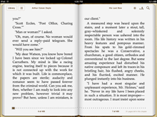
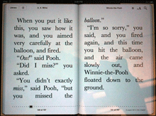
[Photos: iBooks page spreads from iPad in landscape mode (left); animated GIF of Kindle page as the font size changes (above).