function jdb_page_navigation()
sPageSlug = blog
sPageTitle = easily amused
header:139:aPageArgs:page_title = easily amused
header:140:aPageArgs:section_title =
functions-johndberry:262:aPageArgs:page_title = easily amused
functions-johndberry:298:sPageTitle = easily amused
functions-johndberry:359:sPageTitle = easilyamused

easilyamused |

Archive for the category ‘fonts’

t for 2

Published

You don’t get wonderful bound specimen books from type foundries very often these days. Digital foundries tend to produce digital specimens, for all the obvious reasons. But a few days ago The Terminal Design Type Catalog arrived in my (physical) mailbox, and I was delighted.

James Montalbano, the Chief Cook and Bottle-Washer of Terminal Design, has been designing extensive, carefully coordinated type families for twenty-five years. “Ever since my days as a magazine art director,” he writes in his brief Preface, “I have both loved and been disappointed by type. I loved mixing, arranging and discovering different type designs, but was always disappointed by the lack of weights and widths of most designs.” That disappointment will not await anyone browsing this catalog.

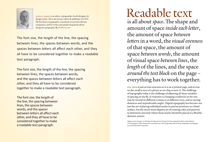
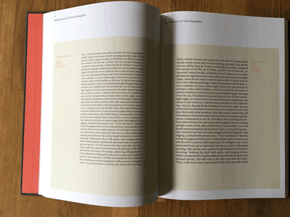
This a well-made, well-bound hardcover book, designed by Charles Nix. The embossed red t that takes up the whole cover is striking and dramatic. Each type family is given several pages, with a display of the full character set and large one-line showings. For text faces, there are also pairs of sample text pages with the type shown at different sizes and sometimes different weights.

Terminal Design catalog text spread

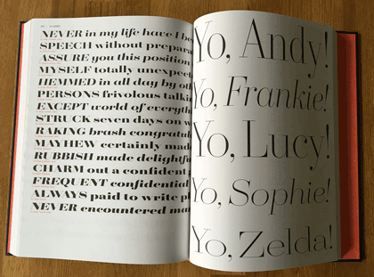
The display faces don’t require extensive text settings, but they’re shown off in dramatic form. My favorite page in the whole book must be the final page for the 20-weight typeface Yo.

Terminal Design catalog display spread

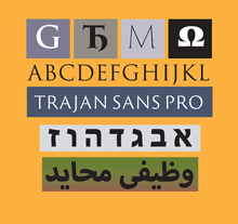
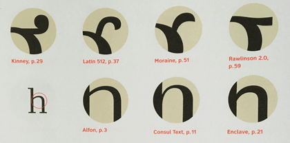
The back matter shows sample pairings of display and text faces, comparison of x-heights, the variations in OpenType stylistic sets, and, most notable of all, a visual index of “earmarks,” the distinguishing features of glyphs from different typefaces.

Terminal Design catalog earmarks

James Montalbano’s typefaces are always thoroughly considered, cleanly designed, and well produced. His squarish text face Choice Sans, with multiple widths, gives a lovely, modern texture to both text and display. The sharply serifed Consul takes high-contrast Didot style and freshens it, with six weights and four optical sizes, in both roman and italic. Even the wonderfully weird Fervent, with its pitchfork e and its double-wide w, looks assured and solid on the page.

There are two things that bother me in this catalog. One is the lack of any descriptions of the various typefaces: each one has a careful list of all its features, but there’s no hint of its history and nature, or of how its designer thinks about it.

The other thing is a choice: in the text samples, facing pages of the same typeface at different sizes have the same amount of added leading (3 points). The effect of that is to give the text blocks of smaller type looser line spacing than the text blocks of larger type. That makes it harder to compare them usefully.

Opening up OpenType

Published

Besides their other useful aspects, OpenType fonts may include a variety of alternate glyphs for the same character: anything from capital and lowercase forms to small caps, superscripts, subscripts, or swash versions. In non-Latin fonts, they may include other related variants, such as the several forms that each character takes in Arabic, and alternate forms preferred in different languages. In some large calligraphic fonts, there may be quite a lot of alternate forms available – but in the past it’s been hard to find them and put them to use.

The most recent update to Adobe’s InDesign CC (2015.2, released Nov. 30) finally addresses this problem. You could always go spelunking in the Glyphs palette to find alternates, but now you have a more direct method: simply select a single character in a text string, and any OpenType alternate forms appear in a small pop-up right on your layout page. Choose one, and it replaces the selected character.

This is the first fruit of a popular groundswell that got started at the ATypI conference in Barcelona last year: type users needed better ways of using OpenType layout features, and petitioned Adobe to improve their products. This new feature in InDesign is a good start.

It has a few glitches, though. Sometimes the relationships among the displayed alternates is not obvious. In Adobe Caslon Pro, for instance, many of the ordinary letters show among their alternates one of the Caslon ornaments. That’s a little odd.

One practical limitation of the current version of this feature is the size of the glyphs in the pop-up. The example shown on Adobe’s tutorial page (left, above) uses a large, bold, flashy typeface (Lust Script) with obvious swash features; it’s not hard to make out the alternates on the screen. But if you try the same thing with a typeface like Bickham Script Pro, which has a very small x-height, it’s virtually impossible to tell one alternate from another.

InDesign pop-up showing OpenType alternates for Bickham Script Pro

The InDesign team added another useful capability while they were figuring out how to access alternate glyphs. Since an OpenType font may include real fractions, you can now select a string of numerals, with a slash in the middle, and turn it into a fraction, using a pop-up much like the one for glyph alternates. How well the fraction is constructed will depend on the font, but if the function is in the font, you can now get at it easily.

Way to go, Adobe! Don’t stop now.

P.S. Yves Peters has done a more in-depth exploration of these features, pointing out some useful things that I had missed. Check it out.

The Letterform Archive

Published

I recently had my first chance to visit the remarkable Letterform Archive in San Francisco. This is the fruit of thirty-five years of collecting by Rob Saunders, all of it related to type and lettering and printing – especially type specimens and printer’s samples, along with books, manuscripts, and all kinds of printed and hand-made ephemera. In 2013, Rob turned his private obsession into an institution and established the Letterform Archive as a formal entity. More recently, as he announced last month at TypeCon, he acquired the enormous collection of the late Dutch bibliophile Jan Tholenaar, consisting of thousands of type specimens from the last 400 years.

The purpose of the Letterform Archive is to make original research materials available to people for hands-on study: so you can not just look at them but pick them up and hold them in your hands. There are larger collections than his, as Rob freely admits; but too many of them are closed to the public and not easily accessible. With the Letterform Archive, Rob hopes to provide a resource to students, researchers, type historians, graphic designers, and anyone interested in the history of letters. It’s easy to arrange a visit; the space is bright and welcoming, and so are the people.

The other initiative that Rob announced at TypeCon is a new program in conjunction with Cooper Union: Type@Cooper West. This will be a West Coast equivalent of Type@Cooper, the post-graduate program in type design that Cooper Union has been offering for several years at its campus in New York City.

Rob has a few other ambitious plans in mind, too. I’m delighted to see such an energetic undertaking. And I can say from personal experience that it’s a pleasure to sit in the Archive and peruse type in all its many forms.

The ATF Collection

Published

Just in time for this year’s TypeCon, the new digital ATF Collection arrived on the typographic scene. This is a remarkably broad range of typefaces and type families based on the metal typefaces issued by the American Type Founders Company from the late 19th century to the middle of the 20th. (These were not “hot metal”; that refers to type that was cast on a machine, such as a Linotype or a Monotype caster. ATF was a consolidation of the many American type foundries that manufactured type for hand-setting, in foundry metal. The metal was “hot” when it was first cast, but not when it was being set.) ATF was responsible for many of the best-known American typefaces of the 20th century, both original designs and revivals of classic European types. This release features a wide variety of sans-serif display faces, plus a classic text & display family and a funky brush-written display face.

I had the pleasure of writing most of the descriptions of the typefaces in the collection, as well as the background on ATF. (Stephen Coles wrote the copy for the peculiar ATF Wedding Gothic and a very amusing riff on the quirky yet familiar ATF Brush.) The new typefaces reference ATF’s original designs, but extend them into larger and more fully usable families. Many of the faces in the ATF Collection are sans display faces that we’ve been seeing, in one form or another, for most of our typographic lives.

The mind behind the ATF Collection is Mark van Bronkhorst, director of TypoBrand and founder of the respected digital type foundry MVB Fonts. (I’ve been using his MVB Verdigris as my go-to book text face for many years.) Mark is unusual among type designers for being both a talented and respectful designer of type and a very thoughtful and creative user of type, a typographer. I had ample experience of this when I was editing U&lc and Mark was the designer of the magazine.

Since the début of the ATF Collection a few weeks ago, a number of people have asked me about the back story, especially how Mark got the rights to the ATF name. The answer turns out to be remarkably simple,

“The ATF and American Type Founders trademarks were abandoned many years ago,” Mark told me. The old trademarks had expired by 1996; no one had renewed them, and in any case, “ATF had never been registered for use with digital fonts.” Mark discovered further that “it also appears that ‘American Type Founders’ has never been registered, and, except for our use, no other company appears to be registered as doing business under that name.” So, legally, the name was available for use.

“We started using the ATF and American Type Founders names and filed trademark applications for them in commerce seven years ago,” says Mark, “by releasing an ATF Franklin Gothic as a single digital font on fonthaus.com. (Technically, we had actually started using the ‘ATF’ trademark much earlier.) The USPTO after a diligent examination accepted and issued trademark registrations to TypoBrand for use of the trademarks with our digital ATF fonts. Our registrations have been live for seven years now.”

That’s the story behind the question of who now owns the ATF name (at least the short version). The point is that Mark and TypoBrand were very careful not to step on any toes, legally or ethically, in bringing these type designs back onto the market.

“Stated briefly,” says Mark, “I felt it was high time that the designs formerly associated with ATF see new life in digital form and that such an effort be branded accordingly as a collection, paying tribute to their legacy.” That is exactly what he is doing with the new ATF Collection. “It is my intent to honor the body of work that deserves a place in the digital community.” Mark adds that this is an ongoing effort, and that he’d love to see participation from other interested type designers.

It’s been fun working on this project, and seeing the typefaces take their present form. Reviving and expanding hundred-year-old metal typefaces involves a lot of careful work – not just adapting to a new medium and new technology but extending character sets far beyond what anyone was expecting back in the hand-setting days. I’m looking forward to seeing how people put these newly available fonts to use.

An ironic typeface used for a non-ironic purpose

Published

’Twas the eighteenth of April of Twenty-fourteen…” Yes, it was, actually and literally. That’s when I snapped this picture of the sign at the edge of the Calvary Cemetery, overlooking University Village in Seattle.

Easter sign using the typeface Mason, zoomed in

The typeface, with its postmodern ecclesiastical look, is Jonathan Barnbrook’s Mason, which was originally released by Emigre Fonts in 1992 under the name “Manson.” For reasons that you can imagine, that name caused a lot of unease, and Barnbook soon dropped one n and renamed it “Mason.” By either name, it’s very much in the tradition of ironic type design, taking recognizable features from the past and combining them in unusual ways to achieve a new effect.

The smaller type, identifying the cemetery and its web address, appears to be the appropriately named Requiem. Presumably, irony was not uppermost in the mind of the designer of this welcoming and wholly un-ironic sign.

Mike Parker 1929–2014

Published

It’s hard to remember when I first met Mike Parker. I’m sure I had seen him and heard him at ATypI and other conferences before I ever got to know him; his tall, erect posture and booming voice were hard to miss, whether he was making a pronouncement or telling a joke (sometimes both at the same time).

I certainly got to know him better when he moved to Seattle for a while in the mid-1990s, to provide the typographic vision behind a start-up called Design Intelligence. Mike recruited me to design templates that would use suites of typefaces and hierarchical page designs to create a system of flexible layouts in various styles – not unlike what he had been working on already with his Pages Software, and not unlike what we are still trying to do today with adaptive page layout onscreen. We used to talk about where this idea could be taken, and while we were doing that he would tell me stories from his long history in the typographic field.

Mike was an inveterate storyteller. He might have embellished a story or two, as one does, but they were all wonderful to listen to. And they filled in many a hole in the history of type and the people who made it. Pity I can’t remember any of them in detail.

I do remember two incidents from somewhat later, during the San Francisco TypeCon in 2004. There was a big party hosted by a design firm in its studio on the top floor of an old building south of Market Street; everyone was invited, but the only access was through a rather small elevator, so you might have a long wait before you got to ascend to the party floor – and once there, you’d be reluctant to leave. Both Mike and I found ourselves uninterested in the lively dance scene that dominated the room, so we grabbed a couple of folding chairs, propped them against the wall, and spent the next hour or two watching the action and chatting comfortably between ourselves. That, I believe, was when Mike explained to me the chthonic origins of a river name in England, and regaled me with tales of the neolithic standing stones at Avebury. This was an altogether perfect way to spend the evening. Every once in a while, one of us would get up (usually me) and get us another couple of drinks.

The other conversation I remember from the same conference was over dinner, at an Italian restaurant near Union Square that Mike suggested. I don’t recall how we got on the subject, but we were talking about the transition from metal type to phototype and then to digital type, and the design compromises that had been made in adapting so many text faces to the new technology. In particular, I mentioned ITC New Baskerville, which had begun life as Mergenthaler’s adaptation to phototype of a popular Linotype text face. I lamented that New Baskerville seemed too “bright,” too high-contrast, to work well in text, and I speculated that in adapting the design from metal, they had used too large a master (14pt or larger) rather than a text size such as 10pt.

What I was momentarily forgetting was that Mike Parker had been, for more than a decade, the head of typographic development at Mergenthaler, overseeing the transition of their library from hot metal to phototype.

Mike just leaned over the table toward me and said, quietly, “I’m sorry.”

I started, then we both laughed, and continued the conversation.

[Image: From the cover of a tribute booklet from TypeCon 2012, when Mike was given the 2012 SOTA Typography Award. Illustration by Cyrus Highsmith. The type, of course, is Starling.]

At last: Dolly Pro

Published

One of my favorite book typefaces is finally available as an OpenType font. (More precisely, it’s available as a family of OpenType fonts.) Dolly, designed by the Dutch/Finnish “pan-European design collective” Underware, was released in 2001 as a set of four PostScript fonts: roman, italic, small caps, and bold. It was intended from the first as “a book typeface with flourishes,” as the Underware website has it. I used the original version of Dolly as the text face for Stable Strategies and Others, the first short-story collection by my partner Eileen Gunn (Tachyon Publications, 2004), and I have used it in other books since.

Text in Dolly, from 'Stable Strategies and Others'

But I’ve been hesitant to use it in recent years, simply because I’ve grown accustomed to only using OpenType fonts that incorporate advanced typographic features like small caps, old-style figures, ligatures, and alternate characters in the same font as the standard character set. With an OpenType font like that, you can apply those features within InDesign without altering the flow of the text; that is, the characters in the original text string remain exactly as they were, so reusing or repurposing the text is easy and almost seamless. (I say “almost” because I usually massage the text in a book by forcing line breaks here and there for better readability; if that text is going to be exported or copied for further use, those breaks need to be taken out. Similarly, I often insert a hair space between, say, an italic exclamation point and a roman close-quote, rather than using kerning to fix the spacing; but that might not be useful if the text is being exported for use in an e-book.)

Last spring, Underware finally upgraded their entire type library to OpenType, taking the opportunity to add new ligatures and alternate glyphs, alternate figures, and much wider multilingual Latin-script support to Dolly and many other of their type families. Of course, since no type designer can resist fiddling with the design when given the chance, Dolly has a lot of improvements to individual characters, most of them very slight but still adding up to enough difference that you couldn’t simply apply Dolly Pro to a passage typeset in Dolly and expect not to see some text reflow. But that’s often true of font upgrades; and the original Dolly fonts are still on my system and available if I need them.

Meanwhile, I’ve already used the new Dolly Pro in a book: a self-published memoir by my nephew Mark L Berry, a commercial-airline pilot and the other writer in the family. The book, 17,360 Feet: My Personal Hole in the Sky, is available now as an e-book (not designed by me) and a printed book from Amazon.

Dolly roman is a low-contrast old-style that appears comfortingly traditional at text sizes, although if you look at it closely you realize that it has some very odd angles and curves in the details of the letters; it’s a sort of rounded roman, with asymmetrical serifs and no real straight lines, despite its upright and sturdy demeanor. The italic is downright sinuous, although based on easily recognizable italic forms. There have been a number of type designs since 2001 that echoed Dolly’s characteristics, but none that has surpassed it for sheer usefulness.

[Images: logo from the Underware website page about Dolly Pro (above left); an example of text in Dolly, from Stable Strategies and Others (above).]

The Briem Report

Published

Last year, after a highly entertaining turn as the keynote speaker at the ATypI conference in Reykjavík in 2011, designer and lettering artist Gunnlaugur SE Briem asked around 100 practitioners of lettering or typography to contribute a two-page spread each to a new compendium, The Briem Report: Letterforms 2012. I was pleased to be among those invited to participate. The resulting volume was published earlier this year as a freely downloadable PDF, and recently Briem sent printed copies to all the contributors. (I recommend the print-quality PDF, as the hard copy is a black-and-white print-on-demand edition; you can order it from Amazon and it’s wonderful to have, but I consider the core edition to be the digital one.)

Briem did something similar once before, in 1986, when he edited and produced a book for Thames & Hudson called Sixty Alphabets, asking sixty noted calligraphers to introduce themselves and their work and to contribute a design of their own choice. That in turn had been inspired by a much earlier compendium, Dossier A–Z 1973, which had been put together in 1973 by Fernand Baudin for that year’s ATypI congress in Copenhagen, on the theme of “Education in the Design of Letter Forms.” Both Baudin’s 1973 volume and Briem’s 1986 one examined the place of written letter forms in a world dominated by print. The Briem Report takes this one step further: what is the place of both calligraphy and type design in a world that’s becoming thoroughly digital? Baudin was looking at the changing nature of type and letter design in 1973; Briem is asking much the same question today.

The answers are all over the place; there is no one thesis to be found in this anthology. But as a snapshot of current practice and ideas, it’s invaluable. The contributors include most of the people you might expect, and many that you might not be aware of; Briem drew from many different streams of practice. Some are artists, some are technical experts, many are educators. As Briem describes the book, aptly (and in thoroughly Briem fashion), on his Operina website: “Inspiring ideas, firm convictions, lovely dreams.”

Trajan & Hebrew & Arabic, oh my!

Published

Last year I wrote the texts for four new digital specimen books for extensions to Adobe Originals typefaces, and just last week Adobe posted those specimens online. All of them are additions to existing type families: two derive from Trajan (Trajan Pro 3, which extends both the number of weights and the language coverage, and the new Trajan Sans) and two from Myriad (Hebrew and Arabic versions of this widespread humanist sans). The project gave me an opportunity to delve into the history of the inscription on the Trajan column in Rome (which, almost every time I’ve tried to take a close look at it, was chiuso per restauro and wrapped in a blue plastic tarp), and an even more interesting chance to learn about the design of both Hebrew and Arabic typefaces. The latter pair gave me an excuse to engage the considerable knowledge and expertise of Scott-Martin Kosofsky, a typographer of fine sensibilities and an expert in bilingual Hebrew/English publishing, and Mamoun Sakkal, an expert in Arabic type design with a particular penchant for the style known as square kufic (though this is not, actually, the tradition that the Myriad Arabic extension draws on) and a friend who, happily, lives in the Seattle area. Mamoun, along with his software-coding daughter Aida, had been expanding my knowledge of Arabic for some time; Scott I met through this project, and have been learning from quite happily ever since.

I should be quite clear: I can neither read nor write either Hebrew or Arabic, although I’ve learned quite a lot about the design of typefaces in both scripts. And about the quixotic and sometimes contradictory nature of designing “sans serif” typefaces in either script. Not to mention the fraught question of what it means to have an “italic” in either Hebrew or Arabic, neither of which has any such tradition before the digital age.

P.S.: I was quite pleased to notice that one of the samples of Myriad Arabic in action was bilingual versions of three poems by Maram al-Massri (with English translation by Khaled al-Mattawa) that had been published by Copper Canyon Press, an excellent international poetry publisher for whom I have done a lot of book design in the past. Synchronicity is everywhere.

Garamond after Garamond

Published

James Felici has an article on CreativePro about the many different typefaces called “Garamond.” It’s not a new subject, but it’s one that we need to be reminded of every so often. As Felici explains, many of the typefaces that we know as “Garamond” are actually not based directly on the work of Claude Garamond, the 16th-century French punchcutter, but on the work of Jean Jannon, who was working several decades later. Jannon was inspired by Garamond, but his types are distinctly different.

I took a crack at explaining this myself in the early ’90s with a Garamond family tree that I put together for Aldus magazine. (When I say “put together,” I mean that I researched it, organized it, and wrote the text; I did not, however, design the actual page.) That’s what you see a snapshot of over there to the left.

The tree gets complicated. Monotype Garamond, for instance, is a Jannon revival; so is Garamond No. 3, released by Mergenthaler Linotype in the early 20th century. ITC Garamond, although its letter forms are clearly based on Jannon’s, is so wildly inflated and exaggerated that I always wish ITC hadn’t called it “Garamond” at all; it’s a useful advertising typeface, but never a book face. Stempel Garamond, on the other hand, is based on Claude Garamond’s own types; so is Adobe Garamond, and the even better Garamond Premier Pro (both designed by Robert Slimbach).

Garamond Premier Pro was Slimbach’s return to the source several years after he designed Adobe Garamond (and well after I created this family tree). Although both of them are based on the Garamond type specimens in the archives of the Plantin-Moretus museum, Garamond Premier draws on several sizes of Garamond’s types to create optical sizes for the digital typeface. I find it a more satisfying and versatile typeface.

[Images: Garamond family tree (top), from Aldus magazine, March/April 1993; samples (bottom) of optical sizes of Garamond Premier Pro.]