function jdb_page_navigation()
sPageSlug = blog
sPageTitle = easily amused
header:139:aPageArgs:page_title = easily amused
header:140:aPageArgs:section_title =
functions-johndberry:262:aPageArgs:page_title = easily amused
functions-johndberry:298:sPageTitle = easily amused
functions-johndberry:359:sPageTitle = easilyamused

easilyamused |

Archive for the category ‘events’

TypeCon Port L’ampersand

Published

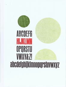
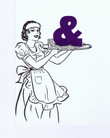
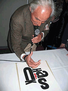
For last month’s TypeCon in Portland, Oregon (“TypeCon Portl&” as it was dubbed), Jules Faye and I prepared a talk about the work of her late partner Chris Stern, who was an innovative letterpress printer with a particular fondness for sans-serif type. Although he came to typography through learning to set phototype at a local job shop, and later headed up the type department at the fledgling Microsoft Press, Chris taught himself letterpress printing and became an expert in hand-set and hot-metal typesetting. At his death, Chris had been working on a manifesto about the use of sans-serif type in metal, with lots of images both informative and playful and lots of samples of carefully set Monotype and foundry sans-serif type. He never completed this work, but Jules unearthed enough notes and proofs and trial settings that we could weave a narrative around them that we thought would inspire some of the printers and typographers in the audience.

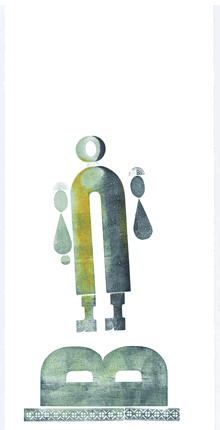
We got to show some of Chris’s meticulously layered typographic compositions, as well as fanciful characters – printed faces and bodies made up entirely of metal type. We also showed some of his serious book work (concentrating on the ones where he used sans-serif), as well as some sample spreads for his unfinished manifesto: juxtaposing sober blocks of sample text with whimsical but pointed illustrations. I even scanned and zoomed in on several pages of Chris’s notes and edits to his own proposed text – but a little of that goes a long way when you’re seeing it projected on a big screen. One passage from his own text that we quoted and showed in a sample setting was his description of the type for the manifesto itself: “Sans Transgression/ This book was going to be 100% sans serif. It seemed only fitting, after all. But along the byways of design, Commercial Script jumped into my path and I couldn’t resist. I feel confident that this will be my only sans transgression. My partner, however, says not to worry because there aren’t any serifs, just swirls.”

Among my favorite images are the multi-color prints of U-Man, an anthropomorphic character whose body is a bold, condensed capital U (sans-serif, of course!) and whose other body parts sometimes changed from one incarnation to the next.

In presenting this material, Jules felt that we were opening up Chris’s unfinished manifesto and giving it a continuing life, whatever form that may take. Nothing is ever finished.

Warning! Adults Only! Product contains letterforms at their most exposed! Viewer Discretion Is Advised. Adults Only: Warning!

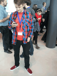
On Sunday afternoon, I caught a city bus up to the north end of town for an open house at the C.C. Stern Foundry, which is now the home of much of the printing and type-casting equipment that once filled up the barn at the “printing farm” of Stern & Faye. Many TypeCon attendees made the trek, so there was a lively group of printers, typographers, and interested amateurs. And whoever designed the nametags for the volunteer staff of C.C. Stern put to shame the design of the TypeCon nametags, which (typically) gave pride of place to the logo and kept the name too small to read from across a room.

This was a good TypeCon, full of good conversations and with a number of excellent talks and presentations. Of course Portland is a great city to visit – it’s hipster central, a land of coffee, beer, wine, and food trucks, with a very convenient transit system. The weather even gave us a taste of Northwest drizzle, though it also gave us some un-Northwestern warm humidity. I think pretty much everyone had a good time.

The visual identity for this TypeCon rendered the host city as “Portl&” in a very retro-’80s graphic style. I kept referring to it as “Port L’ampersand” – the little settlement on the Willamette River that grew up to be a real city written with real letters.

Next up on the typographic calendar: ATypI in Amsterdam, October 9–13. See you there?

Hong Kong images

Published

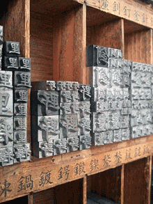
After an absurdly long delay, I have finally put some of my photos from last October’s ATypI Hong Kong up on Flickr: here. Although I didn’t take a lot of snapshots, there are few images there that ought to be interesting to people who weren’t there – and to some of the people who were. In particular, I got to the very first letterpress workshop at Zi Wut, which contains the type and printing press from a former printshop in Kowloon, now operated by three women as a teaching resource, with the original owner of the printshop offering examples and showing how the processes worked. Zi Wut has a presence on Facebook, and there’s a nice short write-up, with more images, on the Metropolis magazine blog.

ATypI Hong Kong: personal context

Published

In less than two weeks, I’ll be in Hong Kong, for this year’s ATypI conference, which is being put on with the cooperation of the School of Design of the Hong Kong Polytechnic University. This will be the first time ATypI has ever held its conference in Asia; it will also be my first visit to Hong Kong, or indeed to any part of China.

I studied Chinese history while I was an undergraduate at Stanford – when actually visiting China was virtually impossible for a United States citizen, although Hong Kong was then still a British colony and easily accessible. At the time (circa 1970), Stanford’s History department had what amounted to an unofficial mini-department of Chinese history, with several excellent professors, most of whom I took courses from. (The one professor I didn’t take a course from, Mark Mancall, gave a guest lecture for one of the other’s classes, entitled “The Complete History of Relations Between the Russian Empire and the Ch’ing Dynasty, in 45 Minutes – with Flourishes.” The bit I remember most clearly was Mancall’s description of how nervous the Ch’ing court was when they realized that the curious foreigners who had been nosing about China’s western frontiers in Central Asia, and the ones who had been nibbling at her northeastern frontiers in Manchuria, came from the same place; and how relieved the Chinese were when they finally realized just how far away Moscow really was.) Although I have never put that knowledge to practical use, I have a pretty good awareness of the outlines of Chinese history, including the tumultuous 19th century. In college, I read Arthur Waley’s The Opium War Through Chinese Eyes, which is essential background to understanding the founding of Hong Kong. Much more recently, I gained new perspective on the maritime history of southern China when I read Tonio Andrade’s Lost Colony: The Untold Story of China’s First Great Victory over the West, as well as the East Asian parts of 1493, by Charles C. Mann. These are all fascinating and highly readable antidotes to the simpleminded tales that we’re sometimes told in lieu of real history.

The theme of this ATypI conference is “墨 [mò] – between black & white,” which refers directly to the marks of ink on paper as well as alluding to contrast, balance, art, and intellectual pursuits. Naturally, there will be a strong emphasis on the typography of eastern Asia, along with all the usual range of subjects for talks, demonstrations, workshops, and exhibits. There’s still time to register and attend; and this year we’ve adjusted the schedule so that the bulk of the main conference falls on the weekend, to adapt to the common practice in both China and Japan and make it easier for interested typographers and designers from those countries to attend. I’m looking forward not only to visiting Hong Kong but to seeing the impact of Chinese and European typographies upon each other, in the distinctly human form of this professional conference. The conversations in the corridors – the heart of any conference – should be fascinating.

Edgy trust

Published

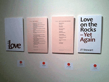
I’ve done a number of projects with Seattle poet JT Stewart over the last few years: two chapbooks, a bunch of broadsides, promotional materials for events, and the workshop that we’ve taught together for poets who want to turn their poems into broadsides. Most recently, JT’s work was selected for a display of literary and visual works that came out of Artist Trust’s EDGE program, a “professional development program” for artists. The exhibit, called “A Celebration of Washington Artists,” is on display at the Washington State Convention Center in downtown Seattle until October 18. Most of the work on the walls is paintings, prints, photos – visual art – but interspersed among them are poster-size displays of some of the writing that has come out of the program. Since the poems of JT’s that got selected came from the chapbook Love on the Rocks – Yet Again, which I designed and produced, I created a visual display for them as part of this exhibit. Two of the four panels are the front and back covers of the chapbook (the back features a highly visual poem); the other two are poems from the body of the book, presented in a format that I thought would be eye-catching and readable on a public wall.

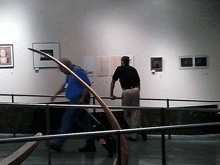
When I stopped by the WSCC on the first day of the exhibit, I could spot our installation immediately from the escalator. On the way back down, I caught a snapshot of someone already stopping to read the poems.

Copper Canyon e-book potlatch

Published

On Wednesday I was in Port Townsend for an “E-book Potlatch” at Copper Canyon Press. The press is housed in one of the old wooden buildings at Fort Worden, a former military base turned into a state park and cultural & arts center; Copper Canyon has been there since the 1970s, publishing some of the best in modern and international poetry. Right now they’re figuring out how to bring their backlist (and their front list) into e-book format alongside their printed books – and how to do it right. Consortium, the independent-books distributor, and the “e-book aggregator” Constellation (both part of the Perseus Books Group) sent three people to this planning meeting; according to Consortium’s Michael Cashin, Copper Canyon is on the cutting edge of creating readable e-books for poetry.

For five years in the ’90s, I was the designer for Copper Canyon’s books and collateral, and I’ve done a few projects since then, but my only current connection is as a friend and supporter of the press. Still, e-book typography is what I’ve been thinking about for the past year, so it made sense to participate in the meeting. I was impressed by the level of thinking and planning that was already going on. Both Copper Canyon and Consortium are committed to finding good ways to get books into practical e-book form right now, for immediate sale, and at the same time to developing formats that will be true to the unique demands of poetry and the future demands of technology. It’s not an easy task, but it’s well worth doing. This is an essential part of our culture.

The all-day summit was productive but exhausting. At the end of the day, Copper Canyon hosted a cook-out on the beach at Discovery Bay, where executive editor Michael Wiegers cooked up clams and prawns and salmon, and a few bottles of wine were drunk. It was one of this summer’s rare warm, sunny days, and some of the madder members of the crew ran out into the cold, cold water for a refreshing dip. That’s how the future of publishing happens.

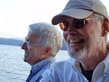
[Photo: Michael Wiegers (left) and me on the beach at Discovery Bay. Photo by Valerie Brewster.]

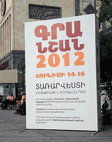
Granshan 2012

Published

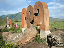
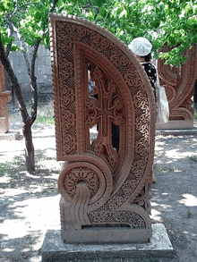
In June, I traveled almost halfway around the world to the tiny Republic of Armenia, for Granshan 2012, the fifth non-Latin type-design competition and its accompanying small conference. This year is the 500th anniversary of the publication of the first book printed in Armenian (the book was printed not in Armenia but at an Armenian monastery in Venice, which was then a center of both printing and scholarship); this year Yerevan, Armenia’s capital, was also named the World Book Capital by UNESCO. Armenians are enthusiastic about their unique alphabet, which was created 1600 years ago by Mesrop Mashtots (now a saint in the Armenian church); we visited not one but two locations where giant stone letters are placed like so many statues, one set on a hillside facing the republic’s highest mountain, the other under the trees in a garden next to the Church of Saint Mesrop Mashtots in Oshakan. (Armenia is the world’s oldest Christian country; it officially adopted Christianity in 301 CE, decades before Constantine made it the official religion of the Roman empire.)

The judges of the competition chose the best designs among the typefaces submitted, and gave a Grand Prize to Dalton Maag for Nokia Pure, which was a prize-winner in three categories: Greek Text, Cyrillic, and Armenian. Meanwhile, the two-day conference opened with a day of public lectures (I spoke briefly about the importance of space in typography) and concluded with a day of more specialized talks about type design. (Actually, it concluded with the field trip the next day to the giant letters in the countryside.) I was particularly taken with Ken Komendaryan’s talk about designing the currency symbol for the Armenian dram (with its relationship to the tall arch form common to many letters in the Armenian alphabet and to architectural forms in medieval Armenian buildings) and with Panos Vassiliou‘s discussion of harmonizing type designs across different writing systems (something that you could see every day in the streets of Yerevan, where Armenian, Russian, and English all appear frequently in multilingual signage and advertising).

The two co-organizers, Edik Ghabuzyan and Boris Kochan, brought together an international group of type experts, not only for the judging but to encourage conversations and cross-fertilization within the field of non-Latin type design. This was a high-profile event in Armenia: we were interviewed for local television (and Edik told me later that Granshan was covered on all the local TV stations – something he had never seen before), and as president of ATypI I was invited to join Edik and Boris in a meeting with the Minister of Culture.

After the official events, Edik and his team took us on a day trip into the country to see Lake Sevan, one of the largest high-elevation lakes in the world (“This is our lake, our sea, our ocean,” said Edik proudly), the Black Monastery on a former island in the lake (the island is now a peninsula, thanks to Soviet-era engineering), and the historic monastery of Haghartsin. Then we claimed a patch of ground overlooking the forested river in the valley near Haghartsin for a family-style barbecue masterminded by Edik. I’ve posted a few photos from that day, along with Yerevan street signage and some images from the amazing exhibition of ancient manuscripts, inscriptions, and early printed books at the Matenadaran museum, on Flickr.

Jack Stauffacher: Master of Types

Published

If you’re in San Francisco on June 15, I suggest that you drop by Swissnex, 730 Montgomery, between 6:30 and 9:30 p.m. to hear Jack Stauffacher in conversation with his friends. I’ve written plenty of times about Jack, who simply calls himself a printer but in fact carries on the cultural traditions of centuries of printing and learning through his practice of the printer’s trade (and, not incidentally, his practice of talking and thinking and encouraging others to do the same in his company). If I weren’t going to be in Yerevan for Granshan 2012 next week, I’d be sorely tempted to bop down to the Bay Area for the event.

This evening marks the close of “Types We Can Make,” an exhibition at Swissnex of “new typographic works from Switzerland.”

Swissnex is conveniently located just up the street from William Stout Architectural Books, which is a dangerous place to enter if you’re a bibliophile, especially if your vulnerability is in the line of architecture, typography, or graphic design. You’ve been warned.

New: Check out this very nicely done short video of Jack talking about his creative working methods and interacting with people at last week’s event.

[Photo: Jack Stauffacher at the AIGA National Design Conference in Vancouver, B.C., October 2003.]

TYPO in SF

Published

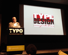
Last weekend I was in San Francisco for TYPO SF, the first episode of FontShop’s ongoing series of Typo conferences to be held in North America. I’ve written about it, briefly, for the Eye magazine blog, but of course there’s always more to say.

The only other Typo conference I’ve been to was Typo Berlin, back in 1999. There’s plenty of continuity, of course, starting with the fact that the overall organizers are the same (though the hands-on organizers, Michael Pieracci and Meghan Arnold, were local, and no doubt too young to have organized a type conference thirteen years ago; they certainly seemed to know what they were doing, though). Deeper continuity and context was provided on Friday afternoon by Neville Brody, who put the whole event into perspective by referring to Typo’s antecedents in the first FUSE conference, in London in 1994, and the second one, right there in San Francisco in 1998. I heard echoes of some of the themes and ideas that I remembered hearing from Neville and from Jon Wozencroft in those heady days, though perhaps with less of the stirring call to arms. (I had to leave before the end of Neville’s talk, but if there was any overt barricade-storming, I didn’t hear about it later.)

Erik Spiekermann, Jan Abrams, and Kali Nikitas took turns with the mastering of ceremonies, presenting a seamless front end; I know that both Kali and Jan took pains to find out context and interesting insights for the speakers they didn’t already know, and I think that care paid off in how well integrated it all felt to the audience.

From a speaker’s perspective, I can say that TYPO SF was very well organized. There is inevitably a divide between the speakers and the audience, more so than at a smaller professional conference like ATypI or TypeCon, but I felt it less this time than I remember feeling at Typo Berlin. There was a lot of interaction, good conversation, and sparking of fresh ideas. I know I came away from Typo SF with some new contacts and a lot of new energy.

[Photo: a snapshot taken by Chuck Byrne during my talk]

JFP in SEA

Published

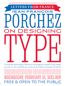
If you’re in Seattle in mid-February, you might want to come to one of these events to hear and meet Jean François Porchez, who is probably the most widely-known French type designer today. JFP will be giving a free talk on Wednesday, February 15 at Kane Hall at the University of Washington, as part of a week-long symposium: “Letters From France: On Designing Type.” He will also be speaking the following day at the Good Shepherd Center (4649 Sunnyside Avenue North, Seattle), with a Q&A session in both French and English. And I hope to entice him to our monthly typographers’ pub, on the second Tuesday, which will be February 14 (yes, Valentine’s Day), at the Pub at Third Place (6504 20th Avenue NE, Seattle), from 8 p.m. on; anyone interested in type is welcome. (Look for the table full of obvious typographers.) A bientôt!

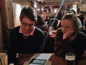
[Update:] Videotape of Porchez’s talk at Kane Hall is available online. Below, a very poor snapshot of JFP (L) at the type pub, looking over sketches of a type design by Andrea Harrison (R).

Jean François Porchez & Andrea Harrison at Seattle typographers' pub

ATypI Reykjavík 2011

Published

By all accounts, this year’s ATypI conference was a notable success. People kept coming up to me and telling me how much they were enjoying the event, how impressive the venue was, how well everything was organized, how intelligent the talks were, how much they liked the food. I kept telling them that I couldn’t take any credit for these things, that it was the organizers, both local and from ATypI, who had brought all this together. But it was certainly gratifying to hear.

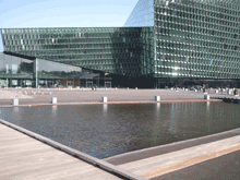
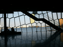
The venue was spectacular: a brand-new building, Harpa, built right on the edge of the waterfront in the harbor of Reykjavík, which houses the national symphony as well as serving as a state-of-the-art conference center. Harpa’s irregular geometry and fishnet-over-glass windows all around highlighted the location and gave us a light, airy interior to inhabit and meet in. Its various meeting spaces were easy to configure for both talks and meals. And when the weather got bad – Sunday saw a good bit of wind and rain – it was satisfying to sit snug in Harpa and gaze out at the wind-whipped harbor.

There were fewer attendees than usual this year (no doubt a reflection of the dismal economy, and of the fact that while Reykjavík is easily accessible from both North America and Europe, it’s not exactly local to anyone but the Icelanders). But those who came were excited and stimulated, and came away talking about ideas.

How often do you have a head of state opening a typography conference? The President of Iceland, H.E. Ólafur Ragnar Grímsson, not only welcomed ATypI to Iceland but gave a twenty-minute talk about the Icelandic language and its typography – an intelligent, eloquent commentary that set a high standard and neatly prefaced our keynote speaker, Gunnlaugur SE Briem. Briem spoke wittily about type, letters, and language. Together, they kicked off the main conference brilliantly.

The theme of the Icelandic letter “eth” (ð, the voiced “th” sound found in English too) led naturally to a rich track of talks on other special characters, and on a wide range of non-Latin writing systems as well. We heard about the typography of Indic, Korean, Arabic, Mongolian, Chinese, and Khmer scripts, not to mention Danish, Irish, German, and Turkish letters within the Latin alphabet. The number of presentations on Indic typography on Sunday was particularly appreciated; and there was talk of making a proposal in a few years for holding an ATypI conference somewhere in India.

The structure this year seemed to work quite well: two preliminary days of workshops and technical and educational items, in two parallel tracks, followed by the official opening on Thursday night and then a single main track of programming on Friday, Saturday, and most of Sunday. This allowed for specialization in the preliminary days, but a common experience during the main conference – and no running around trying to switch from one track to another, or worrying about coordinating the timing between multiple simultaneous talks. Our program structure is partly determined by the venue, but I think we’ll try to repeat this success in the future.

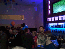
Saturday night we clambered into city buses for a short ride out of town to a penthouse restaurant with wide views in all directions, where the restaurant’s staff were quickly accommodating when they discovered that we had more people for dinner than we had planned. That was followed by a crowded party back in town at the Icelandic Design Centre, and the usual dispersal to the bars of downtown Reykjavík.

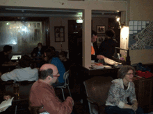
The city is so small that it was easy to keep running into each other; at one point, one of the pleasant local bars was entirely filled with typographers. This also meant that no matter where you were staying, it wasn’t more than a walk away from the conference venue. So not only did Harpa provide excellent spaces for talking and mingling, but the city itself contributed to this lively interpersonal dynamic. Reykjavík is a very cozy capital.

For a flavor of the event, check out write-ups by Roger Black on his blog (“We are all one culture, here on Œŧħ. We’ve just taken different glyphs”) and by Dan Reynolds on ilovetypography (“Font editors & a book steal the show”), and scan the photos from various attendees on Flickr. (I’d be happy to hear of other reports that I’ve missed.) And take a look at the impressionistic, kaleidoscopic videos put together by a group of young Icelandic filmmakers who were roaming the conference, cameras in hand.

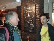
[Photos, top to bottom: the exterior of Harpa, with pool in front; the interior of Harpa, looking out; the bar before Saturday’s gala dinner; Thomas Phinney and Dawn Shaikh, at the pub; Mark Barratt and Dave Crossland, suitably out of focus, at another pub; Nick Sherman’s sartorial splendor (what, no hoodie?); and one of the images from the Typographer’s Guide to Iceland.]