header:139:aPageArgs:page_title = easily amused
header:139:aPageArgs:section_title =
functions-johndberry:262:aPageArgs:page_title = easily amused
functions-johndberry:298:sPageTitle = easily amused
functions-johndberry:359:sPageTitle = easilyamused

easilyamused |

Archive for the category ‘events’

Typographer’s lunch 7: NYC subway map debate

Published

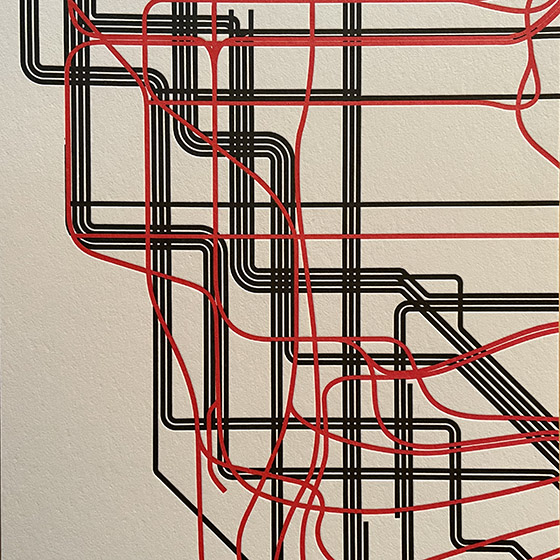
In 1978, in the Great Hall of Cooper Union in New York, a heated debate took place over a proposed redesign of the NYC subway map. In 2021, Gary Hustwit and Standards Manual published the transcript of that debate, accompanied by photos taken that same evening, in a smart-looking little book called The New York Subway Map Debate. It’s a document of design in the very real world.

The debate was a battle of two antagonistic concepts of what a transit map was supposed to do. In 1972, Massimo Vignelli and his studio had designed an elegantly abstract new subway map, doing away almost entirely with geography and presenting a schematic, almost a wiring diagram, of how to get from one point to another within a closed system. In 1978, a new map, championed by railroad enthusiast and cartographer John Tauranac, was proposed as a replacement. The new map would restore a semblance of geography, connect the subway to the city streets above, and show how the complex tangle of New York’s subways really worked. It was, as designer and debate panelist Peter Laundy later described it, “really a tunnel map rather than a route map.”

I started riding the New York subways in 1966, when I was sixteen. Shortly before that, Vignelli and Bob Noorda had designed a new signage system for the subways, assigning color-coded numbers or letters to each route. I found this system easy to follow; what I didn’t find easy to follow was the old signs in all the stations, pointing to the “BMT trains” or the “East Side Local.” The new system had not fully replaced the old, and to a novice these mixed signals were confusing. The Vignelli map had not yet been created, but the then-current subway map did identify all the lines by number or letter. There was no clue on it to the old nomenclature, or to the fact that the NYC subway system had been cobbled together from three separate companies, the IRT, the BMT, and the IND.

That map, and the Vignelli schematic in 1972, was an attempt at imposing order on a fundamentally chaotic and contradictory system. This, it seems to me, is exactly what design is supposed to do.

[Originally published on January 1, 2022, in PPN Post and Updates, the newsletter of the Publishing Professionals Network.]

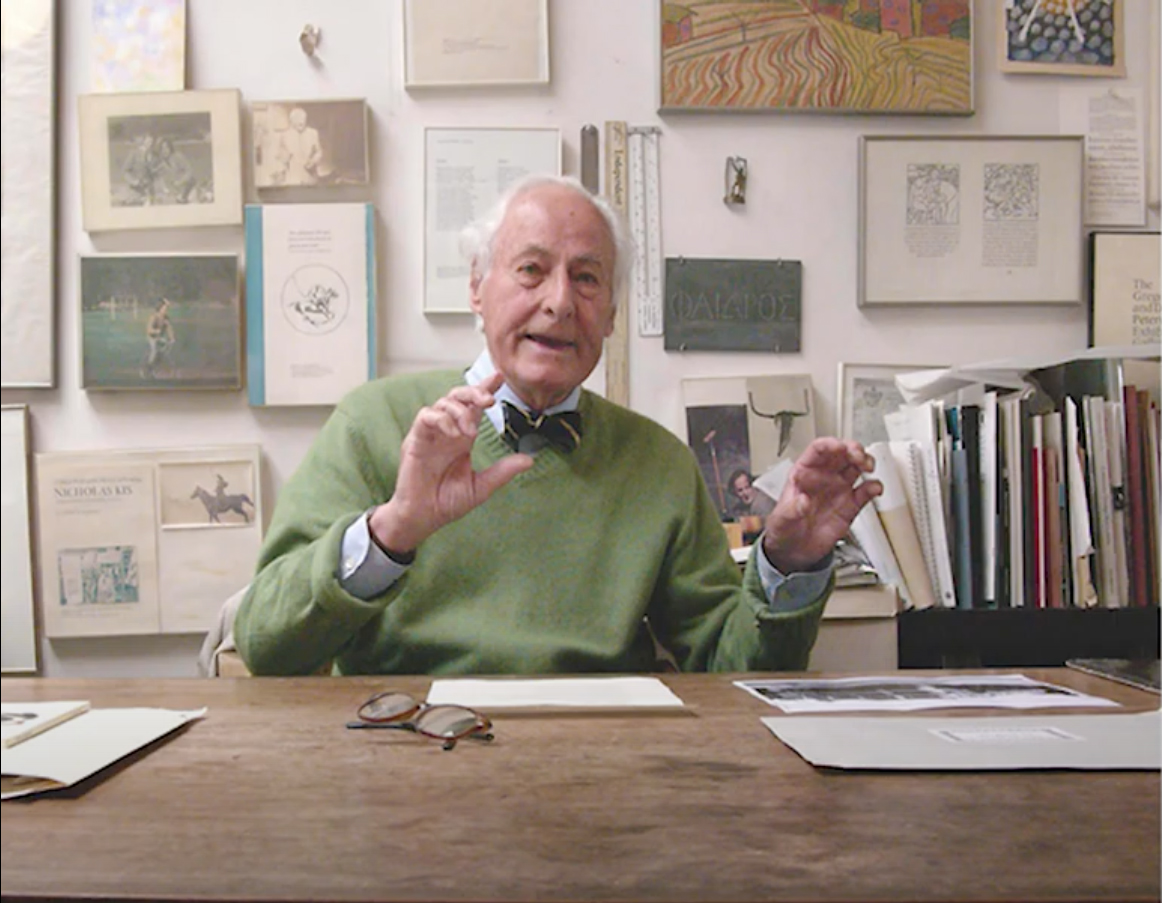
A talk on Jack Stauffacher’s legacy

Published

In October I joined Chuck Byrne to give a two-part talk about the life and work of Jack W. Stauffacher for the Society of Printers in Boston. No doubt in a normal time we would have traveled to Boston to address the members in person, but because of the pandemic the event was entirely virtual. This has its disadvantages (my connection was evidently a bit wonky, sometimes making my audio slur for a moment, though I had no way of knowing this until I listened to the recording later), but it has advantages as well: a much larger potential audience, one that was geographically dispersed although constrained by time zone. And of course the talk was recorded, so you can watch it now, well after the fact.

My part focused on Jack’s life, using the biographical essay I had written for Only on Saturday, the upcoming book from the Letterform Archive about Jack’s abstract wood-type prints. I was reading my text, rather than speaking extemporaneously, which seemed appropriate, since the book hadn’t yet been published. For the talk, I put together a selection of images that I hoped would give a visual counterpoint to the narration. Researching Jack Stauffacher’s life was a fascinating project, and finding a way to organize its many aspects and facets was a creative project of its own. But it was all in the service of telling people about Jack.

Chuck is the moving force behind the book, and in his part of the presentation he went through the book, page spread by page spread, explaining why they had chosen particular images and how they had put them together into a remarkable, highly visual volume. The design of the book is Chuck’s; he was quite sure that Jack’s approach to the design would have been different, but they were long-time friends and no doubt would have enjoyed mutually criticizing each other’s choices. It’s a beautifully designed book.

Talkin’ punctuation

Published

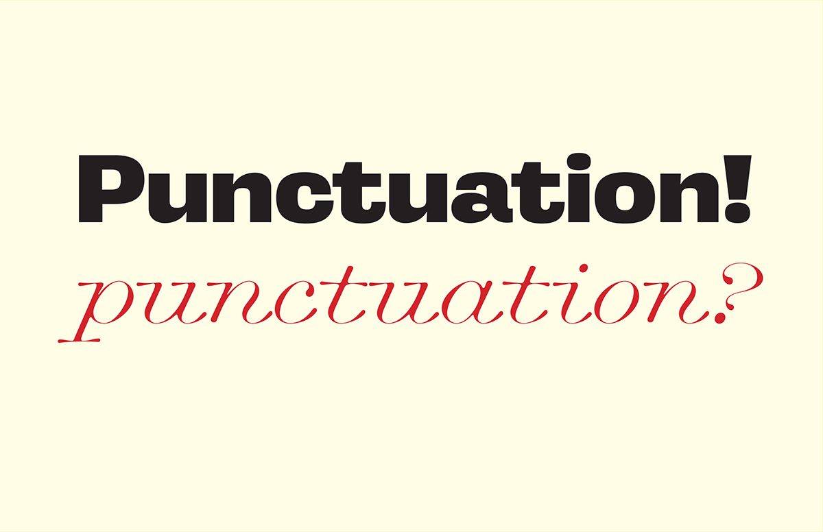
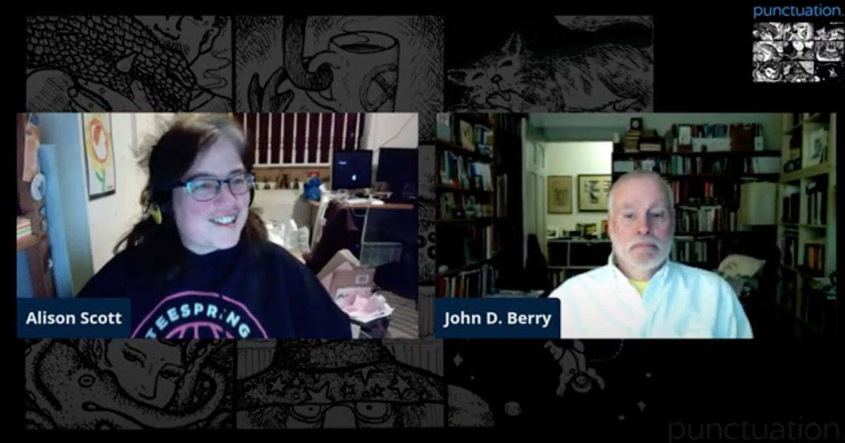
A couple of weeks ago, I was asked to do a short talk on the subject of punctuation, to kick off an online British science-fiction convention that was called, for obscure reasons, Punctuation. I was happy to do it, as this gave me a chance to overlap my two long-time communities, typography and science fiction. (There are a few other people with a foot in each puddle.)

The original suggestion, from organizer Alison Scott, was for either a talk or a panel. “Say something about punctuation,” she said. Doing a short talk seemed like the better idea, but the mention of a panel was what prompted me to speak briefly about the very different notions that the two communities have of what a “panel” ought to be.

As intended, my talk was quite short, followed by Alison’s reading questions from the chat stream and my trying to answer them. It was fun to talk about punctuation, along with a few other somewhat related topics, and Alison was an excellent host.

The video is available on YouTube.

A history of TypeLab

Published

At the beginning of 2020’s online virtual TypeLab, Petr van Blokland was telling the story of how TypeLab started in the early ’90s.

He described it as “a rogue version of ATypI,” which he and a few collaborators (among them Gerrit Noordzij, David Berlow, Erik van Blokland, and other ATypI designers) put together for the 1993 conference in Antwerp. It grew out of the experience in Budapest a year earlier, when the various international delegates who didn’t speak Hungarian found themselves milling around outside during a lecture on Hungarian type that was being delivered in Hungarian (naturally) without translation (unfortunately). It became apparent, Petr said, that there might be value in providing something else for people to do when they didn’t want to spend all their time in the official program. (In those days, ATypI conferences were fairly small, and they had only a single track of programming.)

After Budapest, Petr suggested to the ATypI Board of Directors that they plan some kind of informal alternative for the Antwerp conference, but the Board wasn’t willing to do that. So Petr and his friends set up their own alternative, which they dubbed TypeLab.

This was a time when digital typography was still thought of as new; it was only three years since Zuzana Licko had épaté la typoisie at Type90 with her HyperCard-based, music-enhanced presentation on fonts for the screen. Very little content about digital type had made its way into ATypI’s main program so far, and what had been included was largely theoretical. TypeLab was meant to be a sort of hands-on side-conference, an experimental laboratory, with a room full of equipment where anybody could try out the new technologies.

They managed to secure sponsorship from Agfa, which made it possible to have the computers, software, and printers all freely available.

“The room of 15 x 15 meters,” says Petr, “was divided into four quarters: a little lecture theatre of 40 chairs, a design studio with Macs and software, a ‘lounge’ where people could sit, talk, and show their sketches and drawings (note that there wasn’t anything like phones or laptops back then), and a printing department (loaded with printers, a typesetter, and copying machines).

“The board of ATypI didn’t go for the idea, so we planned to rent a space on the other side of the street. In the summer of 1993 Agfa, the main sponsor of ATypI that year in Antwerp, got wind of the idea, so Petr got invited to the Antwerp headquarters in late July. The appointment was made with the chairman of the board of Agfa, and also present was the then chairman of ATypI, who still didn’t want TypeLab to happen. But Agfa left ATypI no choice and promised the intended lunch space to TypeLab, also allowing a wish list for equipment.”

Over the course of the conference, they made their own magazine for the delegates, conceived and printed on the fly, using fonts that had been created right there just the day before. “The A3 printed newspapers, ready at breakfast for the attendees, were indeed made with the type that was created the day before. Many traditional/regular ATypI participants thought that to be impossible. Making type was something costing years, not days.”

Petr recalls a student at the Antwerp conference telling him how Adrian Frutiger had wandered into the lab, and the student had shown him how Fontographer worked – a technology that Frutiger was completely unfamiliar with at the time.

That was the first of six TypeLabs, Petr said, the last one being held at the 1996 conference in The Hague. By that time, Petr himself was on the ATypI Board, and from then on, the essence of TypeLab got incorporated into the regular conference program. It was no longer necessary as a guerrilla alternative; it had arrived.

Five years ago, TypeLab got revived as an adjunct to the Typographics conferences that were getting started at Cooper Union in New York. Organizer Cara di Edwardo had suggested that there ought to be some sort of program on the side during the main conference, so Petr re-created TypeLab for the occasion. It has been a Typographics fixture ever since, and this year, because of the coronavirus pandemic, TypeLab became an online-only, virtual event (“a 72-hour marathon,” says Petr), with participants and audience from around the world.

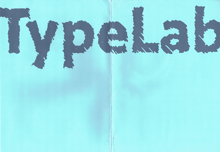
[Image: big blue TypeLab-branded folder for conference materials, from ATypI 1993 in Antwerp.]

A tale of three nametags

Published

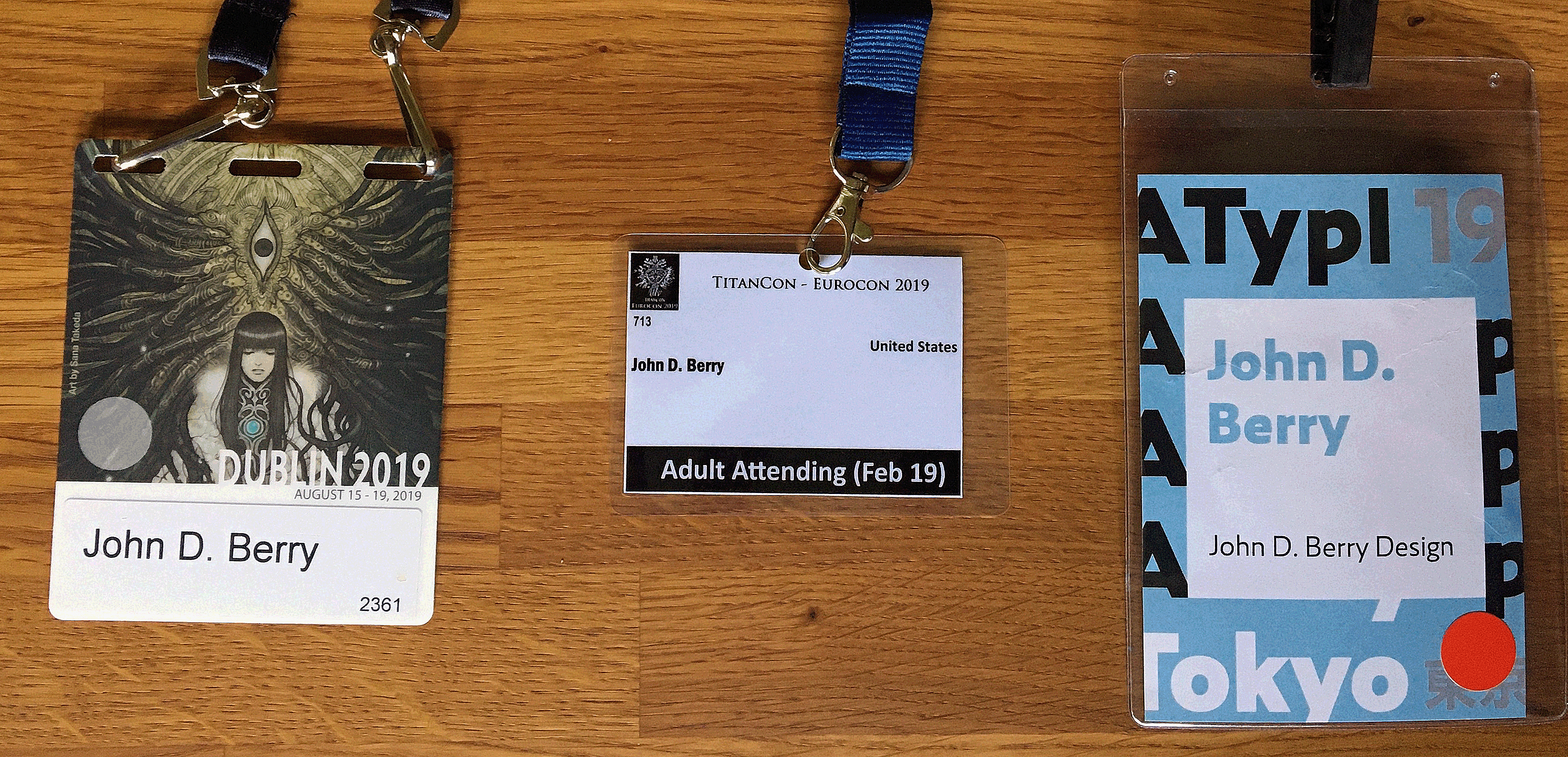
In the course of less than a month this summer, I attended three major events, each of which had a nametag that attendees were supposed to wear. The first, in Dublin, was this year’s World Science Fiction Convention, which was being held in Ireland for the first time. The second, a week later in Belfast, was the Eurocon, or European Science Fiction Convention, which moves around among European countries and was hosted by the organizers of Titancon, an annual Belfast science fiction convention; holding it in Northern Ireland the week after the worldcon made it easy for people visiting from other countries to attend both conventions on their trip. The third event was ATypI 2019, the annual conference of the Association Typographique Internationale, in Tokyo – ATypI’s second time in Asia, as it happens.

Aside from dueling jetlags (I was only home in Seattle for five days between the two trips), this juxtaposition provided a classic opportunity to compare approaches to designing the nametags or badges for such an event. I’ve written about this before, in an article about nametags published in FontShop’s Font magazine: “The moment when the design of nametags really matters is when you’re stumbling about at an opening reception, trying to spot familiar names without rudely staring at people’s chests.” Although the organizers might consider the first purpose of a nametag or badge to be labeling someone as a paying (or non-paying) official attendee of the event, for the attendees themselves the purpose is to be able to identify individual people by name. And the distance at which you want to be able to read the name is about three meters (ten feet), well before you find yourself face to face with that person whose name you know you ought to recall.

So how well did the badge-designers for these three 2019 events do?

Close-up of three nametags

Well, the Dublin nametag does make the name fairly large, though not large enough to be read at any distance. Fully three-quarters of the area of the nametag is taken up with artwork, which incorporates the name of the convention. Not too bad, but not ideal.

The nametag for Eurocon/TitanCon seems perfunctory. It’s quite small, and the largest visual element is the label “Adult Attending.” The typeface used for the name is a pretty good choice – clear, condensed, bold, and set in upper- and lowercase – but it’s tiny. You can barely read it even if you’re peering at it up close. The same name set ten times larger would have been effective; and there’s plenty of white space to accommodate a much bigger name. The TitanCon nametag is basically not functional.

On the nametag for ATypI, which is the largest of the three, the attendee’s name is both big and bold, clearly set within a large white square. It might have accommodated longer names better with a somewhat condensed typeface (which would also let shorter names be set larger), but overall my only complaint is that the name isn’t set in black; instead, it’s set in a pale second color, which tends to drop back, visually. (The color varied depending on the status of the attendee.) But it was generally readable as you approached someone in the corridor, so it was doing its job.

I don’t understand why this is so difficult. It should be thought of as information design, not just branding. Combine the typeface and color of the TitanCon names and the size and placement of the ATypI names, and you’d have a near-perfect nametag. Yet year after year, organizers of conventions and conferences, even ones devoted to graphic design, reinvent the wheel. And they sometimes get it flat.

In search of ATypI

Published

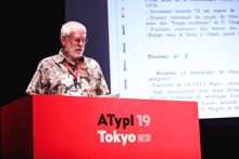
This is the text of the talk I gave yesterday at ATypI 2019 in Tokyo, about the project I’ve been working on for the past year: a history of ATypI. A draft of the first part of the history is now available on Medium.

*

I’ve given this talk the title “In Search of ATypI” because it really did require a search, to uncover the Association’s early history.

The Association Typographique Internationale (ATypI) was founded in 1957. The driving force behind the creation of ATypI was Charles Peignot, managing director of Deberny et Peignot, one of the most important French type foundries. (This, incidentally, is the reason why the Association’s name is in French.) The first official general meeting of ATypI took place in Lausanne, Switzerland, during an exhibition called “Graphic 57.” The list of people involved in that first meeting is a virtual Who’s Who of the type world of the 1950s.

Over the 62 years of ATypI’s existence, we haven’t always been very good at keeping records and preserving the association’s institutional memory. Most of the records we have are now kept at the University of Reading, but those records don’t go back past the 1970s and a little bit of the 1960s. And only some parts of them have been organized and catalogued.

When the Board of Directors commissioned me last year to write a history of ATypI, I had to see if I could find some documentation for those early years, and try to talk to the relatively few people left whose memory goes back that far.

My own involvement with ATypI began in 1990, when I attended Type90 in Oxford, my first type conference. So I have several decades of first-hand knowledge; but when ATypI was born I was barely seven years old. On the other hand, in subsequent years I served on the Board of Directors for fourteen years and as President for six, I have written quite a lot about typographic history, and I’m willing to talk to pretty much anyone while I’m doing research. So it may be that I was the right person to ask to write this history.

I only wish we had begun this project ten years ago. But I suppose everyone writing a history of a contemporary organization has a similar regret.

*

There are many boxes and file cabinets of ATypI records at the University of Reading, and right after the 2018 conference in Antwerp, I spent several days in Reading digging into those boxes. Some of them were well organized; some were not. My work was made easier because Ferdinand Ulrich had done some organizing and cataloging of the materials as part of his postgraduate research at Reading, so I had Ferdinand’s very useful outline of what kinds of materials we had and where they were in the archive.

And by following up on a couple of serendipitous leads, I discovered earlier collections of papers from both Charles Peignot and John Dreyfus, co-founders of ATypI and the association’s first and second presidents, respectively. These were not in Reading.

*

The Peignot lead came from Jean François Porchez, who was ATypI president from 2004 to 2007, and who organized the 1998 ATypI conference in Lyon. I stopped over in Paris for a couple of days on my way from Antwerp to Reading, and over dinner, Jean François told me that he thought that Peignot had given his papers to the Librairie Paul Jammes, a highly respected rare-book dealer. This antiquarian bookshop is located in a very old building in the heart of Paris, in the Saint-Germain-des-Prés quarter of the 6th Arrondissement. The very next day, I visited the bookshop and met the director, Isabelle Jammes, the granddaugher of the founder. She was very helpful, but she told me that the Peignot archives had been donated many years ago to the Bibliothèque Forney, the city of Paris’s specialist library for, among other things, the graphic arts.

I had no time during my brief stopover to visit the Bibliothèque Forney myself, but luckily one of my American friends who lives in Paris is an art historian and editor, and she is also a member of the Forney. She was quite familiar with the library, she speaks French, and she was willing to go to the library and dig into the Peignot archive.

So I got permission from the Board to commission her to do exactly that.

It turned out that the Peignot archive, or “le fonds Peignot” in French, had an unusual condition attached to it: only items that had already been published could be photographed or scanned; original documents could not, although they could be quoted. This meant that Allison had to copy out by hand any information that seemed relevant.

Not all of the Peignot archive was concerned with ATypI, but among the papers were many records of early meetings when the Association was first being planned and when it first got going – the institutional memory that was missing from the archives in Reading. There wasn’t much personal correspondence, unfortunately.

*

But here is where the other unexpected lead comes in. One of the long-time ATypI members that I got in touch with was the Swiss book designer and publisher Erich Alb. Erich told me that John Dreyfus, the second president of ATypI, had donated four boxes of ATypI-related papers to the St Bride Printing Library in London many years ago, and recommended that I go find them.

When I got to Reading, I told Gerry Leonidas about this. I didn’t have time to go to St Bride’s myself, but Gerry of course is very familiar with the library and said he would visit it and see what he could find. A few weeks later, when he had a chance to do that, he discovered that the Dreyfus papers were indeed there, but that nobody had been aware of it. Apparently the four boxes had somehow been put into storage with their labels to the wall, so that they appeared to be just four more unidentified boxes in an already over-stuffed library.

What Gerry found in those boxes was exactly what we had been looking for: not just official documents but correspondence between John Dreyfus and other founding members of ATypI, including of course his friend Charles Peignot. There are missing pieces and blank holes in the historical record, but between the Dreyfus papers at St Bride and the Peignot papers at the Forney, we now have a fair amount of documentation describing how ATypI got started.

*

The impetus behind the creation of ATypI was the advent of phototypesetting, which Charles Peignot supported but which he thought would make it much easier for competitors to copy each other’s type designs. Of course, copying of designs goes back as far as the early 16th century, when the printers in Venice accused the printers in Lyon of copying their type designs. But it was a major feature of the type business in the first half of the 20th century, with each major foundry or type-machine manufacturer rushing out new type designs that would echo the latest popular designs of their competitors.

In those days, type was either set by hand or cast on a mechanical typesetting system. Those systems were not mutually compatible; each manufacturer made its own type that worked only on its own typesetting machines. Even if a foundry licensed one of its designs to a manufacturing company like Linotype or Monotype, the design would have to be redrawn and engineered to work on their system. (This was also true of the new phototypesetting machines.)

Peignot’s goal was to have type design included in the system of international standards that was governed by the Hague Agreement of 1925 on industrial designs. A large part of ATypI’s early effort was devoted to achieving this goal, including participating in endless international standards meetings and trying to establish ATypI as an expert voice on matters of type and typography.

As it turned out, all these efforts were for nought. The quest for international protection of type designs was a quixotic effort that, over the course of more than 60 years, has never fully achieved its goal. But that’s a story for a later part of the ATypI history project.

What ATypI did achieve, through the efforts of Charles Peignot, John Dreyfus, Jan van Krimpen, G.W. Ovink, and many others, was to bring the leading figures of the typographic community together, creating an international forum for discussion of type design and typography. When they started, they were thinking in terms of a “European Typographic Union,” which quickly expanded to become an “International Typographic Association,” including the United States and Canada. I wonder what the founders would have made of ATypI today, with our focus on education rather than industrial protection, and our expanded reach around the world. I like to think that they would approve.

*

So far, my research has been mostly about the earliest years of ATypI’s history, since those are the least known. But here are a few highlights from later years.

The 1967 ATypI Congress at UNESCO in Paris was the first to be a real conference, not just a series of business meetings. As Matthew Carter recalls: “Over time, people realized that this single question, the protection of typefaces, was not really going to be enough of a reason for ATypI to exist. So these annual conferences got more and more important in the life of ATypI. They became more social and less industry-oriented. That was a novel idea at the time, to have a program of talks and so on. As far as I remember, all of them since then have had a program, some degree of talks.”

In 1973, the early efforts at type-design protection culminated at the Vienna Congress, which was a general effort at revising international standards for the protection of industrial designs. A special agreement about type design was reached, and hopes were high; when John Dreyfus concluded his term as President later that year, he did so with a feeling of “mission accomplished.” But that turned out to be premature. The agreement required at least five countries to ratify it. In the end, only two countries did.

In addition to its conferences, ATypI sponsored a series of “working seminars” between 1974 and 1992, each one focusing on a particular aspect of type or typography. (As you know, a new series of Working Seminars has just been launched, beginning with the one in Colombo, Sri Lanka, earlier this year.) The 1983 Working Seminar at Stanford University, “The Computer and the Hand in Type Design,” turned out to be a seminal event, focusing attention on the new possibilities of digital typography. It was organized by Chuck Bigelow, who at the time was an Associate Professor of Typography at Stanford, and featured, among others, Hermann Zapf, John Dreyfus, Donald Knuth, and Jack Stauffacher.

Type90, the 1990 conference in Oxford, England, was ATypI’s first event to be open to the wider community of visual design. It was organized by Roger Black, and it was a typographic extravaganza, presenting both the traditions of type and the effects of new digital technology. Sometimes it turned into a clash of cultures: I remember the shock with which some people reacted to Zuzana Licko’s all-digital presentation with its rock-music soundtrack, in one of the hallowed halls of Oxford. From that date on, ATypI was more outwardly focused than it had been in its earlier days.

In 2009, ATypI held its first conference in Latin America, in Mexico City. In 2015, the first ATypI conference in South America was held in São Paulo. The first ATypI conference in Asia was held in Hong Kong in 2012, and now here we are in Tokyo for our second Asian conference.

*

We have just published a draft of the first part of my history of ATypI on the ATypI website, so you can go there and read it now. It’s just a draft; it will be part of the first book in the ATypI history series, which will be published in time for next year’s conference in Paris. I welcome comments and any new information from anyone who was involved in ATypI’s early years. I would be especially happy to hear from anyone who has usable images from those early years; what we have is pretty sparse.

Thank you for your attention. I hope this short talk has given you a bit of historical context for the ongoing project that is ATypI.

TypeCon 2018 Portland

Published

At the beginning of August, I was in Portland, Oregon, for the 20th anniversary of TypeCon (which was also TypeCon XX, thanks to their having skipped 1999, the second year). As one of the few who attended the very first TypeCon, held in a crummy motel next to a business park in Westborough, Mass., I appreciated how the conference has grown and changed. It was founded by Bob Colby as a low-cost convention for type enthusiasts and appreciators; as it happened, many of the attendees of the first TypeCon turned out to be independent type designers, and that put a stamp on it for years to come.

As with any gathering of its kind, TypeCon for me is first and foremost an opportunity to see old friends and make new ones, and I did plenty of both in Portland. There were intriguing talks and presentations, and I managed to get to most of them on the first day, though more spottily after that. But the highlights for me tended to be things like sitting around one afternoon in the hotel lobby talking with Rod McDonald about Ed Cleary and old times in the type world. A nice mix of friends and new acquaintances was the TypeThursday lunch organized by Thomas Jockin, where those of us from various TT chapters got to meet up and chat for an hour or so.

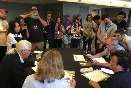
But there were also highlights among the official events. I particularly enjoyed Gemma O’Brien’s very hands-on keynote talk, and meeting her briefly later. Frida Medrano, who was given the SOTA Catalyst Award, impressed me with her cutting-edge knowledge of variable fonts. Rainer Erich Scheichelbauer did a live-action tapdance of OpenType Variations that was witty, entertaining, and eye-opening. Nina Stössinger delivered an excellent keynote talk (no surprise there!). The Sunday Type Crit, as usual, was a relaxed yet focused insight into the type designs of various volunteer designers, and into the minds of the very experienced critiquers. (I wouldn’t call them “judges” or a “jury,” as it wasn’t in any sense a competition; just helpful advice and suggestions.)

Type Crit

I had been skeptical about Matthew Wyne’s “Letters and Liquor: a Typographic History of Cocktails,” but he pulled off an entertaining slideshow, and afterward several of us cheerfully accompanied him to a local bar that served “barrel-aged Negronis,” a variation on my favorite cocktail that was new to me.

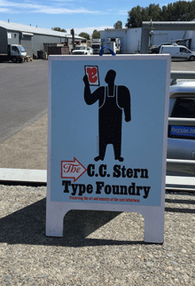
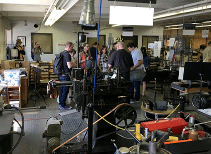
With Glenn Fleishman, I journeyed up to the northern edge of Portland to revisit the C.C. Stern Type Foundry, or as it’s calling itself now, the Museum of Metal Typography. I was welcomed by printers and typesetters I hadn’t seen since my previous visit, during the previous Portland TypeCon, and enjoyed the smells and sounds of metal type-founding (and the heat of a busy machine shop).

C.C. Stern Type Foundry

For North Americans (and visitors from overseas), TypeCon provides an annual place to get together and catch up with the typographic community. I must admit that I’m enjoying the current pattern, where TypeCon seems to return to the Pacific Northwest every couple of years. As has become habitual, though, the SOTA board had not decided on next year’s location yet when this year’s TypeCon ended. We’ll just have to wait and see.

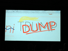
[Photos: (top, above) the Type Crit in action; a scene at the C.C. Stern Type Foundry; (left, top to bottom) (L–R) Matthew Carter, Frida Medrano, John Downer, Jill Pichotta after the Type Crit; (L–R) Jean François Porchez & Christopher Slye, looking spiffy; (L–R) Laura Serra & Erin McLaughlin at the closing party; the C.C. Stern Type Foundry sign; Rainer Erich Scheichelbauer’s live variable-fonts demonstration.]

Facing the world, typographically

Published

On Dec. 1 & 2, Stanford University hosted “Face/Interface,” a small conference on “Type Design and Human-Computer Interaction Beyond the Western World.” The conference was held in conjunction with an exhibition at Stanford’s Green Library: “Facing the World: Type Design in Global Perspective.” The exhibition, organized by Becky Fischbach, runs until March 24. (Go see it!)

The organizer of Face/Interface was Thomas S. Mullaney, an associate professor of Chinese history at Stanford who has spoken at ATypI and who wrote the canonical book on the history of the Chinese typewriter. Tom is an indefatigable organizer and a generous host, with a clear idea of what is required to make an event like this a success (and a ruthless way with a stopwatch, if speakers run over).

The roster of scheduled speakers was impressive. I knew this would be a notable event, but, as everyone seemed to agree, it turned out to be even better than we had been expecting. There was not a single talk that I was willing to miss, even first thing in the morning, and the interplay among them, dealing with varying languages and technologies and cultures, wove a rich tapestry of ideas. Which is exactly what a scholarly conference ought to do.

Not surprisingly, there were a number of references to an earlier typographic event at Stanford: the famous 1983 ATypI Working Seminar, “The Computer and the Hand in Type Design,” which was recently written about in an article by Ferdinand Ulrich in Eye magazine. That 1983 seminar had been organized by Chuck Bigelow, who at the time was an associate professor of typography at Stanford (the only person ever to hold such a position there – so far). And Bigelow was one of the closing speakers this year, thus tying together these events 33 years apart. (Donald Knuth, also a key figure of the 1983 seminar, dropped by on Friday for a while, though he had no official involvement in this year’s event.) I wouldn’t be surprised if Face/Interface didn’t figure as prominently in future typographic memory as the 1983 gathering has over the last three decades. It felt like a pivotal moment.

Highlights for me included Thomas Huot-Marchand on the contemporary successor to the Imprimerie nationale; Bruce Rosenblum’s highly personal account of “Early Attempts to Photocompose Non-Latin Scripts”; Liron Lavi Turkenich‘s visual tour through trilingual signage in Israel; Lara Captan’s tour-de-force performance, “Facing the Vacuum: Creating Bridges between Arabic Script and Type“; Gerry Leonidas on Adobe’s treatment of Greek typefaces; and the other two closing talks (mine was sandwiched between them), by Chuck Bigelow and John Hudson. Other notable memories include Tom Milo projecting his ground-breaking live-text Qur’an technology on a wall-sized screen in the Stanford maps collection, upstairs from the exhibition reception, and a lively conversation with Chuck Bigelow over breakfast on the last day.

For those speakers who didn’t have to rush off on Sunday, there was an informal brunch and tour of the Letterform Archive in San Francisco, where Rob Saunders showed off his collection and ended up selling off some of his duplicates to eager collectors such as myself.

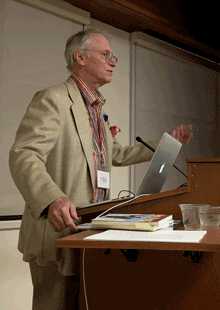
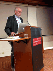
[Images, top to bottom:] Chuck Bigelow, John Hudson, & John D. Berry after the closing presentations (photo by Chen-Lieh Huang); Chuck Bigelow at the podium; Sumner Stone, asking a question from the audience; John D. Berry at the podium (photo by Eileen Gunn); Becky Fischbach & Fiona Ross outside the hotel in Palo Alto; Rob Saunders’s hands showing off the original Depero bolted book at the Letterform Archive.]

A tale of two cons

Published

I just got back from almost a week in Montréal, where I was attending this year’s ATypI conference; just a couple of weeks before that, I had been in Boston at TypeCon. There was, as you might expect, a lot of overlap among the attendees at both conferences, though the close proximity, both geographical and temporal, meant that many people had to choose between them. (I chose both.)

In both cities I was staying with friends, rather than at the official hotel. In Boston, that meant hopping the Red Line in from Cambridge each day. (Since my journey took me right by the Charlie Card store at Downtown Crossing, I stopped in and got myself a senior pass. It took only a few minutes, and now I’m an official Old Person in the eyes of Boston’s transit system.) In Montréal, it was a straight shot on the no. 80 bus down Avenue du Parc from the Mile End neighborhood, where I was staying, to the UQAM campus on Sherbrooke. One day, since the weather was lovely, I borrowed my friend Will’s bike helmet and his key to the public-bike system and bicycled down to the conference.

From the conversations at both events, it has become clear to me that the next big thing is flexible publishing: publishing on any and all platforms, without dividing them up or treating them differently (print vs. screen, tablet vs. phone, website vs. ebook). Variable fonts, which were last year’s bombshell announcement, are on track to becoming a key ingredient in the mix. Evolving layout capabilities in web design are another. The great challenge, as these tools finally begin to be available at a practical level, is achieving excellence across all those platforms.

One of the key events at ATypI wasn’t on the program: it was a lunch discussion organized by Gloria Kondrup of HMCT about “type education.” There must have been thirty or forty people there, not all involved directly in educational institutions. What grew out of that was a clear sense that it wasn’t students who needed to rethink their approach to design, but teachers and practitioners. The old categories, and the assumptions about those categories, are standing in the way. But how do you rethink your approach to doing design and teaching design, and still maintain the highest standards? A conundrum well worth pondering.

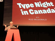
Highlights of ATypI this year included the three keynote speeches, by Paula Scher, Rod McDonald, and Roger Black; Stephen Coles’s visual feast of pre-digital type specimens from the Letterform Archive; Peter Constable’s report on the current state of variable fonts; Paul Shaw’s history of the Electra typeface by W.A. Dwiggins; Sergio Trujillo’s funny, articulate presentation of designing a typeface for an endangered language from Assam in northeastern India; Sahar Afshar on new and old approaches to designing Arabic typefaces; a four-person panel discussion that interrogated job titles and what we mean by them; and Veronika Burian and José Scaglione on the need for giving credit where credit is due in the complex teamwork of designing typefaces and producing fonts. And of course the interstitial schmoozing and networking that are at the heart of any conference.

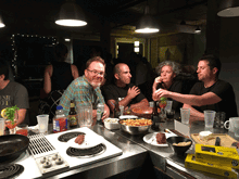
[Above: a quick panorama of the exhibits room during one of the coffee breaks at ATypI 2017 Montréal.]

As always, there were talks I would have liked to see but had to miss. Happily, the AV team not only videotaped the entire program, but they got much of it up online and freely available while the conference was still going on.

Aside from any formal events, I enjoyed conversations, some long, some short, with Lucie Lacava, Katy Mawhood, Gerry Leonidas, Paul Luna, Jason Pamental, Mary Catherine Pflug, Matt Soar, Laurence Penney, Rod McDonald, Liu Zhao, Natalie Dumont, Roger Black, Sahar Afshar, Tom Foley, and Will Hill – and no doubt with others who have slipped my mind at the moment. This is the essence of a good conference.

This year marked a personal watershed, as I finally left the ATypI board of directors after 17 years. I was first elected in Leipzig in 2000, when Mark Batty suggested that I ought to run. I certainly didn’t expect to remain a board member for such a long stretch of time – possibly the longest continuous run, though I’m not sure about that – including two three-year terms as ATypI president. I’m very pleased with the directions that ATypI has taken in that time, and of course I’m not going away. But I’m looking forward to attending next year’s conference in Antwerp as a civilian (and not having to take time out for board meetings).

José Scaglione stepped down this year as president, after leading ATypI through a smooth transition from our ancient, outdated bylaws and into a newly outward-facing approach. The new president, Gerry Leonidas, has plenty of experience on the board and a lot of new ideas, which strikes me as a fine combination. And I’m glad that José is helping to establish a tradition by continuing as a board member after his term as president. That’s a useful kind of continuity in any organization.

In August at TypeCon, I spent a fruitful lunch talking with Jason Pamental, whose zeal for online typography matches my own and whose knowledge of web design outstrips mine by a mile, about how to encourage higher standards in flexible publishing and what can be demonstrated right now. We continued this conversation in Montréal, along with others like Gerry Leonidas and Paul Luna. This is the sort of thing I’m talking about above, the direction that typography seems to be going right now.

(Why “A tale of two cons”? Two conferences, of course. But why “con”? Jean François Porchez once asked, “Why do they call it by a rude word in French?” The answer is simple (and ignorant of the French meaning of con). TypeCon was founded in 1998 by Bob Colby, who had also been one of the founders of the literary science-fiction convention Readercon. And in the SF community, “con” is shorthand for “convention,” the annual or occasional gatherings that have been going on, in the United States and elsewhere, since the late 1930s. I’m sure it seemed quite natural to Bob Colby to name his new creation in the same tradition, as “TypeCon.” The shortened term works equally well for a convention or a conference.)

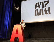
[Photos, top to bottom: outgoing president José Scaglione kicks things off; Rod McDonald’s keynote talk, “Type Night in Canada”; Kevin Larson pointing, not really saying, “This is your brain on type!”; 8 Queen, the highly typographic venue for the workshops & the final-night closing party; at the Morisawa party; at the final-night party; at the after-party, very late Saturday night.]

Typography of the future: variable fonts

Published

I’ve just finally watched the Special OpenType session, ATypI 2016 Warsaw of the “Special OpenType Session” from the ATypI 2016 Warsaw in Warsaw in September. (Because of scheduling and flight conflicts, I didn’t arrive in Warsaw until the evening of that day, so I missed the live event. Not surprisingly, it was the talk of the town among attendees at the conference.) The discussion in the video is highly technical, but the upshot of this development is exciting.

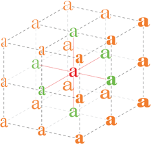
Variable fonts” seems to be the name that everyone’s adopting for this new extension of the OpenType font format. What it means is that an entire range of variations to a basic type design can be contained in a single font: all the various styles from Extra Light to Extra Bold, for instance, and from Compressed to Extended. Instead of a super-family of separate font files, you can have one font that, conceivably, contains them all.

The presentation had representatives from Adobe, Microsoft, Apple, and Google, reflecting the fact that this is truly a cooperative effort. All four major companies (and several smaller ones) have committed to supporting and implementing this new standard. That’s a very important fact: usually, adventurous people come up with an ambitious new spec for wonderful typographic features, but the problems arrive when the developers of operating systems and applications don’t fully commit to supporting them. This time, from the very first, the companies that develop those apps and OSes are committed.

What that means is that, if it’s implemented properly, the new format will make it possible for font developers to create fonts that adapt to changing circumstances. For instance, in a responsive web layout, you might change the width of the text font as the width of the window gets narrower or wider. You could also change the weight subtly when the screen colors are reversed. These small, almost unnoticeable, but very important variations could make reading onscreen much more comfortable and natural.

This is a watershed. What it reminds me of is two different nodal points in the development of digital type: multiple master fonts, and web fonts. The introduction of variable fonts at this year’s ATypI conference has the same “Aha!” and “At last!” feeling that the introduction of the WOFF font format standard for web fonts had at Typ09, the 2009 ATypI conference in Mexico City. Both events mark the coming-together of a lot of effort and intelligent work to make a standard that can move the typographic world forward.

The history of multiple master fonts is sadder, and it points up the pitfalls of creating a good idea without getting buy-in from all the people who have to support it. The multiple-master font format was a breakthrough in digital type; with its flexible axes of variable designs, it made possible a nearly infinite variation along any of those design axes: a weight axis, a width axis, or (most promising of all) an optical-size axis, where the subtleties of the design would change slightly to be appropriate to different sizes of type.

But the multiple master technology, developed by Adobe, never made it into everyday use. The various Adobe application teams didn’t adopt it in any consistent or enthusiastic way, and it wasn’t adopted by other companies either. Instead of being incorporated into the default settings of users’ applications, giving them the best version of a font for each particular use, multiple master was relegated to the realm of “high-end typographers,” the experts who would know how to put it to use in airy, refined typographic projects. That’s not the way it should have worked; it should have been made part of the default behavior of fonts in every application. (Of course, users should have had controls available if they wanted to change the defaults or even turn it off; but the defaults should have been set to give users the very best, most appropriate typographic effects, since most users never make any changes to the defaults at all. It’s important to make the defaults as good as possible.)

Now it sounds like the new variable-fonts technology is going to be incorporated into the operating systems and the commonly used applications. If this really happens, it will improve typography at the everyday, ordinary, pragmatic level. And what that means is the improvement of communication.

I’m looking forward to seeing how this works in practice. And to putting it to use myself, and helping in any I can to improve and implement these new standards.

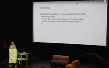
[Images: (left, top) Peter Constable speaking at the Special OpenType Session at ATypI Warsaw, September 2016; (left) schematic of the design variations of Adobe’s Kepler, designed by Robert Slimbach.]