function jdb_page_navigation()
sPageSlug = blog
sPageTitle = easily amused
header:139:aPageArgs:page_title = easily amused
header:140:aPageArgs:section_title =
functions-johndberry:262:aPageArgs:page_title = easily amused
functions-johndberry:298:sPageTitle = easily amused
functions-johndberry:359:sPageTitle = easilyamused

easilyamused |

Archive for the category ‘ambient letters’

Backwards rolled the apostrophes

Published

There’s a wonderful photo on SFGate today, in a set of images from the just-completed Republican National Convention. It’s a shot of a couple of stagehands carrying a big sign down to the floor of the auditorium, in preparation for the event. The sign consists of giant Optima letters stuck to a ladder-like frame; the cap-height is about half the height of one of the guys carrying it. Naturally, the phrase spelled out so grandly is “McCAIN ’08” – except that the apostrophe (which is about the length of the guy’s head) is backwards.

There’s something peculiarly wonderful about a typographic error that has its origins in automated typesetting (“smart quotes”) being embodied in such a large, hands-on, physical form and lugged down the stairs to be erected in front of a huge crowd in a convention hall.

Vernacular information design

Published

Everybody loves “vernacular typography,” or at least enjoys finding examples. This purely functional sign resides on a store-front church in a neighborhood in Seattle (not far, in fact, from the building with the faded “Roycroft Theater” sign that I noted last year). For several years, the church sign was characterized by the shaky lettering in the top image; I was never sure whether it was a deliberate style or the result of being painted by someone with a nerve problem. (Whatever the intention or the skill involved, presumably it served its purpose; the information was there, albeit in a rather peculiar form.)

More recently, that sign was replaced by the one in the bottom image – same information, mostly, but a more controlled sort of lettering, or at least a more formal set of models. Still not anything that would be mistaken for the work of a professional sign-painter.

Digital wood type

Published

I took a couple of pictures of this sign over a shop in Valle de Bravo, Mexico, in February – not because it was picturesque or folkloric but precisely because it was such an odd mix of digital and hands-on technologies. The plaque and the letters were all made of wood, but the letters were all obviously digital in origin: carved in wood by machine from digital letter forms. The bold caps of ‘CONSULTORIO MEDICO,” in fact, look like Arial – the most digital of digital fonts. Yet the letters were also clearly carved separately from the plaque, and later attached; the seams were easy to see, and the spacing was what you might get from someone placing each letter by hand, while standing on a teetering ladder. If you look closely, you can even see that the n in “pone” (“pone a su disposicion”) is backwards – something that could only have happened from a physical mistake, not a digital one.

Detail of wooden sign in Valle de Bravo

Vernacular typography? Yes, Jim, but not as we know it.

Missing letters | 3

Published

Spotted on the corner of a building in Madison, Wisconsin, last weekend, at the entrance to an alleyway leading off State Street. I particularly like the unexplained vertical block between “FOR” and “RENT.”

Missing letters | 2

Published

This one is a more traditional sort of missing lettering: a faded sign on a wall in Brighton, which I took a photo of while I was there in September for the ATypI conference. Palimpsests within palimpsests.

Missing letters | 1

Published

I’m a collector of images of vanished signs – not just the decades-old faded lettering on old brick buildings that’s so common around central cities, but the ephemeral remains of more recent signage. Sometimes it’s nothing more than the holes in the wall where molded letters were once attached. This is a form of instant obsolescence; it must appeal to my sense of passing time.

This shot is of a soon-to-be-torn-down building on Broadway in Seattle.

Separated at concept?

Published

I just wrote an article for Eye, the excellent graphic-design magazine out of London, about type and lettering on public buildings. It’ll be in the spring issue, Eye 67. The starting point for this piece was Rem Koolhaas’s new Seattle Public Library, and the original ways in which really big type was being used for some of the internal signage. The article expanded far beyond there, of course. (It’s embarrassing to remember how long ago I first spoke with John Walters, Eye’s editor, about doing such a piece. It’s one of those subjects that just keeps expanding; I wouldn’t be surprised if it ended up as a book.)

There’s a lot of smaller-scale signage in the library, too – the sort of ordinary informational stuff that everyone has to deal with. I took a bunch of photos of the SPL signage, in the course of my research. Only one of them ended up in the magazine, but I was intrigued by some of the side-roads and byways that didn’t get covered in a more general article. One unexpected juxtaposition is illustrated here: an informational sign from the library (left), which was free-standing at the top of the “books spiral,” SPL’s unique form of library stacks; and another free-standing sign (below), using the same typefaces and remarkably similar color and shapes, which I noticed next to the fuel pumps in my local gas station on Capitol Hill.

Futura sign at Seattle gas station

Coincidence? Well, yes, probably. But it’s a surprising bit of design echo, in two entirely different contexts that are only about a mile apart. Fill ’er up! Would you like a book with that?

Tramwise in Seattle

Published

Last December, Seattle’s new streetcar débuted, connecting downtown with the rapidly developing South Lake Union. This tram, like the development of South Lake Union itself, was the brainchild of Paul Allen, Microsoft co-founder. It was a cold winter day when the service began, but I managed to get there in time to ride the streetcar on the evening of its first day. I may also have seen the new streetcar line’s first drunk – an amiable drunk, to be sure, who was gently ushered off the car at a convenient stop.

The line is quite simple – there and back again – but I was curious to see how the informational signage would be handled. It seems pretty good at letting you know where you are, and the stops on the street are fairly well marked.

Simple schematic of the line, displayed inside the car

The fare boxes were covered with a decorative paper wrapping, because for the first month everyone got to ride for free. Presumably now the fare boxes are in operation; I’ll have to go back downtown and see.

Fonts in flicks

Published

Windsor Condensed – one of the hardest display typefaces to use well. We tried to use it on the cover of what turned out to be the final issue of the Pacific Northwest Review of Books, back in 1978, but it defied our attempts at spacing it right. Apparently Woody Allen has been using it since about the same time for his some of his movie titles, as documented on Boing Boing earlier today.

Actually, it’s the Elsner+Flake digitization of Windsor Elongated, an even more straitened and squashed version of Windsor, that Woody Allen uses. It’s got a decidedly retro feel, which of course is the point; Woody Allen is nothing if not nostalgic, or at least nostalgia-referential. Apparently it was the ubiquitous and talented Ed Benguiat who recommended this typeface to Woody at a diner in New Jersey, back in the mid-1970s. Windsor also has a lot of spirit of Benguiat’s own swash-inspired style of lettering, which was in full flush in the ’70s and is still recognizable and alive today. (So, indeed, is Ed Benguiat, who is one of the most entertaining type designers around.)

[Left: Windsor Bold in a detail from the cover of the Pacific Northwest Review of Books, vol. 1, no. 4, July/August, 1978.]

Signs of change

Published

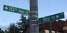
Seattle’s street signs have recently been undergoing a change. While they’re still the same recognizable freeway-green rectangles, outlined in white and with white letters reversed out of the green, the new signs have noticeably larger type. The old signs (top, left) were always easily legible – upper and lowercase letters, except in secondary information such as “AVE,” and always spaced loosely enough to be readable at an angle from a moving car – though a lot of the old signs are now too faded to do their job. (I had to search a bit to find an example of old signs that were still in good condition.) Even the numerals were legible, an important consideration in a city with lots of numbered streets.

The new street signs (bottom, left) aren’t obviously different, except that the letters are larger. They take up more of the space inside the green rectangle, which creates a less pleasing shape but make them readable from a greater distance away. They look a bit bloated when you see them from the sidewalk, as you walk along a city street; but from a moving car, they’re large and clear. Clearly that was the priority in their design.

Some of the small details are fussier in the new signs. It might seem better to have “Ave” in upper and lowercase letters, like the street name, since it’s more legible than the old all-caps setting; but this is purely secondary information, so it’s actually a distraction. Similarly, the gratuitous addition of superscripts such as “th” on “10th Ave E” just clutters things up. The simpler the form, the better, as long as the essential information is there.

In case you’re wondering, the arrows in the bottom photo are there simply because I took that picture at a peculiar intersection where streets come together at an angle.