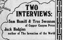
Windsor Condensed – one of the hardest display typefaces to use well. We tried to use it on the cover of what turned out to be the final issue of the Pacific Northwest Review of Books, back in 1978, but it defied our attempts at spacing it right. Apparently Woody Allen has been using it since about the same time for his some of his movie titles, as documented on Boing Boing earlier today.
Actually, it’s the Elsner+Flake digitization of Windsor Elongated, an even more straitened and squashed version of Windsor, that Woody Allen uses. It’s got a decidedly retro feel, which of course is the point; Woody Allen is nothing if not nostalgic, or at least nostalgia-referential. Apparently it was the ubiquitous and talented Ed Benguiat who recommended this typeface to Woody at a diner in New Jersey, back in the mid-1970s. Windsor also has a lot of spirit of Benguiat’s own swash-inspired style of lettering, which was in full flush in the ’70s and is still recognizable and alive today. (So, indeed, is Ed Benguiat, who is one of the most entertaining type designers around.)
[Left: Windsor Bold in a detail from the cover of the Pacific Northwest Review of Books, vol. 1, no. 4, July/August, 1978.]