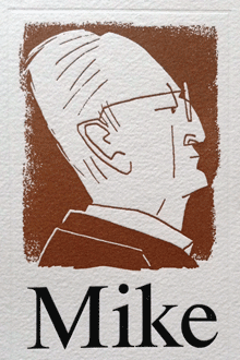
It’s hard to remember when I first met Mike Parker. I’m sure I had seen him and heard him at ATypI and other conferences before I ever got to know him; his tall, erect posture and booming voice were hard to miss, whether he was making a pronouncement or telling a joke (sometimes both at the same time).
I certainly got to know him better when he moved to Seattle for a while in the mid-1990s, to provide the typographic vision behind a start-up called Design Intelligence. Mike recruited me to design templates that would use suites of typefaces and hierarchical page designs to create a system of flexible layouts in various styles – not unlike what he had been working on already with his Pages Software, and not unlike what we are still trying to do today with adaptive page layout onscreen. We used to talk about where this idea could be taken, and while we were doing that he would tell me stories from his long history in the typographic field.
Mike was an inveterate storyteller. He might have embellished a story or two, as one does, but they were all wonderful to listen to. And they filled in many a hole in the history of type and the people who made it. Pity I can’t remember any of them in detail.
I do remember two incidents from somewhat later, during the San Francisco TypeCon in 2004. There was a big party hosted by a design firm in its studio on the top floor of an old building south of Market Street; everyone was invited, but the only access was through a rather small elevator, so you might have a long wait before you got to ascend to the party floor – and once there, you’d be reluctant to leave. Both Mike and I found ourselves uninterested in the lively dance scene that dominated the room, so we grabbed a couple of folding chairs, propped them against the wall, and spent the next hour or two watching the action and chatting comfortably between ourselves. That, I believe, was when Mike explained to me the chthonic origins of a river name in England, and regaled me with tales of the neolithic standing stones at Avebury. This was an altogether perfect way to spend the evening. Every once in a while, one of us would get up (usually me) and get us another couple of drinks.
The other conversation I remember from the same conference was over dinner, at an Italian restaurant near Union Square that Mike suggested. I don’t recall how we got on the subject, but we were talking about the transition from metal type to phototype and then to digital type, and the design compromises that had been made in adapting so many text faces to the new technology. In particular, I mentioned ITC New Baskerville, which had begun life as Mergenthaler’s adaptation to phototype of a popular Linotype text face. I lamented that New Baskerville seemed too “bright,” too high-contrast, to work well in text, and I speculated that in adapting the design from metal, they had used too large a master (14pt or larger) rather than a text size such as 10pt.
What I was momentarily forgetting was that Mike Parker had been, for more than a decade, the head of typographic development at Mergenthaler, overseeing the transition of their library from hot metal to phototype.
Mike just leaned over the table toward me and said, quietly, “I’m sorry.”
I started, then we both laughed, and continued the conversation.
[Image: From the cover of a tribute booklet from TypeCon 2012, when Mike was given the 2012 SOTA Typography Award. Illustration by Cyrus Highsmith. The type, of course, is Starling.]

