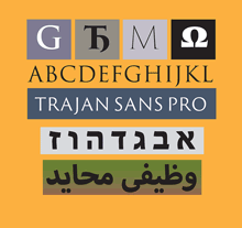
Last year I wrote the texts for four new digital specimen books for extensions to Adobe Originals typefaces, and just last week Adobe posted those specimens online. All of them are additions to existing type families: two derive from Trajan (Trajan Pro 3, which extends both the number of weights and the language coverage, and the new Trajan Sans) and two from Myriad (Hebrew and Arabic versions of this widespread humanist sans). The project gave me an opportunity to delve into the history of the inscription on the Trajan column in Rome (which, almost every time I’ve tried to take a close look at it, was chiuso per restauro and wrapped in a blue plastic tarp), and an even more interesting chance to learn about the design of both Hebrew and Arabic typefaces. The latter pair gave me an excuse to engage the considerable knowledge and expertise of Scott-Martin Kosofsky, a typographer of fine sensibilities and an expert in bilingual Hebrew/English publishing, and Mamoun Sakkal, an expert in Arabic type design with a particular penchant for the style known as square kufic (though this is not, actually, the tradition that the Myriad Arabic extension draws on) and a friend who, happily, lives in the Seattle area. Mamoun, along with his software-coding daughter Aida, had been expanding my knowledge of Arabic for some time; Scott I met through this project, and have been learning from quite happily ever since.
I should be quite clear: I can neither read nor write either Hebrew or Arabic, although I’ve learned quite a lot about the design of typefaces in both scripts. And about the quixotic and sometimes contradictory nature of designing “sans serif” typefaces in either script. Not to mention the fraught question of what it means to have an “italic” in either Hebrew or Arabic, neither of which has any such tradition before the digital age.
P.S.: I was quite pleased to notice that one of the samples of Myriad Arabic in action was bilingual versions of three poems by Maram al-Massri (with English translation by Khaled al-Mattawa) that had been published by Copper Canyon Press, an excellent international poetry publisher for whom I have done a lot of book design in the past. Synchronicity is everywhere.

