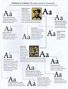
James Felici has an article on CreativePro about the many different typefaces called “Garamond.” It’s not a new subject, but it’s one that we need to be reminded of every so often. As Felici explains, many of the typefaces that we know as “Garamond” are actually not based directly on the work of Claude Garamond, the 16th-century French punchcutter, but on the work of Jean Jannon, who was working several decades later. Jannon was inspired by Garamond, but his types are distinctly different.
I took a crack at explaining this myself in the early ’90s with a Garamond family tree that I put together for Aldus magazine. (When I say “put together,” I mean that I researched it, organized it, and wrote the text; I did not, however, design the actual page.) That’s what you see a snapshot of over there to the left.
The tree gets complicated. Monotype Garamond, for instance, is a Jannon revival; so is Garamond No. 3, released by Mergenthaler Linotype in the early 20th century. ITC Garamond, although its letter forms are clearly based on Jannon’s, is so wildly inflated and exaggerated that I always wish ITC hadn’t called it “Garamond” at all; it’s a useful advertising typeface, but never a book face. Stempel Garamond, on the other hand, is based on Claude Garamond’s own types; so is Adobe Garamond, and the even better Garamond Premier Pro (both designed by Robert Slimbach).
Garamond Premier Pro was Slimbach’s return to the source several years after he designed Adobe Garamond (and well after I created this family tree). Although both of them are based on the Garamond type specimens in the archives of the Plantin-Moretus museum, Garamond Premier draws on several sizes of Garamond’s types to create optical sizes for the digital typeface. I find it a more satisfying and versatile typeface.
[Images: Garamond family tree (top), from Aldus magazine, March/April 1993; samples (bottom) of optical sizes of Garamond Premier Pro.]


