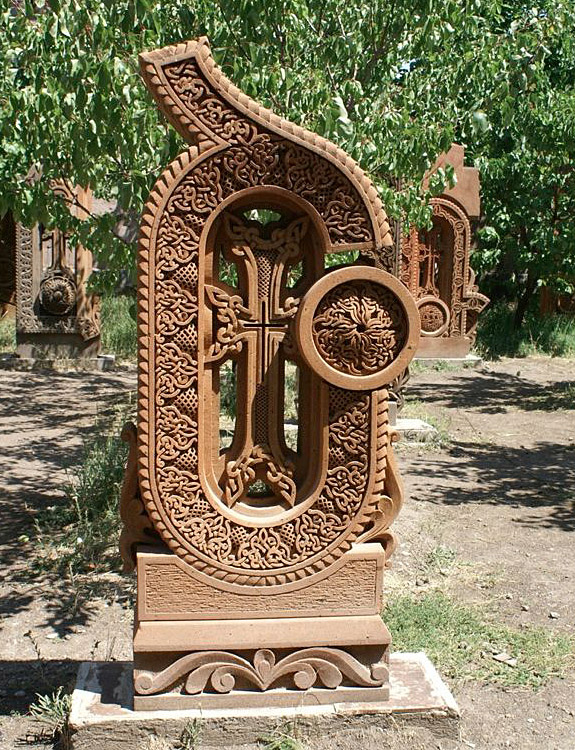
In June, I traveled almost halfway around the world to the tiny Republic of Armenia, for Granshan 2012, the fifth non-Latin type-design competition and its accompanying small conference. This year is the 500th anniversary of the publication of the first book printed in Armenian (the book was printed not in Armenia but at an Armenian monastery in Venice, which was then a center of both printing and scholarship); this year Yerevan, Armenia’s capital, was also named the World Book Capital by UNESCO. Armenians are enthusiastic about their unique alphabet, which was created 1600 years ago by Mesrop Mashtots (now a saint in the Armenian church); we visited not one but two locations where giant stone letters are placed like so many statues, one set on a hillside facing the republic’s highest mountain, the other under the trees in a garden next to the Church of Saint Mesrop Mashtots in Oshakan. (Armenia is the world’s oldest Christian country; it officially adopted Christianity in 301 CE, decades before Constantine made it the official religion of the Roman empire.)
The judges of the competition chose the best designs among the typefaces submitted, and gave a Grand Prize to Dalton Maag for Nokia Pure, which was a prize-winner in three categories: Greek Text, Cyrillic, and Armenian. Meanwhile, the two-day conference opened with a day of public lectures (I spoke briefly about the importance of space in typography) and concluded with a day of more specialized talks about type design. (Actually, it concluded with the field trip the next day to the giant letters in the countryside.) I was particularly taken with Ken Komendaryan’s talk about designing the currency symbol for the Armenian dram (with its relationship to the tall arch form common to many letters in the Armenian alphabet and to architectural forms in medieval Armenian buildings) and with Panos Vassiliou‘s discussion of harmonizing type designs across different writing systems (something that you could see every day in the streets of Yerevan, where Armenian, Russian, and English all appear frequently in multilingual signage and advertising).
The two co-organizers, Edik Ghabuzyan and Boris Kochan, brought together an international group of type experts, not only for the judging but to encourage conversations and cross-fertilization within the field of non-Latin type design. This was a high-profile event in Armenia: we were interviewed for local television (and Edik told me later that Granshan was covered on all the local TV stations – something he had never seen before), and as president of ATypI I was invited to join Edik and Boris in a meeting with the Minister of Culture.
After the official events, Edik and his team took us on a day trip into the country to see Lake Sevan, one of the largest high-elevation lakes in the world (“This is our lake, our sea, our ocean,” said Edik proudly), the Black Monastery on a former island in the lake (the island is now a peninsula, thanks to Soviet-era engineering), and the historic monastery of Haghartsin. Then we claimed a patch of ground overlooking the forested river in the valley near Haghartsin for a family-style barbecue masterminded by Edik. I’ve posted a few photos from that day, along with Yerevan street signage and some images from the amazing exhibition of ancient manuscripts, inscriptions, and early printed books at the Matenadaran museum, on Flickr.