After he was unceremoniously ejected from Microsoft Press, Chris Stern found a job at a leading type shop in Seattle, Thomas & Kennedy. It was a very different environment from Microsoft, with its own kind of hectic pace.
[Up to now, these reminiscences have been pretty much chronological. From this point on, though, I’m going to be jumping around a bit more, following themes rather than years. This one picks up where I left off, with my departure from Microsoft Press. The new publisher had abruptly laid off Chris Stern, head of the type department, which ended up sending Chris into a whole new typographic career.]
I remember Chris telling me about what it was like working at Thomas & Kennedy. Most of the typesetting work was on ads and brochures for regular clients; it was the same sort of job work that we had done at Franklin Press, but for higher-end clients and on more sophisticated typesetting machines (an Alphatype front end). There was so much business that T&K ran two shifts, one in the daytime and one in the evening. Often the first version of an ad would be set by the day shift, then proofread and marked up for corrections in the evening, then re-set the next day. (One of the proofreaders was Marianne Moon, who had been laid off from Microsoft Press when Min Yee decided that production proofreading was redundant. Her skills were much better appreciated at a job shop like T&K.) This two-shift system opened up ample opportunities for differing interpretations of the fine points of typesetting in each job. Chris would get quite frustrated when his carefully thought-out details got changed according to someone else’s idea of how it should be done.
I’m not sure how Chris first moved from digital typesetting to letterpress, but I imagine it was partly fueled by that frustration with the fast-moving, malleable world of setting digital type for advertising.
:: :: ::
This is what I wrote for an exhibition of Chris’s work at a Seattle gallery in 2008, just two years after his untimely death from cancer. The exhibit showcased both Chris’s own work and some of the work that he had done in collaboration with his partner Jules Remedios Faye. Jules and Chris were both remarkable printers, and I’m always amused to remember that I knew each of them before they knew each other.
– John D. Berry, June 2008
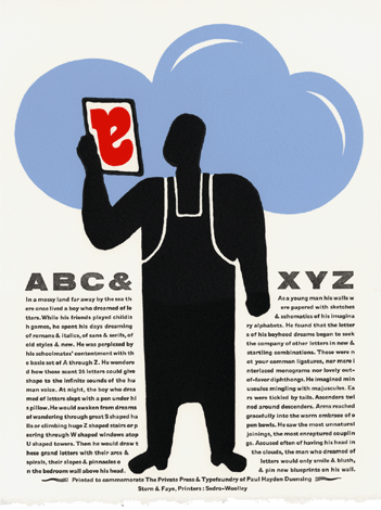
Chris Stern and Jules Faye printed together for a decade and a half, under the name of Stern & Faye, Printers. Each of them had also been printing for longer than that under their individual imprints: Chris established Grey Spider Press in 1986, and Jules established Street of Crocodiles Letterpress Printery in 1990. When they moved out of Seattle in 1994, they settled in the rural Skagit Valley and set up what they referred to as a “printing farm,” with a barn full of working presses and typesetting equipment. Separately and together, they produced an impressive body of printed work, until Chris’s death in 2006 put an end to his side of their collaboration.
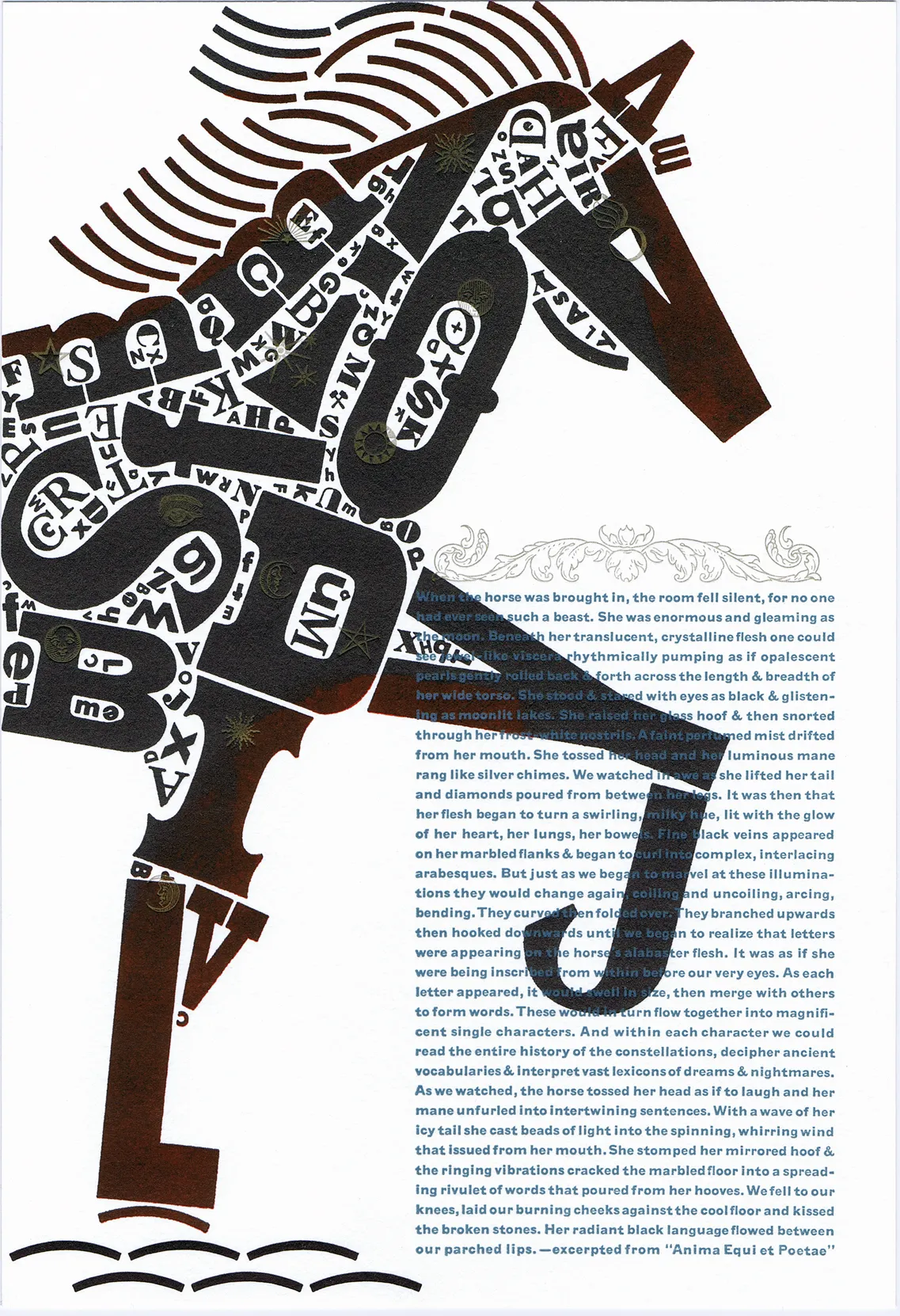
What’s unique may be their combination of “fine press” sensibility and a freewheeling approach to typography and art. You don’t often see letterpress these days in Futura (a favorite typeface of Chris’s); more often, it’s a delicate, Renaissance-derived face like Garamond. Chris had a command of both idioms, and mixed them freely.
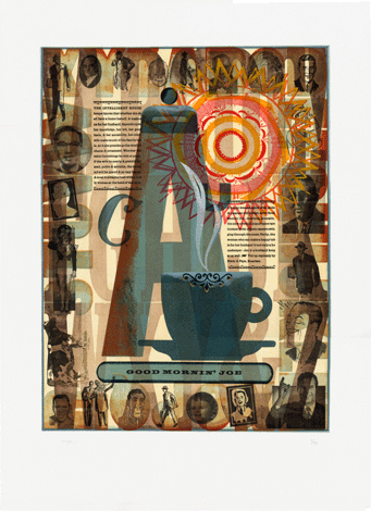
He also liked to play, sometimes, with retro themes. In this decade, in addition to books and ephemera, Chris started doing a series of art prints, mixing up various kinds of old type with antique or out-of-date images from advertising and job printing, layering them densely but wittily.
Chris came to this calling by an eccentric path. His first brush with typesetting was on a Compugraphic phototypesetting machine at Franklin Press in the early 1980s (where I was working and where, he later insisted, I had taught him how to typeset). From there he leapt to the start-up Microsoft Press, setting up its type department and helping to establish the insanely high standards of book production that the press had in its earliest days. (I remember Chris spending all night adjusting the kerning in a digital font — long before the days of graphic displays and WYSIWYG — so it would give a smoother and more effective texture when we used it in books.) After Microsoft, Chris worked in a digital type shop that served Seattle’s advertising agencies, but it was also then that he became captivated by letterpress printing — the very opposite of the hi-tech production methods he had mastered up till then.
When Chris and I established a sort of informal “typographers’ pub,” Typographers & Others, in Seattle in the late 1980s, Chris used this opportunity to try out various printing ideas on the monthly postcards we sent out as invitations and meeting announcements. Some of those are in this exhibit, including the one where Chris wanted to see whether it was possible to make all-caps blackletter readable. It was possible, he found, just barely; but he had no desire to do it again.
Chris’s book printing work became justly famous; the poets and other writers that he printed invariably valued those editions very highly, yet found them comfortable and easily readable. The ephemera that he produced has been kept lovingly by amused friends and colleagues over the years, belying the idea of its being ephemeral. And the large-scale prints and posters evolved into a unique form of art. Examples of all of that can be seen in this show.
Chris was a uniquely talented artist and craftsman, fiercely ambitious for excellence. He and Jules have produced wonderful artifacts, which will live beyond them. They have also taught and inspired innumerable other aspiring printers, artists, and craftspeople, directly and by example. This exhibit is one of the fruits of that.
[Copyright 2020. Originally published in Medium.]