We had to figure out solutions to intricate design problems as we implemented someone else’s designs, so why not start designing the books ourselves?
Books at the press
One of the pleasures of working at Microsoft Press was working on a daily basis with very smart, talented, highly motivated people. The publisher and founder of the press, Nahum Stiskin, had the vision of being the first publisher to bring together expertise in book publishing and expertise in computer programming. (He felt that of the competing publishers of technical books, one had good technical chops but a poor understanding of the publishing business, while the other had exactly the reverse.)
The books we published were trade books, not manuals; they were the after-market books that you could buy to get the real scoop on how to use your new software or hardware. As I learned later, the problem with producing a software manual was that it had to be printed and ready to go into the box when the software shipped; but the lead time for printing meant that the manual writers could never cover all the last-minute changes that the programmers made to the software. Most notably, it was quite often the start-up procedure that got finalized last, after the manual had gone to press; yet this was exactly what any user was going to encounter first. Trade computer books filled this niche: timely information but more complete than any manual.
This did mean that computer books had a shelf-life that could be measured in months. Thus the relatively high prices: it might be worth it to you to pay that price right now, to get a handle on your newly purchased program or equipment, but by the same time next year nobody would be interested. The rate of change in the computer business was tremendous.
Most of Microsoft Press’s books were about software, but there were exceptions. Cary Lu’s introductory book on the Macintosh, The Apple Macintosh Book, was a bestseller that went through edition after edition. (I had the pleasure — and challenge — of updating the design of the interior for the second or third edition.)
At one point we were going to publish a new edition of Ted Nelson’s highly idiosyncratic Computer Lib/Dream Machines, a wild-and-wooly tour-de-force from the early days of computing (“You can and must understand computers NOW”) that the author had self-published in 1974. The original edition, with its doodled illustrations and handwritten annotations, might best be described as “artisanal.” It was going to be quite an adventure trying to figure out how to create a coherent, digitally typeset update of this essentially hand-crafted book. In the end, I didn’t get to tackle the project, but I did get to meet Ted Nelson when he came in to the office to plan the new edition.
More trivial, but definitely out of the run of ordinary Microsoft Press books, was a small, oblong book of cartoons about computers by Eldon Dedini, a cartoonist best known for the easily recognizable style of his erotic cartoons for Playboy.
The Director of Design & Production at the Press was Karen-Lynne de Robinson, who had come to Microsoft from one of the other major technical publishers and had a clear-eyed understanding of the mechanics of getting books into print. Karen gave us a lot of leeway as we tried to push the typographic limits of computer books; but, as she explained to us, there came a point in each book’s production cycle when she would enter “stet mode,” no longer approving any changes that weren’t actually essential to getting the book done. That seemed to us an entirely reasonable approach.
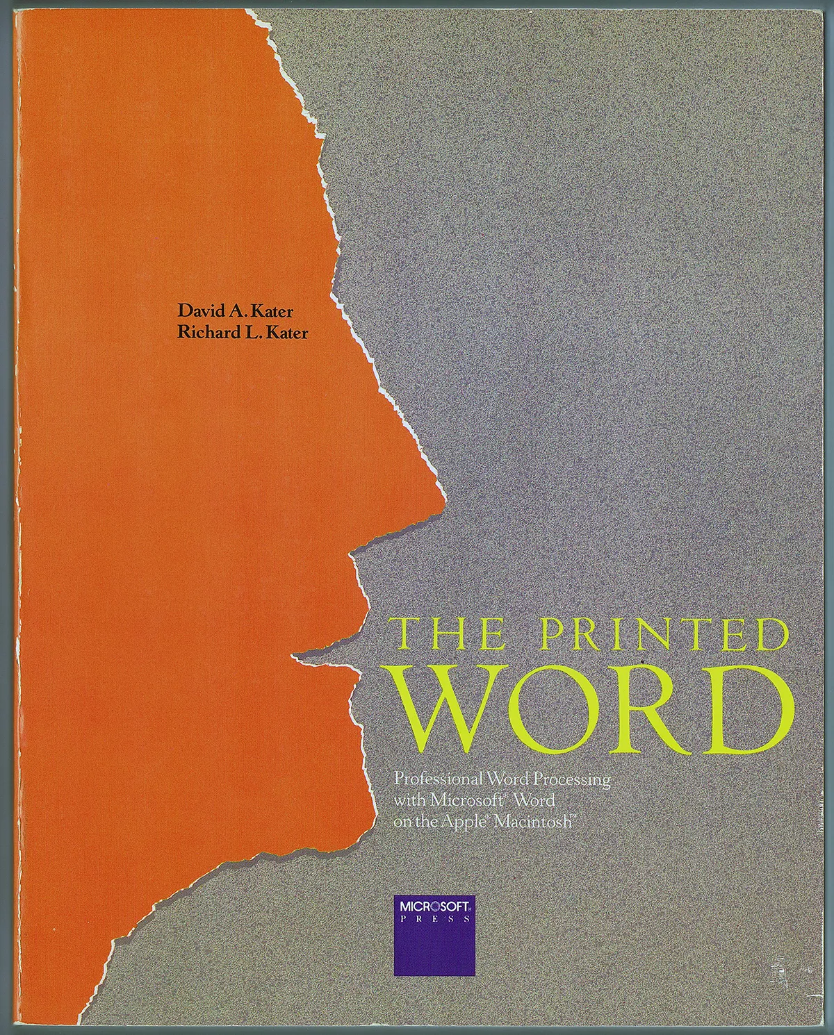
I once spent most of an afternoon working and reworking the precise spacing of the word “WORD” on the cover of The Printed Word, designed by Steve Renick, the art director of the University of California Press. It was the only book Steve designed for Microsoft Press, but I knew he would care about details like that.
As typographers (glorified typesetters, as we said), we would be responsible for taking the electronic manuscript of a book and turning it into printable pages. This sounds straightforward, but in practice the books were done on such a fast schedule that we were quite often typesetting the first third of a book and getting it pasted up as pages when the final third was still being written. The structure of a computer book is complex, with a variety of formats and hierarchies needed to organize the information and an unpredictable combination of charts, tables, illustrations, and screen-shots to illustrate it. Karen usually commissioned a design for both cover and interior from Seattle graphic designer Ted Mader; the covers could be striking, but the sample pages that we got for the interior design often seemed perfunctory. To be fair, there was no way the junior designer in Mader’s studio who actually created the interior design could know every element that would be needed; the manuscript didn’t exist yet. The result was that we, the typesetters, often found ourselves having to create new design elements on the fly.
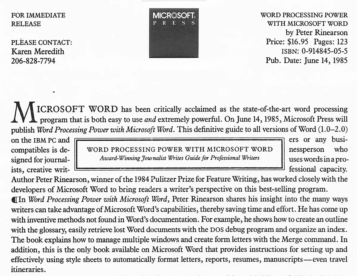
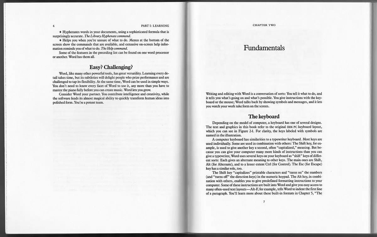
After several rounds of this designing-on-the-fly, several of us asked Karen to let us design the book interiors ourselves. It took a while, but eventually that’s exactly what we did. (Covers were still coming from Ted Mader.) For myself, the very first book interior that I designed for Microsoft Press was Peter Rinearson’s clunkily titled Word Processing Power with Microsoft Word. It had the usual almost square format that computer books required in order to show screenshots from DOS screens at true size, but I worked to try and bring some elements of traditional book typography to the page design. (In retrospect, I probably tried to bring too many traditional elements to the design, but it seemed somehow appropriate to a book about text and word-processing.)
I’ve never been entirely sure which was my first book design. At the same time I was working on Peter Rinearson’s book, I was also designing a short book of essays for a brand-new small press in Seattle, Serconia Press. The two co-publishers were part of the local science-fiction community, and their initial book was a collection of essays, The Pale Shadow of Science, by the eminent British science-fiction writer Brian Aldiss. Since the Aldiss essay collection and the Rinearson computer book both came out at about the same time, I simply count them both as my “first” designs.
[Copyright 2020. Originally published in Medium.]