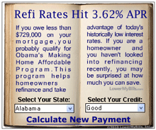
Sometimes you just have to show a really bad example. The one you see on the left is an online ad that appeared recently on a popular web page. It’s not high-end advertising design. The open-book metaphor seems to fight with the interactive drop-down lists, and in a misguided attempt to suggest the printed page, the designer has let the program freely alter the spaces within words and lines, without the aid of anything so mundane as a hyphen. The result is magnificently bad.
In those 19 lines of text, there are almost none that are typeset competently. Words are squashed together, other words are stretched out, all with no apparent logic except to force them into those terribly narrow justified columns. It’s hard to imagine this ad enticing anyone to read the text, even if they were hooked by the promise of the headline. What an open book has to do with refinancing a mortgage is anyone’s guess, but this miniature version is about as far from the even texture of a well-typeset page as you can possibly get.

