
Jumping from phototypesetting into the digital world — before desktop publishing — at Microsoft Press in the 1980s.
[Previous installments of this memoir have talked about my days as a phototypesetter at Franklin Press, and my eventual migration across Lake Washington to the fledgling Microsoft Press, where the type department was headed up by Chris Stern.]
But first, a couple of late additions
[These bits properly belong in an earlier section, about working as a phototypesetter at Franklin Press.]
At Franklin Press, and also at Rocket Type, we used to ask aspiring typesetters to set the word “Seattle” in all-caps Helvetica. It’s easy to set the letters; it takes quite a bit of care to space them properly. That ‘AT’ combination invites close kerning, yet the ‘EA’ combination before it insists on space, and the double-‘T’ creates a gigantic, conspicuous space under the adjacent crossbars, requiring all the other letters to space out a bit.

We lived, as I would point out to them, in a hard-to-kern city.
*
The typefaces called for in easily half the jobs that came in to Franklin Press, in the late ’70s and early ’80s, were the Compugraphic equivalent of either Times Roman (“English Times”) or Helvetica (“Helios”). So it was no surprise to me that the core fonts on the first PostScript printer, the Apple LaserWriter, when it came out in 1985, were Times & Helvetica. They already seemed to be everybody’s default choices.
[Now back, or rather forward, to Microsoft Press:]
The nitty-gritty
Chris Stern dove into every problem with intensity and concentration. And he never stopped. We would be trying to figure out the solution to a thornily technical typographic problem during the work day, then go home (no doubt quite late) for the night. When I came in the next morning, Chris would have continued worrying at the problem overnight and would be dumfounded that I hadn’t followed his logic and wasn’t already up to speed on his thought processes.
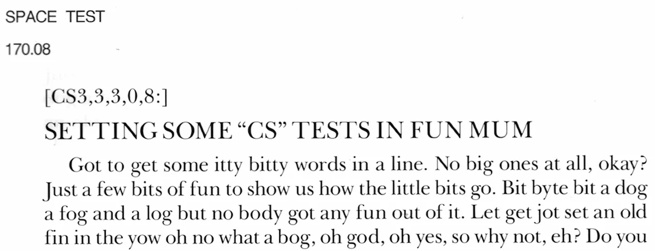
The Compugraphic phototypesetting systems I had worked on at Franklin Press had displayed certain formatting codes on the screen, but you didn’t type in the codes yourself; there were extra buttons on the keyboard to control things like font changes and size changes (within the constraints of the filmstrips currently installed in the machine). At Microsoft Press, working on the CCI digital typesetting system, I learned to control typesetting by typing in the codes directly. We had left behind the world where you had to type in the text itself; instead, we got text files and only had to format them. But that formatting was a complex process.
I didn’t realize it at the time, but it was the beginning of my learning how to program. I was not interested in computers per se, but I was very interested in what they could do for me in producing books. So I learned the logic behind CCI’s “formats,” little strings of code that you could apply at certain points within the stream of text in order to get the typesetting effects you wanted, and I got quite good at putting them to use. It was an education in thinking like a computer. At one point, we were actually writing hexadecimal translation tables, which would apply various global changes to the book manuscripts as we imported them into the system.
Since we’d usually be working on one or possibly two books at a time, I got good at visualizing the effects of the code I was entering. There was no WYSIWYG, no visual interface beyond the softly glowing screen of the Tandberg monitor and the cool green letters running across it (much nicer and more readable than the choppy text on Microsoft’s contemporaneous DOS screens). We would enter changes on our keyboards, then send the file to the output unit down the hall (a desk-sized Linotron 202) to be printed out on photo-sensitive paper. Only then could we see whether we’d achieved the effects we had intended. By midway through production of a book, we’d be pretty good at getting things right the first time.
CCI was a very good typesetting system, designed for the rigors of newspaper production. But CCI the company was coming apart; the founders had left, and eventually so did much of the technical staff. By the summer of 1985, whenever we had a tricky question and called CCI for support, we found that all too often we already knew more about the problem than the techie at the other end of the line. This was both gratifying (yes, we did know what we were doing) and frustrating (no, we were on our own).
Sometime before that, I had been sent to CCI’s headquarters in Chatsworth, outside Los Angeles, for an intensive training session. (I think it was to learn the intricacies of tables — always one of the hardest problems in digital typesetting.) But that was the year before, when the company was still apparently healthy. By the next year, that kind of trip would have been useless. (It was the first time I had ever been sent on a business trip. What I remember, from renting a car at LAX and driving out to the San Fernando Valley, was realizing that the grid of LA’s freeways was much like a scaled-up version of the local street grid. Sort of a “Powers of 10” realization of scale.)
The digital fonts we were using were pre-PostScript, pre-DTP technology; there were no “screen fonts,” no What You See Is What You Get (WYSIWYG), no visual representation of the result on your input screen. The CCI system simply sent its output to the Linotron 202, where the fonts were stored. The Linotron’s font outlines were constructed of lots of tiny vectors, which could simulate smooth curves, rather than the Bézier curves that were later introduced with PostScript. The 202’s resolution was high enough that this didn’t make any practical difference in the output, but at heart it was an approximation. We typographers at the Press were obsessed with details like this, and spent an inordinate amount of energy (and time) trying to make the tools at hand produce the very best typographic results.
[Copyright 2020. Originally published in Medium.]